by Charles Hugh Smith, Of Two Minds
People sense the ‘recovery” is bogus, and their rational response is to save more money rather than squander it.

Sometimes one chart captures the fundamental reality of the economy: for example, this chart of money velocity and the civilian-population ratio. (thank you, Joseph Y. for posting it on my Facebook feed.)
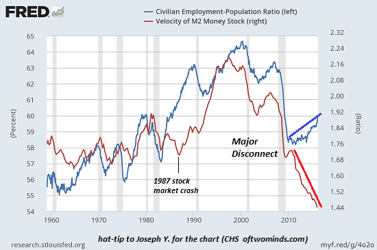
When the blue line is up, more of the population has a job. (the blue line is the Employment-Population ratio.)
The red line is money velocity, the rate at which money changes hands. (Money buried in the coffee can in the back yard has a money velocity of zero.)
As Joseph noted, the correlation between the percentage of people working and money velocity was strong until 2010. In the post-2009 recession “recovery,” the percentage of the populace with jobs rose modestly, but money velocity absolutely cratered to unprecedented lows.
(The one other disconnect was triggered by the 1987 stock market crash, which caused money velocity to dip even as more people entered the workforce. This absence of correlation was relatively brief.)
The correlation between more people working and money velocity is commonsensical. More people working = more household income = more spending = higher money velocity.
But something changed in 2010. Did the quality and compensation of work change? Joseph observed:
People started going back to work after the official recession ended in Q4 2009 but they were working for lower pay. With lower pay comes less disposable income, hence the cliff-like drop off in velocity.
Another potential factor is higher inflation. Some recent estimates (Where’s The Beef? ‘Lies, Damned Lies, And Statistics’) suggest the gap between official inflation and actual inflation in rent, food, energy and medical care in the past 20 years has subtracted 20% from paychecks.
The four “biggies” for the average American are rent, food, energy, and medical care, in approximately that order. These “four horsemen” have been galloping along at a faster rate than headline CPI. According to the BLS definition, they compose about 60% of the aggregate population’s consumption basket, but for struggling middle-class Americans, it’s closer to 80%. For the working poor, spending on these four categories can stretch to as much as 90% of total spending.
(If we add exposure to higher education’s soaring costs, the rate goes even higher.)
So even if wages held steady, once we factor in “real” inflation, real take-home pay has declined by 5% to 20%, depending on the household’s exposure to rent, food, energy, medical care (love those co-pays and out-of-pocket expenses) and higher education.
Another potential factor is the figurative coffee can in the back yard: people sense the ‘recovery” is bogus, and their rational response is to save more money rather than squander it. Even though central banks have reduced the yield on savings to less than zero, people are still saving whatever they can.
Data suggests it’s all three: lower incomes, higher inflation and a recognition that savings are more important in a ‘Lies, Damned Lies, And Statistics’ economy than more spending.
This chart says it all: real income is declining and the bottom 95% are poorer. No wonder people are socking away what they can and tightening their spending: they have no other choice, even as the Federal Reserve strip-mines their savings.
My new book is #3 on Kindle short reads -> politics and social science: Why Our Status Quo Failed and Is Beyond Reform ($3.95 Kindle ebook, $8.95 print edition) For more, please visit the book’s website.


