
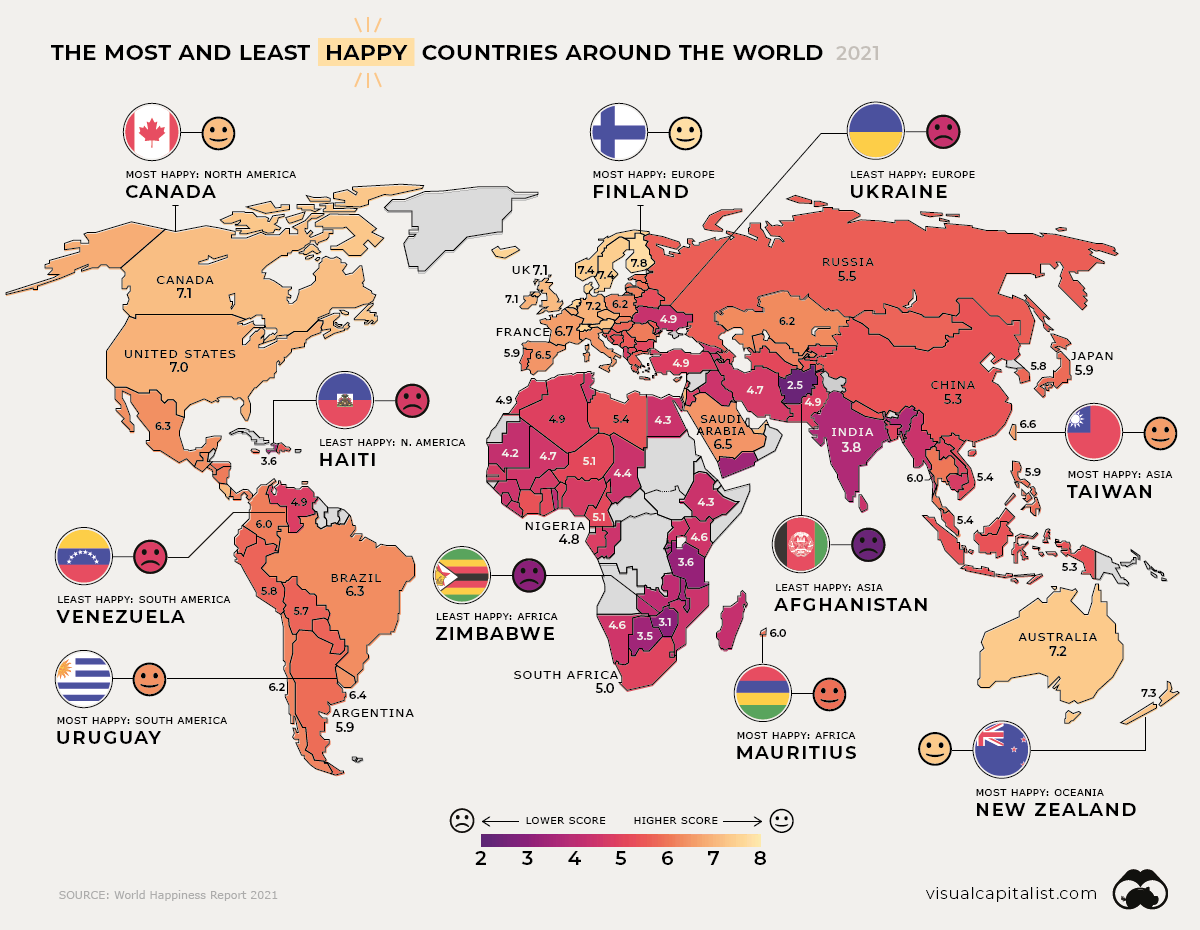
Today’s infographic pulls data from the World Happiness Report to uncover the average scores of 149 countries between 2018-2020, and which ones emerged the happiest or unhappiest. We also look at the most and least improved countries in every region.

Source: https://www.visualcapitalist.com/mapped-global-happiness-levels-in-2021/


