The economist Max Roser from Our World in Data argues that this familiarity with the world map may lead to complacency in understanding global matters. After all, the typical world map shows us the basic geography of countries and continents, but it doesn’t give any indication of where people actually live!

To get around the challenges of relying on the standard world map, Roser instead has made a population cartogram based on 2018 population figures.
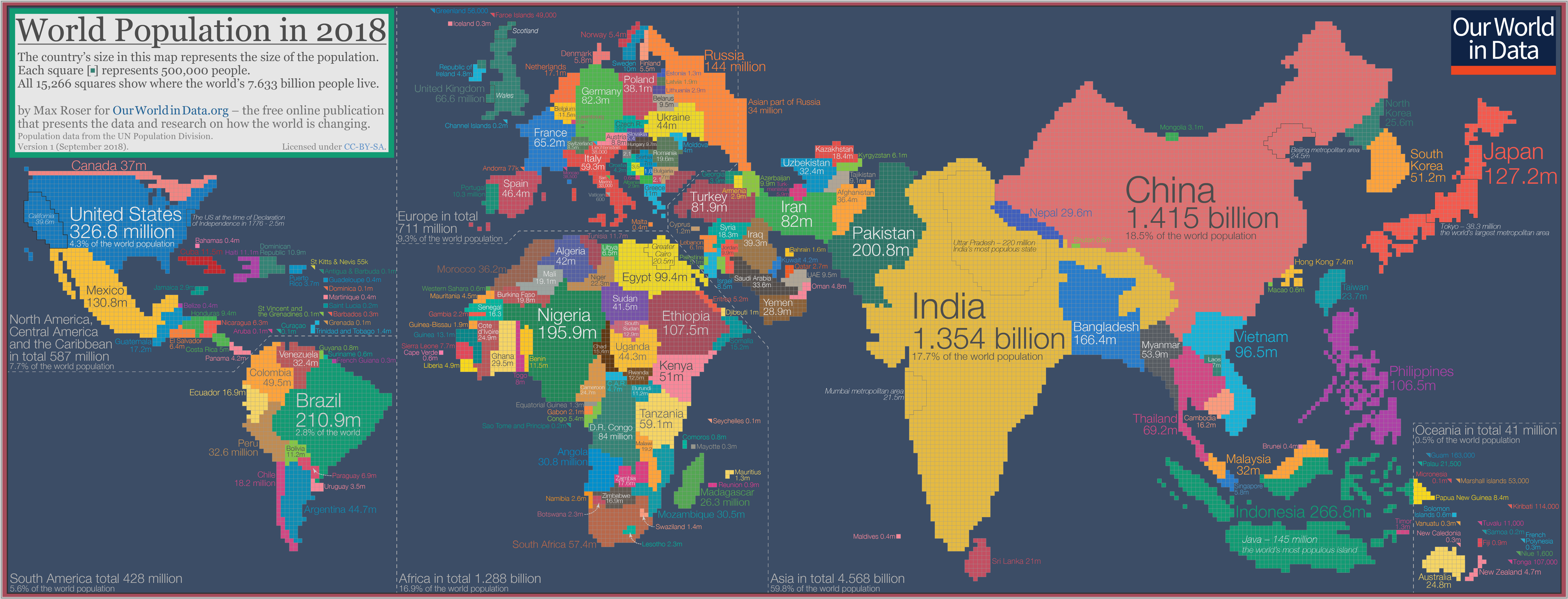
What’s a population cartogram?
A cartogram is a visualization in which statistical information is shown in diagrammatic form. In this case, it’s a population cartogram, where each square in the map represents 500,000 people in a country’s population.
In total there are 15,266 squares, representing all 7.633 billion people on the planet.
Countries like Canada or Russia – which have giant land masses but small relative populations – appear much smaller on this kind of map. Meanwhile, a country like Bangladesh grows much bigger, because it has a large population living within a smaller area.
Source: http://www.visualcapitalist.com/massive-world-map-redrawn-based-country-populations/


