
Discussion last updated on December 4, 2014
Written by Sig Silber
Note: Graphics in this report are auto-updated by NOAA (National Oceanic and Atmospheric Administration and the various weather organizations within NOAA as it is a complex organization) and other sources. The commentary from Econintersect is updated once or twice a week and may lag the graphics updates.
This report is organized into the following sections:
A. U.S. Weather: Current and Three-Month Outlooks
B. The Special Topic of most interest. For some time now that has been the possibility of an El Nino.
C. U.S. Longer-Term Outlooks which means more than three months and with respect to the maps covers a little over a year.
D. Information on Climate Cycles
E. Weather and Climate Around the World.
F. Climate Change: F1 Climate Impacts, F2 Economic Impacts, F3 Reports from Around the World.
A. U.S. Weather – Current and Three Month Outlook.
Current Through Seven Day U.S. Weather Maps.
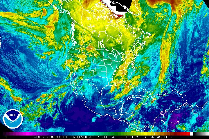
Let’s take a look at the situation with respect to the U.S. Here is the current weather map. Notice it updates every six hours. The time used is ZULU which in some places is called Greenwich Mean Time (GMT) or UTC. Here is a ZULU to normal time converter. Where I live I just subtract six hours (not worrying about the one hour that Daylight Savings or Standard Time changes that formula) which means that 10 pm my time shows up as 4 am ZULU with tomorrow’s date so one has to be careful in how to interpret the time stamp.

The explanation for the coding used in these maps i.e. the full legend can be found here.
And here is another view of the actual enhance infrared satellite imagery without interpretation.
And here is pretty much the same information with interpretation and a focus on tropical storms. It does not cover as wide an area e.g. it does not cover the Western Pacific or the Atlantic far east of the U.S.

Here is a better look at the Western Pacific which has been active recently.

Sometimes it is useful to take a look at the location of the Jet Stream or Jet Streams.

And sometimes the forecast is revealing. This is the forecast out five days.

To see it in animation, click here. At the time this article was published the animation shows a tendency for there to be a Southern Branch of the Polar Jet Stream in addition to the usual Northern Branch. It can bring storms further south than usual.
U.S. 3 Day to 7 Day Forecasts
You can enlarge the below daily (days 3 – 7) weather maps by clicking here.
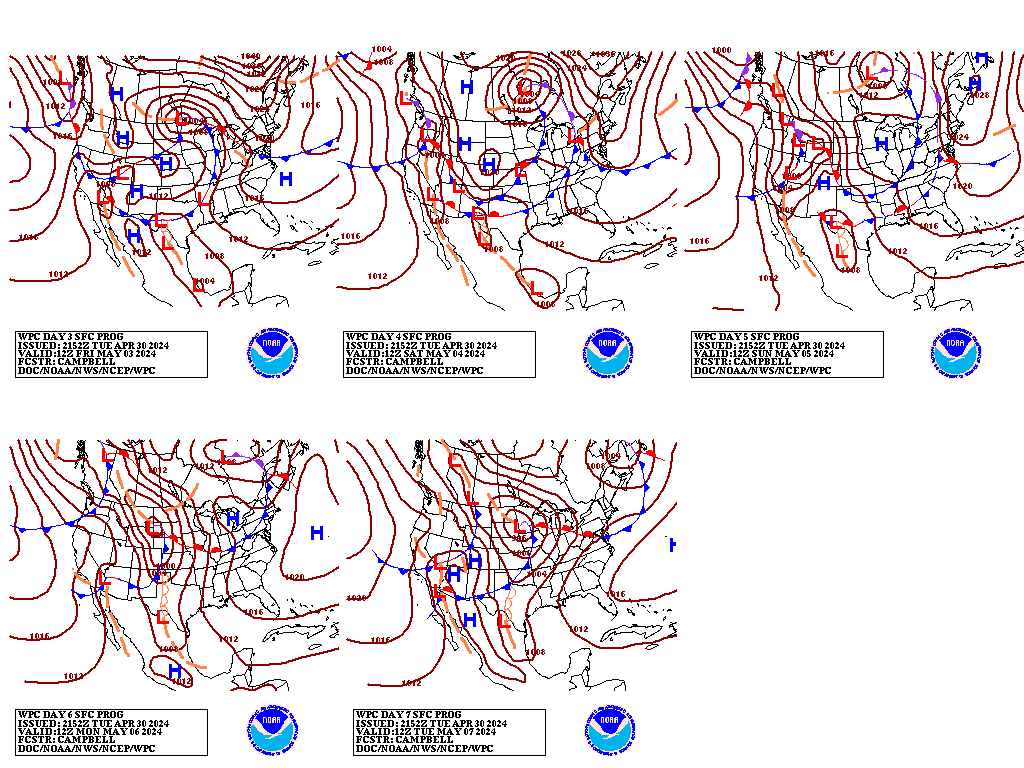
And below is a another view which highlights the highs and the lows re air pressure which in theory it should be the same as the Day 6 map above but it may not be identical because it may have been issued slightly earlier or later than the above maps and may have been prepared by a different meteorological team. It should be pretty close and is easy to read.

This next map is the mid-atmosphere 7-Day chart rather than the surface highs and lows and weather features. In some cases it provides a clearer less confusing picture as it shows the major pressure gradients.

Note the zonal flow. With a little imagination you can see the Pacific trough and impact of the southern branch of the Polar Jet Stream. This graphic provides a fast overview of the situation in the U.S. and Canada and Mexico.
(6 – 10 and 8 to 14 day) Forecasts
Note: This is a forecast for six days from when it is issued.
When I provide comments, they apply to the forecast issued on the most recent Monday. Please note these maps auto update daily and on weekends they are generally issued without review or discussion by the NOAA meteorological team.
1. Temperature Forecast for days 6 – 10:

2. 6 – 10 Day Precipitation Forecast:

And now what they call Week Two which is days 8 – 14. Notice the overlap of days 8, 9, and 10. This reflects the difficulty of precisely timing the movement of highs (ridges) and lows (troughs) which is the primary mechanism for the development of these forecasts especially during the winter when these patterns tend to move from west to east.
3. The 8 – 14 Day (Second Week) Temperature Forecast:

4. The 8- 14 Day Precipitation Forecast:

In theory the week one forecast each week should be what was forecast as week two the prior week. You can track the ability of NOAA to predict things by looking at the prior week’s forecast.
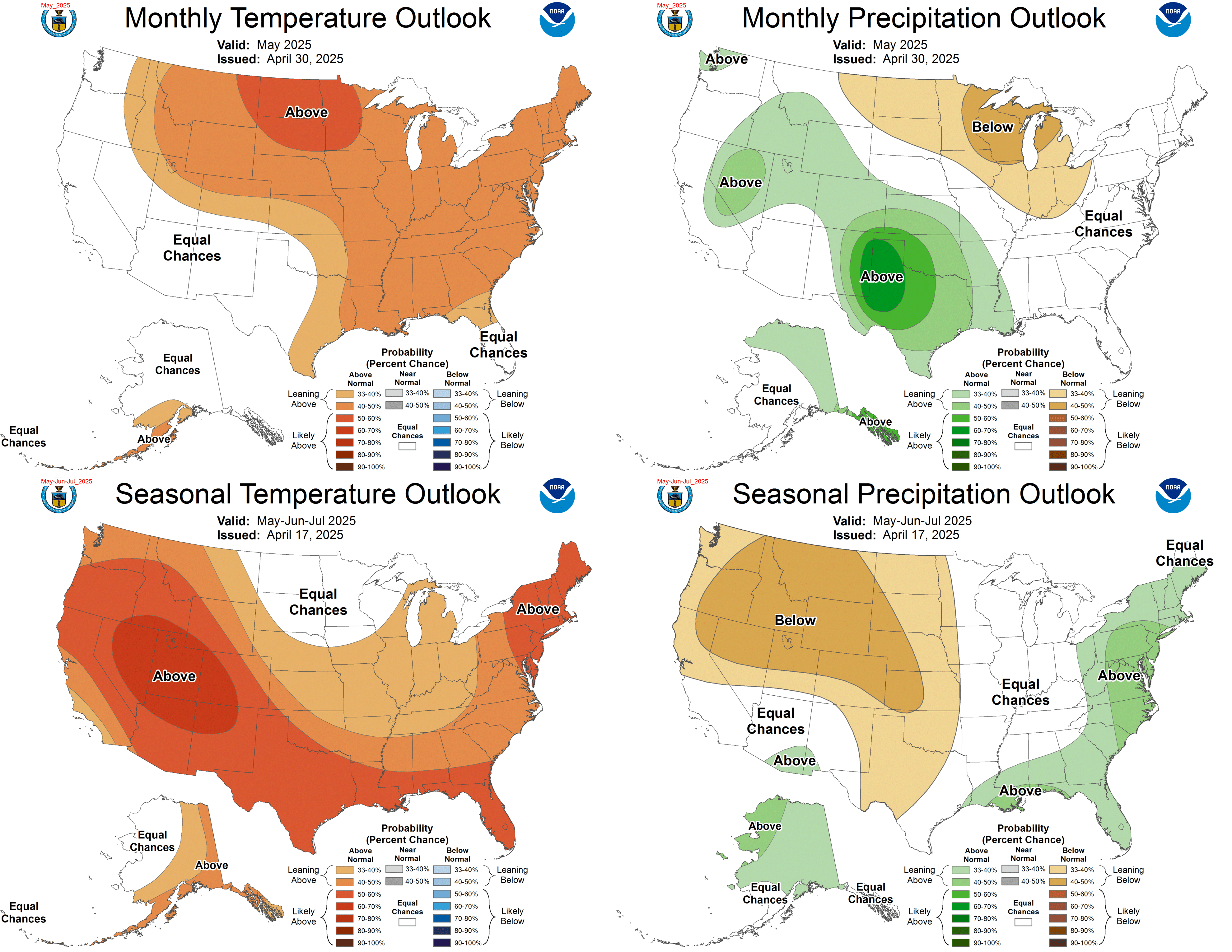
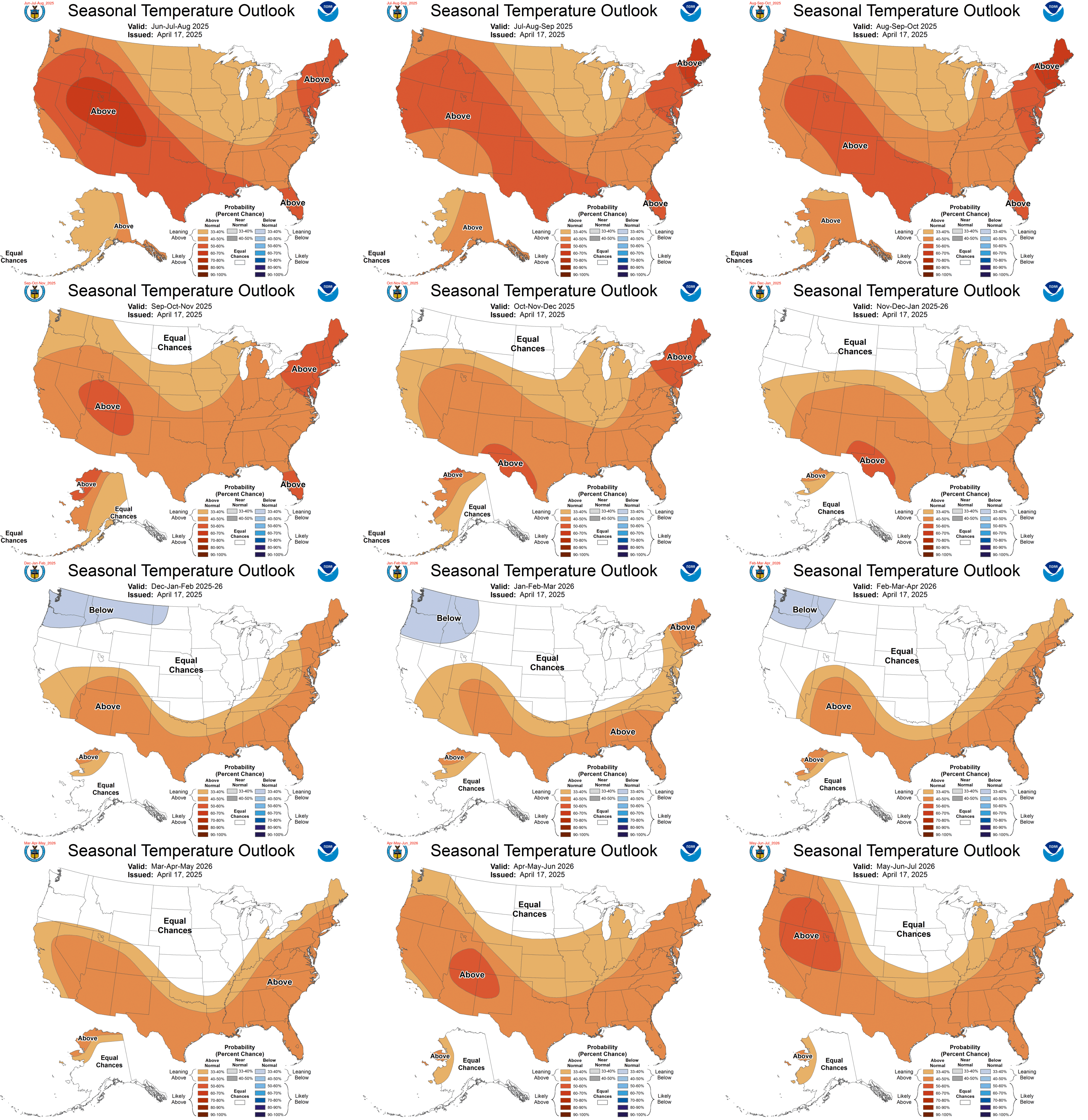
U.S. Current/Next Month and Three Month Outlooks .
Here is the current month outlook as well as the next three month’s outlook. Note the date in the legend as the current month varies in the sense that towards the end of the month it is the next month and until the third Thursday it is the current month.
We now have the new outlook for December and January and February 2015 issued on November 20 which is very similar to the prior outlook. The December Early Outlook was updated on November 30.
A new seasonal outlook will be issued on December 18. Here is what was issued on November 20, 2014 and updated on November 30.
And here is the discussion:
First the Current Atmospheric and Ocean Condition:
“ATMOSPHERIC AND OCEANIC CONDITIONS IN THE TROPICAL PACIFIC REMAIN MOST CONSISTENT WITH AN ENSO-NEUTRAL STATE. SST ANOMALIES HAVE INCREASED IN RECENT WEEKS AND ARE NOW ABOVE +0.5 IN ALL THE ENSO CRITICAL REGIONS OF THE PACIFIC, WITH ANOMALIES OF +0.7C, +0.6C, +0.9C AND +0.6C IN THE NINO 4, 3.4 Editor’s Note: 0.6C in Nino 3.4 is the criteria for minimal El Nino Condition but by itself does not define an El Nino which can only be defined after the fact. When we take a look at the current location of the Kelvin Wave, it will be clear why there are anomalous warm conditions along the Eastern Equator, 3, AND 1+2 REGIONS RESPECTIVELY. SSTS ALONG THE EQUATOR ARE ABOVE +0.5 C EVERYWHERE FROM ABOUT 160 E TO JUST SHY OF THE SOUTH AMERICAN COAST, WITH SOME REGIONAL ANOMALIES IN EXCESS OF +1.0 C. OCEAN SUBSURFACE TEMPERATURE ANOMALIES REMAINED FAIRLY STEADY IN THE PAST MONTH, AND RANGE FROM +1.0 TO +4.0 C AT BETWEEN 100 AND 200 METERS DEPTH, EXCEPT NEAR SOUTH AMERICA WHERE ABOVE NORMAL OCEAN TEMPERATURES ARE CONFINED TO THE UPPER 50 METERS OR SO. WITH THE EXCEPTION OF THE SOI, THE USUAL ATMOSPHERIC RESPONSE TO EL NINO ARE NOTABLY ABSENT FROM RECENT OBSERVATIONS. RECENT OLR ANOMALIES SUGGEST THAT CONVECTION IS NEAR TO BELOW NORMAL OVER THE CENTRAL EQUATORIAL PACIFIC IN AREAS THAT USUALLY SEE ABOVE-NORMAL CONVECTION DURING EL NINOS. BOTH LOWER AND UPPER LEVEL WIND ANOMALIES DURING THIS PERIOD REMAIN NEAR NORMAL. WITHOUT LARGE SCALE ATMOSPHERIC ANOMALIES NORMALLY ASSOCIATED WITH EL NINO PRESENT, ENSO-NEUTRAL STILL BEST DESCRIBES THE CURRENT CONDITIONS IN THE PACIFIC.
SIGNIFICANT EXTRA-TROPICAL ANOMALIES THAT MAY HAVE AN IMPACT ON THE CLIMATE OVER NORTH AMERICA INCLUDE A LARGE AREA OF POSITIVE SST ANOMALIES IN THE WESTERN NORTH PACIFIC BASIN THAT PROJECTS ONTO A POSITIVE PDO, ALTHOUGH ANOMALIES HAVE WEAKENED CONSIDERABLY IN THE LAST MONTH. SST ANOMALIES ALONG THE ATLANTIC SEABOARD HAVE DECREASED CONSIDERABLY IN THE PAST MONTH, AND ARE NOW BELOW NORMAL FROM VIRGINIA SOUTHWARD, WITH POSITIVE SST ANOMALIES HOLDING ON IN THE NORTH.
Special note: In the last two Reports I have presented an abstract of a paper that suggests that the AMO has peaked and is now declining and will gradually go negative. It is not the only paper where that has been the conclusion. The changes taking place which are measured by the AMO and PDO are far more important to the economy of the U.S. and World than minor perturbations to the ENSO Cycle along the Equator. Cycles which last in the order of 60 years have more of an impact than sub-decadal cycles like ENSO over the 60 year period even though the amplitude of the sea surface temperature anomalies in the 60 year cycles are less than the anomalies in extreme years within the sub-decadal ENSO cycle.
IMPRESSIVELY POSITIVE ANOMALIES IN THE AREAL EXTENT OF SNOW COVER WERE OBSERVED DURING THE MONTH OF OCTOBER IN BOTH NORTHERN EURASIA AND CANADA. THE AREAL EXTENT OF SNOW COVER IN LATE OCTOBER IS THE THIRD HIGHEST SINCE THE LATE 1960’S, ONLY EXCEEDED BY OCTOBER VALUES IN 1976 AND 2002.
THERE IS FAIRLY GOOD CONSENSUS AMONG BOTH STATISTICAL AND DYNAMICAL MODELS FOR ABOVE-NORMAL SSTS TO PERSIST IN THE NINO 3.4 REGION THROUGH THE BOREAL WINTER. MOST OF THE TROPICAL ATMOSPHERIC RESPONSE TO EL NINO IS USUALLY WELL ESTABLISHED BY THIS LATE IN THE YEAR, SO IN SPITE OF THE CONSENSUS OF PREDICTIONS, THE EL NINO IS EXPECTED TO BE WEAK, IF IT DEVELOPS AT ALL. THE CURRENT CONSENSUS OF OPINION AMONG FORECASTERS AT CPC AND IRI IS FOR A 60% CHANCE OF EL NINO DEVELOPMENT. THE MULTI-MODEL AVERAGE OF NINO 3.4 SSTS IS FOR ANOMALIES OF CLOSE TO +1.0 C BY EARLY 2015. A CALIBRATED CONSENSUS OF BOTH STATISTICAL MODELS AND THE CFSV2 PREDICTIONS SUGGESTS AN EARLIER PEAK TO NINO 3.4 SSTS OF JUST OVER +0.7 C, IN NDJ 2014-15, DECREASING SLOWLY AFTERWARD AND REACHING +0.5 C BY MAM 2015.
Special Note: If this turns out to be correct, this warm event may not even be categorized as an El Nino because the duration was too short. But I suspect that NOAA is incorrect on the duration of the length of time that the ONI Index will indicate El Nino Conditions in fact I think they may be off by as much as a full year. In fact their major problem may be that they are early by a year in their analysis.
MOST MODELS RUN AS PART OF THE NMME AND IMME PERSIST ABOVE-NORMAL SSTS ALONG THE WEST COAST OF NORTH AMERICA THROUGH AT LEAST LATE SPRING 2015. THE AREAL EXTENT AND MAGNITUDE OF THESE PREDICTED ANOMALIES PROJECT ONTO A POSITIVE PDO PATTERN AND ARE LARGE ENOUGH TO POTENTIALLY HAVE AN IMPACT ON CLIMATIC CONDITIONS OVER NORTH AMERICA IN THE NEXT SEVERAL SEASONS.”
Then the 30-DAY OUTLOOK DISCUSSION FOR DECEMBER 2014
“THE DECEMBER 2014 OUTLOOK REMAINS CHALLENGING, THOUGH FOR SOMEWHAT DIFFERENT REASONS THAN THOSE DISCUSSED BELOW FOR THE 0.5 MONTH LEAD OUTLOOK. A DRAMATIC PATTERN CHANGE IS ANTICIPATED ACROSS THE NORTH-CENTRAL CONUS, WHERE MUCH BELOW-NORMAL TEMPERATURES FOR THE FIRST COUPLE DAYS OF THE MONTH ARE FORECAST TO BE REPLACED BY ABOVE-NORMAL TEMPERATURES THROUGH AT LEAST THE SECOND WEEK OF THE MONTH. A SIMILAR SITUATION IS FORECAST FOR THE NORTHEAST, WHERE A SERIES OF CANADIAN HIGHS ARE FORECAST TO DOMINATE SURFACE CLIMATE EARLY. THE ARCTIC AIR IN CANADA EARLY IN THE PERIOD IS THUS EXPECTED TO PROGRESS MORE EAST THAN SOUTH, AS A +NAO CIRCULATION IS EXPECTED EARLY IN MONTH. THIS LEAVES AREAS TO THE SOUTH MILDER THAN CLIMATOLOGY FOR MOST OF THE FIRST 10 DAYS OF THE MONTH OR SO
IN THE MEDIUM RANGE PERIOD, THE MODELS ARE IN GOOD AGREEMENT THAT AN ANOMALOUS TROUGH WILL FORM IN THE NORTH PACIFIC, THOUGH THERE IS SOME DISAGREEMENT AS TO ITS LONGITUDINAL CENTER. THE GLOBAL ENSEMBLE MEANS INDICATE A FAIRLY LONG WAVELENGTH PATTERN, APPEARING AS A HYBRID OF THE CANONICAL +PNA AND LOW-FREQUENCY ENSO FOOTPRINT. THE LATTER REMAINS SUSPECT AS THE EXPECTED CONVECTIVE RESPONSE TO EL NINO IN THE CENTRAL PACIFIC REMAINS TENUOUS.
Special Note: From here. “During the remainder of the year a larger SST anomaly, up to +1.5°C in November-December-January, is required in order to reach the threshold to support persistent deep convection in that region.” The latest reading I have seen with respect to the ONI was 0.6 and most models predict values of around 0.8 for this winter and spring. So it is not clear the extent to which this El Nino will produce the convective response of the typical El Nino or other weather impacts of a typical El Nino.
THE MJO HAS REMAINED ACTIVE OVER THE PAST TWO WEEKS, AND IS FORECAST TO PROPAGATE INTO THE PACIFIC OVER THE NEXT WEEK TO 10 DAYS. THIS FAVORS A COLDER SOLUTION RELATIVE TO NORMAL ACROSS MUCH OF THE CENTRAL AND EASTERN CONUS FOR THE LAST 10 TO 15 DAYS OF THE MONTH.
COMBINING THE ABOVE FACTORS WITH UNANIMOUS MODEL AGREEMENT AMONG THE EXTENDED RANGE ECMWF, CFS, AND JMA, A WARMER-THAN-NORMAL DECEMBER FOR MUCH OF THE CONUS AND ALASKA IS FAVORED. SOME BELOW-NORMAL TEMPERATURES ARE FAVORED ALONG THE GULF COAST WHERE A +PNA HAS A STRONG TEMPERATURE FOOTPRINT, AND WHERE ANY PATTERN CHANGE LATE IN THE MONTH WOULD CONTRIBUTE TO BELOW-NORMAL TEMPERATURES. PROBABILITIES ARE GENERALLY LOW, HOWEVER, REFLECTING THE MIDDLE AND LATE MONTH UNCERTAINTY, GIVEN THE MJO SIGNAL FOR A PATTERN CHANGE.
THE PRECIPITATION OUTLOOK IS CHANGED TO REFLECT THE CHANGES IN MODEL GUIDANCE FROM THE ECMWF, CFS, AND JMA, AS WELL AS TO HARVEST THE HIGH CONFIDENCE SHORT-RANGE FORECASTS FOR THE NEXT SEVERAL DAYS. COMBINING THESE FACTORS WITH THE WEEK-2 OUTLOOK INFORMS THE PRECIPITATION OUTLOOK FOR THE MONTH. EQUAL CHANCES ARE INDICATED OVER MUCH OF THE EASTERN CONUS, WHERE PRECIPITATION SIGNALS ARE WEAK EARLY IN THE MONTH. IN THE SOUTHEAST, THOUGH BELOW-MEDIAN PRECIPITATION IS FAVORED FOR THE FIRST 10 DAYS OF THE MONTH, THE MJO AND ANY LOW-FREQUENCY ENSO SIGNAL FAVOR NEAR- TO ABOVE-MEDIAN PRECIPITATION LATER IN THE MONTH.”
Three Month Outlook
“THE TEMPERATURE OUTLOOK FOR DECEMBER-JANUARY-FEBRUARY INDICATES ELEVATED CHANCES FOR ABOVE-NORMAL TEMPERATURES IN ALASKA, MOST OF THE WESTERN CONUS, AND FOR PARTS OF NEW ENGLAND. THERE IS NOTABLY HIGH SPREAD AMONG TOOLS FOR TEMPERATURES IN THE CENTRAL AND EASTERN CONUS, WITH SOME TOOLS AND DYNAMIC MODELS FAVORING BELOW NORMAL TEMPERATURES, WHILE OTHERS FAVOR ABOVE. THIS MAY, IN PART BE RELATED TO THE DIFFERING STRENGTHS OF THE EL NINO PREDICTIONS FROM THE MODELS. STRONGER EL NINO EVENTS TEND TO BE ASSOCIATED WITH ABOVE-NORMAL TEMPERATURES IN THE UPPER MID-WEST AND GREAT LAKES, WHILE WEAK EVENTS SHOW COOLER AND MORE VARIABLE TEMPERATURE CONDITIONS. GIVEN THE EXPECTED WEAK NATURE OF THIS EL NINO, THE WARMER SOLUTIONS AMONG THE TOOLS WERE LARGELY DISCOUNTED. SNOW COVER THROUGHOUT THE NORTHERN HEMISPHERE WAS WELL ABOVE THE LONG-TERM NORMALS IN OCTOBER, AND SOME RECENT RESEARCH SUGGESTS THAT THIS MAY INCREASE LIKELIHOOD OF BELOW-NORMAL TEMPERATURES IN EASTERN NORTH AMERICA. THE CA–SST TOOL SUGGESTS A NEGATIVE AO/NAO WHICH IS ALSO ASSOCIATED WITH BELOW-NORMAL TEMPERATURES IN THE EASTERN CONUS. CONSIDERING THESE FACTORS, THE REGION FAVORING BELOW-NORMAL TEMPERATURES WAS EXPANDED SOMEWHAT FROM WHAT WAS INDICATED ON LAST MONTH’S OUTLOOK, AND THE CHANCES FOR ABOVE-NORMAL TEMPERATURES IN THE NORTHERN GREAT PLAINS HAVE DIMINISHED TO NO HIGHER THAN LONG TERM CLIMATOLOGY. BELOW-NORMAL TEMPERATURES ARE NOW FAVORED THROUGHOUT MUCH OF THE SOUTHERN HALF OF THE CONUS FROM THE SOUTHERN ROCKIES EASTWARD, WHERE WEAK EL NINO COMPOSITES ALSO LEND SUPPORT.
THE DJF 2014-15 PRECIPITATION OUTLOOK INDICATES ENHANCED CHANCES OF BELOW-MEDIAN PRECIPITATION FOR PARTS OF THE PACIFIC NORTHWEST, NORTHERN ROCKIES, GREAT LAKES AND OHIO VALLEY. INCREASED PROBABILITIES FOR ABOVE-MEDIAN PRECIPITATION AMOUNTS ARE FORECAST FROM SOUTHERN AND CENTRAL CALIFORNIA EASTWARD ACROSS THE SOUTHWEST, SOUTHERN PLAINS, AND ALONG THE GULF AND SOUTHERN ATLANTIC COASTS NORTHWARD TO INCLUDE THE EASTERN SEABOARD TO SOUTHERN NEW ENGLAND. THE PROBABILITIES FOR ABOVE-MEDIAN PRECIPITATION ARE ALSO ENHANCED OVER PARTS OF COASTAL SOUTHERN ALASKA, WHILE PARTS OF INTERIOR ALASKA HAVE ENHANCED CHANCES OF BELOW-MEDIAN PRECIPITATION AMOUNTS.
Worldwide Precipitation Outlook
The Australian Queensland Bureau of Meteorology uses the SOI to make a worldwide precipitation forecast and here it is. It is interesting because it is based on just one variable: the air pressure differential between Tahiti and Darwin Australia.

You can read about it here. I have not researched the skill level of this tool and the SOI is mostly a tropical measurement but I include it because it is interesting.
B. Special Topic of Most Influence on 2105 Weather Worldwide – The ENSO Cycle – Currently the now probable appearance of an El Nino – with some hints that the level of optimism might be a bit overstated.
I guess we should start by describing what ENSO is. Basically the El Nino Southern Oscillation is no more or less than:
- The location of the warm water in the Tropical Pacific i.e. collecting to the west or to the east.
- The resulting pattern of convection and precipitation in the Pacific called the Walker Cycle and
- Any interactions between the movement of warm water and the impact of these movements on the prevailing Easterlies along the Equator which themselves have an impact on the movement back and forth of the warm water.
When the warm water is shifted to the West we have what is called La Nina Conditions. When the warm water is shifted to the East we have what is called El Nino Conditions and anything in between is called ENSO Neutral. Although the Walker Circulation as it applies to the tropics in the Pacific and is usually measured by what is called the Southern Oscillation (SOI) Index is important for confirming the phases of ENSO and sustained values of -8 are associated with El Nino Conditions (and it is at that level now), the approach most used to assess ENSO conditions is to measure the Sea Surface Temperatures in four areas of the tropical pacific shown in the below graphic.

Statistics show that the temperature anomaly in the area labeled NINO 3.4 above has the highest correlation with the weather impacts we observe worldwide with the La Nina and El Nino phases of ENSO so this is the most common measure used and is called the Ocean Nino Index or ONI. More information is available here. One very interesting statement in that document is
“During the remainder of the year a larger SST anomaly, up to +1.5°C in November-December-January, is required in order to reach the threshold to support persistent deep convection in that region.”
This is interesting to me given the excitement when the ONI exceeds 0.5. We currently have a Nino 3.4 reading of 0.6 and people expect the weather patterns to be very impacted by this but no so much.
The ONI is not the only measurement of interest and some say it is not the best but it is the one most widely utilized.
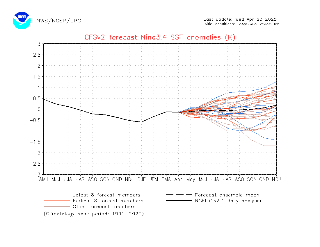
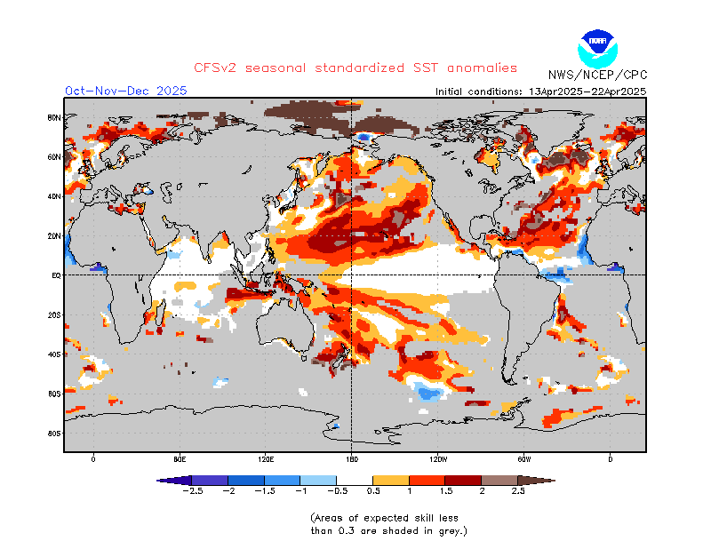
The first graphic below shows the most recent runs of the tool used to predict which phase of ENSO (El Nino Southern Oscillation), El Nino or La Nina, is likely in the coming months. A word on how to read this graphic. Notice there are a number of different model runs shown on that graphic and color coded. It is important to remember when looking at the forecasts of these models that getting above the 0.5 line does not make an El Nino Event but essentially creates what is called El Nino Conditions. One has to average that level for five consecutive overlapping three-month periods for an El Nino to be declared. So we are looking ahead and seeing positive signs of an El Nino coming but are not nearly able to make a definitive forecast at his point in time especially in terms of the strength of the event. Notice the ensemble mean is now substantially below 1.0 especially for the early winter months (eyeballing it it seems like a SST of 0.8 which is barely an El Nino) meaning that even those committed to there being an El Nino this winter are predicting a very weak one. Also notice the movement of the forecast mean higher into this coming summer which conflicts with the the discussion recently released by NOAA.
This second graphic is the projected sea surface temperatures. It provides a more global view of many cycles not just ENSO. The current information strongly suggests that next winter will have some characteristics associated with El Nino conditions worldwide. Notice the red area off the coast of Ecuador. That is the signature of El Nino. The warm water returning from the Western Pacific to the Coast of Ecuador. Notice this has now been updated to be a May/June/July map i.e. well into Spring and Summer in the Northern Hemisphere. Of interest this graphic unlike the first graphic has been statistically adjusted by screens to improve the calibration of the data shown. It is consistent with the tail end of an El Nino and a transition to an El Nino Modoki for the following year as predicted by the Japanese meteorological authorities. Notice the projected continued warm water off the coast of Alaska a characteristic of a Modoki Type II and possibly a shift to a positive phase of the PDO. But keep in mind that this graphic is beyond the Spring Prediction Barrier so one has to keep that in mind as the models may well change as we move beyond Spring.
Along the Equator, by this point in time (May – June 2015) the most significant part of the warm anomaly is predicted to be in the Central Pacific not to the East or West. That means it will still record as an El Nino but behave more like an El Nino Modoki which has impacts similar to a La Nina. I may not be getting this correct, but my interpretation is that the impacts will be a bit like shifting convection patterns west and rotating things a bit clockwise.
Below is the current situation regarding ocean sea surface temperatures. Notice the higher latitude anomalously warm water to some extent in the northern Pacific and to a greater extent in the eastern Pacific. To me this PDO+ pattern is a lot more significant than the minor anomalies along the Equator.
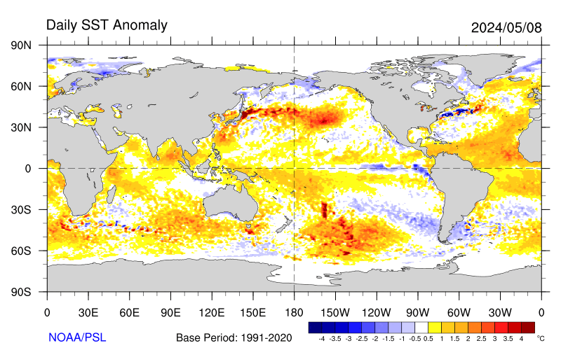
To put this into animation click here. It goes fast and shows SST from two weeks ago up until I guess today or yesterday.
Here is another useful tool. It provides a visual representation of the Tropical Pacific both surface temperature and winds absolute and anomalies. One can see what is called the “Cold Tongue” that extends into the Tropical Equator off of Ecuador. This needs to be warmed up for there to be an El Nino.

This graphic is currently showing the favorable conditions of reduced Easterlies (see the arrows in the anomalies graphic pointing to the east) and the warm water anomaly off the coast of Peru which is supporting the development of a possible El Nino. You can find a larger version here.
The following map may be helpful in understanding how ENSO works.

The Japanese view of ENSO.

The forecast does not update frequently.
Australia has their own model which updates more frequently; usually just once early in the month. Looks like it was recently updated.

Notice the criteria for achieving El Nino or La Nina status are different than that used by most others. And curiously, the view from Australia with respect to the development of an El Nino this year has until now been pretty much more subdued than the view from the U.S. This latest run reverses the Mid-November view which called for a borderline El Nino while this now is instead projecting a gradual return to ENSO neutral but that is not fully represented in the discussion.
“Issued on 2 December 2014
Many climate indicators remain close to El Niño thresholds, with climate model outlooks suggesting further intensification of conditions remains likely. The Bureau’s ENSO Tracker status is currently at ALERT, indicating at least a 70% chance that El Niño will be declared in the coming months. Whether or not an El Niño fully develops, a number of El Niño-like impacts have already emerged.
Several ENSO indicators are currently close to, or exceed, El Niño thresholds. These include tropical Pacific Ocean temperatures, which have now exceeded El Niño levels for a month, and the Southern Oscillation Index, which has remained at or near El Niño levels for three months. Other indicators, such as tropical cloud, trade winds and rainfall patterns, have either remained near average or only temporarily approached thresholds. This indicates a typical El Niño ocean-atmosphere interaction may not be fully locked in.
The majority of international climate models surveyed by the Bureau suggest further warming of the tropical Pacific Ocean is likely, so it also remains possible that the ocean and atmosphere will fully couple in the coming weeks to months. If an El Niño is established, models suggest it will be weak, or moderate at most. Regardless of whether an El Niño is declared, El Niño-like effects are likely, as shown by the Bureau’s December-February Climate Outlook, which shows a drier and warmer summer is likely for many parts of Australia. Some El Niño-like impacts have already been seen this spring in Australia and several regions around the globe, including Asia, South America and southern Africa.”
C. U.S. Longer-Term Outlooks.
The other maps in the Seasonal Outlook were also updated on November 20 which is the third Thursday of the month. The next update is scheduled for December 18, 2014.
PROGNOSTIC DISCUSSION OF OUTLOOKS – DJF 2014 TO DJF 2015
THE TEMPERATURE AND PRECIPITATION OUTLOOKS FROM DJF 2014-15 THROUGH MAM 2015 ARE INFLUENCED BY THE POTENTIAL IMPACTS OF A WEAK EL NINO. THE LIKELY MARGINAL STRENGTH OF EL NINO RESULTS IN ONLY SLIGHTLY ENHANCED CHANCES OF CLIMATIC ANOMALIES IN THE REGIONS USUALLY INFLUENCED BY ENSO, AND IS WELL SHORT OF THE CONFIDENCE ASSOCIATED WITH A STRONGER EVENT. LARGE-SCALE INDICATORS, SUCH AS THE POSITIVE PDO Editor’s Note: Probably more significant than what is going on along the Equator. AND NEGATIVE SOI CURRENTLY ARE CONSISTENT WITH EL NINO CONDITIONS AND MAY INDICATE THE EVENTUAL ESTABLISHMENT OF THE USUAL TELECONNECTION PATTERNS ASSOCIATED WITH EL NINO IN SPITE OF THE CURRENTLY DISORGANIZED EQUATORIAL ATMOSPHERIC STATE.
FOR OUTLOOKS FROM AMJ THROUGH DJF 2015-16, DECADAL TRENDS DUE TO CHANGES IN THE CLIMATE BASE STATE AND THE CON (HEAVILY INFLUENCED BY TRENDS) ARE THE PRIMARY SOURCE OF TEMPERATURE AND PRECIPITATION SIGNALS.”
1. Temperature outlook:
From the NOAA discussion:
“THE PATTERN OF FORECAST TEMPERATURE PROBABILITIES FAVORED IN DJF EXTENDS TO THE LATE WINTER MONTHS AND THEN GRADUALLY DIMINISHES INTO SPRING, 2015. BEFORE LARGELY VANISHING BY AMJ 2015. PREDICTED ANOMALIES FOR MJJ AND BEYOND ARE LARGELY DETERMINED BY RECENT TRENDS, ALTHOUGH SOME REVISIONS WERE MADE TO THE FORECAST IN THE WESTERN CONUS. THE REGION OF ENHANCED CHANCES FOR ABOVE-NORMAL TEMPERATURES WAS EXPANDED IN THE LATE SPRING TO REFLECT NORTH PACIFIC SSTS PREDICTED BY THE MOST DYNAMIC MODELS AS WELL AS THE CA–SST WHICH FAVOR WARM CONDITIONS. THE PREDICTED SSTS PROJECTS ON TO THE POSITIVE PDO INDEX, AND CORRELATES WEAKLY WITH ABOVE-NORMAL TEMPERATURES IN THE WESTERN CONUS, SO THE REGION OF ENHANCED CHANCES OF ABOVE-NORMAL TEMPERATURES WAS EXPANDED IN PARTS OF THE WEST RELATIVE TO PREVIOUS OUTLOOKS IN AMJ AND MJJ 2015. SIGNALS FROM TRENDS PREDOMINATE DURING THE SUMMER MONTHS, RESULTING IN ELEVATED CHANCES FOR ABOVE-NORMAL TEMPERATURES FOR MUCH OF ALASKA, AND AS WELL AS MUCH OF THE CONUS EXCEPT FOR INTERIOR PORTIONS.
TREND-RELATED SIGNALS GRADUALLY DIMINISH INTO THE FALL AND WINTER SEASONS, UNTIL BY DJF 2015-16 ELEVATED CHANCES FOR ABOVE-NORMAL TEMPERATURES ARE RESTRICTED ONLY TO REGIONS IN THE SOUTHWEST, SOUTHERN ROCKIES, AND TEXAS AS WELL AS NEAR NEW ENGLAND, AND IN NORTHERN ALASKA. SUBSTANTIALLY ENHANCED PROBABILITIES OF ABOVE-NORMAL TEMPERATURES ARE FORECAST FOR NORTHERN ALASKA FROM ASO 2015 THROUGH OND 2015 DUE TO THE LIKELY ANOMALOUS DELAY IN ARCTIC OCEAN AND BERING SEA SEA-ICE COVER FOR OCTOBER AND NOVEMBER IN THE LAST DECADE RELATIVE TO 1981-2010.”
2. Precipitation Outlook:
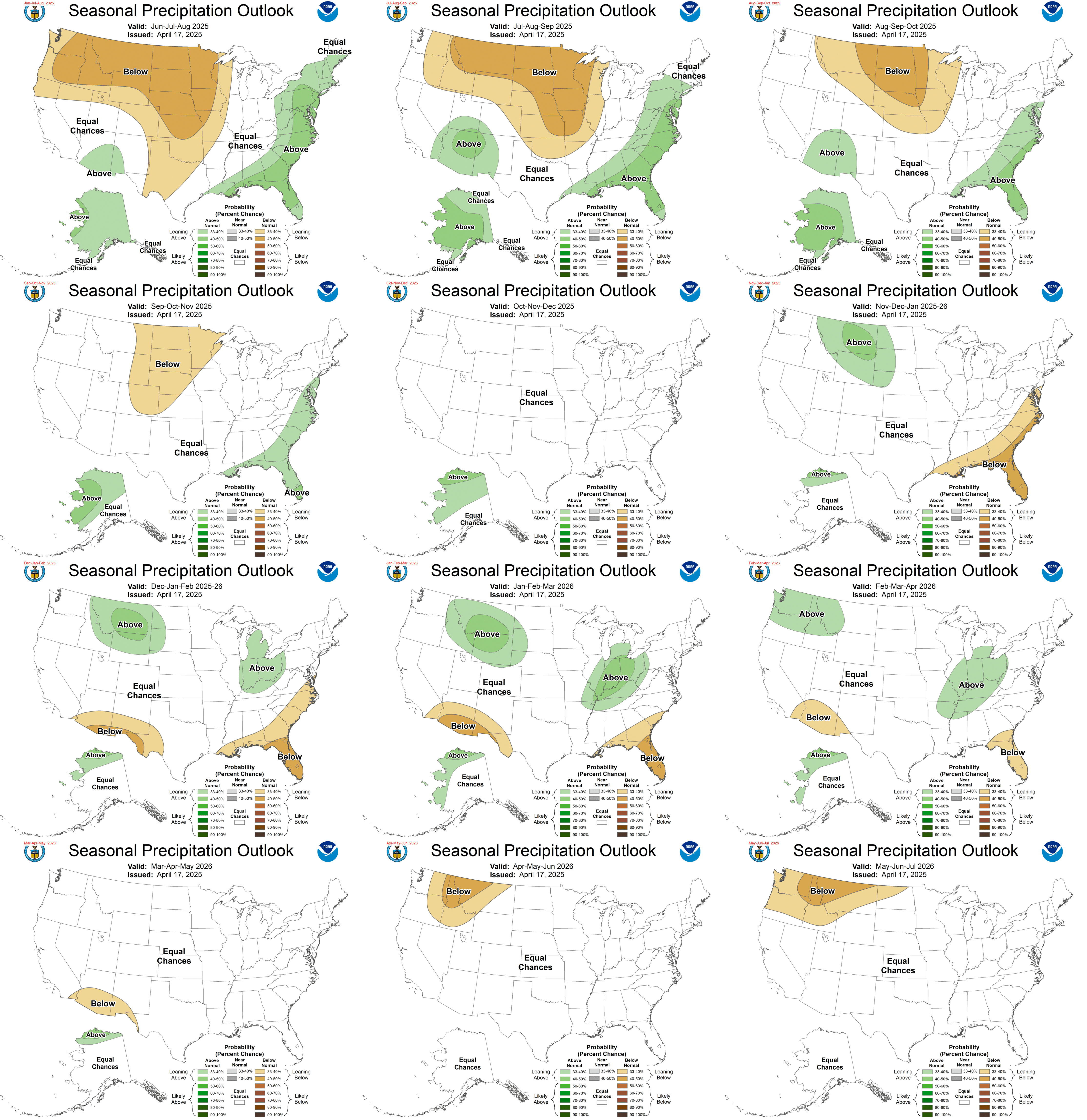
If you want larger versions of each map (temperature and precipitation) you can find them here. And each of those maps can be clicked on to further enlarge them.
From the most recent discussion released by NOAA:
“THE ELEVATED CHANCES FOR A WEAK EL NINO EVENT INFLUENCES THE PRECIPITATION OUTLOOK MAPS THROUGH FMA 2015. DYNAMICAL MODEL FORECAST GUIDANCE FROM THE NMME AND IMME AND THEIR PARTICIPANT MODELS GENERALLY SUPPORT WARM EVENT COMPOSITES. PRECIPITATION FORECASTS FROM THE GLOBAL SST BASED CONSTRUCTED ANALOG TOOL WAS ALSO CONSIDERED.
THE CHANCES FOR ABOVE-MEDIAN PRECIPITATION AMOUNTS ARE ELEVATED FOR CENTRAL CALIFORNIA, ACROSS THE SOUTHWEST, PARTS OF THE SOUTHERN GREAT BASIN, THE SOUTHERN PLAINS AND THE SOUTHEAST CONUS FROM DJF 2014-15 THROUGH FMA 2015. THE NMME SUGGESTS WETTER CONDITIONS FOR CENTRAL CALIFORNIA ON THE MOST RECENT RUNS THAN RUNS FOR THE SAME SEASON ISSUED LAST MONTH. THE PRECIPITATION FORECAST FOR CENTRAL CALIFORNIA WAS REVISED TO REFLECT THIS INFORMATION. EL NINO COMPOSITES ALSO WEAKLY SUPPORT AN INCREASE IN THE ODDS FOR ABOVE AVERAGE PRECIPITATION NORTHWARD ALONG THE EASTERN SEABOARD TO SOUTHERN NEW ENGLAND WITH LIMITED SUPPORT FROM THE NMME AND IMME MODEL GUIDANCE.
ENHANCED PROBABILITIES FOR BELOW-MEDIAN PRECIPITATION ARE INDICATED FOR THE PACIFIC NORTHWEST THROUGH MAM 2015, AND FROM THE CENTRAL MISSISSIPPI VALLEY INTO THE GREAT LAKES REGION FROM DJF 2014-15 THROUGH MAM 2015. THE AREA AND CONFIDENCE IN THE FORECAST FAVORING BELOW-MEDIAN PRECIPITATION IS REDUCED SOMEWHAT IN RELATION TO THE OUTLOOKS ISSUED A MONTH AGO IN THE PACIFIC NORTHWEST DUE TO WEAK SUPPORT FROM THIS MONTHS NMME AND IMME. PROBABILITIES OF ABOVE-MEDIAN PRECIPITATION ARE ENHANCED FOR PARTS OF SOUTHERN ALASKA THROUGH FMA 2015, ALTHOUGH THIS AREA IS SOMEWHAT SMALLER THAN IN PREVIOUS OUTLOOKS FOR THE SAME SEASON DUE TO THE LACK OF SUPPORT FROM RECENT MODEL RUNS. SOME RECENT EXAMINATION OF PRECIPITATION IN PAST INSTANCES OF WEAK EL NINO CONDITIONS SUPPORT ENHANCED CHANCES OF BELOW-MEDIAN PRECIPITATION AMOUNTS IN PARTS OF CENTRAL ALASKA IN DJF AND JFM.
RECENT DYNAMIC FORECASTS FROM THE NMME SUGGEST ABOVE-MEDIAN PRECIPITATION FOR THE SOUTHERN ROCKY MOUNTAINS AND PARTS OF THE SOUTHERN GREAT PLAINS IN THE LATE SPRING, CONTRADICTING THE FORECAST ISSUED LAST MONTH, WHICH WERE PRIMARILY BASED ON TREND AND BEYOND THE LAST LEAD OF THE DYNAMIC MODELS INITIALIZED LAST MONTH. IN VIEW OF THIS NEW INFORMATION, THE FORECAST FOR AMJ AND MJJ 2015 WAS REVISED TO EQUAL CHANCES FOR PRECIPITATION TERCILES FOR THE SOUTHERN HIGH PLAINS. DECADAL TRENDS POINT TO ELEVATED CHANCES FOR BELOW-MEDIAN PRECIPITATION IN THE PACIFIC NORTHWEST DURING THE JAS AND ASO 2015 SEASONS. TRENDS IN PARTS OF THE SOUTHEAST CONUS INDICATE ELEVATED CHANCES FOR BELOW-MEDIAN PRECIPITATION AMOUNTS IN DJF 2015-16.”
D. Information on Climate Cycles which the IPCC refers to as Internal Variability
D1. Low Frequency (long) Ocean Cycles
Atlantic Multidecadal Oscillation (AMO) Index can be found here.
It is useful to understand the Atlantic Meridional Overturning Circulation (AMOC) which if you ignore the wind component is called the Thermohaline Circulation since changes in salinity as the water moves north plays a big role. You can read about that here.
Pacific Decadal Index (PDO) can be found here. The original research paper describing the PDO (even before it was named) can be found here. This is an index that covers both the north and south Pacific and is called the Interdecadal Pacific Oscillation Index.
At this point it might be useful to discuss the PDO. The below shows the different pattern of where the surface water is warm and where it is cool in the Pacific during two most discussed phase of the PDO. The graphic on the left is PDO+ and notice how well it conforms to where the models say we will be in the second quarter of 2015. Actually that is about where we are today. It is very different from conditions since mid 1998.
| PDO Positive | ————————————————- | PDO Negative |

The seminal work on the impact of the PDO and AMO on U.S. climate can be found here. And here is a later version but I do not have a link that shows it in color but I believe the maps have not changed from the earlier version.
The key maps are shown below:
–
Drought frequency (in percent of years) for positive and negative regimes of the PDO and AMO. (A) Positive PDO, negative AMO. (B) Negative PDO, negative AMO. (C) Positive PDO, positive AMO. (D) Negative PDO, positive AMO.
As of the time that I have last updated this document, September 29, 2014, the PDO Index has become positive but slowly declining back towards normal and the AMO Index flirted with going negative but is currently again positive i.e. the situation is currently PDO + (warm)/ AMO + (warm) or consistent with the C regime in the above McCabe et al graphic. Clearly this is a situation that requires close monitoring. The current values of the PDO and AMO may not be nearly as significant as values that generally remain the same sign for a lengthy period of time.
How Might we Predict the Future State of the PDO and AMO and other Ocean Cycles?
A new paper is out. Unfortunately I can only access the abstract. Some with subscriptions may find the full paper here.
Klöwer et al. (2014) Atlantic meridional overturning circulation and the prediction of North Atlantic sea surface temperature.
Highlights:
• North Atlantic sea surface temperature exhibits high decadal predictability potential.
• Model bias hinders exploiting the decadal predictability potential.
• An innovative method was developed to overcome some of the bias problem.
• North Atlantic sea surface temperature will stay anomalously warm until about 2030.
Abstract:
The Atlantic Meridional Overturning Circulation (AMOC), a major current system in the Atlantic Ocean, is thought to be an important driver of climate variability, both regionally and globally and on a large range of time scales from decadal to centennial and even longer. Measurements to monitor the AMOC strength have only started in 2004, which is too short to investigate its link to long-term climate variability. Here the surface heat flux-driven part of the AMOC during 1900–2010 is reconstructed from the history of the North Atlantic Oscillation, the most energetic mode of internal atmospheric variability in the Atlantic sector. The decadal variations of the AMOC obtained in that way are shown to precede the observed decadal variations in basin-wide North Atlantic sea surface temperature (SST), known as the Atlantic Multidecadal Oscillation (AMO) which strongly impacts societally important quantities such as Atlantic hurricane activity and Sahel rainfall. The future evolution of the AMO is forecast using the AMOC reconstructed up to 2010. The present warm phase of the AMO is predicted to continue until the end of the next decade, but with a negative tendency.
The conclusions of this paper are more or less in line with the recent IPCC AR5 WG1 Report which failed to detect appreciable slowing of the North Atlantic Meridional Overturning Circulation (NAMOC). Most believe that this means that we have not yet seen the lengthening of the AMO. At this point it is useful to mention that most refer to these ocean cycles as oscillations as they are not as regular as the shape of a true cycle but the choice of terminology is a matter of style as the “business cycle” is also not very regular but we use the term cycle to describe it. I believe that if we become more comfortable that the AMO and PDO are regular occurrences they will increasingly be referred to as cycles.
And then there is this paper.
On the observed relationship between the Pacific Decadal Oscillation and the Atlantic Multi-decadal Oscillation Department of Atmospheric and Oceanic Sciences, University of Wisconsin-Madison, Madison, USA; Laboratory of Climate, Ocean-Atmosphere Studies, Department of Atmospheric and Oceanic Science, Peking University, Beijing, China
Journal of Oceanography (Impact Factor: 1.46). 01/2011; 67(1):27-35. DOI: 10.1007/s10872-011-0003-xABSTRACT We studied the relationship between the dominant patterns of sea surface temperature (SST) variability in the North Pacific
and the North Atlantic. The patterns are known as the Pacific Decadal Oscillation (PDO) and the Atlantic Multi-decadal Oscillation (AMO). In the analysis we used two different observational data sets for SST. Due to the high degree of serial correlation in the PDO and AMO time series, various tests were carried out to assess the significance of the correlations. The results demonstrated that the correlations are significant when the PDO leads the AMO by 1 year and when the AMO leads the PDO by 11–12years. The possible physical processes involved are discussed, along with their potential implication for decadal prediction.”
Another cycle of interest is the East Asian Surface Air Temperature (EATS). This paper is of interest.
And here is a similar paper published in 2007.
A third paper brings the East Asian Surface Air Temperatures (EATS) into the equation. It is not just about the U.S. This paper can be found here.
From the Abstract:
“The authors analyzed the lead-lag connection of the Atlantic Multidecadal Oscillation (AMO) with East Asian surface air temperatures (EATs) using instrumental records, and compared the results with the Pacific Decadal Oscillation (PDO). The maximum correlation was found when EATs led the AMO by five to seven years (with a correlation coefficient of 0.72, whereas the correlation coefficient was −0.91 when the AMO led EATs by 24–28 years). This is different from the PDO, which mostly correlated with EATs when the PDO led EATs by 13–15 years (with a correlation coefficient of 0.67, whereas the correlation coefficient was −0.76 when EATs led the PDO by 24–26 years). The PDO led the AMO by 19–21 years (with a correlation coefficient of 0.71, whereas the correlation coefficient was −0.84 when the AMO led the PDO by 16–18 years). These results support a previous understanding that EATs positively correlate with the AMO, and imply that the observed East Asian warming trend may have been slowing down since the early 2010s.”
Also of interest.

The top of this Figure 1 show the three ocean cycles. It may not be easy to find another such graphic. The bottom shows the results of the correlation of the various lags. I added to the Legend at the top (the bold type) to make it clearer and hopefully I did this correctly. I will provide what I did to the Author and if I got it wrong I assume I will be so informed. This is easier to undertand by looking at the following table.

I said it would be easier. I did not say it would be easy. But you can see that these are pretty hefty correlation coefficients. So one has a fighting chance at figuring out what the climate is going to be like over the next 100 years by region. The major problem is the limited amount of data that was available to do this correlation analysis and you can see that from Figure 1 above. It is the reason that the leads and lags computed in this paper for the AMO and PDO different slightly from those computed in the papers I presented two weeks ago. It is also quite possibly the reason that the IPCC has not yet included these low frequency ocean cycles in their climate models. There really is not enough data to do so. Thus the IPCC climate models are essentially useless for predicting climate for periods of time less than 100 years and yet many do so and then are surprised when the projected and observed levels of temperature and precipitation diverge. If you do not include ocean cycles in a forecasting model it will not incorporated “internal variability”.
Now I attempt to put the information from the three papers together and this is what I came up with. This table relates the AMO to the PDO. So “Lead” means the AMO reaches a peak or minimum and begins to trend in the other direction in advance of the PDO beginning to change its direction (if it is positive begin to become less positive and then become negative or vice versa).”Lag” means the AMO chances direction later than the PDO which could be expressed as the PDO leads the AMO. So yes this is a difficult concept to grasp when looking at a table of numbers. For me it is more understandable when I look at a graph of the time series of the amplitudes of the surface temperature anomalies of the AMO and PDO.
| AMO relationship to the PDO re Leads and Lags | Lead | Lag | Sum of Absolute Values of the Lead and Lag | Twice the number in the prior column |
| Orgeville and Peltier | -13 | +17 | 30 | 60 |
| Wu, Liu, Zhang and Delworth* | 12 to 14 | 12 to 13 | 26 | 52 |
| Li and Luo | -(16 to 18) | 19 to 21 | 37 | 74 |
* This paper decomposes the PDO into a high Frequency 20 year cycle and a low frequency presumably 60 year cycle. The above data is for the Low-Frequency Cycle and in this paper the authors also report a high correlation for the PDO lagging the AMO by 1 – 3 years. Although I show a positive correlation for this paper in the above table in regards to the AMO leading the PDO it may well be that I have not read the paper carefully enough and that the correct sign of that correlation is also negative. So I would not conclude that this paper is inconsistent with the other two.
In all cases where both low frequency and high frequency cycles were studied and reported on, I have tabulated the results with respect to the low- frequency long component of the cycle. Note that similar decompositions into sub-cycles within the most familiar duration of these cycles are done by most researchers and not just for the PDO but many believe the PDO has both a high frequency approximately 20 year cycle (possibly ENSO related) and a low frequency approximately 60 year cycle. This is possibly the reason the correlation coefficients are not totally impressive.
To better understand “leads” and “lags” I now present another graphic from the Li et al paper.

Here the authors plotted the AMO versus the PDO which was shifted back by 17 years. Notice when you do this the AMO and PDO are always in a different phase. On the other hand if you had moved the PDO ahead by 20 years they would be in the same phase. Thus the sign of the correlation coefficient may be a function of how the relationship is described e.g. if A leads B by N years, B lags A by the same N years. So the choice of terminology may be somewhat arbitrary.
Much more important if the two cycles are 74 years in duration (as seems to be indicated by the calculations performed by the Li and Luo paper), or if you prefer, 17 years is not very different than 20 years, it would appear that the four conditions:
- AMO+/PDO+
- AMO+/PDO-
- AMO-/PDO+
- AMO-/PDO-
occur approximately an equal percentage of the time i.e. 25% for each combination. This is a very important conclusion, if correct, and I believe it is supported by all three papers. This makes the McCabe et al (and I do not want to not mention Julio Betancourt who was instrumental in that work) analyis of drought probability shown above that much more valuable.
East Asian Surface Temperature Oscillation (EATs)
Now that I have introduced the topic of the East Asian Surface Temperature Cycle, this paper is of interest.
D2. Medium Frequency Ocean Cycles
El Nino Indices and More Information on the ENSO Cycle.
The Oceanic Niño Index (ONI) Index can be found here.
The Mutivariate ENSO Index (MEI) can be found here. Some believe it is a better Index in that it covers more variables than the ONI Index.
Information on Modoki El Nino a variant of El Nino can be found here. An even more technical analysis can be found here.
The tradition Southern Oscillation Index or SOI Index which basically describes the pattern of convection along the Equator in the Pacific can be found here.
The formula for calculating the SOI is:
                 [ Pdiff - Pdiffav ]
        SOI = 10 -------------------
                     SD(Pdiff)
Where:
Pdiff = (average Tahiti MSLP for the month) – (average Darwin MSLP for the month),
Pdiffav = long term average of Pdiff for the month in question, and
SD(Pdiff) = long term standard deviation of Pdiff for the month in question.
But actually the traditional SOI Index maintained by the Australia Bureau of Meteorology is off the Equator a bit. A different index NOAA Equatorial Southern Oscillation Index maintained by NOAA is right on the Equator and it can be found here.
El Nino Modoki
Not all El Nino’s are alike and in recent years the distinction between traditional or canonical (true to form) El Ninos and Central Pacific El Nino’s often called El Nino Modoki has become increasingly clear. In Japan they are forecasting an El Nino this winter followed by an El Nino Modoki the subsequent winter. This becomes important because the impacts of each type of El Nino on weather worldwide is very different.
This is illustrated in the following maps:
Starting with surface temperature:
| Traditional El Nino | El Nino Modoki |

And now considering precipitation
| Traditional El Nino | El Nino Modoki |

You can find these graphics and more information here.
And below is a breakdown of precipitation anomalies from climatology by important parts of the world very impacted by the Modoki form of El Nino. You can find more information on this here.

So there is a big difference in the differential impact on weather yet BOTH WILL REGISTER AS AN EL NINO ON THE ONI INDEX.
Some think a Modoki is some sort of strange thing. To me it looks like a Modoki is simply an El Nino that did not fully make it to Ecuador or after reaching Ecuador has taken its sweet time getting all the way back to the Western Pacific Warm Pool. From a weather perspective, with a Modoki you end up with two Walker Cells. So you have a lot of precipitation in the Central Pacific. Notice how the impact on Japan and the Western U.S. varies between a Canonical El Nino and an El Nino Modoki.
Most believe the El Ninos of 2002/2003 and 2004/2005 were actually of the Modoki variety and you can see that in the winter precipitation data for New Mexico and Rio Grande Stream Flow. The below may be a Bob Tisdale compilation but it is based on the Ashok formula which is generally recognized as the way of identifying a Modoki.
The Ashok formula is EMI = [SSTA]A-0.5x[SSTA]B–0.5x[SSTA]C where the A anomaly is calculated in the region 165E -140W,10S-10N, B is 110W-70W, 15S-5N, and C is 125E-145E,10S-20N.

The 2009/2010 El Nino was also a Modoki, So you see what you read in the news may not be very useful. I do not believe that many TV and Radio station weather people (many of whom are not even meteorologists but simply actors) understand the difference between these two types of El Nino’s. It is fairly recent knowledge.
To make things even more complicated, some believe there are two kinds of El Nino Modoki’s and this is described here. Among other things, the referenced article provides the details on how the following breakdown was developed. Based on these authors, we have since 1950 had sixteen El Ninos broken down as follows:
| Traditional or Canonical El Nino | Modoki Type I | Modoki Type II |
| 1951/1952 | 1963/1964 | 1968/1969 |
| 1965/1966 | 1987/1988 | 1979/1980 |
| 1972/1973 | 1990/1991 | 1991/1992 |
| 1976/1977 | 2002/2003 | 1992/1993 |
| 1982/1983 | 2004/2005 | |
| 1997/1998 | 2009/2010 | |
Although both the researchers work for NOAA and were based in Miami Florida when they did this research, they seem to have used the Chinese System of identifying an El Nino i.e. focusing on Nino 3.0 rather than Nino 3.4. Nino 3.0 is the eastern part of Nino 3.4. This may explain the slight difference between their characterizations and that of Bob Tisdale and NOAA in that these Chinese authors do not seem to recognize 2006/2007 as any kind of El Nino. It barely met the ONI criteria of five consecutive overlapping three month periods with the ONI being 0.5 or higher and in the first period it was exactly 0.5 so it may very well have not recorded as an El Nino when Nino 3.0 was used as the criteria rather than Nino 3.4 which is a bit further west.
That does not seem to be a good explanation to me but this was “barely” an El Nino and any slight change in criteria could rule it out. Tisdale categorized it as a canonical El Nino and when I look at the precipitation situation in New Mexico and the values of the PDO Index it seems to me that this was more of a relief between two La Nina events, one of which was quite strong, rather than an El Nino so I think the characterization in the above table is probably more on target than the NOAA characterization although it is a borderline case.
But the general conclusion is that since the PDO turned negative in 1998 we may not have had a traditional or what is called technically a canonical El Nino. I have not yet matched the above categorization of Modoki I and II to precipitation patterns in the U.S. The referenced authors focused on the Western Pacific mainly China.
It tells me that we have to be very careful about how we relate to something called an El Nino since there are at least three varieties and each has a different impact on Global Weather.
Let us talk a bit more about the work of Chunzai Wang and Xin Wang. From the abstract of their article.
“Abstract
Based on the opposite influence on rainfall in southern China during boreal fall, this paper classifies El Niño Modoki into two groups: El Niño Modoki I and II which show different origins and patterns of SST anomalies. The warm SST anomalies originate in the equatorial central Pacific and subtropical northeastern Pacific for El Niño Modoki I and II, respectively. Thus, El Niño Modoki I shows a symmetric SST anomaly distribution about the equator with the maximum warming in the equatorial central Pacific, whereas El Niño Modoki II displays an asymmetric distribution with the warm SST anomalies extending from the northeastern Pacific to equatorial central Pacific. Additionally, the warm SST anomalies in the equatorial central Pacific extend further westward for El Niño Modoki II than El Niño Modoki I. Similar to canonical El Niño, El Niño Modoki I is associated with an anomalous anticyclone in the Philippine Sea which induces southwesterly wind anomalies along the south coast of China and carries the moisture for increasing rainfall in southern China. For El Niño Modoki II, an anomalous cyclone resides east of the Philippines, associated withnortherly wind anomalies and a decrease in rainfall in southern China. Canonical El Niño and El Niño Modoki I are associated with a westward extension of the western North Pacific subtropical high (WNPSH), whereas El Niño Modoki II shifts the WNPSH eastward. Differing from canonical El Niño and El Niño Modoki I, El Niño Modoki II corresponds to northwesterly anomalies of the typhoon steering flow which are unfavorable for typhoons to make landfall in China.”

A very good reference to the literature on ENSO can be found here. It is an amazing document and the discussion on Global Warming is very interesting. There is no consensus on how Global Warming has or will impact ENSO although many think it does, But they disagree on how!
All of this is very important for many reasons which technically boil down to how the overall behavior of the Pacific and Tropical Pacific are interrelated. Currently we decompose the Pacific into the Pacific north of the Equator which we describe by one index called the PDO and the Tropical Pacific which we describe by one index called the ONI. But from what I read (and I have in this article provided the links) it probably is less than fully productive to look at things the way we have been looking at things and I anticipate that more people will be looking at things differently.
El Nino Impacts
North Carolina has a very good State Climatologist so that is a good place to seek information on the impact of a possible El Nino. The following charts were all prepared by NOAA but I found them here so I am using them from the North Carolina Climatologist’s web site.
This chart is interesting:

Notice all the red off the coast of Ecuador and Peru. The current forecast map looks a lot like this but not quite the amount of warm water off of Ecuador and Peru. So that is the difference between what is currently projected and a truly powerful El Nino.
This chart shows the impacts for December through February.

And here is the information for June through August. As you can see, El Nino (as is La Nina) is a worldwide event.

These charts do not show the impact on ocean fisheries which is another important part of the story. Wet or dry; warm or cold can have an impact related to the difference from the norm. Crops that like moisture usually thrive during wet periods but too much moisture can also be harmful and certain crops prefer it to be relatively dry. So one has to look at the impacts region by region. And of course there is the risk of flooding in some places.
Some have raised issues about the coffee crop and in the U.S. the Florida citrus harvest is often impacted by El Nino. Every area highlighted on this map is likely to be impacted either negatively or positively by an El Nino event if it occurs.
Here is another set of graphics from British Met which can be found here. It shows impacts for both El Nino and La Nina and is broken down by precipitation and by temperature. There are many ways to do this analysis and show the results.


It is very difficult for researchers to isolate internal variability (ENSO, decadal and multi-decadal ocean cycles) from the secular trend in climate due to anthropogenic forcings. That is one reason why much can be learned from observing the current impacts of El Nino, La Nina and the longer ocean cycles. To some extent, climate change resembles a continual and strengthening El Nino but there is a limit to the usefulness of that analogy since El Nino does not impact the globe in exactly the same way as anthropogenic climate change. But there are a lot of similarities.
Also every instance of a phase of a climate cycle is unique. So the above represents the typical impacts.
Focusing on the U.S.
How is El Nino likely to impact the U.S.? This first map shows the impact on temperature as compared to ENSO Neutral Conditions.

It would be colder in the south and warmer in the north but it is not a big difference. But is it enough to put the Florida citrus crop in danger? How might natural gas prices be impacted?
This map shows the impact on precipitation.

It is wetter in the West and drier in the Southeast.
And again these are not big differences but when you compare the El Nino data not to the mean but to La Nina conditions, it starts to be more significant.
California Niño/Niña. It seems that Baja California has its own cycle of changes in the upwelling of cold water and that this may be somewhat independent of the ENSO process but be instead specific to Baja California and Southern California. More information on this can be found here.

The map to the left shows the geographic area we are talking about and the chart on the right shows: (a) Lead-lag correlation coefficients between the July-September California Niño/Niña indices and the 3-month-running mean California Niño/Niña (CA, grey filled bar), along-shore surface wind (ASW, dark open bar) and upwelling (UWI, blue line) indices from 1982-2011. The ASW is positive equatorward, and UWI positive upward.
This is a difficult graphic to interpret but basically it is showing that July to September conditions in the summer impacts wind and upwelling into the following winter and this may not be connected to the ENSO Cycle but is a separate (intrinsic) phenomenon.
A couple of thoughts about this research:
A. It is interesting how the Japanese found this pattern rather than some professor at a California University. Does this tell us anything about the lack of focus by the U.S. on U.S. climate other than projects funded under the rubric of Climate Change?
B. There more than likely are other similar micro climates like this. Micro is relative as this pattern may impact a fairly large area.
La Nina Impacts
This may be of less interest right now but a general description can be found here and the December through February impacts can be found here and the June through August impacts can be found here.
D3. Air Pressure and Wind Related Cycles.
Air Pressure Cycles.
Arctic Oscillation (AO) and North Atlantic Oscillation (NAO). Basically both the AO and the NAO relate to the differential between mid-latitude and high latitude atmospheric pressure. The NAO is a bit easier to define as there are two semi-permanent features: the Icelandic Low and the Azores High sometimes called the Bermuda High. But still there are at least three different ways of measuring the NAO. I am not sure how and exactly where the AO is measured, but in both the AO and NAO a positive index indicates the differential between the mid latitude highs and the Arctic air pressure are larger than usual and a negative index means the opposite. The following table is my interpretation of the impacts of the AO and NAO but one needs to understand that these are two atmospheric factors (and thus somewhat independent of sea surface temperatures SST but that is not totally clear) which interact with many other factors so please view the following table as potential tendencies rather than a hard and fast prediction tool and also a work in progress.
| Winter Impacts (Summer is different) | AO+ | AO- | NAO+ | NAO- |
| Mid-Latitude Jet Stream | Stronger | Weaker | Stronger | Weaker |
| Weather Variability | Lower | Higher | Lower | Higher |
| Alaska, Scotland, Scandinavia | Wet | Dry | Wet and Warm | Dry and Cold |
| Greenland and Newfoundland | Warmer | Colder | ||
| U.S. East Coast | Warmer | Cold spells in the Midwest | Cold spells as far south as Florida | |
| Western United States and the Mediterranean | Dry | Wet | Storms track further south | |
| Southern Europe and North Africa | Wet and Stormy |
Here is a NOAA graphic that I modified (made horizontal rather than vertical) to show the impact of the Arctic Oscillation. The North Atlantic Oscillation’s impact is similar but further east. It is not clear if these are two separate patterns or two parts of the same pattern as they are not perfectly correlated but they do represent somewhat the same situation.

Without having yet performed a careful analysis, it would appear that a negative AO or NAO or both present a negative factor for the economies of the nations impacted.
The current value of the NAO Index can be found here. The AO here.
Are the AO and NAO and ENSO Related?
Is El Nino and the AO or NAO correlated to any significant extent?
Beginning with this article. From the Abstract
“We have applied a multiresolution cross-spectral analysis technique to resolve the temporal relationship between the NAO and ENSO. The study shows significant coherence between NAO and Nino3 SST in about 70% of the warm ENSO events from 1900 to 1995, of which 33% and 37% are associated with a 5-to 6-year period (El) and a 2-to 4-year period (E2) oscillation terms in the spectral decomposition, respectively. The dominant teleconnection pattern associated with changes in the mean atmospheric circulation during the initial winter of a typical E1 and E2 events is the positive phase of the Pacific/North American (PNA) pattern. Non-coherence Between the NAO and ENSO occurs during relatively weak Nino3 SST anomaly, with a teleconnection pattern which shows a strong negative phase of the NAO and a pattern which resembles a weak eastward shifted negative phase of the PNA pattern.”
And from an article in the American Meteorological Society:
The dynamical mechanism for the late-winter teleconnection between El Niño–Southern Oscillation (ENSO) and the North Atlantic Oscillation (NAO) is examined using the output from a 2000-yr integration of a coupled general circulation model (GCM). The coupled model captures many salient features of the observed behavior of both ENSO and NAO, as well as their impact on the surface climate in late winter. Both the observational and model data indicate more occurrences of negative phase of NAO in late winter during El Niño events, and positive NAO in La Niña episodes.
The potential role of high-frequency transient eddies in the above teleconnection is diagnosed. During El Niño winters, the intensified transient disturbances along the equatorward-shifted North Pacific storm track extend their influences farther downstream. The eddy-induced negative height tendencies are found to be more coherent and stronger over North Atlantic than that over North Pacific. These negative height tendencies over the North Atlantic are coincident with the southern lobe of NAO, and thus favor more occurrences of negative NAO events.
During those El Niño winters with relatively strong SST warming in eastern equatorial Pacific, the eastward extension of eddy activity is reinforced by the enhanced near-surface baroclinicity over the subtropical eastern Pacific. This flow environment supports a stronger linkage between the Pacific and Atlantic storm tracks, and is more conducive to a negative NAO phase.
These model results are supported by a parallel analysis of various observational datasets. It is further demonstrated that these transient eddy effects can be reproduced in atmospheric GCM integrations subjected to ENSO-related SST forcing in the tropical Pacific.
So it would appear that there may be some correlation of an El Nino and negative NAO with the direction of causality being from the ENSO process to the occurence of a negative NAO. It does seem that the development of the El Nino and its intensity and location will impact the intensity and duration of a possible negative NAO but lagged from the initiation of an El Nino or La Nina.That may be important for the U.S. East Coast and Northern Europe
Monsoons
Monsoons are seasonal changes in the prevailing wind direction caused by the changing differential between land and ocean temperatures during various seasons and there are usually associated changes in the location and strength of High and Low Pressures Systems.
North American Monsoon (NAM)
The North American Monsoon affects Mexico and the the southern tier of the U.S. mostly Arizona and New Mexico but it can impact states to the north and to the Northeast of Arizona and New Mexico thus it has a significan impact in the summer over the entire Southwest and even the Plains States.
And in term of how El Nino and Pacific and other factors impact the North American Monsoon (NAM), this from a presentation on the Albuquerque NM Weather Service web site may be helpful.

Click here for a larger Image.
This article on the role of sea surface temperatures in the Gulf of California re the initiation of the NAM in Arizona may also be of interest. This article may be related.
And here is what we were looking for in June as a precursor to the development of the North American Monsoon. A nice big high pressure center in Northern Mexico heating up the land.

Similar patterns are characteristic of other monsoons around the world which are generally based on the land warming and thus impacting the direction of prevailing winds.
D4. Attempting to Extrapolate to the Impact of Ocean Cycles Worldwide – a First Attempt at Putting it all Together.
This table is a first attempt at putting it all together. It is just that: a first attempt. Anyone with additional information please provide it to me by sending it to the GEI Publishers.
| Geographical Area | PDO+ | PDO- | AMO+ | AMO- | Comments |
| Western US | Wet. High ratio of El Ninos to La Ninas | Dry. High ratio of La Ninas to El Ninos | Amplifies PDO – | Amplifies PDO + | The Arctic Oscillation (A) mediates the impact of the PDO on the Northern Tier and other parts of the U.S. |
| Eastern US | Dry | Wet | Cold Winter Dry and Warm Summer | Warm Winter Wet and Cold Summer | AMO + tends to correlate with North American Oscillation (NAO) which means a colder Europe and cold air intrusions into the Center of the U.S. and the North East. |
| Europe | NA | NA | Cold Winter Wet and Warm Summer | Warm Winter Dry and Cold Summer | |
| South America | West Coast impacted more Often by El Nino | East Coast impacted more often by La Nina | Moisture further North | Wet Summer | Note when the North Atlantic is Warm the South Atlantic is Cool and the Intertropical Convergence Zone (ITCZ) shifts to the south. |
| West Africa | NA | NA | Wet Summer | Dry Summer | Wet West African summers tend to increase hurricane activity in the U.S. |
| Australia | Dry | Wet | NA | NA | PDO Impacts the Indian Ocean Dipole IOD so that impacts both Australia and India but probably in the opposite way as India and Australia are in different hemispheres. |
| India | Dry | Wet | NA | NA | |
| Comments | Arctic Oscillation (AO) very important mediator of PDO impacts in the US especially the Northrn Tier. | North American Oscillation (NAO) very important mediator of AMO impacts especially for the Central and Norther Tier of the U.S. and Europe | |||
Attempting to put this into a two-dimensional matrix may not have been a good idea as there are not only impacts among the ocean cycles shown across the top of this matrix but also interactions with the air pressure cycles (which themselves may be related to Ocean Cycles.) So look at this matrix as just a first attempt at showing the interactions. I will be refining it. There may be conflicts not only in the literature but also due to the interaction of so many different forcings including climate change so again this is just a starting point to think about how these different cycles impact our climate. NA perhaps should have been NS as meaning not significant. All the cycles impact everything but some have more impact than others and that is what I am attempting to show.
E. Weather and Climate Around the World.
Focusing on India and Australia.
Both India and Australia are bordered by the Indian Ocean but Australia is bordered by both the Indian and Pacific Oceans. How does his impact their climate?

Indian Ocean Dipole (IOD)
The Australian Bureau of Meteorology has their own proprietary Model (POAMA) for forecasting the IOD.

To what extent are the ENSO and IOD related? That is discussed here.
And how does the IOD impact Australia? This is discussed here.
And there are variations of IOD. So if one wants to really delve into the subject you could read this article.

“The Indian Ocean Dipole (IOD) is a coupled ocean-atmosphere phenomenon in the Indian Ocean. It is normally characterized by anomalous cooling of SST in the south eastern equatorial Indian Ocean and anomalous warming of SST in the western equatorial Indian Ocean. Associated with these changes the normal convection situated over the eastern Indian Ocean warm pool shifts to the west and brings heavy rainfall over the east Africa and severe droughts/forest fires over the Indonesian region.”
Thus it is easy to remember how to interpret the IOD. “+” means warm to the west and “-” means warm to the east.
Focusing on China and Japan.
This discussion of how the impacts of El Nino and El Nino Modoki impact China and Japan can be found here.
F. Climate Change.
F1. Impact on Climate
What is happening to our Oceans?
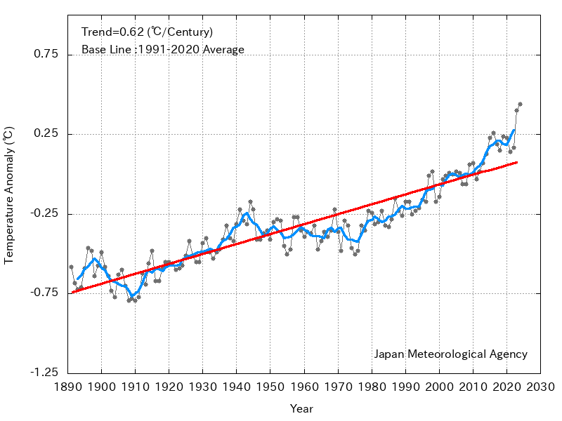
From Japan Met Global Environment and Marine Department Report
“The annual mean annual global average sea surface temperature in 2013 was +0.13°C above the 1981-2010 average, making it the 2nd highest since 1891. The long-term trend of the global average sea surface temperature for 1891-2013 was about 0.51°C per century. Although positive anomalies above the long-term trend have frequently been observed since the late 1990s, the global average sea surface temperature has generally remained at similar levels since the early 2000s.”
Here is another more short-term oriented chart.
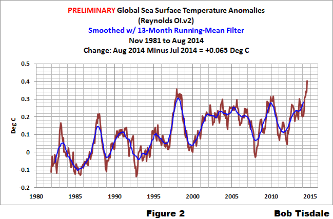
Notice the spike in August. This needs to be watched.
And this is a very interesting table (you can click on it to enlarge it) prepared by Bob Tisdale and you can find the full article here.
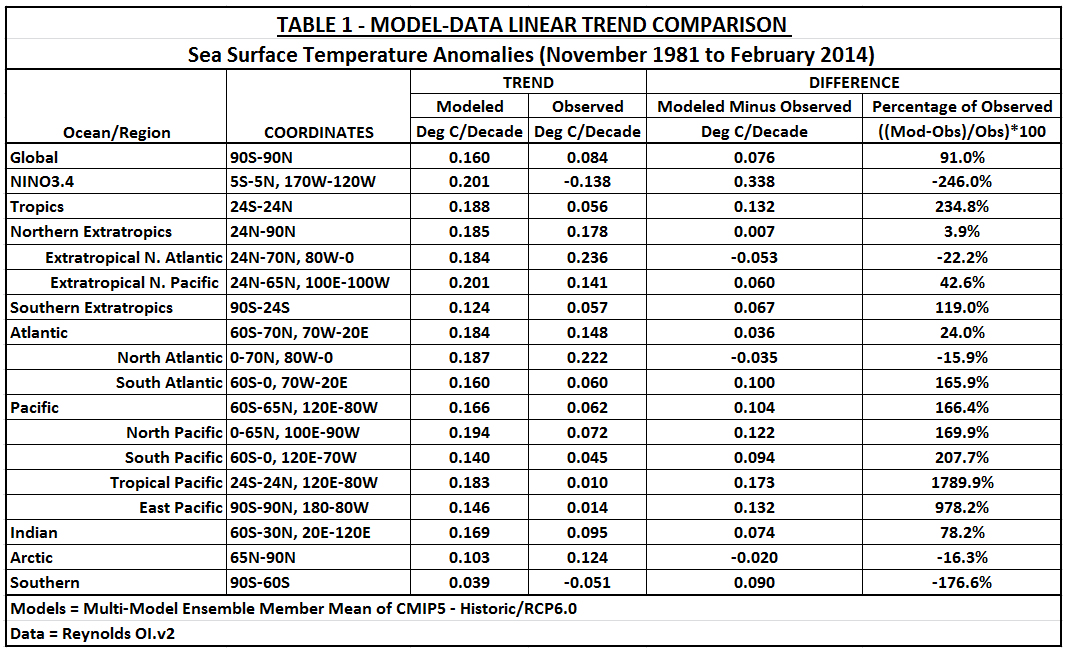
It shows the results of running the latest IPCC models from 1981 (using the RCP 6.0 scenario which in my mind is probably the most realistic of the four) and compares the model results with the observed values. This provides a lot of useful information. 1981 was an ENSO neutral year and PDO had recently turned positive and the AMO was solidly negative. The starting point is very significant when comparing observed values with the IPCC model results because the IPCC models have no ability to integrate low-frequency cycles like the AMO and questionable ability to integrate medium frequency cycles like ENSO.
So you see that:
A. Overall the models have been high by about 100% re sea surface temperatures. That is a large forecasting error.
B. Probably much of this has to do with the AMO which unlike many ocean cycles actually has a warm phase and a cold phase. This is different than the PDO which is really about the geospacial distribution of warm and cold water rather than the warming and cooling of the Pacific although the index every once in a while is adjusted to reflect the overall warming of the Pacific.
So you can see there is a lot of variability in the warming of the sea surface temperatures. There has been a lot of discussion about sub-surface temperatures but we have even less monitoring of that overall and weather is determined by the surface temperature. The subsurface temperature is a good guide to what future surface temperatures will be.
I found this graphic developed by Bob Tisdale quite interesing and his full article on this can be found here.
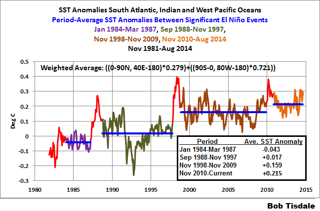
He and I strongly disagree on how to interpret the above. Bob Tisdale seems to be taking the position that ocean cycles not GHG are the cause of Global Warming. I disagree but do agree that ocean cycles influence the timing of both SST and atmospheric warming. The staircase phenomenon was discovered by British Met and I wrote about it at that time and my article can be found here.
F2. Observed Economic Impacts.
Impact of Climate Change on Food Security
This information comes from the latest IPCC Draft Report on the Impacts, Adaptation and Vulnerability resulting from Climate Change and can be found here. The Table below is difficult to read as it often contains two scenarios (an alternative in parentheses both in the Yield and Scenario Identification columns). Some data is based on models that do not reflect the increase in carbon dioxide level which generally stimulates plant growth and may also improve water utilization but the table is clear on which studies incorporate or do not incorporate the impact of carbon dioxide.
As you can see, there is a lot of variation in these estimates. So far I have not been able to sort out this data but according to the text in the full report, the correct answer is less wheat, much less corn and more rice. It seems that a key factor is the type of photosynthesis involved which would appear to change the C3/C4 ratio of plant types as carbon dioxide levels increase. But there are other factors. A good resource for understanding this can be found here or here. It is very complicated. But I am surprised that so far as I know there has not been a model created that integrates the climate forecasts of temperature, precipitation (including seasonal variations), and carbon dioxide levels to expected changes in the C3/C4 ratio for each geographical area. I think it is feasible to create such a model and then calibrate it with the historical record of what has grown where at different points in time with different values of the key parameters. This would provide estimates of crop yields and water requirements.
I hope that no one concludes that I am being critical of the IPCC WGII effort as I am not. Their work is based on a large number of studies and they have done a reasonable job of abstracting from those studies and reporting on them in their report. The problem appears to be that the variation in study results so far has made it impossible to create a global picture of impacts. This is not the fault of the authors of the WGII Draft Report. It is the nature of the problem that crop yields are vary specific to location, crops and varieties/cultivars of the crop (farmers know what they are doing) and many other variables. So it is very difficult to develop a global model and yet that is what is needed. I have purposely avoided reading the WGII Summary for Policy Makers but I am curious if they have acknowledged that they have no idea about how Climate Change impacts food security other than adaptation will be necessary. Farmers have adapted to climate variations from time immemorial. It is what farmers do.
Looking just at the table below, on balance it would seem like a climate change is going to be a wash relative to food security and easily adapted to by advances in agricultural technology. We we also have the factor of population increases so climate change ends up being more about population increase than temperature increases when it comes to food security. Here is an interesting quote from the WG2 final accepted Draft Report 7.2.2
“Food production is an important aspect of food security (7.1), and the evidence that climate change has affected food production implies some effect on food security. Yet quantifying this effect is an extremely difficult task, requiring assumptions about the many non-climate factors that interact with climate to determine food security. There is thus limited direct evidence that unambiguously links climate change to impacts on food security.”
Box 7-1 Table: Projected Impacts for Crops and Livestock in Global Regions and Sub-Regions under Future Scenarios
Crop yield impacts in ( ) correspond to ( ) in the scenario column. – CO2, without CO2 effects; + CO2, with CO2 effects; I, irrigated; R, rain fed. In Europe: Atl., Atlantic; Cont., continental; Med., Mediterranean. pp, precipitation. N, north; E, east; W, west; S, south; C, central.
Regional Impacts on Crops
Region | Subregion | Yield Impacts (%) | Scenario | Reference |
| |
World |
| Maize: up to -4 (-12) Rice: -9.5(-12) Wheat -10 (-13) | CSIRO(MIROC) | Nelson et al, |
| |
|
|
| 2050 | 2010 |
| |
East Asia | China | Rice: -19 (+3.5); -32(+2.5);-40(+0.18) | +1ºC; +2ºC;+3ºC | Chapter 24 |
| |
|
| Maize: -22(-11) ;-28 (-18) ; -34(-26) | – CO2(+CO2) |
|
| |
| Eastern China | Rice: −10 to +3 (+7.5 to +17.5)/ −26.7 to +2 (0 to | 2030/2050/2080 | Tao et al |
| |
|
| +25)/ −39 to −6 (−10 to + 25) | – CO2 (+CO2) | 2013 |
| |
| China (3H | Wheat-maize: +4.5±14.8/ -5.8 ±25.8 | +2ºC / +5ºC, | Chapter 24 |
| |
| Plain) |
|
|
|
| |
| North China | IWheat : -0.9 (+23) RWheat : -1.9 (+28) | 2085-00 -CO2 | Yang et al |
| |
| Plain |
| (+CO2) | 2013 |
| |
| China | IRice : -14.8 (-3.3) RRice: -15.2 (-4.1) | 2021-2050 -CO2 | Chapter 24 |
| |
| YangtzeRiver |
| (+CO2) |
|
| |
South | South Asia | Maize: -16 ; Sorghum: -11 | 2050 | Knox et al, |
| |
Asia |
|
|
| 2012 |
| |
| South Asia | Net cereal production -4 to -10 | +2ºC | Lal (2010) |
| |
| India | Sorghum winter: up to -7; -11; -32 | A2 2020, 2050, 2080 | Chapter 24 |
| |
| India | IRice: -4,-7,-10 RRice: -6, -2.5; -2.5 | 2020,2050,2080 | Kumar et al |
| |
|
|
| +CO2 | 2013 |
| |
| India NE | IRice -10/+5RRice:-35/+5Maize:up to -40Wheat:up | 2030 +CO2 | Kumar et al |
| |
|
| to-20 |
| 2011 |
| |
| India Coastal | IRice -10/+5RRice:-20/+15IMz:-50/-15RMz:-35/+10 |
|
|
| |
| India W.Ghats | IRice:-11/+5RRice:-35/+35Maize,Sorghum up to -50 |
|
|
| |
|
|
|
|
| ||
| India | Monsoon Maize-21 to 0;-35 to 0 ;-35 to 0 | 2020;2050;2080 A2 | Byjesh et al |
| |
|
| Winter Maize -13 to +5 ; -50 to +5 ; -60 to -21 |
| 2010 |
| |
| Pakistan | Wheat: -7 / -24 (Swat), +14 / +23 (Chitral) | +1.5ºC / +3°C | Chapter24 |
| |
| Pakistan | Wheat: -6/-8 Rice: -16/-19 | B2/A2 2080 | Chapter24 |
| |
Jordan | Barley -8/+5 Wheat: -20/ +18 | -20% pp/ +20% pp | Chapter24 |
| ||
Asia | (Yarmouk) |
|
|
|
|
|
Africa | All regions | Wheat -17 Maize -5 Sorghum -15 Millet -10 | 2050 |
| Knox et al, |
|
|
|
|
|
| 2012 |
|
| All regions | Maize: -24 ± 19 | 2090 | +5ºC | Thornton et |
|
|
|
|
|
| al 2009 |
|
| East Africa | Maize: -3 to +15 ; -8.6 to +17.8 | 2030;2050 | Thornton et |
| |
|
| Beans: -1.5 to +21.8; -18.1 to +23.7 |
|
| al 2010 |
|
| Sahel | Millet -20/-40 | +2ºC/+3ºC | Ben |
| |
|
|
|
|
| Mohamed |
|
|
|
|
|
| 2011 |
|
Central | Brazil (NE) | Maize: 0 to -10, Wheat: -1 to -14, Rice : -1 to -10 | 2030 |
| Chapter27 |
|
& South | Brazil (South) | Maize: -15 Bean: +45 | 2080 | + CO2 | Chapter27 |
|
America | Paraguay | Wheat: +4/-9/-13 (-1/+1/-5) Maize +3/+1/+6 | 2020/2050/2080; | Chapter 27 |
| |
|
| (+3/+3/+8) Soybean: 0/10/-15 (0/-15/-2) | A2 (B2) |
|
| |
| Central | Wheat -1 to -9 Rice: 0 to -10 | 2030 |
| Chapter27 |
|
| America |
|
|
|
|
|
|
| Maize: 0/0/-10/-30 Bean: -4/-19/-29/-87 Rice: +3/-3/- | 2030/2050/2070/210 | Chapter27 |
| |
|
| 14/-63 | 0 |
|
|
|
| Panama | Maize: -0.5/+2.4/+4.5 (-0.1/-0.8/+1.5) | 2020/2050/2080 | Chapter27 |
| |
|
|
| A2 (B1) + CO2 |
|
| |
| Andean region | Wheat: -14/ +2 Barley: -1 / -8 Potato: 0/ -5 Maize: 0 | 2030 |
| Chapter27 |
|
|
| / -14 |
|
|
|
|
| Chile | Maize: -5% to -10% Wheat: -10% to -20% | 2050 | A1F1 + CO2 | Chapter27 |
|
| Argentina | Wheat: -16/-11 (+3/+3) Maize: -24/-15 (+1/0) | 2080 | A2/B2 | Chapter27 |
|
|
| Soybean: -25/-14 (+14/+19) | – CO2 (+CO2) |
|
| |
North | US Midwest | Maize: -2.5 (-1.5) Soy: +1.7 (+9.1) | +0.8ºC (+CO2) | Hatfield et al |
| |
America | US SE | Maize: -2.5 (-1.5) Soy: -4.4 (+2.4) |
|
| 2011 |
|
| US Gt Plains | Wheat: -4.4 (+2.4) |
|
|
|
|
| US NW | Winter Wheat: +20/+30, Spring Wheat:+7/+3 | 2040/2080 +CO2 | Stockle et al |
| |
|
|
|
|
| 2010 |
|
| Canadian | Small grains: -48 to + 18 Oilseeds: -50 to +25 | +1ºC, +2ºC,+20% | Kulsh- |
| |
| Prairies |
| pp, -20% pp | restha 2011 |
| |
Europe | Boreal | +34 to +54/+20 to +23/-5 to +22 | 2080 | A2 B2 | Iglesias et al |
|
| /Alpine/AtlN |
| HadCM3/ | 2012 |
| |
| Atl C/Atl | +5 to +19/-26 to -7/-8 to +4 | HIRHAM |
|
| |
| S/ContN |
| ECHAM4/RCA3 |
|
| |
| ContS/Med | +11 to +33/0 to -22/+5 to -27 |
|
|
|
|
| N/MedS |
|
|
|
|
|
Austra- | South | Wheat: -15/-12 | Low/High PAWC | Luo et al, |
| |
lia |
|
| 2080 | +CO2 | 2009 |
|
| South-East | Wheat: -29 (-25) | 2080 | (+CO2) | Anwar et al, |
|
|
|
|
|
| 2007 |
|
Impact on U.S,. Agriculture
The following may be useful in terms of relating all of these climate factors to some of the major U.S. crops. These are not specialty crops but they are some of the major crops grown in the U.S. and crops that are very impacted by weather.

It is a fairly concentrated area.

Soybeans overlap a lot with corn giving farmers a decision to make based on expected product pricing.

There are a lot of cotton growing areas thus a lot of places to be helped or hurt by the weather and climate. In the long term, I guess we should be looking for Anthropogenic Climate Change to result in the cotton belt gradually expanding north. But today I am focusing on the short term.

I assume they got a late start with spring wheat this year. Winter wheat is a crop where we will watch the impact of a possible El Nino closely.
Notice the maps are shown by climate division so it is easy to track the weather for those crops. Those climate divisions shown as growing areas for certain crops are not the only locations that those crops are grown. Cotton is grown in New Mexico but apparently it is not grown sufficiently consistently in any of the climate divisions in New Mexico to be shown. So these maps show the most important climate divisions for these crops.
F3. Reports from Around the World.
U.S. Too many to cover here. This will be covered in my book
Canada.
Mexico.
South America
Nortern Europe
Southern Europe
Russia:
From the Russian News Agency Tass this short assessment. Basically they like the idea of being warmer.
Middle East
Africa
India
China
Japan
Australia


