Written by Sig Silber
Crops are still doing well but there is no immediate relief from the Western Drought in sight except possibly for the Great Plains. Tonight we focus on the Colorado River Basin as it is essential to the economy of many states and the U.S. That is not to ignore the problems associated with the Rio Grande and the Ogallala Aquifer. The April State Rankings with respect to temperature and precipitation came out today and we report on that. See our fifth video in our weekly education program on sustainable agriculture. We have not removed the first video so that readers can see the introduction to this very important topic. Tonight’s article contains all of our regular features and as usual, we include an intermediate-term weather forecast.

Please share this article – Go to the very top of the page, right-hand side, for social media buttons. Please feel free to send this article to anyone who you think might benefit from reading it.
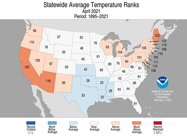
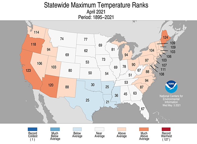
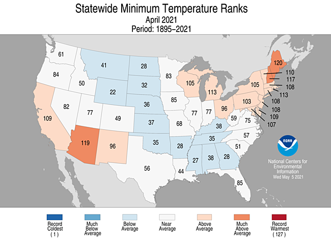
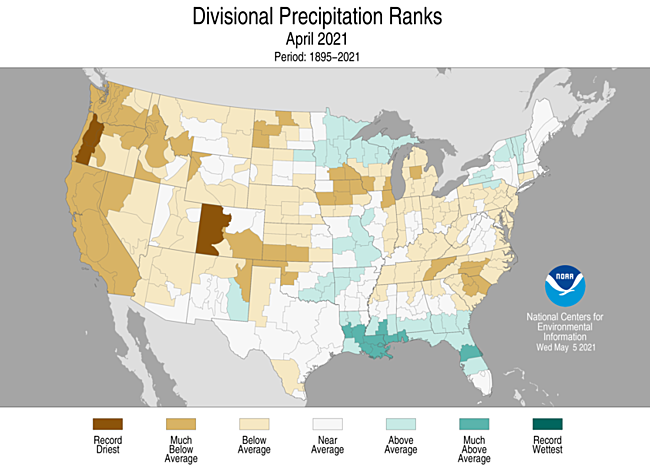
Just out: State Rankings for April 2021. Remember how the rankings work is that NOAA looks at the 127 years of what is considered the most reliable data that we have and for various criteria, a state is ranked as to where they fit in the 127 years of data. So for average temperature, if the average temperature is the warmest in that 127-year history it gets ranked 127. If it is the coolest in 127 years it gets ranked 1. If it was in about the middle it would get ranked 63 or 64.
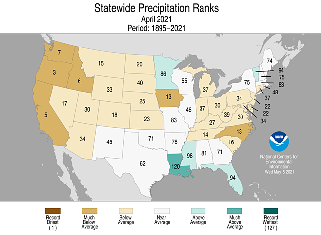
We like to look at the climate divisions when we consider precipitation
Of Special Interest.
Time passes and it was time for NOAA to update the Climate Normals and they did and we wrote an article about it which you can access here.

Severe Weather

Spring Runoff: We are actively tracking that situation
Focus on the Colorado River Basin
There was a webinar on this topic today and I am presenting all the slides used in the webinar.


This is a good place to show the situation for the California Reservoirs


We update the above map each time we publish but more frequent updates can be obtained here.
Here is what the SNOTEL data is telling us about Spring runoff.

Here is the same information presented differently.

And here is the water year.

And it is always useful to look at the last seven days.

Let’s look at the current drought situation.

And the week to week change

Here we look at four time periods: one week, one month, six months, and a full year.

Drought Discussion (The Regional links are live and will take you to the drought map for that Region)
This Week’s Drought Summary
This U.S. Drought Monitor (USDM) week saw an active weather pattern with severe weather observed across portions of the central and southern Plains, Texas, mid-South, Midwest, and the Northeast. In Texas, 7-day rainfall accumulations ranged from 2 to 10+ inches leading to significant improvement in drought-related conditions across the state. Likewise, areas of northeastern Colorado and portions of the central Plains received much-needed rainfall (2-to-4-inch accumulations) leading to improvements on the map. Out West, 83% of the region is currently in moderate-to-exceptional drought with the most severe conditions centered on the Four Corners states, California, and Nevada. In California, conditions deteriorated on this week’s map in response to a combination of factors including back-to-back dry water years, above-normal temperatures, below-normal snowpack, and drought impacts (agricultural, ecosystem health, water supply, recreation).
Northeast
On this week’s map, areas of the region – including western and northern New York, and southern portions of New Hampshire and Vermont – saw improvements in areas of Moderate Drought (D1) in response to precipitation (~2 inches) during the past week. Likewise, this week’s rainfall led to reduction of areas of Abnormally Dry (D0) in Maine, Massachusetts, and Rhode Island. For the week, average temperatures were above normal across the southern part of the region with the greatest positive anomalies (6 to 8 deg F) observed in southern Pennsylvania, southern New Jersey, and Delaware. Further to the north, slightly cooler-than-normal temperatures (1 to 4 deg F) were observed across much of New York, as well as northern portions of New Hampshire and Vermont. According to the U.S. Department of Agriculture (USDA) for the week ending on May 2, the percentage of topsoil moisture in Maine rated short to very short was 61%, whereas all other states in the region ranged from 0 to 29% short to very short. However, the NASA Crop-CASMA (Crop Condition and Soil Moisture Analytics), a remotely sensed geospatial soil moisture and vegetation index mapping application, is showing negative soil moisture anomalies (May 1) across parts of eastern Pennsylvania where 7-day average streamflow percentiles are ranging from the 1st to the 24th percentile.
Southeast
During the past week, scattered precipitation was observed across the region with rainfall accumulations generally ranging from 1 inch to 3+ inches in northern Alabama, whereas other states in the region – including Georgia, South Carolina, and Florida – logged lesser accumulations. However, after the 8:00 a.m. ET USDM data cutoff on Tuesday (May 4), a severe storm outbreak impacted portions of Alabama and Georgia with areas of very heavy rainfall, hail, flash flooding, high winds, and power outages. On this week’s map, rainfall during the past week helped to alleviate short-term precipitation deficits, which led to reductions in areas of Abnormally Dry (D0) in Georgia and South Carolina, as well as slight improvements in an area of Moderate Drought (D1) in southwestern Florida. According to the USDA, the percentage of topsoil moisture in South Carolina rated short to very short was 73%, whereas both Florida and North Carolina were 38% short to very short. Across most of the region, 7-day average streamflows were running at normal levels or above, with the exception of areas of eastern North Carolina where flows have dipped below normal. Average temperatures for the week were above normal across the entire region with the greatest anomalies observed in eastern portions of Virginia and North Carolina where temperatures were 6 to 10 deg F above normal.
South
On this week’s map, widespread improvements in areas of drought were made across Texas (and southern and eastern Oklahoma) in response to significant precipitation accumulations (ranging from 2 to 10+ inches) with areas along the Texas Gulf Coast and the Hill Country receiving the heaviest accumulations. The slow-moving front that entered the region last week brought severe storms with frequent lighting, tornados, and softball-sized hail that caused extensive property damage with damage estimates expected to exceed $3 billion. This week’s rainfall significantly improved soil moisture levels across much of Texas, but negative soil moisture anomalies remained across the Trans-Pecos and the Texas Panhandle regions according to the NASA Crop-CASMA. According to Water Data for Texas (May 4), monitored water supply reservoirs are currently 83.6% full, with most of the reservoirs in the eastern half of the state ~80% to 100% full and reservoirs in the western half of the state generally <50% full. Average temperatures for the week were below normal (2 to 10 deg F) in the Trans-Pecos, Edwards Plateau, and southern High Plains regions of Texas, whereas the rest of the region was above normal with the greatest anomalies (5 to 15+ deg F) observed in eastern Texas.
Midwest
On this week’s map, some minor improvements were made in areas of Moderate Drought (D1) and Abnormally Dry (D0) in portions of Ohio, Indiana, and Wisconsin, where areas of isolated heavy rainfall (2 to 3 inches) were observed this week. Elsewhere in the region, mounting precipitation deficits (2 to 4+ inches) during the past 60 days led to an expansion of areas of Moderate Drought (D1) in northern Illinois, as well as new areas of Abnormally Dry (D0) in southern Iowa and northwestern Missouri where conditions have been dry during the past 30 days. According to NASA Crop-CASMA, very dry soils (compared with historical averages for the date) are being observed in northeastern Illinois in Boone, DeKalb, Kane, and McHenry Counties. Average temperatures for the week were above normal (2 to 12+ deg F) across the region with the greatest departures observed in northern Illinois, eastern Iowa, northern Missouri, and southern Wisconsin.
High Plains
On this week’s map, areas of the region – including Kansas, Nebraska, Colorado, and Wyoming – saw improvements, including a reduction in areas of Severe Drought (D2) in southwestern Nebraska and northwestern Kansas as well as in areas of Moderate Drought (D1) in northeastern Colorado and southeastern Wyoming. In northeastern Colorado, 2 to 4+ inches of rainfall were observed during the past week, which provided a timely boost in soil moisture conditions for recently planted crops. Elsewhere, areas of Extreme Drought (D3) expanded in northern South Dakota and southern North Dakota. In northwestern South Dakota, the town of Lemmon saw its driest January through April period on record with only 0.71 inches of precipitation observed. The South Dakota State Extension and the North Dakota State Climate Office are both reporting drought-related impacts in their respective states, including poor water quality for livestock and dry stock ponds. In western North Dakota, dry conditions and strong winds have been exacerbating fire-related conditions as firefighters are battling two wildfires in the Dakota Prairie Grasslands. Average temperatures for the week were above normal across the region with positive temperature anomalies ranging from 2 to 9 deg F above normal.
West
On this week’s maps, areas of drought expanded across California, Oregon, and Washington following a very dry April. In California, areas of Extreme Drought (D3) expanded across the northern and central Sierra Nevada, as well as in areas of the San Joaquin Valley where water deliveries have been severely reduced due to the poor snowpack conditions across the Sierra (59% of normal on April 1 statewide) and below normal reservoir conditions. For the Water Year (since October 1), precipitation across most of California has been much below normal (bottom 10th percentile) with some locations – including areas of southeastern California, and the greater Bay Area – experiencing record or near-record dryness. In Marin County, the Marin Water District declared a water shortage emergency on April 20 in response to Marin’s total reservoir storage level dipping to 50% of capacity, whereas average storage for the date (May 4) is normally 90% of capacity. California’s two largest reservoirs, Lake Shasta and Lake Oroville, were at 50% and 42% of normal, respectively, on May 4. Across the region, statewide reservoir storage levels were below normal in Arizona, California, Colorado, Idaho, Nevada, New Mexico, and Washington according to the NRCS on April 1. On the Colorado River system, the U.S. Bureau of Reclamation (May 5) is reporting Lake Mead at 38% of capacity while upstream Lake Powell is 35% full. In Oregon, drought-related conditions continue to deteriorate in western Oregon after a dry April. On the map, areas of D1 to D4 expanded in Oregon this week in response to a rapid decline of the mountain snowpack across the Cascades in addition to anomalously dry soils and well-below-normal streamflow levels. For the week, average temperatures were above normal (2 to 10 deg F) across most of the West, with the exception of areas of southeastern Arizona and southern New Mexico where temperatures were 2 to 9 deg F below normal.
Alaska, Hawaii, and Puerto Rico
On this week’s map, no changes were made in Alaska. In the Hawaiian Islands, generally dry conditions prevailed across the island chain during the past week. On the map, an area of Severe Drought (D2) was introduced in the lower South Kohala District where rangelands are in poor condition. On the windward side of Maui, areas of Abnormally Dry (D0) were removed from the map because of improving streamflow conditions and recent rainfall, whereas D0 was added on Kauai and Niihau because of downward trending streamflow conditions and below-normal rainfall. In Puerto Rico, rainfall was light-to-moderate (generally <2 inch) across the southeastern part of the island while areas in the western half received some higher totals (2 to 6 inches).
Pacific Islands
Patchy moderate rains brought improvement to a few areas in the U.S.-Affiliated Pacific Islands April 28 – May 4, 2021, but most locations remained essentially unchanged from last week. This continues the pattern of the past several weeks, where areas of rain bring improvement to relatively small areas, resulting in a longer-term trend toward gradual, periodic improvement in the regions of ongoing dryness and drought.
Weather features included a near-equatorial surface trough that persisted across Palau and western Yap State; trade-wind convergence combined with a series of surface troughs across central to eastern Federated States of Micronesia (FSM) and the Marshall Islands (RMI); and weak circulations that migrated across southern parts of the FSM and Palau. The surface features in the east interacted with upper-level divergence at times to enhance precipitation. A frontal zone/shear line moved across the Marianas early in the week, but otherwise a dry trade-wind pattern dominated this region. South of the equator, a ridge of high pressure persisted across the Samoan region with low-level moisture feeding showers over the mountains.
Satellite-based estimates of 7-day precipitation (QPE) showed a band of precipitation (the South Pacific Convergence Zone, or SPCZ) stretching southeastward from Indonesia to south and east of the Samoan Islands, and another broken band of precipitation stretching eastward across Micronesia to the Date Line and beyond. The satellite QPE depicted 1 to more than 4 inches of precipitation associated with the SPCZ south and west of the Samoan Islands with little to no rain detected by this product over American Samoa. Areas of 1 to 2 inches of rain were evident over Palau and parts of Yap State, with a continuous band of 1 to locally 4 inches across central to eastern FSM and the RMI. Patchy areas of 1 to 2 inches of frontal rains were detected in an arc bisecting the Marianas.
Moderate drought (D1) continues over Saipan, Rota, and Guam in the Northern Mariana Islands. These locations recorded several tenths of an inch to nearly 2 inches of rain last week, resulting in totals of generally 2 to 5 inches for April 1 – May 4. Some orographically-favored parts of western Guam recorded as much as 8 inches during this period. Because of this variable rainfall pattern, areas receiving the heavier rains are in better condition than D1 affecting most locations.
Across the Federated States of Micronesia, only the southernmost islands are affected by dryness. Even there, over 20 inches of rain pelted Kapingamarangi in April, and a few tenths more fell during the first few days of May. Conditions are trending toward slow improvement there, though the assessment of long-term moderate drought is unchanged from last week.
Drought continues in Kwajalein and Wotje in the Marshall Islands, but conditions improved a bit. Almost 4 inches of rain fell on Kwajalein last week, bringing their total since April 1 to over 9 inches. As a result, the previous D2 was improved to D1. Rainfall has not been as generous at Wotje, but April rainfall of over 3.5 inches is closer to normal than previous months had been, with only 1.2 inches falling for February and March combined. Still, given the sizeable longer-term moisture shortages, the classification of extreme drought (D3) is unchanged from last week.
Palau remained free of dryness, with another 2.5 to 4.5 inches of rain falling this past week. American Samoa was drier than it had been the prior several weeks, but remained free of dryness in the Drought Monitor
Virgin Islands
Most of the Virgin Islands recorded 0.5 to 1.5 inches of rain, the highest totals in four weeks. But given the large multi-month deficits that have accumulated, the damp week did little to change the severe drought (D2) that is entrenched across the islands. Moderate rains have been a little more widespread and a little heavier on parts of St. John, but not enough to change the assessment as a whole. The University of the Virgin Islands’ also reported close to normal rainfall for April. But as of May 4, less than 7 inches of rain has accumulated on St. Thomas since December 1, 2021 – about 61 percent of normal. St. Croix has been wetter, but rainfall is typically higher there. Since October 1, Rohlsen Airport on St. Croix reported 62 percent of normal rainfall, which is a deficit of over 8 inches.
Looking Ahead
The NWS WPC 7-Day Quantitative Precipitation Forecast (QPF) calls for moderate-to-heavy liquid accumulations ranging from 2 to 4+ inches across the mid-South and lower Midwest while portions of the Plains, Northeast, Mid-Atlantic, and the Southeast are expected to receive <1-inch accumulations. In the Intermountain West and Pacific Northwest, light precipitation (<1-inch accumulations) is forecasted for areas of the central and northern Rockies, and portions of the Cascades. The CPC 6-10-day Outlook calls for a moderate-to-high probability of above-normal temperatures in the Far West, Southwest, Great Basin, and Florida while a high probability of below-normal temperatures is forecasted across most of the Eastern Tier. In terms of precipitation, there is a moderate probability of above-normal precipitation across areas of the central and southern Plains, as well as the southeastern tier of the U.S. Below-normal precipitation is expected across the Pacific Northwest, Great Plains, and areas of the Intermountain West.
Regional Reports
Soil Conditions
The result of the drought is very dry soil conditions

Soil Dryness in More Depth.

 |
 |
 |
 |
April Drought Outlook


Since we are entering fire season it is time to start showing the wildland fire potential outlook. These will update automatically shortly after the month changes.


Crop Progress Reports
 |
 |
 |
 |
| Crop | Crop Progress | Crop Condition |
| Corn | Planted and Emerged looking good | NA |
| Soybeans | Planted looking good | NA |
| Cotton | Planted OK | NA |
| Winter Wheat | Headed a bit slow | Not Great |
| Spring Wheat | Planted and Emerged looking good | NA |
| Sorghum | Planted slightly slow | NA |
| Rice | Planted and Emerged OK | NA |
| Oats | Planted and Emerged and looking good | NA |
| Barley | Planted and Emerged looking good | NA |
| Peanuts | Planted slow especially in certain states. | NA |
| Sugar Beets | Planted looking outstanding | NA |
| Sunflowers | NA | NA |
| Pasture and Range | Extremely Bad |
Additional Information can be found here.

USDA and NASS Executive Briefings and other reports.
There are available NASS Reports which you can access here.
Sustainable Agriculture Weekly Video. Source: Sare.Org but we may include other related videos as they become available…You want to watch these! They are short but very informative.
Introduction
Episode 5 Pest Management
News
Nothing to report tonight.
Intermediate-Term Weather Forecast
Showing from left to right, Days 1- 5, 6 – 10, 8 – 14, and Weeks 3 – 4 You can click on these maps to have them enlarge. Also, the discussions that go with these forecast maps can be found here (first two weeks) and here (Weeks 3 and 4).
First Temperature
|
|
|
|


And then Precipitation
|
|
|


The Week 3-4 Discussion is always interesting so we include it in the article. Similar discussions for the 6 -10 Day and 8 – 14 Day Forecasts are available here.
Week 3-4 Forecast Discussion Valid Sat May 22 2021-Fri Jun 04 2021
La Nina conditions appear to be transitioning to ENSO neutral conditions in the Pacific Ocean. Equatorial sea surface temperatures (SSTs) are slightly below average from the central to eastern Pacific Ocean, as enhanced upper level westerly wind anomalies persist over the central and eastern equatorial Pacific Ocean. An active MJO propagated from the Western Hemisphere into the Indian Ocean in recent weeks, and dynamical models forecast continued eastward propagation. Forecasts of a weakening of the MJO may be a result of the method of calculation of the RMM indices and not representative of the forecast. Therefore, the MJO is expected to influence both dynamical and statistical model forecasts for week 3-4. The week 3-4 temperature and precipitation outlooks are based primarily on dynamical model guidance including the GEFS, CFS, Canadian, ECMWF, JMA, and the Subseasonal Experiment (SubX) multi-model ensemble (MME) of experimental and operational ensemble prediction systems, with additional considerations made for the state of MJO and La Nina, as well as decadal climate trends and the predicted evolution of the pattern from week-2 forecasts.
The forecast 500-hPa height anomaly patterns are generally consistent among model guidance over the North Pacific Ocean for the week 3-4 period with significant differences forecast over the CONUS. Most model forecasts predict persistence of ridging over the North Pacific from week 2 into the week 3-4 period, as well as positive height anomalies to the north of Alaska. The GEFS and ECMWF ensemble means predict a greater influence of positive 500-hPa height anomalies on southeastern Alaska in week 3-4. Dynamical models generally predict weak troughing downstream near or over part of the CONUS, with generally positive height anomalies over much of the region. The ECMWF ensemble mean predicts mid-level troughing over the western CONUS and positive height anomalies centered over the Northeast, consistent with greater persistence of the week 2 period forecast relative to other models. The JMA places troughing further into the interior west, while the CFS places the center of positive height anomalies over the west and troughing over the east. The MLR statistical tool, based on the MJO, La NIna and decadal trends, predicts generally positive height anomalies across the CONUS, oriented from the Southwest across the central CONUS into the Northeast. The manual blend of model forecasts predicts weak positive 500-hPa height anomalies across the entire forecast domain, with slightly greater anomalies centered over the North Pacific, to the north of Alaska over the Arctic, and over the northeastern CONUS.
Consistent with the manual blend of temperature tools and positive 500-hPa height anomalies, above normal temperatures are forecast across most of the forecast domain. Equal chances of above and below normal temperatures are indicated over parts of the Northern Plains, resulting from the influence of MJO as expressed in the MLR tool. Equal chances are also predicted for parts of the Southeast, consistent with calibrated dynamical model forecast tools and enhanced above normal precipitation probabilities. Higher probabilities for above normal temperatures are indicated for the Southwest, due to decadal temperature trends, and over the Northeast, under the influence of greater positive height anomalies. Above normal temperatures are predicted for Alaska, under positive height anomalies.
The increasing influence of positive mid-level height anomalies over the North Pacific leads to a forecast of likely below normal precipitation for parts of the southern coast of Mainland Alaska, as indicated by calibrated dynamical model forecasts, including the ECMWF. A weak mid-level flow pattern and positive height anomalies lead to enhanced probabilities for below normal precipitation for most of the western CONUS. Enhanced probabilities of above normal precipitation are indicated for parts of the Gulf Coast region, consistent with the consensus of calibrated precipitation forecasts from the CFS, ECMWF and JMA. Equal chances of above and below normal precipitation are indicated for eastern areas of the Great Plains into the Mississippi Valley, as moisture flowing northward around ridging to the east leads to precipitation in various model forecasts, but there is significant uncertainty among models. Below normal precipitation probabilities are increased over the Northeast, under predicted positive mid-level height anomalies.
Dynamical model guidance, including the experimental SubX MME, depicts significant uncertainty and equal chances for above and below normal temperatures over the Hawaiian islands. Equal chances of below or above normal precipitation are forecast for Hawaii, based on little to no signal among precipitation tools.
International

Energy Analysis
No Report this Week.
Major Sources of Information Used in this Weekly Report. We will not be using them all each week but the reader is welcome to refer to these resources.
|
Science Feature
Double Dip La Nina Continued
I want to attempt to present a paper that explains why we have more La Ninas than El Ninos. I think you can read the full paper here. I am not positive of that because I am registered with ResearchGate but they did not ask me to log in so I think you can access the full article but hopefully I will present enough for readers to understand the concept.
I have not made any progress on this but I am leaving it in the article for those who may want to think about the issue and I will try to expand the discussion below at some point.


The rest of the discussion is later on in the article. And consider this an introduction because some of my readers may be familiar with this but for me, it is uncharted territory. So I need to do a lot more research. But what caught my interest was the part of the discussion not shown here but in the slides that are presented later in this article which suggests that the Pacific Decadal Oscillation or PDO does not explain as much about weather cycles (what I call low-frequency weather cycles) as I have assumed and that there are other factors now that need to be included in the analysis. One of the two is the Pacific Meridional Model or PMM mentioned in the Abstract. If that is the case, and I can come across some other references to this it is very important – let me just say it that way.
I have moved the other slides I made to somewhere close to the end of this article. I will be coming back to this topic very soon. I am not sure yet if this theory if you want to call it that explains why we may have a two-year La Nina this time around. It is not clear that we will but some of the models suggest it. Not all La Nina’s are dry for the Southwest but most are. So if the ratio of two-year La Ninas to one-year La Ninas is increasing, that is very important. I could have held back all this information until was read to fully discuss it but that did not seem to be proper. Some of my readers may know more about this and can leave me messages in the comment section that follows every article I publish.
I also see the possible connection of what is discussed in this paper with the storm we just had. In the article I posted last night on the NOAA four-season forecast I provided some snapshots of the Equatorial Pacific which showed a lack of movement of the cool and warm anomalies. I showed four snapshots which basically covered three months but I could have gone back many more months and it would have looked similar. You can see that set of graphics here. The importance of that is this La Nina is not decaying rapidly. So it could last into next winter or fade for a short period of time and later regain La Nina Status. I am not making any predictions here but I am raising the question of has something fundamentally changed?
I am certainly familiar with the deliveries to Elephant Butte the major reservoir on the Rio Grande and I am familiar with the deliveries to the three beneficiaries of that project namely an irrigation district in New Mexico, a similar irritation district in El Paso County Texas, and Mexico. Shortly after the MegaNino of 1997 and the subsequent La Nina of 1998 deliveries declined to Elephant Butte Reservoir and to the three (there is actually a fourth in good years when there is surplus water available to Hudspeth County Tx under a Warren Act Contract). I concluded that this was a normal change of phase of the PDO but perhaps there is more to it. So that explains my interest in the topic and although I frame the issue in a New Mexico context it impacts essentially all of the U.S.


Just what is the Pacific Meridional Mode?
This may help a bit. It is a second reference to the issue and this time an NOAA article. BTW, the fish are never wrong. We create indices on observed fish behavior. If their behavior deviates from what our indices suggest their behavior should be, it is not because the fish are confused it is because our indices or models no longer are accurate.
This graphic also might help


