Written by Sig Silber
This article provides additional detail to our Weather Live All Week Article. The information here mostly auto-updates but we will add and remove information as appropriate. There is no need to pay attention to the published date since if you reach this article from the link in WEATHER Live all Week, you have reached the most up-to-date version.

We also provide weather forecasts for the entire World but do not analyze those forecasts to the same level of detail that we do for Alaska and CONUS.
Please share this article – Go to the very top of the page, right-hand side for social media buttons. Also, feel free to send this article to anyone you feel will benefit from it. This is a supplement to our LIVE: All Week Report which is updated daily. To find that article or any weather article we publish you can find the latest version by consulting the Directory by clicking here and then clicking on the latest version of the article of interest which will be near the top of the Directory. If you click on links or to enlarge graphics you may want to hit the return arrow located at the top left of your screen to return to where you were.
Note: At any time you can return to the article from which you came to get here by hitting the “back arrow”, usually found in the extreme left hand upper corner of the page.
A. Now we will begin with our regular approach and focus in more detail on Alaska and CONUS (all U.S.. except Hawaii).
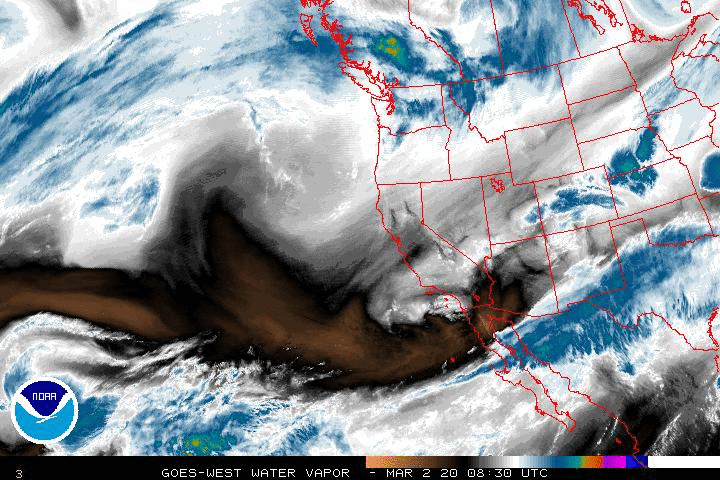
Water Vapor.
This view of the past 24 hours provides a lot of insight as to what is happening.
You can see from this animationhow the pattern is evolving.

This is the freeze frame of the current situation. It is the last frame from the above animation. You can tell a lot from this.
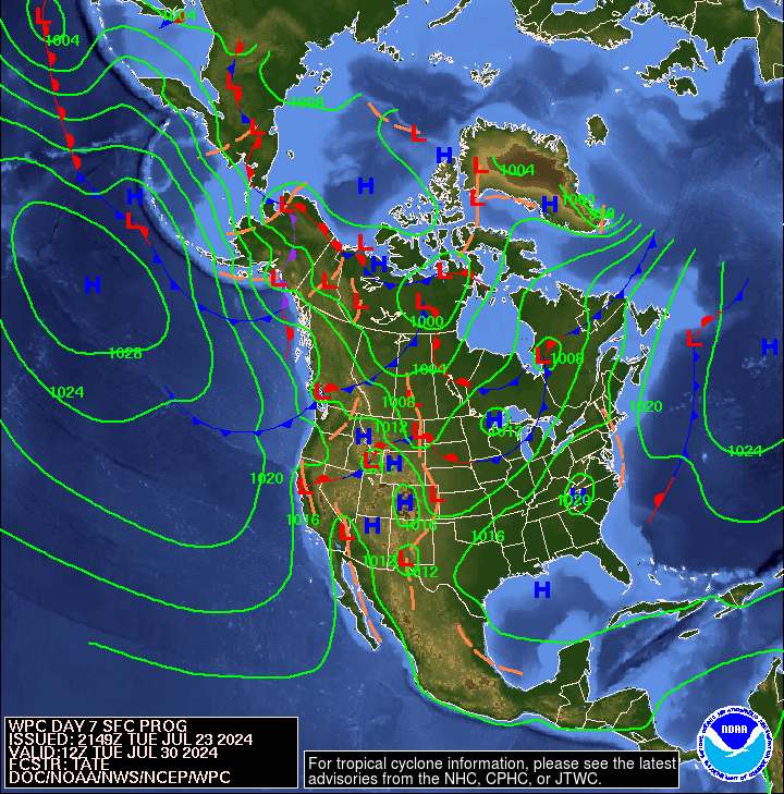
Below is a graphic that highlights the forecast surface Highs and the Lows re air pressure on Day 7. The Day 3 forecast can be found here. The Day 6 Forecast can be found here.
include(“/home4/aleta/public_html/pages/weather/modules/Air_Pressure_Map_by_Day_Matrix.htm”); ?>
Looking at the current activity of the Jet Stream. The below graphics and the above graphics are very related.
Not all weather is controlled by the Jet Stream (which is a high altitude phenomenon) but it does play a major role in steering storm systems especially in the winter The sub-Jet Stream level intensity winds shown by the vectors in this graphic are also very important in understanding the impacts north and south of the Jet Stream which is the higher-speed part of the wind circulation and is shown in gray on this map. In some cases however a Low-Pressure System becomes separated or “cut off” from the Jet Stream. In that case, it’s movements may be more difficult to predict until that disturbance is again recaptured by the Jet Stream. This usually is more significant for the lower half of CONUS with the cutoff lows being further south than the Jet Stream. Some basic information on how to interpret the impact of jet streams on weather can be found here and here. I have not provided the ability to click to get larger images as I believe the smaller images shown are easy to read.
| Current | Day 5 |
 |  |
You can see the current pattern here. | This is the forecast out five days. Please notice the change if any. |
Putting the Jet Stream into Motion and Looking Forward a Few Days Also
To see how the pattern is projected to evolve, please click here. In addition to the shaded areas which show an interpretation of the Jet Stream, one can also see the wind vectors (arrows) at the 300 Mb level.
This longer animation shows how the jet stream is crossing the Pacific and when it reaches the U.S. West Coast is going every which way.
Click here to gain access to a very flexible computer graphic. You can adjust what is being displayed by clicking on “earth” adjusting the parameters and then clicking again on “earth” to remove the menu. Right now it is set up to show the 500 hPa wind patterns which is the main way of looking at synoptic weather patterns. This amazing graphic covers North and South America. It could be included in the Worldwide weather forecast section of this report but it is useful here re-understanding the wind circulation patterns.
These are duplicates to what appear in the LIVE: All Week Article but are already enlarged for your convenience.
Four – Week Outlook: Looking Beyond Days 1 to 5, What is the Forecast for the Following Three + Weeks?
I use “EC” in my discussions although NOAA sometimes uses “EC” (Equal Chances) and sometimes uses “N” (Normal) to pretty much indicate the same thing although “N” may be more definitive.
First – Temperature The NOAA Day 6 – 10 and 6=8 – 14 Day Discussion can be accessed here. Please notice it is abbreviated on the weekends. The NOAA Week 3 – 4 discussion can be accessed here. It updates on Fridays.
. The 6 – 10 Day Temperature Outlook issued today (Note the NOAA Level of Confidence in the Forecast Discussion Released today).

8 – 14 Day Temperature Outlook issued today (Note the NOAA Level of Confidence in the Forecast Discussion Released today.
 –
–
Remember this is an experimental model not the official 6 – 10 day and 8 – 14 day forecast. But it puts the CONUS and Alaska forecasts into context.


Looking further out.

Now – Precipitation
6 – 10 Day Precipitation Outlook Issued Today (Note the NOAA Level of Confidence in the Forecast Released Today)

8 – 14 Day Precipitation Outlook Issued Today (Note the NOAA Level of Confidence in the Forecast Released today)

Remember this is an experimental model, not the official 6 – 10 day and 8 – 14 day precipitation forecast. But it puts the CONUS and Alaska forecasts into context
Then Precipitation

Looking further out.

The 6 to 14 Day Discussion can be found here. .
Analogs to the NOAA 6 – 14 Day Outlook.
NOAA normally provides two sets of Analogs.
A. Analogs related to the 5 day period centered on 3 days ago and the 7 day period centered on 4 days ago. “Analog” means that the weather pattern then resembles the recent weather pattern and the recent pattern is used to initialize the models to predict the 6 – 14 day Outlook. This set of Analogs is found in the Day 6 – 14 Discussion which can be accessed here.
B. There is a second set of analogs associated with the Outlook.These can be found here. It compares the forecast (rather than the prior period) to past weather patterns. I have not been regularly analyzing this second set of information. The first set applies to the 5 and 7 day observed pattern prior to today. The second set relates to the correlation of the forecasted outlook 6 – 10 days out and 8 – 14 days out with similar patterns that have occurred in the past during a longer period that includes the dates covered by the 6 – 10 Day and 8 – 14 Day Outlook. The second set of analogs also has useful information as it indicates that the forecast is feasible in the sense that something like it has happened before. I am not very impressed with that approach. But in some ways both Approach A and B are somewhat similar. I conclude that if the Ocean Condition now is different then the analogs and if the state of ENSO now is different than the analogs that is a reason to have increased lack of confidence in the forecasts and vice versa.
They put the first set of analogs in the discussion with the second set available from this link. I am assuming that the first set of analogs is the most meaningful and I find it so. But NOAA prefers the first set (A) as it helps them (or at least they think it does) assess the quality of the forecast.
We will occassionally update the following table but it will not be updated regularly. But you can do it your self with the links provided (not all will be here immediatedly)
| Analog Date | ENSO Phase | PDO* | AMO* | Comments |
* I assign values that are consistent with the trend so I am doing some subjective smoothing with respect to the phases of the AMO and PDO shown in this table. (t) = a month where the Ocean Cycle Index has just changed from a consistent pattern or does change the following month to a consistent pattern.
The dynamic models are much more reliable than the pre-forecast analogs but I use them as a double check that is all. If the forecast and the analogs do not line up, there are three major possibilites:
A. The analogs were not chosen well.
B. The current pattern is different than what has occured in the past.
C. There are factors ouside of the area where they look for historical analogs with such factors influncing the forecast.
“A” is unlikely as is “B” so “C” is usually the reason.
The seminal work on the impact of the PDO and AMO on U.S. climate can be found here. Water Planners might usefully pay attention to the low-frequency cycles such as the AMO and the PDO as the media tends to focus on the current and short-term forecasts to the exclusion of what we can reasonably anticipate over multi-decadal periods of time. One of the major reasons that I write this weather and climate column is to encourage a more long-term and World view of weather.
| In color | Black and White same graphics |
 |  |
| McCabe Condition | Main Characteristics |
| A | Very Little Drought. Southern Tier and Northern Tier from Dakotas East Wet. Some drought on East Coast. |
| B | More wet than dry but Great Plains and Northeast are dry. |
| C | Northern Tier and Mid-Atlantic Drought |
| D | Southwest Drought extending to the North and also the Great Lakes. This is the most drought-prone combination of Ocean Phases. |
You may have to squint but the drought probabilities are shown on the map and also indicated by the color coding with shades of red indicating higher than 25% of the years are drought years (25% or less of average precipitation for that area) and shades of blue indicating less than 25% of the years are drought years. Thus drought is defined as the condition that occurs 25% of the time and this ties in nicely with each of the four pairs of two phases of the AMO and PDO.
Historical Anomaly Analysis
When I see the same dates showing up often I find it interesting to consult this list.
A Useful Read
Some might find this analysis which you need to click to read interesting as the organization which prepares it focuses on the Pacific Ocean and looks at things from a very detailed perspective and their analysis provides a lot of information on the history and evolution of ENSO events.
Some Indices of Possible Interest: We should always remember that the forecast is driven by many factors some of which are conflicting in terms of their impacts. Please pay more attention to the graphics than my commentary which does not update on a regular basis once the article is published. The indices will continue to update. I provide these indices as they are important guidelines to the weather. It is in a way looking at the factors that are impacting the weather. There were developed because weather forecasters found them to be useful.


Here is another way of integrating all forecasts into a single graphic. These forecasts extend out further into the future than the forecasts presented earlier. But they do not show the recent history. Also, the set of four does not include the AO but instead the WPO so it is not the same but may be useful.

The MJO is an area of convective activity along the Equator which circles the globe generally in 30 to 60 days. The location of the convective activity not only impacts the Equator but also the middle latitudes. Most people are not familiar with the MJO but at certain times it plays an important role Worldwide re weather and for CONUS.
The the Summary from the weekly NOAA analysis of the MJO and much other information on the MJO can be found here. Go down the page to Expert Discussions. The second slide called Overview is all you really need to look at.
It is sometimes useful to look at the recent history of the MJO.
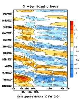
The MJO Index (more information can be found here) indicates where the MJO has been and this Hovmoeller Graphic shows this. The Index is shown for the parts of the Equator where the MJO is most usually found.
 q
q
Forecast Models.
There are a lot of models and I try to read the results from all of them. For access to a variety of models, I refer readers here. This weekly report summarizes things. Here is another useful source of information.
Now the first of the three graphics we typically present which shows where the MJO is now and how it got there.
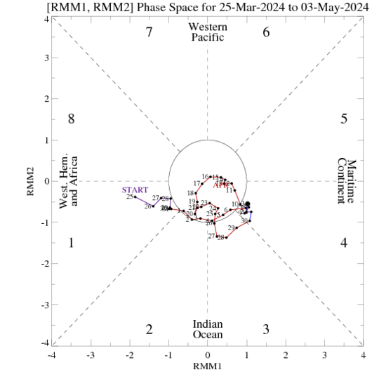
This shows the recent history. What next? Please read the MJO Summary carefully. You willl have to use the link provided to obtain the summary as it does not autoupdate.
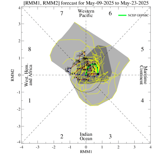
And then a forecast. On this GFS graphic, the light gray shading shows the tracks which fit with 90% of the forecasts and the dark gray shading shows a smaller area that fits with 50% of the forecasts The large dot is the current location.
And then the ECMF forecast.
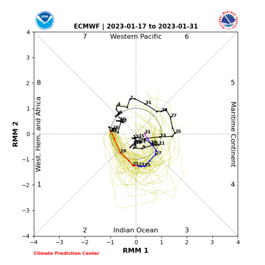
Then side by side to see if they agree. .
|
|
How to interpret the Impacts. For Temperature and Precipitation you have to pick the three month season involved and then the impacts are shown by phase and the level of statistical significance is shown.
B. Beyond Alaska and CONUS Let’s Look at the World which of course also includes Alaska and CONUS
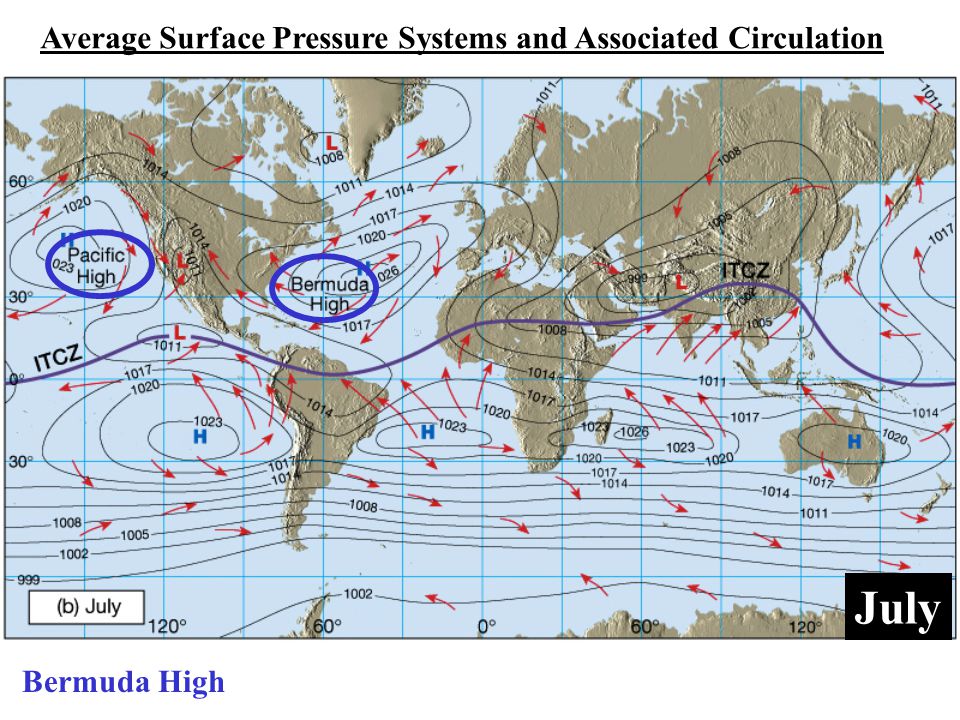
It is Useful to Understand the Semipermanent Patterns that Control our Weather and Consider how These Change from Winter to Summer. These two graphics (click on each one to enlarge) are from a much larger set available from the Weather Channel. They highlight the position of the Bermuda High which they are calling the Azores High in the January graphic and is often called NASH and it has a very big impact on CONUS Southeast weather and also the Southwest. You also see the north/south migration of the Pacific High which also has many names and which is extremely important for CONUS weather and it also shows the change of location of the ITCZ which I think is key to understanding the Indian Monsoon. A lot of things become much clearer when you understand these semi-permanent features some of which have cycles within the year, longer period cycles and may be impacted by Global Warming. For CONUS, the seasonal repositioning of the Bermuda High and the Pacific High are very significant.
 |  |
World Forecasts
1. Today (Source: University of Maine)
2. Short-term set for day six but can be adjusted (BOM – Australia)
3. 8 – 14 Day (NOAA/Canada/Mexico Experimental NAEFS))
1. Forecast for Today (you can click on the maps to enlarge them)

And now precipitation

Additional Maps showing different weather variables can be found here.
2. Forecast for Day 6 (Currently Set for Day 6 but the reader can change that)
World Weather Forecast produced by the Australian Bureau of Meteorology. Unfortunately, I do not know how to extract the control panel and embed it into my report so that you could use the tool within my report. But if you visit it Click Here and you will be able to use the tool to view temperature or many other things for THE WORLD. It can forecast out for a week. Pretty cool. Return to this report by using the “Back Arrow” usually found top left corner of your screen to the left of the URL Box. It may require hitting it a few times depending on how deep you are into the BOM tool. Below are the current worldwide precipitation and temperature forecasts for six days out. They will auto-update and be current for Day 6 whenever you view them. If you want the forecast for a different day Click Here

Again, please remember this graphic updates every six hours so the diurnal pattern can confuse the reader.
Now Precipitation

3. And now we have experimental 8 – 14 Day World forecasts from the NAEFS Model.
We showed these graphics earlier so I am not repeating them.
C. ENSO SUMMARY of Current Status. We are condensing this section to have it be more related to the Intermediate-Term Weather Forecast. We will provide a more detailed analysis once a month when NOAA Issues their monthly analysis.
This section is organized in two parts.
1. Current Sea Surface and Subsurface Temperatures (SST)
2. Current ENSO Index Readings
1. Current and Recent Sea Surface Temperatures (SST)
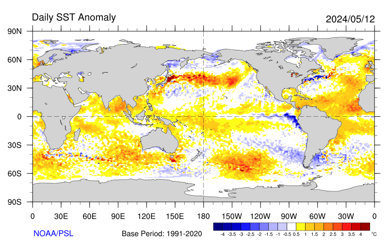
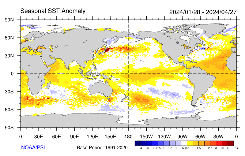
A major driver of weather is Surface Ocean Temperatures. Evaporation only occurs from the Surface of Water. So we are very interested in the temperatures of water especially when these temperatures deviate from seasonal norms thus creating an anomaly. The geographical distribution of the anomalies is very important. To a substantial extent, the temperature anomalies along the Equator have a disproportionate impact on the weather so we study them intensely and that is what the ENSO (El Nino – Southern Oscillation) cycle is all about. Subsurface water can be thought of as the future surface temperatures. They may have only indirect impacts on current weather but they have major impacts on future weather by changing the temperature of the water surface. Winds and Convection (evaporation forming clouds) is weather and is a result of the Phases of ENSO and also a feedback loop that perpetuates the current Phase of ENSO or changes it. That is why we monitor winds and convection along or near the Equator especially the Equator in the Eastern Pacific.
My focus here is sea surface temperature anomalies as they are one of the two largest factors determining weather around the World. If we want to have a good feel for future weather, we need to look at the oceans as our weather mostly comes from oceans and we need to look at surface temperature anomalies (weather develops from the ocean surface
It is the ocean surface that interacts with the atmosphere and causes convection and also the warming and cooling of the atmosphere. So we are interested in the actual ocean surface temperatures and the departure from seasonal normal temperatures which is called “departures” or “anomalies”. Since warm water facilitates evaporation which results in cloud convection, the pattern of SST anomalies suggests how the weather pattern east of the anomalies will be different than normal.
Current Sea Surface Temperature (SST) Departures from Normal for this Time of the Year i.e. Anomalies
One way to look at the above is to fill in the following table.
First the categorization of the current Monthly Average SST anomalies. | ||||
| The Mediterranean, Black Sea, and Caspian Sea | Western Pacific | West of North America | North and East of North America | North Atlantic |
| . | ||||
| Equator | ||||
| ||||
| Africa | West of Australia | North, South, and East of Australia | West of South America | East of South America |
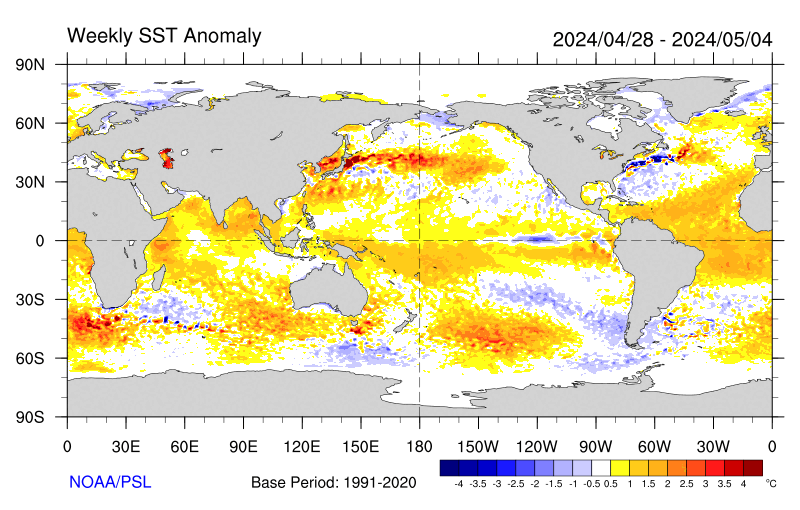
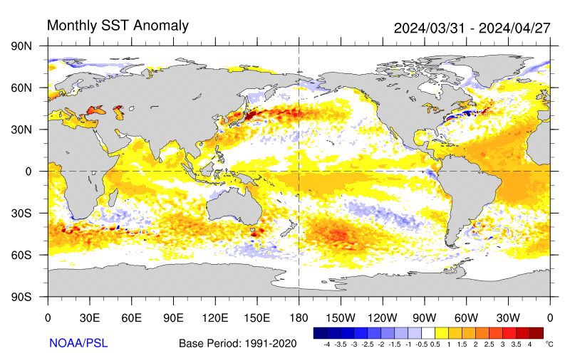
Related maps with longer time frames follow:
Weekly
Monthly
3 Months.
The actual sea surface temperatures can be found here. The different ways of looking at the data are useful for different purposes. We review this in our monthly ENSO STATUS REPORT
Another approach is to look at the change in the anomalies. The SST anomaly is sort of like the first derivative and the change in the anomaly is somewhat like a second derivative. It tells us if the anomaly is becoming more or less intense. Unfortunately I do not have a map of this that auto-updates. But again we discuss this in our Monthly ENSO STATUS REPORT.
A look at the subsurface.
The following graphic is somewhat similar to the graphic above but it updates every five days not once per week. The date shown is the midpoint for the five-day average. It shows a lot more detail than the above graphic. You can see some water at depth that is anomalously warm. But the depth of the warm anomaly is becoming less and there is cool water below it. This pattern might persist for a while.

2. ENSO Index Readings
This graphic is easy to read.

Here is a daily version

The Surface Air Pressure that Confirms the Nino 3.4 Index
And of course, Queensland Australia is the official keeper of the SOI measurements.

SOI = 10 X [ Pdiff – Pdiffav ]/ SD(Pdiff) where Pdiff = (average Tahiti MSLP for the month) – (average Darwin MSLP for the month), Pdiffav = long term average of Pdiff for the month in question, and SD(Pdiff) = long term standard deviation of Pdiff for the month in question. So really it is comparing the extent to which Tahiti is more cloudy than Darwin, Australia. During El Nino we expect Darwin Australia to have lower air pressure and more convection than Tahiti (Negative SOI especially lower than -7 correlates with El Nino Conditions). During La Nina we expect the Warm Pool to be further east resulting in Positive SOI values greater than +7).
D. Useful Reference Information
Understand How the Jet Stream Impacts Weather
Four Quadrant Jet Streak Model Read more here This is very useful for guessing at weather as a trough passes through. It would apply to the states that are at the apex of the trough.
If the centripetal accelerations owing to flow curvature are small, then we can use the “straight” jet streak model. The schematic figure directly below shows a straight jet streak at the base of a trough in the height field. The core of maximum winds defining the jet streak is divided into four quadrants composed of the upstream (entrance) and downstream (exit) regions and the left and right quadrants, which are defined facing downwind.

Isotachs are shaded in blue for a westerly jet streak (single large arrow). Thick red lines denote geopotential height contours. Thick black vectors represent cross-stream (transverse) ageostrophic winds with magnitudes given by arrow length. Vertical cross-sections transverse to the flow in the entrance and exit regions of the jet (J) are shown in the bottom panels along A-A’ and B-B’, respectively. Convergence and divergence at the jet level are denoted by “CON” and “DIV”. “COLD” and “WARM” refer to the air masses defined by the green isentropes.
[Editor’s Note: There are many undefined words in the above so here are some brief definitions. Isotachs are lines of equal wind speed. Convergence is when there is an inflow of air which tends to force the air higher with cooling and cloud formation. Divergence is when there is an outflow of air which tends to result in air sinking which causes drying and warming, Confluence is when two streams of air come together. Diffluence is when part of a stream of air splits off.]
Standard Pressure Levels
When we discuss the jet stream and for other reasons, we often discuss different layers of the atmosphere. These are expressed in terms of the atmospheric pressure above that layer. It is kind of counter-intuitive to me. The below table may help the reader translate air pressure to the usual altitude and temperature one might expect at that level of air pressure. It is just an approximation but useful.

Re the above, H8 is a frequently used abbreviation for the height of the 850 millibar level (which is intended to represent the atmosphere above the Boundary Layer most impacted by surface conditions), H7 is the 700 mb level, H5 is the 500 mb level, H3 is the 300 mb level. So if you see those abbreviations in a weather forecast you will know what they are talking about.
The NOAA Proprietary ENSO Nino 3.4 forecasting model.

E. Table of Contents for Page II of this Report Which Provides a lot of Background Information on Weather and Climate Science
The links below may take you directly to the set of information that you have selected but in some Internet Browsers it may first take you to the top of Page II where there is a TABLE OF CONTENTS and take a few extra seconds to get you to the specific section selected. If you do not feel like waiting, you can click a second time within the TABLE OF CONTENTS to get to the specific part of the webpage that interests you.
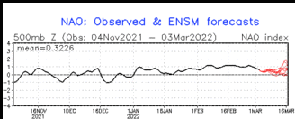
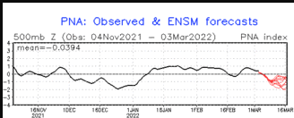
1. Very High Frequency (short-term) Cycles PNA, AO,NAO (but the AO and NAO may also have a low frequency component.)
2. Medium Frequency Cycles such as ENSO and IOD
3. Low Frequency Cycles such as PDO, AMO, IOBD, EATS.
4. Computer Models and Methodologies
5. Reserved for a Future Topic (Possibly Predictable Economic Impacts)
F. Table of Contents of Contents for Page III of this Report – Global Warming Which Some Call Climate Change.
The links below may take you directly to the set of information that you have selected but in some Internet Browsers it may first take you to the top of Page III where there is a TABLE OF CONTENTS and take a few extra seconds to get you to the specific section selected. If you do not feel like waiting, you can click a second time within the TABLE OF CONTENTS to get to the specific part of the webpage that interests you.
2. Climate Impacts of Global Warming
3. Economic Impacts of Global Warming
4. Reports from Around the World on Impacts of Global Warming


