Written by Sig Silber
On October 10, 2019 NOAA declared that ENSO Neutral Conditions applied and most likely will apply through the Winter. This raises two questions:
1) Is it the correct call?
2) Does it matter?
We will address both of these questions and many others in this Special Report.

It is not that we think it was wrong to have declared that ENSO-neutral is favored. We just believe it is less certain than suggested. It is not clear that there is any difference between ENSO Neutral with an El Nino bias and a very weak El Nino. But if the difference in the Nino 3.4 Index is at all substantial from that which NOAA is forecasting, it will impact the weather. So we see the need to carefully monitor the situation.
Please share this article – Go to the very top of the page, right-hand side for social media buttons. Please feel free to share this article with anyone who you believe might find it of interest.
Here is a summary of the Announcement.
EL NIÑO/SOUTHERN OSCILLATION (ENSO) DIAGNOSTIC DISCUSSION issued by CLIMATE PREDICTION CENTER/NCEP/NWS and the International Research Institute for Climate and Society October 10, 2019 ENSO Alert System Status: Not Active but ENSO-Neutral is favored. Synopsis: Consequently, forecasters believe the recent oceanic warmth reflects sub-seasonal variability and is not indicative of evolution toward El Niño. |
Here is the full Update:

Below are the six figures referred to in the announcement some comments from us.

JAMSTEC might point out the Modoki aspects of this pattern. Later we will show some other graphics that add some context to the above.
Notice that Nino 3.4 is on the borderline for Neutral/El Nino. According to NOAA. “forecasters believe the recent oceanic warmth reflects sub-seasonal variability and is not indicative of evolution toward El Niño.” That then is the big question.

This measures the overall temperature anomaly in the area indicated. This allows us to have a single number for the column of water I believe to a depth of 300 meters. The calculation went from positive (warm anomaly predominates) to negative (cool anomaly predominates, but the calculation has again moved to be positive i.e. warm.

This is perhaps the most damning evidence that NOAA has it wrong. See the warm anomaly? Does that look minor to you? It may indeed not be sufficient to create El Nino conditions and it may be that NOAA has simply not provided the correct explanation for their conclusion but it looks like we may have El Nino conditions for some period of time but probably not sufficient to have a full El Nino declared.

Convection has been suppressed Indonesia but stretching to the Date Line. That is somewhat suggestive of at least an El Nino bias.

This will be updated in about a week. Notice the green, blue and red lines are very close to the border between Neutral with an El Nino bias and a very weak El Nino.
Background Information
Here are two key graphics released today by the IRI-CPC group that provides the information that NOAA mostly relies on.

This forecast is based on a survey of meteorologists.
This shows the new and prior forecasts side by side.

The new forecast by meteorologists shows the El Nino probabilities less than the prior forecast by computer models.
Information we released on Monday, October 7, 2019

To understand this better, I extracted the top half of the graphic and added lines to show the boundaries of the Nino 3.4 Measurement Area namely 170W to 120W. Remember this is just the slice along the Equator and the Nino3.4 Measurement Area extends 5 degrees north and south of the Equator and is measured only on the surface.

You can see that the cool water is east of the Nino 3.4 Measurement Area. The water in the Nino 3.4 Measurement area is warm but the anomaly is not extreme but enough to have the Nino 3.4 value this week be reported by NOAA as +0.5C which is the upper end of ENSO Neutral. Thus the question will be what happens now? There is not a lot of warm water there but it is warm, not cool. It does not look like enough warm water to create a full-fledged El Nino but basically, that is what JAMSTEC called for. It certainly does not look like it will be closer to pure Neutral than a weak El Nino or Neutral with a strong El Nino bias.
Here is the live version. Notice it has been updated to October 5, 2019
The top graphic is the one that counts. It has changed a bit since September 30, 2019. It updates every five days. There is no warm water to the west of the warm anomaly. That is why NOAA refers to the situation as a “sub-seasonal variability”. But this warm ocean surface could have impacts on the weather into 2020.
I am leaving it and some other graphics “live” so they will continue to update so this article will not make any sense in a month or so as the graphics in some but not all cases will continue to update and the commentary will not. I might step in and freeze all the graphics in a few weeks.

This is not quite showing El Nino but the short-term trend is was in that direction.
Here is a daily version

It was approaching El Nino Territory. Now it backed off. These are daily readings.
The Surface Air Pressure that Confirms the Nino 3.4 Index
And of course, Queensland Australia is the official keeper of the SOI measurements.

The SOI Index is signaling El Nino but not strongly. This graphic is a 30-day average so it changes slowly.
SOI = 10 X [ Pdiff – Pdiffav ]/ SD(Pdiff) where Pdiff = (average Tahiti MSLP for the month) – (average Darwin MSLP for the month), Pdiffav = long term average of Pdiff for the month in question, and SD(Pdiff) = long term standard deviation of Pdiff for the month in question. So really it is comparing the extent to which Tahiti is more cloudy than Darwin, Australia. During El Nino we expect Darwin Australia to have lower air pressure and more convection than Tahiti (Negative SOI especially lower than -7 correlates with El Nino Conditions). During La Nina we expect the Warm Pool to be further east resulting in Positive SOI values greater than +7).
Other Images Useful to Consider

This is the NOAA proprietary model but they defer to the IRI-CPC analysis. It has changed around a lot and right now seems to be agreeing with the NOAA official analysis.

Location Bar for Nino 3.4 Area Above and Below| ———————————————— | A | B | C | D | E | —————– |
The bottom chart is of most interest as it shows the anomalies. The top chart shows absolute temperatures. ENSO is based on the pattern of anomalies. I show a bar labeled A|B|C|D|E. That indicates where ENSO is measured in the graphic above to determine the phase.
The blue area (cool to cold) is to the right of the Nino 3.4 Measurement Area and the Yellow Area (moderately warm) is to the left. So the two areas are sort of fighting for dominance.

The cooling pattern (shown in blue) was interrupted recently. This graphic was issued on October 7, 2019 and may have been a day or two out of date when issued. So it appeared that the evolving coolish pattern along the Equator in the Eastern Pacific was backing off.
NINO readings

This graphic shows the weekly values which were not shown in Figure 2. It also shows the different areas used to create the four most common ENSO related indices. The red area in the schematic to the left shows the Nino 3.4 measurement area. In Asia, they often pay a lot of attention to Nino 4 and Nino 3

This is Figure 1 but averaged over a month.

This is the same as the above but showing a larger part of the World. You can see the so-called cold tongue extending west of Equador and the cool anomaly for Indonesia all of which is consistent with ENSO Neutral or even La Nina.

Here we can see the week to week change. You see some warming along the Equator.

Here the four weeks of changes are shown combined. Again we see the Equator east of the Date Line warming. To the east is is cooling. So there is some confusion as to what is really happening.

This relates to Figure 4. It shows the warm anomaly (red and tan) growing over time and shifting east but very slowly. And it mostly has been staying at depth where it has no influence on the weather. So there are two questions. To what extent will this at depth warm anomaly influence the surface and how long will it take to move east and be forced to the surface where it will play out?

The new Kelvin Wave can not be ignored. Below I enlarge the Hovmoeller Diagram part of this graphic.

The downwelling phase shown in red and tan will be followed by an upwelling wave that will reduce the surface temperature. It does not appear to be a strong Kelvin Wave.
The view from Australia.
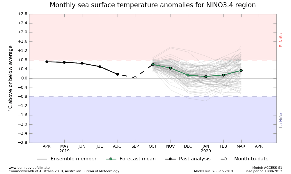
Australia agrees with NOAA
We do not have a new forecast yet from JAMSTEC.
Conclusion
It is inconclusive. I am not a meteorologist. But my lay interpretation of the information is that the level of confidence that ENSO Neutral Conditions will apply into Spring is excessive.
Does it Matter?
That is hard to say. If the difference is between Nino 3.4 of 4.5C versus 5.5C it probably does not matter very much. But if the difference is Nino 3.4 being 3.0C versus 7.0C would matter a great deal. That is the reason for the article tonight.
Recent History of the Nino 3.4 Index which when looked at as three-month averages is called the Ocean Nino Index or ONI.

Clearly in ENSO Neutral right now.


