Written by Sig Silber
Great Lakes, Ohio and Middle Mississippi River Valleys Cold
Updated at 1:30PM EST January 22, 2019 to Update the Graphics which were not available when we published last night.
The MJO is inactive in the Pacific and El Nino has not coupled with the atmosphere so the Jet Stream will allow a ridge (High Pressure) to develop offshore of CONUS which will block storms from entering CONUS from the Pacific. There is one last trough moving across CONUS this week. Then it will be quiet for a while. But cold air intrusions from Canada may continue. The Northern Branch of the Jet Stream is being directed up and over Alaska and it may then be dropping down towards the Great Lakes and New England. As an aside, Groundhog Day will be here soon.

Please share this article – Go to very top of page, right hand side for social media buttons.
From today’s NOAA Discussion
THERE IS STRONG AGREEMENT AMONG BOTH THE DYNAMICAL TOOLS AND STATISTICAL GUIDANCE OF A VERY COLD PATTERN TAKING SHAPE OVER THE CENTRAL AND EASTERN CONUS AS THE POLAR VORTEX SHIFTS SOUTHWARD TO THE VICINITY OF HUDSON BAY FAVORING ARCTIC AIR MASSES BEING PUSHED SOUTHWARD INTO THE CONUS FROM CANADA. AS A RESULT, BELOW NORMAL TEMPERATURES ARE FAVORED ACROSS MUCH OF THE CENTRAL AND EASTERN CONUS, WITH THE HIGHEST PROBABILITIES OVER THE GREAT LAKES, OHIO VALLEY, AND MIDDLE MISSISSIPPI VALLEY. STRONG RIDGING CENTERED OVER THE NORTHEAST PACIFIC FAVORS NEAR TO ABOVE NORMAL TEMPERATURE PROBABILITIES FOR THE WEST COAST. ABOVE NORMAL TEMPERATURE PROBABILITIES ARE FAVORED FOR ALASKA IN ASSOCIATION WITH THE RIDGING AND ABOVE NORMAL 500-HPA HEIGHT ANOMALIES OVER THE REGION.
In our Monday night Weekly Intermediate-Term Weather and Climate Report, we mostly cover Days 6 – 14 and Weeks 3 – 4 which depending on when you read this article covers to about Day 25. We cover Days 1- 5 also but in most cases readers will want to consult their local NWS Office for more detailed information that impacts them in the short term. However, we plan to start publishing a Report that will continually update and provide easy access to products from the NOAA Storm Prediction Center and other parts of NOAA. This will make it easy to see if there are special situations that need to be considered by those living in the areas covered or planning to travel there. It is not intended to replace reliance on the local NWS Offices but will be an easy way to find out if and where that is needed. The first report may be published Wednesday night. .
Here is the recent history of the overall pattern for North America and the North Pacific.

Summary of the Forecast
We now provide our usual summary first for temperature and then for precipitation of small images of the four short-term maps. You can click on these maps to see larger versions. The easiest way to return to this report is by using the “Back Arrow” usually found top left corner of your screen to the left of the URL Box. Larger maps are available later in the article with the discussion and analysis.
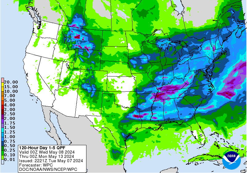
Sometimes it is useful to see the evolution of the forecasts from the 1 – 5 Day, 6 – 10 Day (which NOAA considers to be Week-1 of their intermediate forecast) , 8 – 14 Day (which NOAA considers to be Week-2) and Week 3 and 4 (which after being issued overlap with Week-2). I do not have comparable maps for the Day 1 – 5 forecast in the same format as the three maps we generally work with. What I am showing for temperature is the Day 3 Maximum Temperature and for precipitation the five-day precipitation: the latter being fairly similar in format to the subsequent set of the maps I present each week but showing absolute QPF (inches of precipitation) not QPF deviation from Normal.
First Temperature
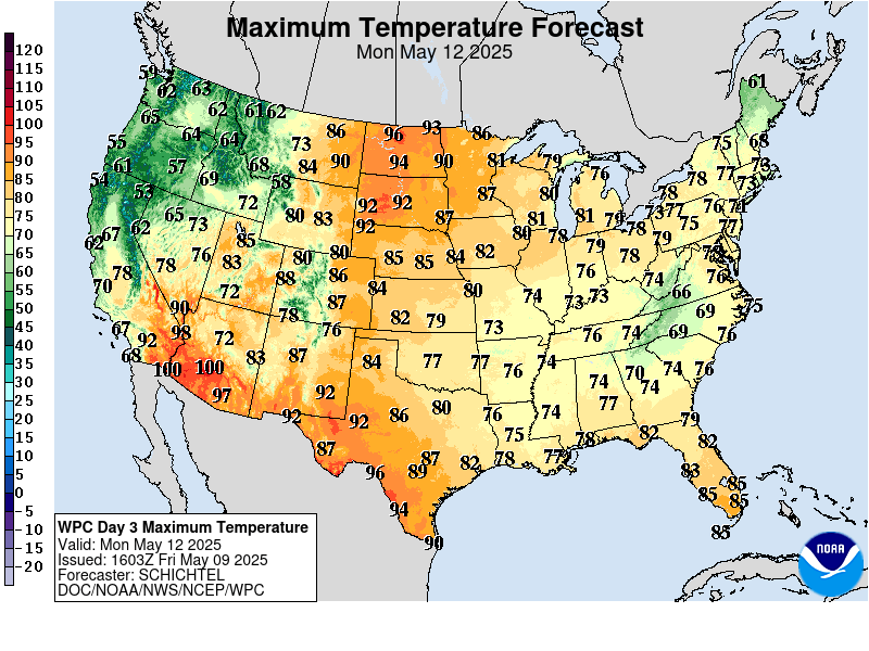 |  |  |  |
| This shows magnitude rather than probability of being higher or lower than Normal and shows the middle day of the five ay period. | The pattern is now mostly zonal (west to east versus meridional north to south to north). But the pattern is moving east very slowly. Notice the large cool anomaly. | The transition from the 8 -14 day forecast shown above to the week 3/4 forecast seems feasible. | |
And then Precipitation
 |  |  | |
| The five day QPF is shown above. The units are different than the other maps i.e. in units of precipitation (inches) not probabilities of exceeding or being less than climatology. | After Day 5, it is generally wet to the north and east but dry west and Southwest. | The transition from the 8 -14 day forecast shown above to the week 3/4 forecast seems feasible. | |
A. Now we will begin with our regular approach and focus on Alaska and CONUS (all U.S.. except Hawaii).
Water Vapor.
This view of the past 24 hours provides a lot of insight as to what is happening.
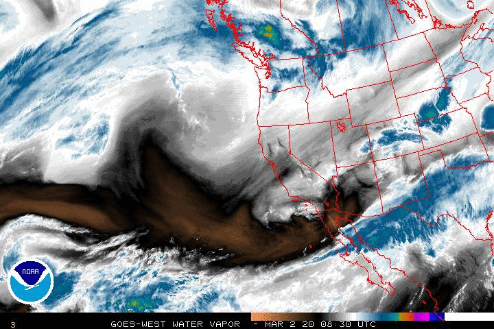
You can see from this animation that moisture has been arriving from both the Northern and Southern branches of the Polar Jet Stream. But the Northern Branch is further north than usual.

Tonight, Monday January 21, 2018, as I am looking at the above graphic, you see very little moisture arriving into CONUS.
We now discuss Atmospheric Rivers i.e. thick concentrated movements of water moisture. More explanation on Atmospheric Rivers can be found by clicking here or if you want more theoretical information by clicking here. The idea is that we have now concluded that moisture often moves via narrow but deep channels in the atmosphere (especially when the source of the moisture is over water) rather than being very spread out. This raises the potential for extreme precipitation events. You can convert this graphic into a flexible forecasting tool by clicking here. One can obtain views of different geographical areas by clicking here.
The graphic we had been using was not updating so for the time being we added another version which is updating. It does not cover all of CONUS but it does provide a very good view of what is happening in the Pacific and the North American West Coast. But the original graphic we were using is not working so we are using both.
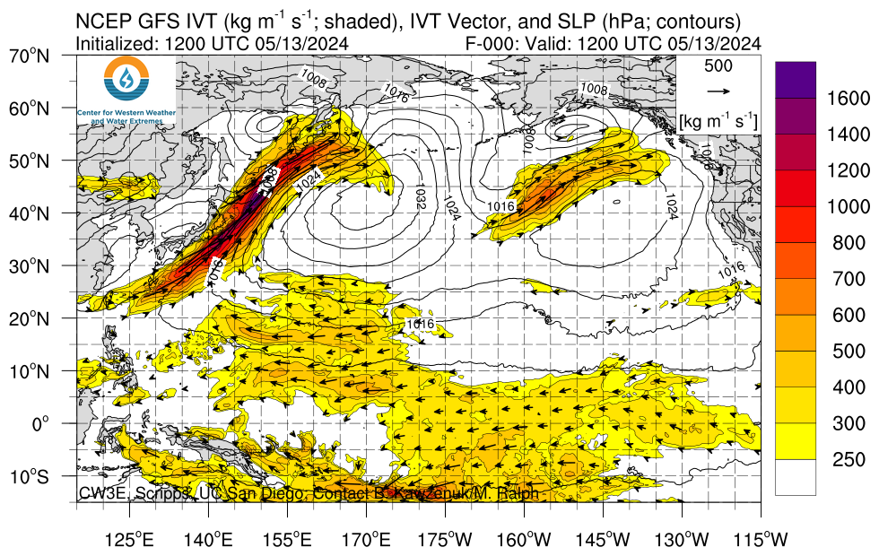
And this graphic is now working again.
And Now the Day One and Two CONUS Forecasts
Day One CONUS Forecast | Day Two CONUS Forecast |
|
|
These graphics update and can be clicked on to enlarge but my brief comments are only applicable to what I see on Monday night prior to publishing. | |
 | |
Except for the Great Lakes Areas, snow looks pretty sparse for the next two days as of Monday Night. | |
Additional useful forecasts are available from our Severe Weather Report which this week can be found here and always can be located via this directory.
60 Hour Forecast Animation
Here is a national animation of weather fronts and precipitation forecasts with four 6-hour projections of the conditions that will apply covering the next 24 hours and a second day of two 12-hour projections the second of which is the forecast for 48 hours out and to the extent it applies for 12 hours, this animation is intended to provide coverage out to 60 hours. Beyond 60 hours, additional maps are available at links provided below. The explanation for the coding used in these maps, i.e. the full legend, can be found here although it includes some symbols that are no longer shown in the graphic because they are implemented by color coding.

The below makes it easier to focus on a particular day. The best way to read them is from left to right on the first row and then from left to right in the row below it.
include(“/home4/aleta/public_html/pages/weather/modules/Weather_Map_by_Day_Matrix.htm”); ?>
What is Behind the Forecasts? Let us try to understand what NOAA is looking at when they issue these forecasts.
Below is a graphic which highlights the forecast surface Highs and the Lows re air pressure on Day 7. The Day 3 forecast can be found here. the Day 6 Forecast can be found here.
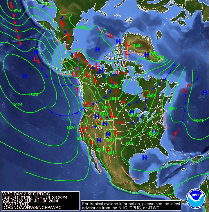
The Aleutian Low is quite strong with surface central pressure of 980Pa and is centered over between Kamchatka and the Western Aleutians There is a high over Western Canada with surface central pressure of 1036 hPa and extends quite far south almost to the border with Mexico. To the west out to sea there is a low with surface central pressure of 1008 hPa and it is not very impressive. We see a Low off the East Coast with surface central pressure of 1008 hPa. There is a Low with surface central pressure of 1004 hPa extending from Greenland into Hudson Bay.
include(“/home4/aleta/public_html/pages/weather/modules/Air_Pressure_Map_by_Day_Matrix.htm”); ?>
Looking at the current activity of the Jet Stream. The below graphics and the above graphics are very related.
Not all weather is controlled by the Jet Stream (which is a high altitude phenomenon) but it does play a major role in steering storm systems especially in the winter The sub-Jet Stream level intensity winds shown by the vectors in this graphic are also very important in understanding the impacts north and south of the Jet Stream which is the higher-speed part of the wind circulation and is shown in gray on this map. In some cases however a Low-Pressure System becomes separated or “cut off” from the Jet Stream. In that case it’s movements may be more difficult to predict until that disturbance is again recaptured by the Jet Stream. This usually is more significant for the lower half of CONUS with the cutoff lows being further south than the Jet Stream. Some basic information on how to interpret the impact of jet streams on weather can be found here and here. I have not provided the ability to click to get larger images as I believe the smaller images shown are easy to read.
| Current | Day 5 |
 |  |
| You can see the current pattern here. | We then see the trough that will bring modified Arctic Air across CONUS. |
Putting the Jet Stream into Motion and Looking Forward a Few Days Also
To see how the pattern is projected to evolve, please click here. In addition to the shaded areas which show an interpretation of the Jet Stream, one can also see the wind vectors (arrows) at the 300 Mb level.
This longer animation shows how the jet stream is crossing the Pacific and when it reaches the U.S. West Coast is going every which way.
Click here to gain access to a very flexible computer graphic. You can adjust what is being displayed by clicking on “earth” adjusting the parameters and then clicking again on “earth” to remove the menu. Right now it is set up to show the 500 hPa wind patterns which is the main way of looking at synoptic weather patterns. This amazing graphic covers North and South America. It could be included in the Worldwide weather forecast section of this report but it is useful here re understanding the wind circulation patterns.
500 MB Mid-Atmosphere View
The map below is the mid-atmosphere 7-Day chart rather than the surface highs and lows and weather features. In some cases it provides a clearer less confusing picture as it shows only the major pressure gradients. This graphic auto-updates so when you look at it you will see NOAA’s latest thinking. The speed at which these troughs and ridges travel across the nation will determine the timing of weather impacts. This graphic auto-updates I think every six hours and it changes a lot. Thinking about clockwise movements around High Pressure Systems and counter- clockwise movements around Low Pressure Systems provides a lot of information.

Here is the whole suite of similar maps for Days 3, 4, 5, 6 and repeated for Day 7. It is quite complicated. Read from left to right first row and then left to right on the second row.
include (“/home4/aleta/public_html/pages/weather/modules/500_Millibar_by_Day_Matrix.htm”); ?>
We are showing both the situation on the surface and at mid-atmosphere 500 mb and the view is different so sometimes it is useful to simply be able to compare them.
| Surface 850MB | Mid Atmosphere 500 MB |
|
|
Here is the seven-day cumulative precipitation forecast. More information in how to interpret this graphic is available here.
Four – Week Outlook: Looking Beyond Days 1 to 5, What is the Forecast for the Following Three + Weeks?
I use “EC” in my discussions although NOAA sometimes uses “EC” (Equal Chances) and sometimes uses “N” (Normal) to pretty much indicate the same thing although “N” may be more definitive.
First – Temperature
6 – 10 Day Temperature Outlook issued today (Note the NOAA Level of Confidence in the Forecast Released on January 21, 2019 was 5 out of 5
8 – 14 Day Temperature Outlook issued today (Note the NOAA Level of Confidence in the Forecast Released on January 21, 2019 was 4 out of 5).
–
Looking further out.
Now – Precipitation
6 – 10 Day Precipitation Outlook Issued Today (Note the NOAA Level of Confidence in the Forecast Released on January 21, 2019 was 5 out of 5)
8 – 14 Day Precipitation Outlook Issued Today (Note the NOAA Level of Confidence in the Forecast Released on January 21, 2019 was 4 out of 5)
Looking further out.
Here is the 6 – 14 Day NOAA discussion released today January 21, 2019
6-10 DAY OUTLOOK FOR JAN 27 – 31 2019
TODAY’S ENSEMBLE MEANS REMAIN IN VERY GOOD AGREEMENT REGARDING A HIGHLY AMPLIFIED 500-HPA HEIGHT PATTERN DEVELOPING OVER THE CONUS. A DEEP LONGWAVE TROUGH IS FORECAST TO BUILD OVER MUCH OF THE EASTERN CONUS, WHILE RIDGING IS EXPECTED OVER THE NORTHEAST PACIFIC. THIS RIDGING IS FORECAST TO EXTEND NORTHWARD THROUGH MAINLAND ALASKA. TROUGHING IS PREDICTED OVER THE BERING STRAIT. TODAY’S MANUAL 500-HPA HEIGHT BLEND IS BASED PRIMARILY ON THE ENSEMBLE MEANS FROM THE ECMWF, GFS, AND CANADIAN MODEL SUITES. THE RESULTANT MANUAL BLEND INDICATES ABOVE NORMAL 500-HPA HEIGHT ANOMALIES OVER THE WESTERN CONUS AND ALASKA. BELOW NORMAL 500-HPA HEIGHT ANOMALIES ARE FORECAST OVER THE EASTERN AND CENTRAL CONUS.
THERE IS STRONG AGREEMENT AMONG BOTH THE DYNAMICAL TOOLS AND STATISTICAL GUIDANCE OF A VERY COLD PATTERN TAKING SHAPE OVER THE CENTRAL AND EASTERN CONUS AS THE POLAR VORTEX SHIFTS SOUTHWARD TO THE VICINITY OF HUDSON BAY FAVORING ARCTIC AIR MASSES BEING PUSHED SOUTHWARD INTO THE CONUS FROM CANADA. AS A RESULT, BELOW NORMAL TEMPERATURES ARE FAVORED ACROSS MUCH OF THE CENTRAL AND EASTERN CONUS, WITH THE HIGHEST PROBABILITIES OVER THE GREAT LAKES, OHIO VALLEY, AND MIDDLE MISSISSIPPI VALLEY. STRONG RIDGING CENTERED OVER THE NORTHEAST PACIFIC FAVORS NEAR TO ABOVE NORMAL TEMPERATURE PROBABILITIES FOR THE WEST COAST. ABOVE NORMAL TEMPERATURE PROBABILITIES ARE FAVORED FOR ALASKA IN ASSOCIATION WITH THE RIDGING AND ABOVE NORMAL 500-HPA HEIGHT ANOMALIES OVER THE REGION.
THE TROUGH BUILDING INTO THE EAST IS FORECAST TO LEAD TO A SURFACE LOW TRACKING OFF THE EAST COAST ALONG A FRONTAL BOUNDARY ON DAY-6 RESULTING IN ENHANCED ABOVE NORMAL PRECIPITATION PROBABILITIES FOR THE EAST COAST. THE TROUGH IN THE EAST COMBINED WITH THE RIDGE OVER THE WEST FAVORS A MEAN STORM TRACK SOUTHWARD OUT OF CENTRAL CANADA, FAVORING ABOVE NORMAL PRECIPITATION OVER THE NORTHERN PLAINS, THE UPPER MISSISSIPPI VALLEY, AND THE GREAT LAKES AREA. BELOW NORMAL PRECIPITATION IS FAVORED FOR MUCH OF THE WESTERN CONUS UNDERNEATH THE RIDGE AND SURFACE HIGH PRESSURE. THESE BELOW NORMAL PRECIPITATION PROBABILITIES EXTEND INTO THE SOUTHERN GREAT PLAINS, WHICH WILL BE DISPLACED FROM THE MEAN STORM TRACK OUT OF CANADA AND ON THE BACKSIDE OF THE MEAN TROUGH AXIS. THERE ARE ENHANCED PROBABILITIES OF ABOVE NORMAL PRECIPITATION FOR MAINLAND ALASKA AND THE ALEUTIANS DUE TO BEING ON THE EASTERN SIDE OF THE TROUGH PREDICTED OVER THE BERING SEA, WHICH FAVORS MULTIPLE CHANCES FOR SURFACE LOW PRESSURE CENTERS TO ROTATE INTO THE STATE.
FORECAST CONFIDENCE FOR THE 6-10 DAY PERIOD: WELL ABOVE AVERAGE, 5 OUT OF 5, DUE TO VERY GOOD AGREEMENT AMONG FORECAST TOOLS AND A HIGHLY AMPLIFIED PATTERN TAKING SHAPE.
8-14 DAY OUTLOOK FOR JAN 29 – FEB 04, 2019
THE ENSEMBLE MEAN SOLUTIONS GENERALLY PREDICT A SIMILAR 500-HPA PATTERN, THOUGH WEAKER COMPARED WITH THE 6-10 DAY PERIOD, ACROSS NORTH AMERICA FOR WEEK-2. TROUGHING AND BELOW NORMAL HEIGHT ANOMALIES ARE FORECAST OVER MOST OF THE EASTERN AND CENTRAL CONUS, CENTERED AROUND THE GREAT LAKES. MEAN RIDGING IS FORECAST TO REMAIN OFF THE WEST COAST WITH ASSOCIATED ABOVE NORMAL MEAN 500-HPA HEIGHT ANOMALIES FAVORED FOR THE SOUTHWESTERN CONUS AND MAINLAND ALASKA, WITH TROUGHING OVER THE BERING STRAIT.
THE TROUGH FORECAST OVER THE EASTERN CONUS AND BELOW NORMAL HEIGHT ANOMALIES RESULT IN ENHANCED PROBABILITIES OF BELOW NORMAL TEMPERATURES OVER MOST OF THE CENTRAL AND EASTERN CONUS. ALL OF OUR TOOLS AGREE THAT THE CORE OF THE COLD IS FAVORED OVER THE UPPER MISSISSIPPI VALLEY AND GREAT LAKES REGION, NEAR THE CENTER OF THE MEAN TROUGH AXIS. ABOVE NORMAL TEMPERATURES ARE FAVORED FOR THE DESERT SOUTHWEST AND CALIFORNIA UNDER ABOVE NORMAL HEIGHT ANOMALIES. RIDGING OVER ALASKA FAVORS ENHANCED PROBABILITIES OF ABOVE NORMAL TEMPERATURES FOR MUCH OF THE STATE.
THE MEAN TROUGH AXIS CENTERED OVER THE EAST AND MULTIPLE SHORTWAVE TROUGHS FAVOR ABOVE NORMAL PRECIPITATION PROBABILITIES FOR THE NORTHERN CONUS. BELOW NORMAL PRECIPITATION PROBABILITIES ARE FAVORED OVER MOST OF THE SOUTHERN CONUS, SOUTHWESTERN ALASKA AND THE ALEUTIANS, WHILE ABOVE NORMAL PRECIPITATION PROBABILITIES ARE MOST LIKELY OVER SOUTHERN TEXAS AND NORTHEASTERN ALASKA, CONSISTENT WITH CALIBRATED PRECIPITATION FROM THE ECMWS ENSEMBLE FORECAST TOOL. THE SOUTHERN STREAM MAY BECOME MORE ACTIVE LATER IN WEEK-2 AS ANOMALOUS NORTHERLY FLOW EASES.
FORECAST CONFIDENCE FOR THE 8-14 DAY PERIOD: ABOVE AVERAGE, 4 OUT OF 5, DUE TO GOOD AGREEMENT BETWEEN ENSEMBLE MEAN SOLUTIONS, AND REASONABLY GOOD AGREEMENT BETWEEN SURFACE TEMPERATURE AND PRECIPITATION TOOLS.
THE NEXT SET OF LONG-LEAD MONTHLY AND SEASONAL OUTLOOKS WILL BE RELEASED ON FEBRUARY 21.
Analogs to the NOAA 6 – 14 Day Outlook.
Now let us take a detailed look at the “Analogs”.
NOAA normally provides two sets of Analogs.
A. Analogs related to the 5 day period centered on 3 days ago and the 7 day period centered on 4 days ago. “Analog” means that the weather pattern then resembles the recent weather pattern and the recent pattern is used to initialize the models to predict the 6 – 14 day Outlook.
B. There is a second set of analogs associated with the Outlook. It compares the forecast (rather than the prior period) to past weather patterns. I have not been regularly analyzing this second set of information. The first set applies to the 5 and 7 day observed pattern prior to today. The second set, relates to the correlation of the forecasted outlook 6 – 10 days out and 8 – 14 days out with similar patterns that have occurred in the past during a longer period that includes the dates covered by the 6 – 10 Day and 8 – 14 Day Outlook. The second set of analogs also has useful information as it indicates that the forecast is feasible in the sense that something like it has happened before. I am not very impressed with that approach. But in some ways both Approach A and B are somewhat similar. I conclude that if the Ocean Condition now are different then the analogs and if the state of ENSO now is different than the analogs that is a reason to have increased lack of confidence in the forecasts and vice versa.
They put the first set of analogs in the discussion with the second set available by a link so I am assuming that the first set of analogs is the most meaningful and I find it so. But NOAA prefers the first set (A) as it helps them (or at least they think it does) assess the quality of the forecast.
Here are today’s analogs in chronological order although this information is also available with the analog dates listed by the level of correlation. I find the chronological order easier for me to work with. It also helps the reader see the impact of the phases of the PDO and AMO which are shown. The first set (A) which is what I am using today applies to the 5 and 7 day observed pattern prior to today.
| Centered Day | ENSO Phase | PDO* | AMO* | Other Comments |
| Jan 13, 1974 | La Nina | – | – | |
| Jan 1, 1994 | Neutral | + | – | |
| Jan 14, 1996 | La Nina | + | – (t) | |
| Jan 15, 1996 | La Nina | + | – (t) | |
| Jan 19, 1997 | Neutral | + (t) | – | Prior to 97/98 MegaNino |
| Jan 20, 1997 | Neutral | + (t) | – | Prior to 97/98 MegaNino |
| Jan 26, 1997 (2) | Neutral | + (t) | – | Prior to 97/98 MegaNino |
| Jan 16, 2005 | El Nino | + (t) | + | Tail End Modoki Type II |
| Jan 17, 2005 | El Nino | + (t) | + | Tail End Modoki Type II |
* I assign values that are consistent with the trend so I am doing some subjective smoothing with respect to the Phases of the AMO and PDO shown in this table. (t) = a month where the Ocean Cycle Index has just changed from a consistent pattern or does change the following month to a consistent pattern.
The spread among the analogs from January 1 to January 26, 2019 is 25 days which is the same as last week. I have not calculated the centroid of this distribution which would be the better way to look at things but the midpoint, which is a lot easier to calculate, and fairly accurate if the dates are reasonably evenly distributed, is about January 14. These analogs are describing historical weather that was centered on 3 days and 4 days ago (January 16 or January 17). So the analogs could be considered to be pretty much in sync with respect to weather that we would normally be getting right now.
For more information on Analogs see discussion in the GEI Weather Page Glossary. For sure it is a rough measure as there are so many historical patterns but not enough to be a perfect match with current conditions. I use it mainly to see how our current conditions match against somewhat similar patterns and the ocean phases that prevailed during those prior patterns. If everything lines up I have my own measure of confidence in the NOAA forecast. Similar initial conditions should lead to similar weather. I am a mathematician so that is how I think about models.
Including duplicates, there are two El Nino Analogs, five Neutral analogs and three La Nina Analogs. The pre-forecast analogs this week strongly favor McCabe Condition A which is “Very little drought Southern Tier and Northern Tier from the Dakotas east with some drought on East Coast “. This somewhat contradicts the forecast but it may be that these analogs are signaling a transition that is a few weeks out.
include(“/home4/aleta/public_html/pages/weather/modules/McCabe_background_information.htm”); ?>
Historical Anomaly Analysis
When I see the same dates showing up often I find it interesting to consult this list.
A Useful Read
Some might find this analysis which you need to click to read interesting as the organization which prepares it focuses on the Pacific Ocean and looks at things from a very detailed perspective and their analysis provides a lot of information on the history and evolution of ENSO events.
Some Indices of Possible Interest: We should always remember that the forecast is driven by many factors some of which are conflicting in terms of their impacts. Please pay more attention to the graphics than my commentary which does not update on a regular basis once the article is published. The indices will continue to update. I provide these indices as they are important guidelines to the weather. It is in a way looking at the factors that are impacting the weather. There were developed because weather forecasters found them to be useful.

include (“/home4/aleta/public_html/pages/weather/modules/AO_NAO_PNA_MJO_Background_Information.htm”); ?>

We provided additional information in the introduction to this Article.
Madden Julian Oscillation (MJO)
The MJO is an area of convective activity along the Equator which circles the globe generally in 30 to 60 days. The location of the convective activity not only impacts the Equator but also the middle latitudes. Most people are not familiar with the MJO but at certain times it plays an important role Worldwide re weather and for CONUS.
There are a lot of models and I try to read the results from all of them. For access to a variety of models, I refer readers here. This weekly report summarizes things. Here is another useful source of information.
First we look at two models that I find very helpful. On the GFS graphic , the light gray shading shows the tracks which fit with 90% of the forecasts and the dark gray shading shows a smaller area that fits with 50% of the forecasts The large dot is the current location.

It is sometimes useful to look at the recent history of the MJO.


Here is another way of looking at this information through time with a Hovmoeller graphic.

Then the first of the two graphics we typically present which shows where the MJO is now how it got there.

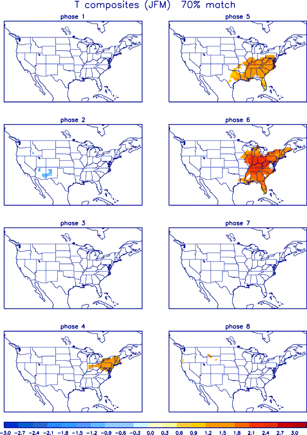
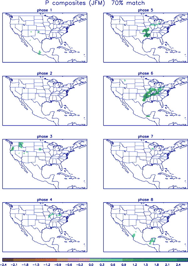
This shows the recent history. MJO is now in Phase 4 (close to the origin in this graphic).
And then a forecast.

Remember we are interested in how the MJO impacts CONUS weather during late-January to early February. So I have displayed the JFM information this week.
Recent CONUS Weather
This is provided mainly to see the pattern in the weather that has occurred recently.
| And the 30 Days ending January 12, 2019 | And the 30 Days ending January 20, 2018 |
|  |
| You can already see the shift north of the precipitation track. We also see warming for the past 30 days. | The West is wetter. |
Remember, these maps are a 30 average so the most distant seven days are removed and the most recent seven days are added. | |

B. Beyond Alaska and CONUS Let’s Look at the World which of course also includes Alaska and CONUS
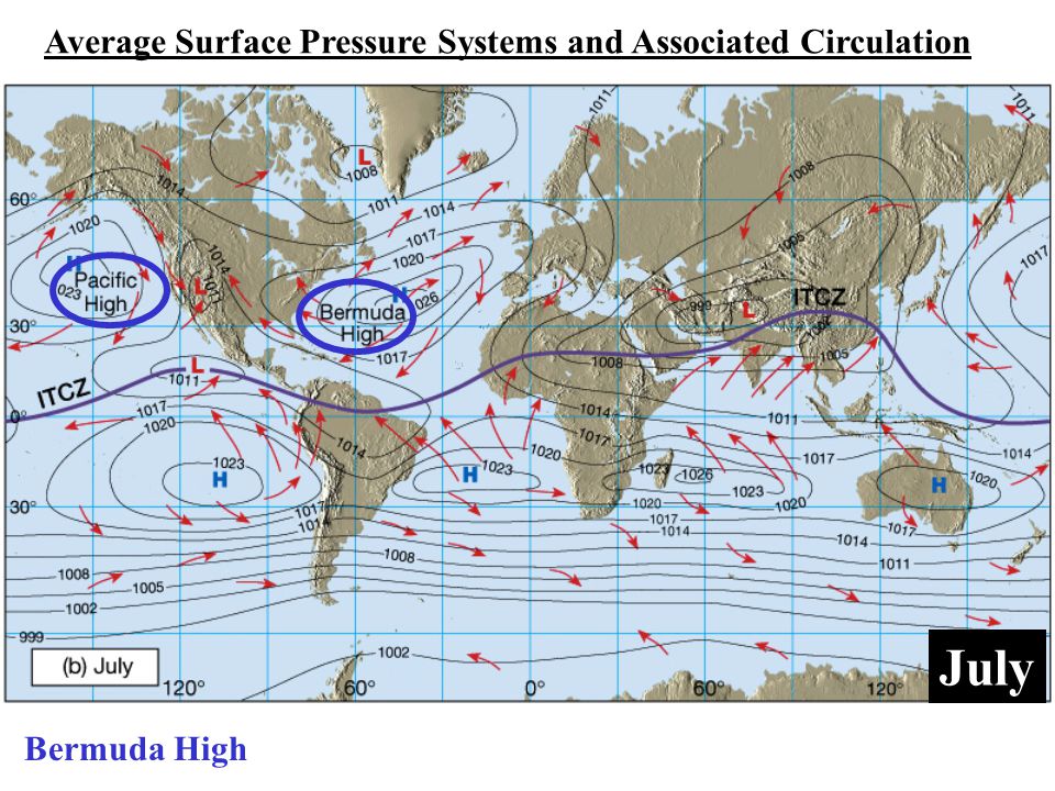
It is Useful to Understand the Semipermanent Pattern that Control our Weather and Consider how These Change from Winter to Summer. These two graphics (click on each one to enlarge) are from a much larger set available from the Weather Channel. They highlight the position of the Bermuda High which they are calling the Azores High in the January graphic and is often called NASH and it has a very big impact on CONUS Southeast weather and also the Southwest. You also see the north/south migration of the Pacific High which also has many names and which is extremely important for CONUS weather and it also shows the change of location of the ITCZ which I think is key to understanding the Indian Monsoon. A lot of things become much clearer when you understand these semi-permanent features some of which have cycles within the year, longer period cycles and may be impacted by Global Warming. We are now moving into early February. We should be beginning to return from the set of positions shown below for the Winter Pattern to the Summer Pattern. For CONUS, the seasonal repositioning of the Bermuda High and the Pacific High are very significant.
 |  |
World Forecasts
1. Today (Source: University of Maine)
2. Short-term set for day six but can be adjusted (BOM – Australia)
3. 8 – 14 Day (NOAA/Canada/Mexico Experimental NAEFS))
4 Tropical Activity
1. Forecast for Today (you can click on the maps to enlarge them)

And now precipitation

Additional Maps showing different weather variables can be found here.
2. Forecast for Day 6 (Currently Set for Day 6 but the reader can change that)
World Weather Forecast produced by the Australian Bureau of Meteorology. Unfortunately I do not know how to extract the control panel and embed it into my report so that you could use the tool within my report. But if you visit it Click Here and you will be able to use the tool to view temperature or many other things for THE WORLD. It can forecast out for a week. Pretty cool. Return to this report by using the “Back Arrow” usually found top left corner of your screen to the left of the URL Box. It may require hitting it a few times depending on how deep you are into the BOM tool. Below are the current worldwide precipitation and temperature forecasts for six days out. They will auto-update and be current for Day 6 whenever you view them. If you want the forecast for a different day Click Here

Please remember this graphic updates every six hours so the diurnal pattern can confuse the reader.
Now Precipitation

3. And now we have experimental 8 – 14 Day World forecasts from the NAEFS Model.
First Temperature

Then Precipitation

4. Tropical Hazards.

C. ENSO SUMMARY of Current Status.
Current Status of ENSO
IRI just issued their update so we will present that now.
IRI ENSO Forecast
IRI Technical ENSO Update
Published: January 18, 2019
Note: The SST anomalies cited below refer to the OISSTv2 SST data set, and not ERSSTv4. OISSTv2 is often used for real-time analysis and model initialization, while ERSSTv4 is used for retrospective official ENSO diagnosis because it is more homogeneous over time, allowing for more accurate comparisons among ENSO events that are years apart. During ENSO events, OISSTv2 often shows stronger anomalies than ERSSTv4, and during very strong events the two datasets may differ by as much as 0.5 C. Additionally, the ERSSTv4 may tend to be cooler than OISSTv2, because ERSSTv4 is expressed relative to a base period that is updated every 5 years, while the base period of OISSTv2 is updated every 10 years and so, half of the time, is based on a slightly older period and does not account as much for the slow warming trend in the tropical Pacific SST.
Recent and Current Conditions
In mid-January 2019, weak El Niño SST conditions were observed in the NINO3.4 region. The December SST anomaly was 1.01 C, at the “bottom” of the moderate El Niño range, and for Oct-Dec it was 0.95 C, indicative of a weak El Niño. The IRI’s definition of El Niño, like NOAA/Climate Prediction Center’s, requires that the SST anomaly in the Nino3.4 region (5S-5N; 170W-120W) exceed 0.5 C. Similarly, for La Niña, the anomaly must be -0.5 C or less. The climatological probabilities for La Niña, neutral, and El Niño conditions vary seasonally, and are shown in a table at the bottom of this page for each 3-month season. The most recent weekly anomaly in the Nino3.4 region was 0.4, indicating warm-neutral conditions. The band of warmed SST extends somewhat west of the Date Line, making the typical west-to-east SST anomaly gradient weaker than normally seen in an El Niño event. During the most recent week, the strength of the positive SST anomaly has weakened to the east of the dateline, but less so just west of the dateline. Despite the warmed SSTs, many of the key atmospheric variables, such as the lower level zonal wind anomalies, the sea level pressure pattern (e.g., the Southern Oscillation index) and the outgoing longwave radiation pattern (convection), have not suggested El Niño conditions, but rather a continuation of ENSO-neutral conditions. Thus, the coupling of the atmosphere to the oceanic conditions has been largely lacking. The subsurface temperature anomalies across the eastern equatorial Pacific remain above-average, although less strongly so over the last month. These warmed waters at depth extend to the surface, resulting in above-average temperatures, and also presaging likely continuation of above-average SST in the coming one to two months. Given the current El Niño-level SST anomalies and the subsurface profile, even with currently poor atmospheric coupling it appears likely that the SST will continue at least at weak El Niño levels through winter and possibly also through spring. This expectation assumes that the atmosphere will finally begin participating in the event more in the coming month or two.
Expected Conditions
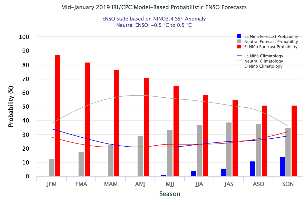
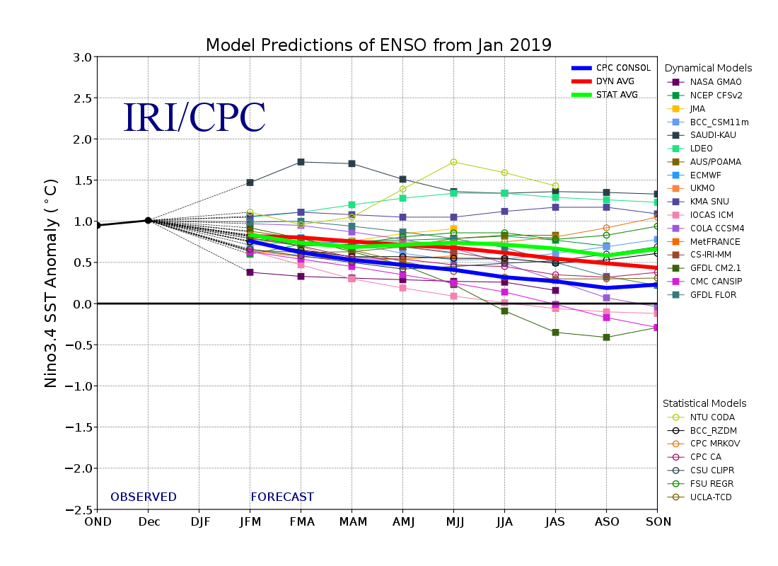
What is the outlook for the ENSO status going forward? The most recent official diagnosis and outlook was issued approximately one week ago in the NOAA/Climate Prediction Center ENSO Diagnostic Discussion, produced jointly by CPC and IRI; it gave a 65% chance for El Niño continuing through spring. An El Niño watch remains active. The latest set of model ENSO predictions, from mid-January, now available in the IRI/CPC ENSO prediction plume, is discussed below. As of mid-January, more than 90% of the dynamical or statistical models predict El Niño conditions for the initial Jan-Mar and Feb-Apr seasons, with less than 10% showing neutral conditions. After Feb-Apr, the percentage of models forecasting El Niño decreases, dropping to 75% for Apr-Jun, 60% for Jun-Aug and to near 55% for Aug-Oct and Sep-Nov. No model predicts La Niña for any season.
Note – Only models that produce a new ENSO prediction every month are included in the above statement.
Caution is advised in interpreting the distribution of model predictions as the actual probabilities. At longer leads, the skill of the models degrades, and skill uncertainty must be convolved with the uncertainties from initial conditions and differing model physics, leading to more climatological probabilities in the long-lead ENSO Outlook than might be suggested by the suite of models. Furthermore, the expected skill of one model versus another has not been established using uniform validation procedures, which may cause a difference in the true probability distribution from that taken verbatim from the raw model predictions.
An alternative way to assess the probabilities of the three possible ENSO conditions is more quantitatively precise and less vulnerable to sampling errors than the categorical tallying method used above. This alternative method uses the mean of the predictions of all models on the plume, equally weighted, and constructs a standard error function centered on that mean. The standard error is Gaussian in shape, and has its width determined by an estimate of overall expected model skill for the season of the year and the lead time. Higher skill results in a relatively narrower error distribution, while low skill results in an error distribution with width approaching that of the historical observed distribution. This method shows probabilities for La Niña at near 0% from Jan-Mar through May-Jul, rising only to 6% by Jul-Sep and to 14% by Sep-Nov. Probabilities for neutral conditions begin at 13% for Jan-Mar, rise slowly to 29% for Apr-Jun, and to 35-40% for Jun-Aug through Sep-Nov. Probabilities for El Niño, which begin at 87% for Jan-Mar, drop through the 70-79% range for Mar-May and Apr-Jun, settling to the 50-55% range for Jul-Sep through Sep-Nov. The failure to drop below 50% by early autumn suggests a possibility for a two-year El Niño event. A plot of the probabilities generated from this most recent IRI/CPC ENSO prediction plume using the multi-model mean and the Gaussian standard error method summarizes the model consensus out to about 10 months into the future.
The same cautions mentioned above for the distributional count of model predictions apply to this Gaussian standard error method of inferring probabilities, due to differing model biases and skills. In particular, this approach considers only the mean of the predictions, and not the total range across the models, nor the ensemble range within individual models.
In summary, the probabilities derived from the models on the IRI/CPC plume describe, on average, a substantial tilt of the odds toward El Niño conditions from Jan-Mar through Mar-May 2019, becoming weaker but still at least 50% through the final season of Sep-Nov. Probabilities for La Niña are close to zero through May-Jul. A caution regarding this latest set of model-based ENSO plume predictions, is that factors such as known specific model biases and recent changes that the models may have missed will be taken into account in the next official outlook to be generated and issued early next month by CPC and IRI, which will include some human judgment in combination with the model guidance.
This section is organized into three parts.
1. Current Sea Surface Temperatures (SST)
2. Current Nino 3.4 Readings
3. The Surface Air Pressure Pattern that confirms the state of ENSO.
1. Current and Recent Sea Surface Temperatures (SST)
A major driver of weather is Surface Ocean Temperatures. Evaporation only occurs from the Surface of Water. So we are very interested in the temperatures of water especially when these temperatures deviate from seasonal norms thus creating an anomaly. The geographical distribution of the anomalies is very important. To a substantial extent, the temperature anomalies along the Equator have disproportionate impact on weather so we study them intensely and that is what the ENSO (El Nino – Southern Oscillation) cycle is all about. Subsurface water can be thought of as the future surface temperatures. They may have only indirect impacts on current weather but they have major impacts on future weather by changing the temperature of the water surface. Winds and Convection (evaporation forming clouds) is weather and is a result of the Phases of ENSO and also a feedback loop that perpetuates the current Phase of ENSO or changes it. That is why we monitor winds and convection along or near the Equator especially the Equator in the Eastern Pacific.
My focus here is sea surface temperature anomalies as they are one of the two largest factors determining weather around the World. If we want to have a good feel for future weather we need to look at the oceans as our weather mostly comes from oceans and we need to look at surface temperature anomalies (weather develops from the ocean surface
It is the ocean surface that interacts with the atmosphere and causes convection and also the warming and cooling of the atmosphere. So we are interested in the actual ocean surface temperatures and the departure from seasonal normal temperatures which is called “departures” or “anomalies”. Since warm water facilitates evaporation which results in cloud convection, the pattern of SST anomalies suggests how the weather pattern east of the anomalies will be different than normal.
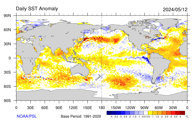
Current Sea Surface Temperature (SST) Departures from Normal for this Time of the Year i.e. Anomalies
First the categorization of the current Monthly Average SST anomalies. | ||||
| Mediterranean, Black Sea and Caspian Sea | Western Pacific | West of North America | North and East of North America | North Atlantic |
Mediterranean and Black Sea and Red Sea slightly warm, Caspian Sea cool | Warm | Warm especially in Gulf of Alaska but also down along the West Coast | Great Lakes cool Cool north of Cape Hatteras Warm around Florida and the Greater Antilles and north of Cancun | Not shown in this map other than the North Atlantic which is Neutral |
| Equator | Looks like El Nino but Barely | |||
 | ||||
| Africa | West of Australia | North, South and East of Australia | West of South America | East of South America |
Warm off Mozambique and Tanzania extending beyond Madagascar Warm offshore of Angola | Cool | Cool NW Warm south and intense SE and beyond New Zealand | Neutral except cool off 40S | Cool of 10N Warm 20S extending to Africa. Warm 40S to 50S. Cool south of Cape Horn |
Then we look at the change in the anomalies. The SST anomaly is sort of like the first derivative and the change in the anomaly is somewhat like a second derivative. It tells us if the anomaly is becoming more or less intense.

I am only showing the currently issued version of the NINO SST Index Table as the prior values are shown in the small graphics on the right with this graphic. The same data in graphic form but going back a couple of more years can be found here. The full table of values can be found here. NOAA considers Nino 3.4 shown in the graphic as the best indicator of Equatorial Surface Temperature Anomalies associated with different phases of ENSO. There is a duration requirement to be a recorded El Nino or La Nina but to have El Nino Conditions the Nino 3.4 index needs to be +0.5C or warmer and to have La Nina Conditions the Nino 3.4 Index needs to be -0.5C or cooler.

This graphic brings the Nino 3.4 up to date and is easy to read.

Here is a daily version


Starting with Surface Conditions.
TAO/TRITON GRAPHIC (a good way of viewing data related to the part of the Equator and the waters close to the Equator in the Eastern Pacific where we monitor to determining the current phase of ENSO. It is probably not necessary to follow the discussion below, but here is a link to TAO/TRITON terminology.
And here is the current version of the TAO/TRITON Graphic. The top part shows the actual temperatures, the bottom part shows the anomalies i.e. the deviation from normal.

| ———————————————— | A | B | C | D | E | —————– |


This may help put the above graphics in focus.

Updated ONI History

3. The Surface Air Pressure that Confirms the Nino 3.4 Index
And of course Queensland Australia is the official keeper of the SOI measurements.

SOI = 10 X [ Pdiff – Pdiffav ]/ SD(Pdiff) where Pdiff = (average Tahiti MSLP for the month) – (average Darwin MSLP for the month), Pdiffav = long term average of Pdiff for the month in question, and SD(Pdiff) = long term standard deviation of Pdiff for the month in question. So really it is comparing the extent to which Tahiti is more cloudy than Darwin, Australia. During El Nino we expect Darwin Australia to have lower air pressure and more convection than Tahiti (Negative SOI especially lower than -7 correlates with El Nino Conditions). During La Nina we expect the Warm Pool to be further east resulting in Positive SOI values greater than +7).
D. Putting it all Together.
At this time, La Nina Conditions along the Equator have come to an end and we are solidly into ENSO Neutral and possibly entering into El Nino Conditions. But the drivers of a transition to El Nino are not solidly in place. In fact this is almost unprecedented in terms of the lateness of the arrival of a potential El Nino. If an El Nino it will be where the Peak Value of the Nino 3.4 Index will be achieved early on and will be in decline the rest of the time which has different impacts than an El Nino with a stable Nino 3.4 Index.
E. Relevant Recent Articles and Reports
Weather in the News
Nothing to Report
Global Warming in the News
Nothing to Report
F. Useful Reference Information
Understand How the Jet Stream Impacts Weather
include(“/home4/aleta/public_html/pages/weather/modules/Jet_Streak_Four_Quadrant_Analysis.htm”); ?>
include(“/home4/aleta/public_html/pages/weather/modules/MJO_and_ENSO_Interaction_Matrix.htm”); ?>
Standard Pressure Levels
include(“/home4/aleta/public_html/pages/weather/modules/Standard_Pressure_surfaces.htm”); ?> include(“/home4/aleta/public_html/pages/weather/modules/Table_of_Contents_for_Part_II.htm”); ?>


