
Written by Sig Silber
It depends on where he lives, how early he gets up and if he sees his shadow he will be wrong. NOAA has done their end of month update of the following Month Outlook which is for February. There is the first hint in their discussion that they realize this El Nino is westwardly displaced. Rise and shine NOAA!

This is the Regular Edition of my weekly Weather and Climate Update Report. Additional information can be found here on Page II of the Global Economic Intersection Weather and Climate Report.

Earlier today (Monday) when I looked, this was the hourly outlook.

At 9 pm Mountain Time Monday when I looked, this is what I saw.

It is nip and tuck.
For more recent updates go to Punxsutawney Weather Forecast.
NOAA has updated their Early Outlook for February.
Prior Temperature Outlook.

New Temperature Outlook

Prior Precipitation Outlook

New Precipitation Outlook

Excerpts for the NOAA Discussion released yesterday January 31.
30-DAY OUTLOOK DISCUSSION FOR FEBRUARY 2016
THE UPDATE OF THE FEBRUARY 2016 FORECAST AT THE VERY END OF JANUARY IS BASED PRIMARILY ON DYNAMICAL MODEL PREDICTION THAT TAKE INTO ACCOUNT THE INITIAL STATE OF THE ATMOSPHERE AT THE PRESENT TIME. THIS GENERALLY YIELDS HELPFUL INFORMATION FOR THE FIRST SEVERAL DAYS OF THE MONTH. SPECIFIC TOOLS CONSULTED FOR THIS PURPOSE ARE THE GFS, GEFS AND CFS, WPC’S LATEST DAY 1-7 FORECAST FOR QPF AND ALSO YESTERDAY’S WEEK 2 FORECAST AND THE EXPERIMENTAL WEEK 3 AND 4 FORECAST MADE JUST 2 DAYS AGO. THE LONG LEAD FORECAST FOR FEBRUARY MADE AT MID-MONTH NEEDS ONLY MINOR ADJUSTMENT FOR TEMPERATURE. FOR PRECIPITATION THE ADJUSTMENT IS SOMEWHAT LARGER. THE CANONICAL ENSO RESPONSE FOR PRECIPITATION OVER THE US DOES NOT APPEAR TO BE FIRMLY IN PLACE FOR THE FIRST 2 WEEKS AT LEAST. [Editor’s Note: NOAA noticed]. FOR BOTH TEMPERATURE AND PRECIPITATION THE ADJUSTMENTS ARE MAINLY IN TERMS OF PROBABILITY. PATTERN CHANGES ARE RELATIVELY SMALL AND NO 2-CLASS CHANGES.
A PRECIPITATION EVENT CURRENTLY UNDERWAY IN SOUTHERN CALIFORNIA WILL PRODUCE A NARROW STRIPE OF PRECIPITATION FROM SOUTHERN CALIFORNIA TO THE GREAT LAKES BUT IN NONE OF THESE AREAS WILL THIS SYNOPTIC EVENT BE ENOUGH TO FORCE THE MONTHLY TOTAL IN THE ABOVE MEDIAN TERCILE. PROBABILITIES FOR BELOW MEDIAN HAVE BEEN REDUCED IN THE GREAT LAKES AREA, WHILE PROBABILITY FOR ABOVE MEDIAN PRECIPITATION HAVE BEEN PUSHED NORTHWARD IN UTAH AND COLORADO. WE REDUCED THE PROBABILITY FOR ABOVE MEDIAN PRECIPITATION IN TEXAS AND SOUTHERN NEW MEXICO AND ARIZONA BECAUSE CFS, WHICH COMBINES THE WELL PREDICTED EARLY SYNOPTIC EVENTS WITH THE CLIMATE SIGNAL IN THE REMAINDER OF THE MONTH, PREDICTS LITTLE PRECIPITATION IN THOSE AREAS. IN OTHER AREAS THE PRECIPITATION FORECAST IS UNCHANGED FROM MID-JANUARY.
AS FOR TEMPERATURE WE REDUCED THE PROBABILITY FOR ABOVE NORMAL ACROSS THE NORTHERN TIER EAST OF THE DAKOTAS SOMEWHAT BECAUSE AFTER A MILD START A COLD AIR OUTBREAK IN THE 2ND WEEK SEEMS LIKELY. BASED ON CFS WE EXTENDED THE BELOW NORMAL AREA ACROSS THE SOUTH SLIGHTLY INTO COLORADO. IN OTHER AREAS THE TEMPERATURE FORECAST IS UNCHANGED FROM MID-JANUARY.
THE MADDEN-JULIAN OSCILLATION IS A POTENTIAL CONTRIBUTOR TO THE VARIABILITY OVER NORTH AMERICA BUT IS CURRENTLY WEAK. MOST OUTLOOKS SHOW IT WILL STRENGTHEN SO IF THIS HAPPENS IT WILL BE CONSIDERED IN THE UPDATE.
DYNAMICAL MODEL OUTPUTS, INCLUDING THE NMME AND CFS, PLAYED A ROLE IN THE OUTLOOKS. IN THE TEMPERATURE FIELDS, MOST OF THE MODELS IN THE NMME SUITE INDICATE PATTERNS CONSISTENT WITH THE EL NINO REGRESSIONS OR COMPOSITES, WITH SOME SMALL SPATIAL SHIFTS. [Editor’s Note: NOAA FINALLY has noticed that his El Nino is a bit different that the typical El Nino] THE NMME AND CFS MODEL OUTLOOKS FOR PRECIPITATION ARE ALSO CONSISTENT WITH CANONICAL, EL NINO COMPOSITES AND CORRELATION MAPS. GUIDANCE FROM THE CFS HAS BEEN CONSISTENT AND ALIGNS WELL WITH CORRELATION MAPS OF FEBRUARY PRECIPITATION WITH NINO3.4 VALUES. THOSE CORRELATIONS IMPLY ABOVE MEDIAN PRECIPITATION ACROSS THE SOUTHERN TIER OF THE CONUS, ALONG MUCH OF THE WEST COAST, AND SOUTHERN PORTIONS OF THE MID-ATLANTIC.
ENHANCED ODDS FOR ABOVE NORMAL TEMPERATURES (UP TO 50%) ARE PREDICTED ALONG THE WEST COAST AND THE NORTHERN STATES ALL THE WAY TO NEW ENGLAND AND THE NORTHERN MID-ATLANTIC. MUCH OF ALASKA IS PREDICTED TO HAVE ENHANCED PROBABILITIES FOR ABOVE NORMAL TEMPERATURES, EXCEPT ALONG ITS WEST COAST WHERE EQUAL CHANCES (EC) IS FAVORED. THE ALASKA PANHANDLE HAS 50% CHANCE FOR THE ABOVE NORMAL TERCILE. ELEVATED CHANCES FOR BELOW NORMAL TEMPERATURES ARE INDICATED ONLY IN TEXAS AND ALONG THE GULF COAST.
ENHANCED ODDS FOR ABOVE-MEDIAN PRECIPITATION ARE FORECAST ACROSS CALIFORNIA, THE SOUTHWEST, CENTRAL/SOUTHERN GREAT PLAINS, GULF COAST STATES, PARTS OF THE EAST COAST AND ALSO SOUTHERN COASTAL ALASKA. THE HIGHEST PROBABILITIES (UP TO 60 PERCENT) FOR ABOVE-MEDIAN PRECIPITATION ARE FORECAST ACROSS THE FLORIDA PENINSULA. FEBRUARY TYPICALLY HAS THE STRONGEST SIGNAL DURING EL NINO. BELOW-MEDIAN PRECIPITATION IS FAVORED ACROSS THE NORTHERN ROCKIES, PARTS OF THE NORTHERN GREAT PLAINS, GREAT LAKES, THE OHIO VALLEY AND MUCH OF ALASKA EXCEPT ITS SOUTHERN COAST. THE DRY SIGNAL ACROSS THE OHIO VALLEY PEAKS TYPICALLY IN FEBRUARY DURING EL NINO.
Sometimes it is useful to compare the present month outlook to the three-month outlook
February plus February – March – April Outlook

One can mentally subtract the February Outlook from the three-month Outlook and create the Outlook for the last two months in the three-month period namely March and April 2016. When I do that, I deduce that February and March will be:
One has to keep in mind that we are now subtracting a January 31 February Map from a January 21 Three-month map so it is less reliable than the exercise we went through last week. We are assuming that the three-month outlook issued on January 21 would not change if it was released today. The results in the box above might be an indication of how the three-month outlook might have been modified if issued today. Also early February is still being impacted by the Active Phase of the MJO which will not be active later in February and into early March based on the cyclical aspect of the MJO. That very well may not have been considered during the preparation of the three-month outlook on January 21, 2016 since the exact timing of the phases of the MJO are not yet able to be forecast accurately.
Let’s Now Focus on the Current (Right Now to 5 Days Out) Weather Situation.
A more complete version of this report with daily forecasts is available in Part II. This is a summary of that more extensive report. This link Worldwide Weather: Current and Three-Month Outlooks: 15 Month Outlooks will take you directly to that set of information but it may take a few seconds for your browser to go through the two-step process of getting to Page II and then moving to the Section within Page II that is specified by this link.
First, here is a national animation of weather front and precipitation forecasts with four 6-hour projections of the conditions that will apply covering the next 24 hours and a second day of two 12-hour projections the second of which is the forecast for 48 hours out and to the extent it applies for 12 hours, this animation is intended to provide coverage out to 60 hours. Beyond 60 hours, additional maps are available at the link provided above.

The explanation for the coding used in these maps, i.e. the full legend, can be found here although it includes some symbols that are no longer shown in the graphic because they are implemented by color coding.
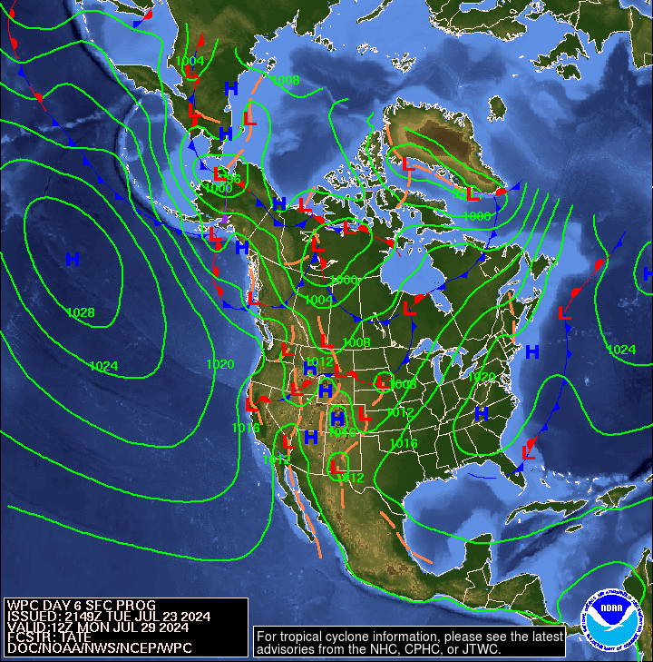
The map below is the mid-atmosphere 7-Day chart rather than the surface highs and lows and weather features. In some cases it provides a clearer less confusing picture as it shows only the major pressure gradients.This graphic auto-updates so when you look at it you will see NOAA’s latest thinking. The speed at which these troughs and ridges travel across the nation will determine the timing of weather impacts. This graphic auto-updates I think every six hours and it changes a lot. Right now it is showing for Day 7 a far Western and an Eastern Ridge with a huge trough from the Great Lakes south. That means that one can decide what sort of weather one prefers and adjust their travel plans accordingly.

Because “Thickness Lines” are shown by those green lines on this graphic it is a good place to define “Thickness” and its uses. The thickness lines are now projected on Day 7 to be below 540 for CONUS only in the upper Northwest and Mountain States/Northern Plains Area. The 540 Level general signifies equal chances for snow at sea level locations. The level of storm activity in the Western Pacific has picked up since the MJO has transitioned to its active phase but that is slow shifting to its inactive phase. Notice the Northern Pacific is like a giant anticyclone with clockwise motion so that which gets sent west due to El Nino is to some extent returned to North America but at higher latitudes.

As I am looking at the below graphic Monday evening February 1, I see a northern shifted weather pattern. This graphic updates automatically so it most likely will look different by the time you look at it as the weather patterns are moving from west to east.

Below is an analysis of projected tropical hazards and benefits over an approximately two-week period. This graphic is scheduled to update on Tuesday and I am reading the Jan 26, 2016 Version and looking at Week 2 of that forecast. Mostly I see for the period February 3 – February 9, 2016 a moderate chance of below average precipitation for the Eastern part of the Maritime Continent and Brazil. There is a moderate chance of above normal precipitation for Eastern Africa and the Western part of the Maritime. There is also a risk of cyclonic activity east of East Africa which could impact Madagascar. .
Below is a graphic which highlights the forecasted surface Highs and the Lows re air pressure on Day 6 (the Day 3 forecast is available on Page II of this Report). This graphic also auto-updates. In recent weeks, the projected location and strength of the Aleutian Low has varied a lot. On some days, the forecast is showing a split low with each of the two lows weaker than a combined single Low. Right now the forecasted Low has an hPa of 984 which is quite intense (the average in the winter is 1001hPa and 994 hPa for a non-split Low) but higher than recently. It is a split low. The largest part of this split low is further west than is ideal for El Nino providing precipitation to California and points south. The smaller Low impacts Siberia. The rapidly shifting position of the Low makes a big difference in how storms are steered. With this forecast, one has a hard time figuring out what is going to happen.
Last week we noted that that the pattern we saw in this graphic was inconsistent with the 6 – 10 Day Forecast which NOAA was so confident in so we concluded that one or the other was incorrect. We were right about that. This week I think the 6 – 14 Day Outlook may be consistent with this graphic if we were in a La Nina year.
A longer discussion of the climate of Beringia and the role of the Aleutian Low is in Part II of this Report: 2. Medium Frequency Cycles such as ENSO and IOD.
Looking at the current activity of the Jet Stream one can certainly see how the Jet Stream is meandering.

And here is the forecast out five days. It still shows the Jet Stream staying north for the Western part of CONUS. Of course this is a forecast and changes daily or perhaps even more frequently. But not all weather is controlled by the Jet Stream (which is a high altitude phenomenon) but it plays a major role in steering storm systems.

To see how the pattern is projected to evolve, please click here. In addition to the shaded areas which show an interpretation of the Jet Stream, one can also see the wind vectors (arrows) at the 300 Mb level.
This longer animation shows how the jet stream is crossing the Pacific and when it reaches the U.S. West Coast is going every which way.
Here is a very flexible computer graphic. You can adjust what is being displayed by clicking on “earth” adjusting the parameters and then clicking again on “earth” to remove the menu. Right now it is set up to show the 500 hPa wind patterns which is the main way of looking at synoptic weather patterns.
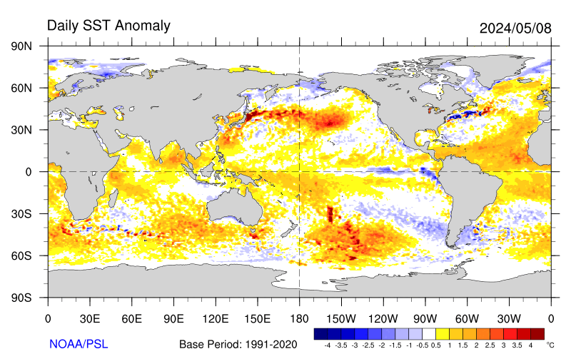
And when we look at Sea Surface anomalies below, we see a lot of them not just along the Equator related to El Nino. The slight gap between the El Nino warm anomaly and the Coast of Ecuador is of interest since this is a daily chart and more up to date than some other sources of information.
Is this El Nino a Modoki?
It did not evolve as a Modoki unless you consider it to be a continuation of the Faux El Nino Modoki of 2014/2015 which is a possible interpretation. But the Walker Circulation is much like that of a Modoki. These graphics help explain this.
The two graphics below show first the changes in the SST’s over the four weeks (ending November 4) as compared to the above graphic which shows the current SST anomalies and then the changes over the four weeks ending on January 27, 2016. Looking at both of these change in anomaly graphics is helpful in putting the current situation shown above into perspective.
First the four weeks ending on November 4, 2015

And below I show the new version issued today which basically shows the changes over the last month in the Sea Surface Temperature (SST) anomalies. It is approximately three months later than the above graphic which you can tell by checking the dates in the graphic. You can clearly see the cooling pattern in the Northern Pacific and since these are “departures” or “anomalies”, it is not a seasonal pattern that is being shown. You can clearly see the weakening of the El Nino especially off of Ecuador and now Peru also and the warming off the coast of Central America at low latitudes has ceased but at high latitudes has become quite intense but less intense than shown last week. The cool anomaly off of Beringia has moved south and weakened a bit and the PDO+ pattern has diminished which you can not tell from this graphic alone. The waters off of the East Coast of North America no longer show continued warming from the already warm levels. The waters east of Australia however are getting warmer as are the waters west of Africa namely the Gulf of Guinea and further south but also further north off the coast of West Africa raising concerns about this year’s Atlantic Hurricane season. Overall, the changes this week are again somewhat muted but important. The receding of the El Nino from the Coast of South America is the most significant change or at least the most easy to interpret.

Now let us focus on the 6 – 14 Day Forecast for which I generally only show the 8 – 14 Day Maps. The 6 – 10 Day maps are always available in Part II of this report but in the winter I often show both maps as the forecasted weather patterns change during that nine day period.
To put the forecasts which NOAA tends to call Outlooks into perspective, I am going to show the three-month JFM and the “early” single month of January forecasts and then discuss the 8 – 14 day Maps and the 6 – 14 Day NOAA Discussion within that framework.
First – Temperature
Here is the Three-Month Temperature Outlook issued on January 21, 2016:

Here is the newly updated February Temperature Outlook.
Below is the current 6 – 10 Day and 8 – 14 Day Temperature Outlook Maps which will auto-update and thus be current when you view them. It covers the nine days following the tail end of the current week. I have included both today and probably will continue to do that all winter as the patterns are moving from west to east fairly rapidly. As I view these two maps on February 1 (it updates each day), it appears that the second week of February may continue to exhibit the west/east division rather than the north/south division which continues to appear in the NOAA monthly and three-month outlooks. .
6 – 10 Day Temperature Outlook

8 – 14 Day Temperature Outlook

Now – Precipitation
Here is the three-month Precipitation Outlook issued on January 21, 2016:

Here is the newly updated February Precipitation Outlook.
Below are the current 6 – 10 Day and 8 – 14 Day Precipitation Outlook Maps which will auto-update and thus be current when you view them. It covers the nine days following the tail end of the current week. I have included both today and probably will continue to do that all winter as the patterns are moving from west to east fairly rapidly. As I view these two maps on February 1(it updates each day), it appears that the second week of February may begin by continuing the drought pattern for the West and Southwest and later have the Northwest change from dryer than climatology to EC leaving the Southwest to continue to be dry rather what is normally expected with a strong El Nino.
6 – 10 Day Precipitation Outlook

8 – 14 Day Precipitation Outlook Notice the somewhat northern displacement of the precipitation which is not usual during a strong El Nino.

Here are excerpts from the NOAA discussion released today February 1, 2016. It covers the full nine-day period and this week I have shown both the 6 -10 Day and the 8-14 Day Maps.
6-10 DAY OUTLOOK FOR FEB 07 – 11 2016
TODAY’S DYNAMICAL MODELS CONTINUE TO BE IN GOOD AGREEMENT ON THE PREDICTED 500-HPA CIRCULATION PATTERN ACROSS MOST OF THE FORECAST DOMAIN. THE OFFICIAL BLENDED HEIGHT PATTERN FEATURES A HIGH AMPLITUDE FLOW PATTERN. AN ANOMALOUSLY DEEP TROUGH IS FORECAST OVER THE ALEUTIANS EXTENDING TO THE NORTH PACIFIC OCEAN, RIDGING IS FORECAST OVER MUCH OF ALASKA AND ALONG THE WEST COAST OF THE U.S., AND TROUGHING IS PREDICTED OVER MOST OF THE EASTERN CONUS. THE ENSEMBLE SPAGHETTI DIAGRAMS INDICATE LOW SPREAD ACROSS THE MAJORITY OF THE FORECAST DOMAIN. TODAY’S 500-HPA BLEND CHART DEPICTS ABOVE NORMAL HEIGHTS OVER THE WESTERN CONUS AND MUCH OF ALASKA WHILE BELOW NORMAL HEIGHTS ARE INDICATED OVER THE EASTERN CONUS. TODAY’S MANUAL 500-HPA HEIGHT BLEND IS COMPOSED PRIMARILY OF THE ENSEMBLE MEAN SOLUTIONS, BASED LARGELY ON CONSIDERATIONS OF RECENT SKILL AND ON ANALOG CORRELATIONS, WHICH MEASURE HOW CLOSELY THE MODEL SOLUTIONS RESEMBLE CASES THAT HAVE OCCURRED IN THE PAST.
ABOVE NORMAL TEMPERATURES ARE FAVORED FOR MOST OF ALASKA DUE TO EXPECTED ANOMALOUS LOW-LEVEL SOUTHERLY FLOW AND ABOVE NORMAL 500-HPA HEIGHTS. ABOVE NORMAL TEMPERATURES ARE FORECAST OVER THE FAR WESTERN CONUS AND THE NORTHERN ROCKIES DUE TO EXPECTED POSITIVE HEIGHT ANOMALIES AND WARMER THAN NORMAL SEA SURFACE TEMPERATURES OVER THE WEST COAST OF THE CONUS. BELOW NORMAL 500-HPA HEIGHTS AND NORTHERLY ANOMALOUS FLOW INCREASE THE CHANCE FOR BELOW NORMAL TEMPERATURES IN MUCH OF THE CENTRAL AND EASTERN CONUS. MOST TOOLS ALSO FAVOR ABOVE NORMAL TEMPERATURES FOR THE NORTHWESTERN CONUS.
TROUGHING OVER THE ALEUTIANS AND SOUTHERLY ANOMALOUS FLOW ENHANCE CHANCES OF NEAR TO ABOVE-MEDIAN PRECIPITATION AMOUNTS FOR ALASKA. RIDGING OVER THE WEST COAST INCREASES THE LIKELIHOOD OF NEAR TO BELOW MEDIAN PRECIPITATION FOR THE WESTERN AND THE SOUTHWESTERN PARTS OF THE CONUS. TROUGHING PREDICTED OVER THE EASTERN CONUS ENHANCES PROBABILITIES FOR ABOVE MEDIAN PRECIPITATION FOR THE UPPER MISSISSIPPI VALLEY, THE GREAT LAKES AND THE EAST COAST OF THE CONUS.
FORECAST CONFIDENCE FOR THE 6-10 DAY PERIOD: ABOVE AVERAGE, 4 OUT OF 5, DUE TO GOOD MODEL AGREEMENT ON THE 500-HPA PATTERN AND FAIRLY GOOD AGREEMENT IN THE TOOLS.
8-14 DAY OUTLOOK FOR FEB 09 – 15 2016
TODAY’S ENSEMBLE MEAN DYNAMICAL MODEL FORECASTS ARE IN GOOD AGREEMENT ON THE PREDICTED 500-HPA CIRCULATION PATTERN OVER NORTH AMERICA FOR THE WEEK-2 PERIOD. THE PREDICTED CIRCULATION PATTERN IS SIMILAR TO THAT EXPECTED FOR THE 6-10 DAY PERIOD BUT LESS AMPLIFIED. TROUGHS ARE FORECAST OVER THE NORTH PACIFIC OCEAN AND THE EASTERN PART OF THE NATION, WHILE A RIDGE IS PREDICTED ALONG THE WEST COAST OF THE CONUS EXTENDING NORTH TO ALASKA.
THE EXPECTED TEMPERATURE ANOMALY PATTERNS FOR WEEK-2 ARE SIMILAR TO THOSE PREDICTED FOR DAYS 6-10. ABOVE NORMAL TEMPERATURES ARE FAVORED FOR ALASKA AND THE WESTERN CONUS, WHILE BELOW NORMAL TEMPERATURES ARE FORECAST FOR MOST OF THE EASTERN CONUS. THE PRECIPITATION PROBABILITY FORECAST FOR WEEK-2 IS SIMILAR TO THE 6-10 DAY PERIOD, EXCEPT THAT NEAR MEDIAN PRECIPITATION OVER MOST OF THE NORTHWESTERN CONUS. THE PRECIPITATION PROBABILITIES FOR WEEK-2 ARE GENERALLY LOWER THAN THAT INDICATED FOR THE 6-10 DAY PERIOD.
FORECAST CONFIDENCE FOR THE 8-14 DAY PERIOD IS: ABOVE AVERAGE, 4 OUT OF 5, DUE TO GOOD MODEL AGREEMENT ON THE 500-HPA PATTERN AND FAIRLY GOOD AGREEMENT IN THE TOOLS.
Some might find this analysis interesting as the organization which prepares it looks at things from a very detailed perspective and their analysis provides a lot of information on the history and evolution of this El Nino.
Analogs to Current Conditions
Now let us take a detailed look at the “Analogs” which NOAA provides related to the 5 day period centered on 3 days ago and the 7 day period centered on 4 days ago. “Analog” means that the weather pattern then resembles the recent weather pattern and was used in some way to predict the 6 – 14 day Outlook.
Here are today’s analogs in chronological order although this information is also available with the analog dates listed by the level of correlation. I find the chronological order easier for me to work with. There is a second set of analogs associated with the outlook but I have not been analyzing this second set of information. This first set applies to the 5 and 7 day observed pattern prior to today. The second set which I am not using relates to the forecast outlook 6 – 10 days out to similar patterns that have occurred in the past during the dates covered by the 6 – 10 Day Outlook. That may also be useful information but they put this set of analogs in the discussion with the other set available by a link so I am assuming that this set of analogs is the most meaningful.
Analog Centered Day | ENSO Phase | PDO | AMO | Other Comments |
| Jan 27, 1959 | El Nino | + | – | Tail End |
| Jan 22, 1965 | La Nina | – | – | Tail End |
| Jan 19, 1978 | El Nino | N | – | Tail End |
| Jan 20. 1978 | El Nino | N | – | Tail End |
| Feb 4, 1986 | Neutral | + | – | |
| Jan 18, 1988 | El Nino | + | – | Tail End of above El Nino |
| Feb 2, 1997 | Neutral | + | – | Prior to Super El Nino of 97/98 |
| Feb 15, 1999 | La Nina | – | + | |
| Jan 18, 2001 | La Nina | – | + | Tail End of above La Nina |
One thing that jumped out at me right away was the spread among the analogs from January 18 to February 15 which is about a week less than last week. There are this time only four El Nino Analogs and two ENSO Neutral Analogs and three La Nina Analogs suggesting that El Nino no longer remains in full control over our weather for the next 6 – 14 Days. The phases of the ocean cycles in the analogs are clearly indicating McCabe Condition A which is fully consistent with the 6 – 14 Day Forecast. The seminal work on the impact of the PDO and AMO on U.S. climate can be found here. Water Planners might usefully pay attention to the low-frequency cycles such as the AMO and the PDO as the media tends to focus on the current and short-term forecasts to the exclusion of what we can reasonably anticipate over multi-decadal periods of time.

You may have to squint but the drought probabilities are shown on the map and also indicated by the color coding with shades of red indicating higher than 25% of the years are drought years (25% or less of average precipitation for that area) and shades of blue indicating less than 25% of the years are drought years. Thus drought is defined as the condition that occurs 25% of the time and this ties in nicely with each of the four pairs of two phases of the AMO and PDO.
Historical Anomaly Analysis
When I see the same dates showing up often I find it interesting to consult this list.
With respect to relating analog dates to ENSO Events, the following table might be useful. In most cases this table will allow the reader to draw appropriate conclusions from NOAA supplied analogs. If the analogs are not associated with an El Nino or La Nina they probably are not as easily interpreted. Remember, an analog is indicating a similarity to a weather pattern in the past. So if the analogs are not associated with a prior El Nino or prior La Nina the computer models are not likely to generate a forecast that is consistent with an El Nino or a La Nina.
| El Ninos | La Ninas | |||||||||
|---|---|---|---|---|---|---|---|---|---|---|
| Start | Finish | Max ONI | PDO | AMO | Start | Finish | Max ONI | PDO | AMO | |
| DJF 1950 | J FM 1951 | -1.4 | – | N | ||||||
| T | JJA 1951 | DJF 1952 | 0.9 | – | + | |||||
| DJF 1953 | DJF 1954 | 0.8 | – | + | AMJ 1954 | AMJ 1956 | -1.6 | – | + | |
| M | MAM 1957 | JJA 1958 | 1.7 | + | – | |||||
| M | SON 1958 | JFM 1959 | 0.6 | + | – | |||||
| M | JJA 1963 | JFM 1964 | 1.2 | – | – | AMJ 1964 | DJF 1965 | -0.8 | – | – |
| M | MJJ 1965 | MAM 1966 | 1.8 | – | – | NDJ 1967 | MAM 1968 | -0.8 | – | – |
| M | OND 1968 | MJJ 1969 | 1.0 | – | – | |||||
| T | JAS 1969 | DJF 1970 | 0.8 | N | – | JJA 1970 | DJF 1972 | -1.3 | – | – |
| T | AMJ 1972 | FMA 1973 | 2.0 | – | – | MJJ 1973 | JJA 1974 | -1.9 | – | – |
| SON 1974 | FMA 1976 | -1.6 | – | – | ||||||
| T | ASO 1976 | JFM 1977 | 0.8 | + | – | |||||
| M | ASO 1977 | DJF 1978 | 0.8 | N | – | |||||
| M | SON 1979 | JFM 1980 | 0.6 | + | – | |||||
| T | MAM 1982 | MJJ 1983 | 2.1 | + | – | SON 1984 | MJJ 1985 | -1.1 | + | – |
| M | ASO 1986 | JFM 1988 | 1.6 | + | – | AMJ 1988 | AMJ 1989 | -1.8 | – | – |
| M | MJJ 1991 | JJA 1992 | 1.6 | + | – | |||||
| M | SON 1994 | FMA 1995 | 1.0 | – | – | JAS 1995 | FMA 1996 | -1.0 | + | + |
| T | AMJ 1997 | AMJ 1998 | 2.3 | + | + | JJA 1998 | FMA 2001 | -1.6 | – | + |
| M | MJJ 2002 | JFM 2003 | 1.3 | + | N | |||||
| M | JJA 2004 | MAM 2005 | 0.7 | + | + | |||||
| T | ASO 2006 | DJF 2007 | 1.0 | – | + | JAS 2007 | MJJ 2008 | -1.4 | – | + |
| M | JJA 2009 | MAM 2010 | 1.3 | N | + | JJA 2010 | MAM 2011 | -1.4 | + | + |
| JAS 2011 | FMA 2012 | -0.9 | – | + | ||||||
| T | MAM 2015 | NA | 1.0 | + | N | |||||
Progress of the Warm Event
Let us start with the SOI.
Below is the Southern Oscillation Index (SOI) reported by Queensland, Australia. The first column is the tentative daily reading, the second is the 30 day moving/running average and the third is the 90 day moving/running average.
| Date | Current Reading | 30-Day Average | 90 Day Average |
| Jan 26 | -10.3 | .24.77 | -12.23 |
| Jan 27 | -14.6 | -24.48 | -12.09 |
| Jan 28 | -11.3 | -24.05 | -12.04 |
| Jan 29 | -4.10 | -23.28 | -11.98 |
| Jan 30 | +2.4 | -22.22 | -11.90 |
| Jan 31 | -4.00 | -21.26 | -11.89 |
| Feb 1 | -4.00 | -20.11 | -11.84 |
The Inactive Phase of the MJO had shifted to the Active Phase but that is coming to an end perhaps already has. So we should be seeing a decline in the SOI negative anomalies at least for a while perhaps the second half of February and probably the peak has occurred.
The 30-day average, which is the most widely used measure, as of February 1 is reported at -20.11 which is definitely a reading that is associated with an El Nino (usually required to be more negative than -8.0 but some consider -6.0 value good enough). But it is lower (smaller negative number) than last week. The 90-day average remains in El Nino territory at -11.84 but is also lower than last week. The SOI continues to be indicative of an El Nino Event in progress.
Low-Level Wind Anomalies
Here are the low-level wind anomalies. In October, the area from 180W to 160W was of interest and quite intense. There then was an area of interest at 160W which also was quite intense. Now, calm appears to prevail but there recently was a WWB (Westerly Wind Burst) near and east of the Date Line related to Tropical Storm Pali which has long since dissipated. But look at the intensity of the wind anomaly associated with that WWB: 14 That might be “all she wrote” for this El Nino.

In the below graphic, you can see how the convection pattern recently appeared to be shifting ever so slightly a bit to the east but not as far east as we would expect with a strong El Nino. Now that slight movement to the East has reversed.

Let us now take a look at the progress of Kelvin Waves which are the key to the situation. The most extreme temperature anomaly colored gray in the graphic is now no longer there. We now focus on the next lower level of warm anomaly which also has exited the ONI/Nino 3.4 Measurement Area which runs from 170W to 120W. In fact it is now nowhere on the Equator. We are down to the next level of anomaly, the 1.5 to 2C anomaly, and it also is now out of the Nino 3.4 Measurement Area.The eastern movement of the more intense part of the warm anomaly is quite evident. This El Nino may be decaying quite rapidly. The decline in the temperature anomalies in the far Eastern Pacific show up here better than in some other graphics that I present. But you also see some warming from 120W to 150W which is related to yet another Kelvin Wave #5 which has now been declared by NOAA. This El Nino is dying but not without a fight. You can see all five of the Kelvin Waves which created this El Nino in this graphic. From the earliest to the most recent they can be named #1 through #5. Next week I will freeze this graphic and retain it for future reference.
We are now going to change the way we look at a three dimensional view of the Equator and move from the surface view to the view from the surface down. This El Nino appears to be fading slowly from west to east. The real decline will be from east to west.
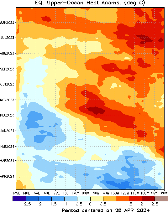
Current Sub-Surface Conditions

Top Graphic (Anomalies)
The above graphic showing the current situation has an upper and lower graphic. The bottom graphic shows the absolute values, the upper graphic shows anomalies compared to what one might expect at this time of the year in the various areas both 130E to 90W Longitude and from the surface down to 450 meters.
The top graphic is still the most useful of the two and shows where 2C (anomaly) water is impacting the area in which the ONI is measured i.e. 170W to 120W. The 2C anomaly no longer extends to 180W an indication that the El Nino is losing ground.The 3C anomaly still extends to 160W but now exists only over to 130W. So I am viewing the 3C anomaly as encompassing only about 40% to 45% of the Nino 3.4 Measurement Area for the ONI along the Equator but even there not the full area from a latitude perspective which extends five degrees latitude to the north and south of the Equator. It explains why NOAA is coming up with lower ONI estimates. The 4C anomaly is now not intersecting the surface. The 6C anomaly is now almost completely gone and there is not much left of the 5C anomaly.
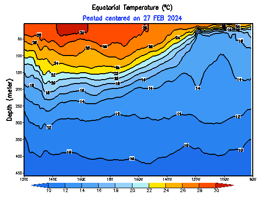
Bottom Graphic (Absolute Values which highlights the Thermocline)
The bottom half of the graphic may soon become more useful in terms of tracking the progress of this Warm Event as it converts to ENSO Neutral and then La Nina. It shows the thermocline between warm and cool water which pretty much looks like this as shown here during a Warm Event. You can see that the cooler water is not yet fully making it to the surface to the east along the coast of Ecuador. In fact, the 25C Isotherm no longer reaches the surface but the 26C isotherm reaches the surface on some says. We now will pay more attention to the 28C Isotherm as west of that temperature is where convection is more easy to occur. The 28C Isotherm has pretty much remained in the same place for months now but now appears to be migrating west consistent with this El Nino fading.
Here are the above graphics as a time sequence animation. You may have to click on them to get the animation going.

TAO/TRITON GRAPHIC
Let us compare the situation as reported on October 4 to the most recent graphic. Remember each graphic has two parts the top part is the average values, the bottom part is those values expressed as an anomaly compared to the expected values for that date. Generally I am mainly discussing the bottom of the pairs of graphics namely the anomalies
First the October 4 version which I am providing for purposes of comparison. I “flash froze” the daily value that day so that it would not auto-update.

And then the December 14 version which I also “flash froze” to stop it from updating.

And then the current version of the TAO/TRITON Graphic. It is quite a bit less intense than on December 14. The 3.5C anomaly is no longer visible. The 3.0C anomaly now only shows in the center-west of the NINO3.4 Measurement Area. It also seems that in the center of the Nino 3.4 Measurement Area, the anomaly is broader north and south of the Equator possibly due to the recent Kelvin Wave activity. But it extends only to 160W and west of 140W. This means that in the calculation of the daily ONI, the estimate begins at the midpoint of the 3C to 3.499999C anomaly and is reduced by all the area that is in areas shaded less red. As of today (yesterdays readings from the TAO/TRITON buoys, the Easterlies are diminished (except east of 120W) but now show as Easterlies (albeit diminished) almost everywhere (top graphic) which is different than on October 4, 2015 when the anomalies were so strong that west of 150W they showed as having been converted into Westerlies. That is an indication that the conditions for maintaining this El Nino are eroding.

And an earlier but recent reference point re the bottom half of the TAO/TRITON Graphic.

| ——————————————— | A | B | C | D | E | —————— |
If you look closely you can see that this El Nino has withdrawn somewhat to the West even in the short period of time since I froze the above January 19 TAO/TRITON graphic. The 2.5C anomaly has also shrunk and only extends now to 125W whereas just two weeks ago it extended to 110W. There has been a lot of change in just over two weeks.
I calculate the ONI each week using a method that I have devised. To refine my calculation, I have divided the 170W to 120W ONI measuring area into five subregions (which I have designated from west to east as A through E) with a location bar shown under the TAO/TRITON Graphic). I use a rough estimation approach to integrate what I see below and record that in the table I have constructed. Then I take the average of the anomalies I estimated for each of the five subregions. So as of Monday February 1 in the afternoon working from the January 31 TAO/TRITON report, this is what I calculated.
| Anomaly Segment | Estimated Anomaly | |
| Last Week | This Week | |
| A. 170W to 160W | 2.4 | 2.2 |
| B. 160W to 150W | 2.7 | 2.7 |
| C. 150W to 140W | 2.9 | 2.8 |
| D. 140W to 130W | 2.7 | 2.6 |
| E. 130W to 120W | 2.5 | 2.4 |
| Total | 13.2 | 12.7 |
| Total divided by five subregions i.e. the ONI | 13.2/5 =2.6 | 12.7/5=2.5. |
My estimate of the daily Nino 3.4 ONI after rounding has declined to 2.5. NOAA has today reported the weekly ONI as again being 2.5. Nino 4.0 is now reported as being 1.5 which is a bit higher than last week and probably related to the now declared by NOAA Kelvin Wave #5. Nino 3.0 is being reported as 2.3 which is significantly lower than last week which has to to with the timing of the surfacing of Kelvin Waves and their reflection to the west after they have surfaced. I believe it peaked at 3.7 during the El Nino of 1997/1998. This is one of many reasons for thinking that this El Nino is shifted to the west to some extent and is clearly significantly weaker than the 1997/1998 Super El Nino if you believe that the Nino 3.0 area is important and the Asian Meteorological Services do. The action which I think is most important to track right now is in Nino 1+2 which is now reported as being only 1.0. The issue remains the extent to which warm water off of Ecuador and Peru impacts CONUS weather. I think it has very little impact except from the tropical storms that move up the west coast of Central America and sometimes contribute moisture to the circulation over CONUS. This phase of the El Nino seems to have come to an end. Most El Ninos decay from east to west so it will be observed most clearly first in Nino 1+2 and it is clear that this process has begun.
This is summarized in the following NOAA Table. I am only showing the currently issued version as the prior values are shown in the small graphics on the right with this graphic. Notice that other than NINO 4.0 (which has been propped up by Kelvin Wave #5), the other indices are trending lower and in the far end of the Tropical Pacific this decline rate has increased.

One wonders about these calculations as they appear to not be related to the “adjusted” version of the NOAA forecast model which was discussed recently. So it is not clear to me how this El Nino will be officially recorded. October-November-December has now been recorded as having an ONI of 2.3. In the NINO value historical graphics on the right, eyeballing it you might conclude that the three months were observed as being 2.5, 2.9 and 2.7. So the impact of adjusting these observed values to what is considered “adjusted” is not obvious to me. If 2.5, 2.9, and 2.7 when averaged and adjusted by NOAA come to 2.3 how should we interpret the unadjusted weekly value of 2.5 To me (and some other knowledgeable folks) it is meaningless but I dutifully report it. It has to do with the two systems of calculating the base temperature profile. As per the discussion on the IRI/CPC Website:
OISSTv2 is often used for real-time analysis and model initialization, while ERSSTv4 is used for retrospective official ENSO diagnosis because it is more homogeneous over time, allowing for more accurate comparisons among ENSO events that are years apart. During ENSO events, OISSTv2 usually shows stronger anomalies than ERSSTv4, and during very strong events the two datasets may differ by as much as 0.5 C. Therefore, the anomalies cited below for this strong 2015-16 event are likely larger than those that will later be cited officially, particularly in comparisons with other strong El Niño events like 1997-98 and 1982-83.
The full history of the ONI readings can be found here.
Although I discussed the Kelvin Waves earlier, now seems to be the best place to show the evolution of the subsurface temperatures.

Normally watching an El Nino evolve is like watching paint dry. But this week we again see some significant changes. The undercutting cool anomaly has withdrawn to the west quite a bit. The subsurface warm water reservoir in the Eastern Pacific is dissipating and at an accelerating pace. It is shifting west and it looks like at depth the western part has been reenergized perhaps by Kelvin Wave #5. It is part of the transition from an El Nino to Neutral to possibly a La Nina next winter. Notice at 90W, the warm reservoir looks to be about to be cut into two.
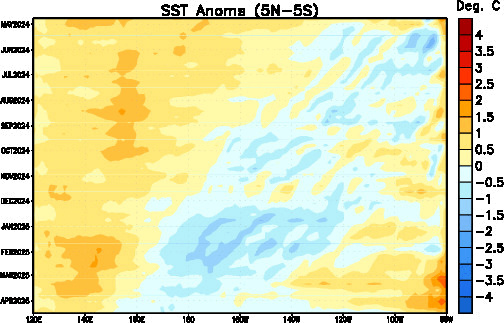
SST Surface Anomaly Hovmoeller
Here is another way of looking at it: Unlike the Upper Ocean Heat Anomaly Hovmoeller (I call it the Kelvin Wave Hovmoeller) which takes an average down to 300 meters, this just measures the surface temperature anomaly. It is the surface that interacts with the atmosphere. A major advantage of the Hovmoeller method of displaying information is that it shows the history so I do not need to show a sequence of snap shots of the conditions at different points in time. Nevertheless this Hovmoeller provides a good way to visually see the evolution of this El Nino and later track its demise. One can easily see the historical evolution of this El Nino and the “hot spots” that existed in December and which resulted in the very high ONI readings. But one can also see the western edge of the warm anomaly starting to shift to the East. You can see at the very bottom of this graphic, which shows the most recent readings, the easing of the extreme temperature anomalies in the Nino 3.4 Measurement area (see the scale on the right: red is less warm than dark red) namely 170W to 120W. That explains the slight reduction in NOAA ONI estimate. That is likely to continue to be the trend. You also see the decay in the anomalies from the east between 80W and 110W and even over to 135W but they are difficult to see with the resolution of this graphic.
Recent Impacts of Weather Mostly El Nino but possibly Also PDO and AMO Impacts.
Below are snapshots of 30 Day temperature and precipitation departures over the life of this El Nino. The end date of the 30 day period is shown in the graphic. It is a way of seeing how the impacts of this El Nino of unfolded.


Again, there are changes from last week and remember this is a 30 day average and only seven days were added and seven days were removed. You can see the extreme moderating of the warm anomalies in the East LOL with a similar moderating of the cool anomaly in the West. You can see the dramatic decline of the wet anomalies in the Southwest especially New Mexico. These are significant changes related to the westward displacement of this El Nino and the northern rather than southern entry of the Jet Stream.
I realize this is a lot of graphics but one needs to look at the history of an event to assess it. As you can see, so far we are not having the expected El Nino Impacts in CONUS.
El Nino in the News
Blame it on the North Atlantic An interesting article but they have a lot of things confused. One has to separate daily weather, low frequency cycles, medium frequency cycles, high frequency cycles and secular Global Warming. When you mix them up you end up with stew. Tasty but hard to tell what is in it.
View from Australia
El Nino

Here is the discussion just released:
Further easing of El Niño
Issued on 2 February 2016
El Niño remains strong, but continues its gradual decline. Climate models suggest a return to neutral levels in the second quarter of 2016.
Close to the equator, the surface of the Pacific Ocean has now cooled by 0.5 °C since the El Niño peaked in late 2015. Below the ocean surface, cooler than average waters now extend into the central tropical Pacific Ocean. In the atmosphere, trade winds have recently returned to near-normal levels in the central and eastern Pacific, although the Southern Oscillation Index (SOI) has been strongly negative in recent weeks. During Australia’s northern wet season, it is not unusual to see big fluctuations in the SOI due to the passage of tropical systems, and hence its value may not be representative of the overall ENSO state.
Based on the 26 El Niño events since 1900, around 50% have been followed by a neutral year, and 40% have been followed by La Niña. Models suggest the neutral state is the most likely for the second half of 2016, followed by La Niña, with a repeat El Niño assessed as very unlikely. Historically, the breakdown of strong El Niño events brings above average rainfall to some-but not all-parts of Australia in the first half of the year.
The Indian Ocean Dipole has little influence on Australian climate between December and April. However, Indian Ocean sea surface temperatures remain very warm across the majority of the basin which may provide extra moisture for rain systems across Australia.
Next update expected on 16 February 2016
IOD (Indian Ocean Dipole)

The graphic comes with only a very short discussion and here is that discussion:
Indian Ocean Dipole
The Indian Ocean Dipole (IOD) is neutral. The Dipole Mode Index value to 31 January was −0.51 °C.
The IOD does not typically influence Australian climate during the months December to May. When the monsoon trough is in the southern hemisphere (as it typically is between the months of December to May) neither positive nor negative IOD events are able to form.
More generally, sea surface temperatures (SSTs) remain significantly warmer than average across most of the Indian Ocean basin, with a large part of the Indian Ocean measuring warmest on record for this time of year. This unusually warm ocean is likely to increase the available moisture for weather systems travelling across Australian in the coming weeks and months, increasing the likelihood of good falls occurring across southern Australia.
Putting it all Together.
The subsurface reservoir of warm water in the Eastern Pacific has reached its maximum and is now beginning to discharge. This would have occurred earlier if not for Kelvin Waves #4 and now #5. This El Nino has peaked in intensity and is now in rapid decline.
We are beginning to speculate on the winter of 2016/2017 which now according to the models seems increasingly likely to be a La Nina. One thing that is fairly certain for the U.S. based on historical patterns is that compared to this winter the following winter is likely to be:
- warmer in the south and less warm in the north and
- more dry in the south and less dry in the north.
The below is the CPC/IRI forecast issued on January 21, 2016.

Two weeks ago we suggested that it is possible the models will be wrong about how fast the Eastern Pacific Warm Pool moves back towards its La Nina location and it may well be that next winter will be more of a Neutral year or even have some characteristics of an El Nino Modoki and thus be wetter than a typical year as the Warm Pool may still be more in the Central Pacific than shifted all the way west to its La Nina position. This new update from CPC/IRI suggests that his concept is not entering into their thinking. But the early and late month forecasts are based on different methodologies (forecasters early in the month and computer model results later in the month) so small differences may not be significant. This however is a big difference from what was presented two weeks ago
.
Forecasting Beyond Five Years.
So in terms of long-term forecasting, none of this is very difficult to figure out actually if you are looking at say a five-year or longer forecast. The research on Ocean Cycles is fairly conclusive and widely available to those who seek it out. I have provided a lot of information on this in prior weeks and all of that information is preserved in Part II of my report in the Section on Low Frequency Cycles 3. Low Frequency Cycles such as PDO, AMO, IOBD, EATS. It includes decade by decade predictions through 2050. Predicting a particular year is far harder.
TABLE OF CONTENTS FOR PART II OF THIS REPORT The links below may take you directly to the set of information that you have selected but in some Internet Browsers it may first take you to the top of Page II where there is a TABLE OF CONTENTS and take a few extra seconds to get you to the specific section selected. If you do not feel like waiting, you can click a second time within the TABLE OF CONTENTS to get to the specific part of the webpage that interests you.
A. Worldwide Weather: Current and Three-Month Outlooks: 15 Month Outlooks (Usefully bookmarked as it provides automatically updated current weather conditions and forecasts at all times. It does not replace local forecasts but does provide U.S. national and regional forecasts and, with less detail, international forecasts)
B. Factors Impacting the Outlook
1. Very High Frequency (short-term) Cycles PNA, AO,NAO (but the AO and NAO may also have a low frequency component.)
2. Medium Frequency Cycles such as ENSO and IOD
3. Low Frequency Cycles such as PDO, AMO, IOBD, EATS.
C. Computer Models and Methodologies
D. Reserved for a Future Topic (Possibly Predictable Economic Impacts)
TABLE OF CONTENTS FOR PART III OF THIS REPORT – GLOBAL WARMING WHICH SOME CALL CLIMATE CHANGE. The links below may take you directly to the set of information that you have selected but in some Internet Browsers it may first take you to the top of Page III where there is a TABLE OF CONTENTS and take a few extra seconds to get you to the specific section selected. If you do not feel like waiting, you can click a second time within the TABLE OF CONTENTS to get to the specific part of the webpage that interests you.
D2. Climate Impacts of Global Warming
D3. Economic Impacts of Global Warming
D4. Reports from Around the World on Impacts of Global Warming


