Written by Sig Silber
Is it possible that an El Nino can be so powerful that it actually self-destructs? That is something to ponder and we will begin that discussion today. But most importantly we will compare the recent NOAA and JAMSTEC forecasts. Above normal temperatures may be exiting from west to east bringing us more fall-like weather.

This is the Regular Edition of my weekly Weather and Climate Update Report. Additional information can be found here on Page II of the Global Economic Intersection Weather and Climate Report.
NOAA issued an updated Seasonal Outlook on October 15. The JAMSTEC (Japanese) analysis is also available. Let us compare them.
First let’s take look at the ONI forecasts which is the most widely available measure of the strength of an El Nino (or La Nina) and is the deviation of the sea surface temperature from climatology (normal) in a small part of the Eastern Pacific along the Equator considered to be the best place to assess the strength of an ENSO phase whether it be El Nino, ENSO Neutral, or La Nina.
First the NOAA forecast of conditions in the Nino 3.4 area which defines the ONI Index:
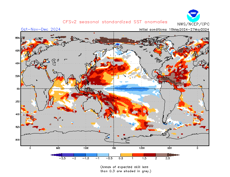
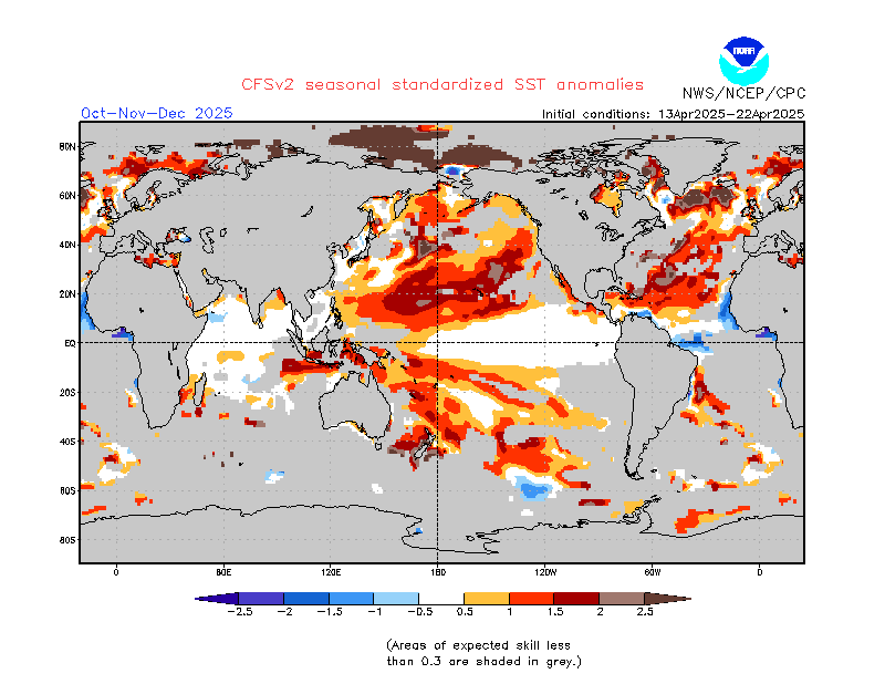
OMG there are two different versions of the model results. There is this one:
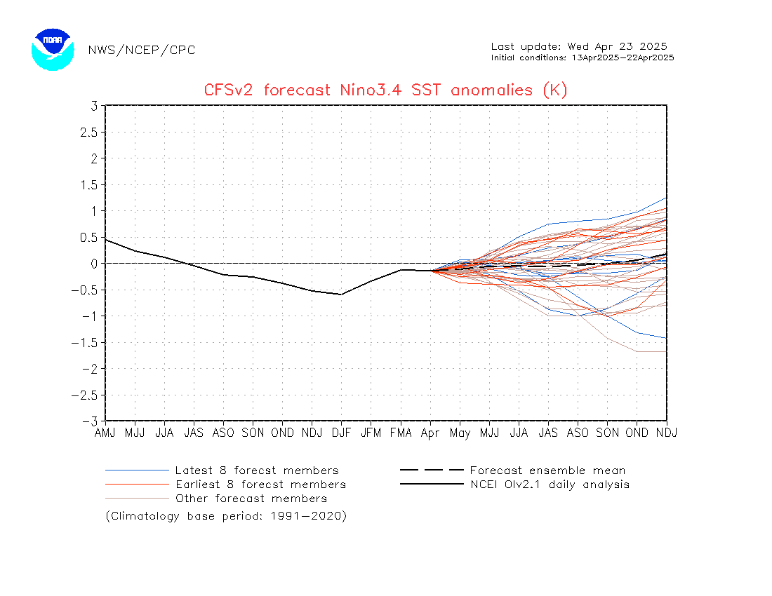
And below is another version (and the version below is the one that NOAA shows in their weekly ENSO Report so I am assuming that it is the one that they want us to use) . I am not sure of the specifics of the difference but the results are modified in some way presumably to make them more accurate. I think it has to do with the base used to establish “Climatology” which is usually defined as conditions from 1981 – 2010 (not sure why it says 1982 – 2010). But the Equator has been experiencing a warming trend thus a thirty-year average may overstate warm anomalies. So, to me, reading the legend in the graphic below It looks like the base was adjusted to 1999 – 2000 reflecting the steady rise of temperatures in the Pacific. It is possible that there is also an adjustment for the variation in the model results for the multiple members of the ensemble but I do not know how that would work given that they still refer to the mean of the different forecasts of the members of the ensemble. So I can not tell you exactly why the model results below differ from the model results above.
It would be good if NOAA decided which approach they wanted to use and presented only one version of this graphic. But I understand their dilemma.The below graphic is probably the most useful and will agree with what is officially recorded but the above version is more consistent with what the other meteorological agencies report. I prefer the below as it is more realistic.They both show this El Nino peaks in October or November of 2015.

And here is the JAMSTEC forecast of the ONI.

This is the JAMSTEC discussion. .
Oct. 23, 2015
Prediction from 1st Oct., 2015
ENSO forecast:
The SINTEX-F model predicts that the current El Niño reaches its peak in boreal fall and will keep its amplitude until boreal winter. The strengthening of the amplitude of El Niño Modoki index suggests that the present El Niño may turn to an El Niño Modoki in boreal spring. [Editor’s note: Most Modoki’s develop as such rather than evolving from a traditional El Nino. But I understand their thought process. I suspect that such a Modoki would be short lived and just a stage along the way to ENSO Neutral and perhaps a La Nina.]
Indian Ocean forecast:
The model predictions suggest that the weak positive Indian Ocean Dipole (IOD) will persist through the boreal fall. Subsequently, basin-wide warming will take over in boreal winter and spring in response to Pacific El Niño.
Regional forecast:
In boreal winter, as a seasonally averaged view, most parts of the globe (including Japan) will experience a warmer-than-normal condition, while northern Europe, northeastern Russia, southern China, and U.S. will experience a colder-than-normal condition. All those may be partly related to the on-going strong El Niño event.
In boreal winter, as a seasonally averaged view, Australia, southern Africa, Brazil, and Southeast Asia will experience a drier-than-normal condition, while northern Europe and U.S (particularly the eastern part) will experience a wetter-than-normal condition. The strong El Niño event and the California Nino could be partly responsible for those.
Now I will compare the two forecasts using three time periods: Short Term, Medium Range, and Long Term
SHORT TERM (December – January – February) JAMSTEC did not publish NDJ information so I am working with DJF. So we are not comparing the forecasts for November. .
Sea Surface Temperatures.
Starting with the NOAA results (and notice that they show Africa twice which can be confusing but allows Africa to be more easily considered in the context of the oceans that surround it):
And now the JAMSTEC Sea Surface Temperature Anomaly.

They look fairly similar if you can get by the garish colors used by the NOAA graphic artists which certainly emphasizes the warm water off the coast of Mexico that is creating these storms off the west coast of Mexico. I find the JAMSTEC graphics easier to look at. I am curious about the cold anomaly that NOAA shows for the Equator in the Atlantic. There also appears to be a difference with respect to the waters off of Japan with JAMSTEC projecting cool and NOAA warm. NOAA also projects both an area of cool anomaly in the South Pacific and further south a strong warm anomaly. That is an important difference.
Now let’s take a look at the Temperature forecasts for that period starting with NOAA:
And then JAMSTEC:

For CONUS, JAMSTEC is forecasting that the colder than climatology area will cover a significantly larger area. NOAA does not cover the rest of the world. In the JAMSTEC map (and the discussion above which was provided by JAMSTEC) you can see that most of the world is projected to be warmer than climatology with the U.K and Scandinavia, Eastern Siberia, the Highlands of Southwest China and a small part of Argentina being the few exceptions. Given that there is Global Warming and the forecasted values are being compared to a base that may not fully reflect the warming which has occurred, any cold anomalies are especially significant.
Now let us look at Precipitation again starting with the NOAA map.
And here is the JAMSTEC Precipitation Map.

The NOAA forecast and JAMSTEC forecast are pretty similar for that period with regards to CONUS but JAMSTEC extends the wet area into the Northwest but the outlook for Alaska differs between the two forecasts. Interesting features of the JAMSTEC map outside of CONUS include dry conditions in Central and Northern Brazil, Central America, parts of Canada, parts of Australia and New Zealand, Iran, Afghanistan, South Africa and the Mediterranean. The dry area for India is no longer shown.
MIDRANGE (March – April – May)
Starting with Sea Surface Temperature Anomalies and beginning with NOAA:
And then JAMSTEC:

JAMSTEC is still showing El Nino into 2016. But it is looking a bit more Modoki-ish in terms of the severance of the connection of the warm water with the South American Coastline. Notice the less intense coloration off the Coast of Ecuador and Peru in the JAMSTEC map. But the AMO is more Negative and the PDO is more clearly defined in the JAMSTEC map. They seem to have different opinions on the ocean temperature anomalies off of the coast of West Africa but NOAA has greatly reduced their cool anomaly off of West Africa.
Now let us take a look at Temperature and again first NOAA:
And then JAMSTEC for the same three months

JAMSTEC now is more aggressive at forecasting widespread colder than climatology conditions for CONUS as compared to NOAA. JAMSTEC is showing cold for parts of Europe. Both JAMSTEC and NOAA show Alaska as still being warmer than climatology which suggests the Aleutian Low will be strong and positioned to direct warmer air over Alaska.
Now Precipitation and again staring with NOAA:
And then JAMSTEC.

JAMSTEC is showing more of a west/east split on precipitation for CONUS while NOAA is more north/south. Brazil is still dry, the rest of South America is wet. Southern Africa is still dry. Western Europe is dry while further east it is wet. Indochina is dry.
LONG RANGE (June – July – August)
First NOAA: And at this point in time this is the furthest out they go and their maps through Apr-May-Jun still shows the El Nino in place.
And then JAMSTEC:

JAMSTEC is well along to ENSO Neutral in their forecast perhaps pausing and resembling an El Nino Modoki Type II on the way. But the warm water off of the West Coast of North America continues so that it is not clear which of the two will have the most impact on North American weather. JAMSTEC is still showing PDO+ even as the pattern shifts to La Nina. That could be signifying a Climate Change in the Pacific to PDO+ and possibly also AMO- but it is too soon to tell.
Now let us look at Temperature and again starting with NOAA
And then JAMSTEC

There is a total difference for the pattern in CONUS with NOAA being warm and JAMSTEC cool extending up into parts of Canada. Again it is a warm Alaska. But in the JAMSTEC maps, Europe remains cool as well as parts of Argentina and far Eastern Siberia. China is mixed.
And finally the Precipitation forecast and again starting with NOAA:
And then JAMSTEC.

For CONUS JAMSTEC is still showing a lot of wetter areas especially in the East. Europe is a bit dry. Indonesia is wet rather than dry as was the case earlier as in this time frame the El Nino transforms into a La Nina.
Conclusions.
The main conclusions relate to temperature and precipitation. I can only compare the two for CONUS and Alaska, but I can also comment on what JAMSTEC is projecting for the rest of the World which I have done for the three time frames: near-term, medium range, and long term. The ONI forecasts are similar but the translation into air temperature and precipitation for CONUS and Alaska are somewhat different NOAA versus JAMSTEC especially further out in time. A few general conclusions are that:
- Both NOAA and JAMSTEC forecast a La Nina starting it the Summer of 2016.
- The JAMSTEC forecast is forecasting a wider deviation from climatology for CONUS than NOAA: Wetter and Cool
- The JAMSTEC forecast predicts dry conditions for Europe, Australia, Brazil. Outside the U.S. El Nino is mainly a drought event.
Not Let us Focus on the Current (Right Now to 5 Days Out) Weather Situation.
A more complete version of this report with daily forecasts is available in Part II. This is a summary of that more extensive report. This link Worldwide Weather: Current and Three-Month Outlooks: 15 Month Outlooks will take you directly to that set of information but in some Internet Browsers it may just take you to the top of Page II where there is a TABLE OF CONTENTS and you may have to wait for a few seconds for your Browser to redirect to the selected section with that Page or if that process is very slow you can simply click a second time within the TABLE OF CONTENTS to get to that specific part of the webpage.
First, here is a national animation of weather front and precipitation forecasts with four 6-hour projections of the conditions that will apply covering the next 24 hours and a second day of two 12-hour projections the second of which is the forecast for 48 hours out and to the extent it applies for 12 hours, this animation is intended to provide coverage out to 60 hours. Beyond 60 hours, additional maps are available at the link provided above.

The explanation for the coding used in these maps, i.e. the full legend, can be found here although it includes some symbols that are no longer shown in the graphic; because they are implemented by color coding.
The map below is the mid-atmosphere 7-Day chart rather than the surface highs and lows and weather features. In some cases it provides a clearer less confusing picture as it shows only the major pressure gradients. This graphic indicates normal (progressive) for this time of the year west to east movement of air masses for the most part. There is a trough across the west and what NOAA describes as a ridge over the Northeast. .

Because “Thickness Lines” are shown by those green lines on this graphic it is a good place to define “Thickness” and its uses. You can find a full uk.sci.weather style explanation (thorough) at that link or just remember that Thickness measures the virtual temperature plus moisture content) of the lower atmosphere and is very useful especially in the winter at identifying areas prone to snow and in the summer areas which are going to be hot and humid. Here is a U.S. style explanation of “Thickness” by Jeff Haby who is a valuable source of Haby Hints for anyone who wants an explanation of a meteorological term. The thickness lines do not yet indicate winter conditions which might be thickness levels below 540 for most areas. This suggests that for the next two weeks, snow is not likely to be prevalent in CONUS other than on mountain tops. The above uk.sci.weather link is is an explanation for the U.K. The levels for CONUS might be slightly different. Obviously these thickness lines do not tell you about mountain peaks. The particular definition of “thickness” on this graphic may not be the best way to define the snow line and this is discussed in the link provided but it is I believe the older method and gives a first approximation which can be further refined as per the discussion in the link.
The following table is useful but designed for Europe. I was not able to find the corresponding information for the U.S. but it would not be drastically different. In the U.S., the last zero is dropped off the Thickness Level so where it says 5640 that would show as 564 in the U.S. Also remember the temperatures shown are in Centigrade. So 580 would correspond to about 80F in full sunshine during the summer. That is why I say the 582 and 576 thickness levels are a bit unusual for late October and early November.

More information on this table is available here.
The level of storm activity in the Western Pacific has declined right now. Notice the Northern Pacific is like a giant anticyclone with clockwise motion so that which gets sent west due to El Nino is to some extent returned to North America but at higher latitudes. So right now there is more headed towards CONUS from the west than being sent to the west. That is probably temporary but a big change. There is also the thought that the overall circulation in the Pacific might be slowing down somewhat which is technically called deamplifying.

Looking at the graphic below, the cyclones generated by the warm ocean water west of Central America can provide Monsoon-like impacts for short periods if those cyclones stay close enough to the Mexican coastline. So that is what is being watched now and there seems to be an endless sequence of the storms forming. Each of these El Nino related tropical storms off the coast of Mexico has the potential, if they are close enough to shore, to introduce moisture into the circulation that enters CONUS and that was the case this summer and continues in early Fall but it is sporadic. For Mexico, an El Nino is a drought event.
.
The graphic below is harder to look at but provides more detail on the water vapor in place which is a good proxy for where precipitation can occur. It covers a much larger area within CONUS so you can see where the moisture currently is and is going. This graphic is very good at pointing out the divisions between cloudy and not cloudy areas. As I am looking at this graphic Monday evening, I see mostly dry areas along the West Coast and from Texas to Alabama. The Texas storm caused by the remnants of Hurricane Patricia (but to some extent that connection has inexplicably been to some extent denied by NOAA) has moved to the east. This graphic updates automatically so it most likely will look different by the time you look at it.

Below is an analysis of projected tropical hazards and benefits over an approximately two-week period. There are two views. One is more focused on the Pacific and one that includes the Indian Ocean and covers Asia more completely. Both graphics auto-update weekly but each updates on a different day of the week so when you look at them both carefully you might see some differences due to the exact day when they were updated. More information can be found here. The discussion at that link updates on Fridays.
Looking at the first graphic (and as I am looking at it, it is the most recently updated as it updates on Fridays) what stands out to me, at the time of publication on a Monday evening, is the continued presence of precipitable water in place in the Southeast of CONUS through a period that ends on Tuesday i.e. tomorrow. Since it is a period of time that is discussed, it does not mean the condition shown will be there for every day in that period. So it can no longer be there without concluding the forecast was incorrect since it was there at one point during that forecast period. It was surprising to me that they were not showing for the first week conditions favorable for the development of cyclones off the west coast of Central America. I guess they are considering Hurricane Patricia to have already been developed prior to October 24 which is correct. Notice in the second week of that forecast (which is the forecast for the current week as I write), the wet area in the Gulf of Mexico is no longer part of the forecast but another area of moderate potential for the development of tropical cyclones is again off the west coast of Central America. When looking at a lot of graphics, the dates for which the graphic applies and the dates when issued become very important in making sense out of the information. It is easy to draw incorrect conclusions by not considering or getting confused by the different timeframes.
This graphic below covers a larger part of the world but on a Monday evening is less up to date for the Americas than the above graphic. With this graphic which will update tomorrow i.e. on Tuesday, at the time of publication Monday evening, you see more activity over by Asia including dry conditions in Indonesia and the Philippines. That part of the World appears to be bearing the brunt of this El Nino so far.

Below is a view which highlights the surface Highs and the Lows re air pressure on Day 3. I usually only show the 6 day graphic on Page I of my report (they both are always on Page II of my report) but because of the volatility of the situation in the Pacific I am showing both this week. Even with a split Aleutian Low each part is very powerful as in very low central pressure. This is quite unusual. Note the tightly wound Low in Canada north of the Great Lakes.
Here is the Day 6 forecast In recent weeks the projected location and strength of the Aleutian Low has varied a bit. On some days, the forecast is showing a split low with each of the two lows weaker than a combined single Low and this is not characteristic of El Nino. Right now the Aleutian Low is projected on Day 6 to be quite robust at 980hPa which is way lower than the average of 1001hPa and 994 hPa for a non-split Low. So the Aleutian Low is currently very strong, characteristic of an El Nino, but the main lobe may be near Siberia. The shifting position of the Low makes a big difference. As shown, it allows for a secondary Low to form in the Gulf of Alaska. It also seems in the Day 6 forecast to be allowing the RRR to “protect” the West Coast from Pacific storms. A longer discussion of the climate of Beringia and the role of the Aleutian Low is in Part II of this Report 2. Medium Frequency Cycles such as ENSO and IOD.

We now need to monitor the Jet Stream to see if it is shifting to the South. This is the current situation which has only a minimal indication of a southern branch of the Jet Stream.

And the forecast out five days. Here we see a meridional Jet Stream bringing a storm down to the Southwest.

We now see evidence of a southern branch component i.e. El Nino impacts. To see how the pattern is projected to evolve, please click here. The activity is projected to become quite meridional which allows troughs to bring precipitation down to lower latitudes. In addition to the shaded areas which show an interpretation of the Jet Stream, one can also see the wind vectors (arrows) at the 300 Mb level.
And when we look at Sea Surface anomalies we see a lot of them not just along the Equator related to El Nino. But you can see the withdrawal of the warm anomaly away from the coast of South America which signifies the beginning of the decline of this El Nino. Warm water off of the West Coast of North America i.e. a positive PDO may be more of a factor than the El Nino. We still have AMO+ but it may be weakening as you can tell from the graphic two down from here. We still have a positive IOD but it also may be weakening as per the graphic two down from here and the new report from Australia shown towards the end of this report.
The two graphics below show first the changes over the four weeks (ending September 16) as compared to the above graphic which shows the current SST anomalies and then the changes over the four weeks ending on October 14. Looking at both of these change in anomaly graphics is helpful in putting the current situation shown above into perspective.
First the four weeks ending on September 16.

Now the four weeks ending on October 21

In both graphics you can see the increasing change of the warm anomaly in the Nino Area but lately all of a sudden we see some decrease in the anomaly along the Equator in the Eastern Pacific (as NOAA continues to report higher ONI values what is that all about?) and to the south of the NINO measurement area the waters off of South America are cooling while further north the warm anomaly off the west coast of North America in most places continues to become more extreme. The AMO is looking negative (cooler at least) at this time. I think you can see the IOD off of Australia perhaps easing with warmer water of the east coast of Australia which is new. You can see the colder water surrounding Indonesia and you can see the waters off of the U.K. becoming warmer or at least less cold. Remember these are four-week averages and graphic above the two four-week average of the changes in the anomalies is the daily readings of the anomalies which auto-updates. You can get a better feel there for the current impacts. It is difficult to relate the actuals to the four-week changes but it paints a picture. Remember the observed values in the first graphic are expressed as anomalies which is the change from climatology (normal) so we are talking in these two bottom two graphics about the change in the change. It is kind of like the first derivative of the “anomalies” which to confuse things NOAA interchanges the word “anomaly” and “departures” which are the same thing.
6 – 14 Day Outlooks
Now let us focus on the 6 – 14 Day Forecast for which I generally only show the 8 – 14 Day Maps. The 6 – 10 Day maps are available in Part II of this report.
To put the forecasts which NOAA tends to call Outlooks into perspective, I am going to show the three-month NDJ and single month of November forecasts and then discuss the 8 – 14 day Maps and the 6 – 14 Day NOAA Discussion within that framework.
First Temperature
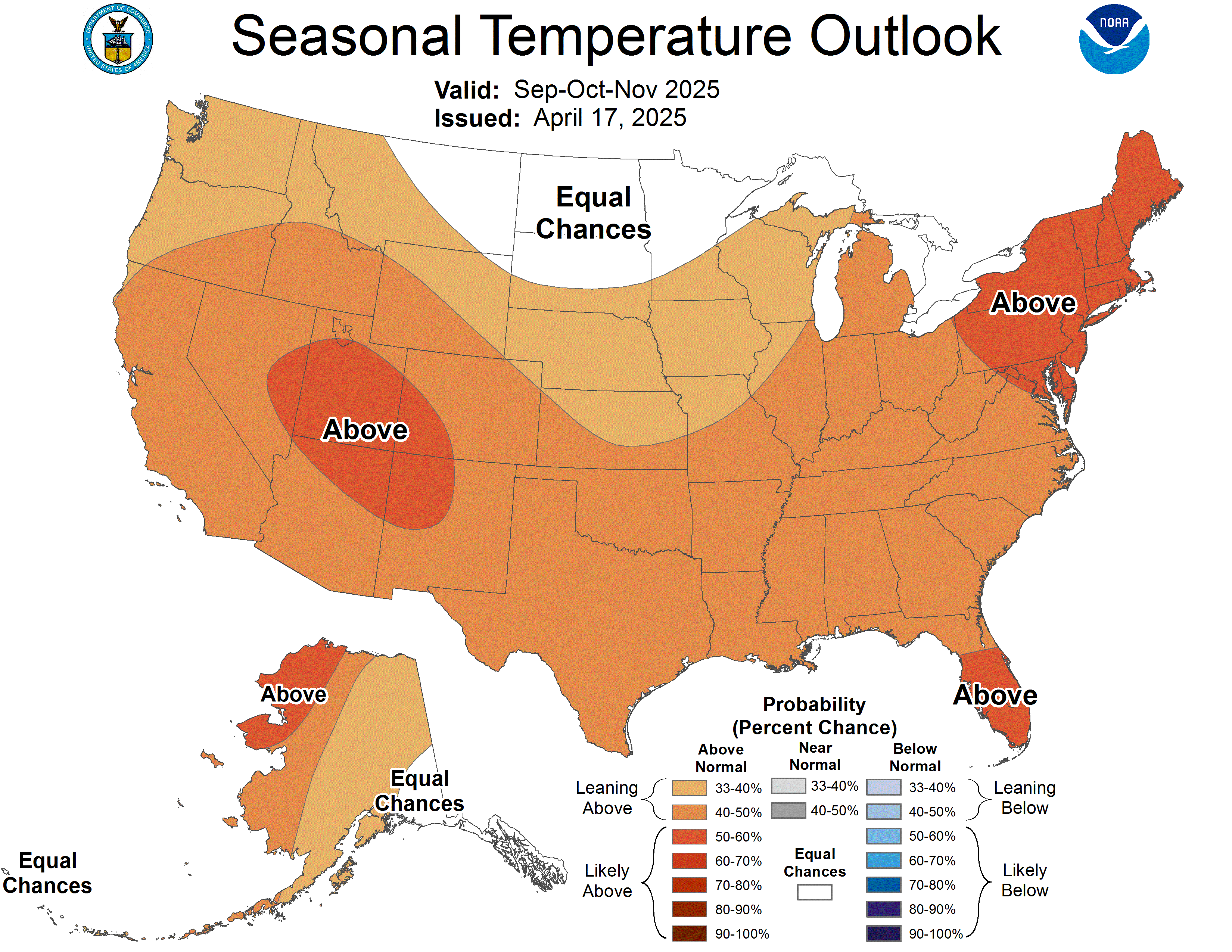
Here is the Three-Month Temperature Outlook issued on October 15, 2015:

And here is the “Early” November Temperature Outlook issued on October 15, 2015. It will be updated on Saturday October 31.

Below is the current 8 – 14 Day Temperature Outlook Map which will auto-update and thus be current when you view it. It covers the week following the current week. Today’s 6 – 14 Day Outlook is just nine days of the month and the map shown below of the 8 to 14 day Outlook only shows seven days. The 6 – 10 Day Map is available on Page II of this report. As I view this map on October 26 (it updates each day), it appears that the start of November will be more of a west/east temperature gradient rather than the north/south temperature gradient projected for the full month of November in the recently issued “Early Outlook” for November.

Now Precipitation
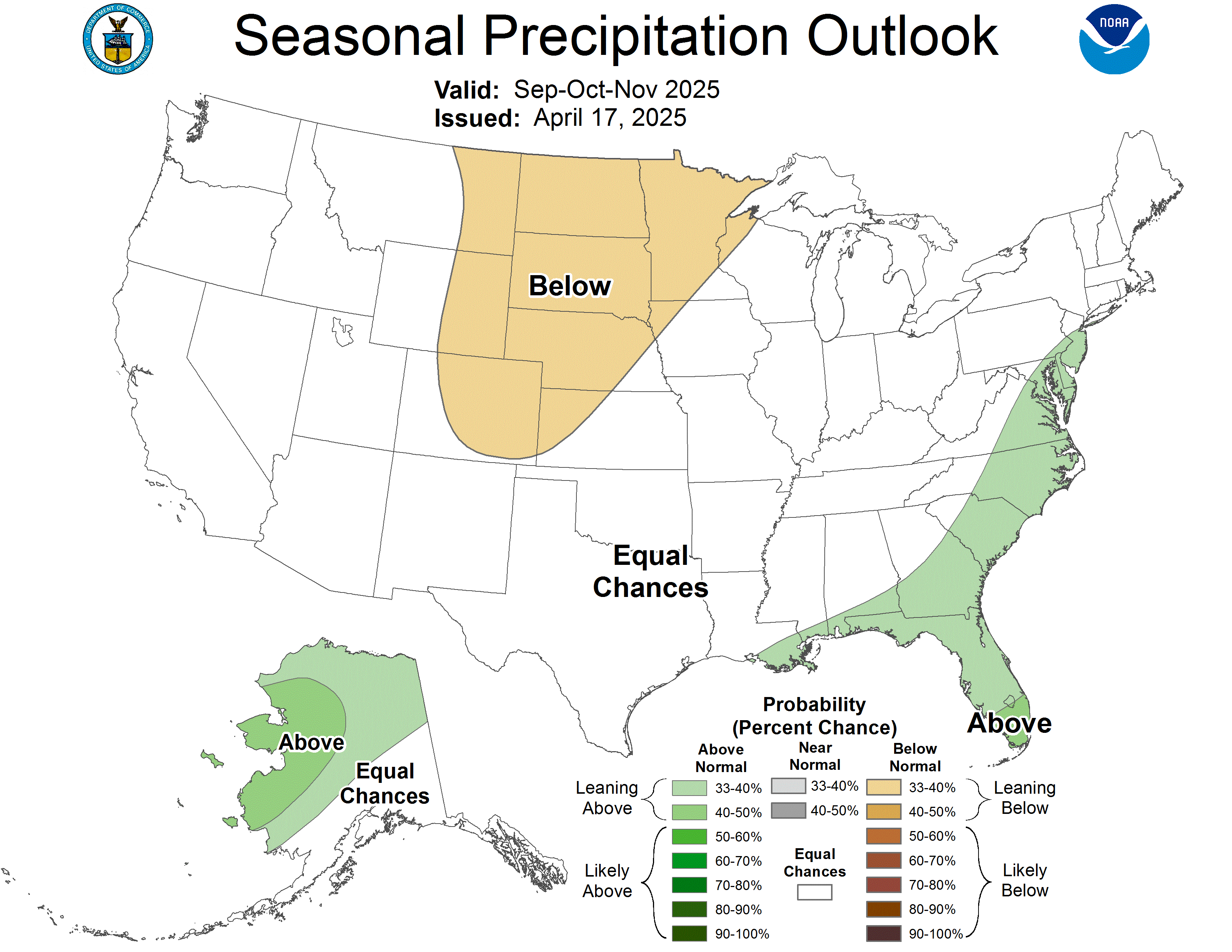
Here is the three-month Precipitation Outlook issued on October 15, 2015:

And here is the “Early” November Precipitation Outlook Update Issued on October 15, 2015. It will be updated on Saturday October 31.

Below is the current 8 – 14 Day Precipitation Outlook Map which will auto-update and thus be current when you view it. It covers the week following the current week. Today’s 6 – 14 Day Outlook is just nine days of the month and the map shown covers seven days of the nine. The 6 – 10 Day Map (the two maps overlap) is available on Page II of this report. As I view this map on October 26 (it updates each day) it appears that the start of November will be somewhat different than the “Early Outlook” for November especially in the eastern half of CONUS.

Here are excerpts from the NOAA discussion released today October 26, 2015. It covers the full nine day period not just the seven days shown in the 8-14 Day Map.
6-10 DAY OUTLOOK FOR NOV 01 – 05 2015
TODAY’S MODEL SOLUTIONS ARE IN GOOD AGREEMENT ON THE PREDICTED 6-10 DAY MEAN 500-HPA HEIGHTS ACROSS THE FORECAST DOMAIN. THE GEFS, ECMWF AND CANADIAN ENSEMBLE MEAN SOLUTIONS PREDICT A TROUGH OVER THE WESTERN CONUS WITH RIDGES OVER THE GULF OF ALASKA AND THE EAST-CENTRAL CONUS. THE DETERMINISTIC GFS AND ECMWF MODELS BOTH PREDICT HIGHER AMPLITUDE FLOW THAN THE ENSEMBLE MEANS SUGGEST, WITH THE LOCATION OF MAJOR FEATURES ABOUT THE SAME AS INDICATED BY THE ENSEMBLE MEAN SOLUTIONS. GOOD RUN-TO-RUN CONSISTENCY AMONG THE HIGHER RESOLUTION DETERMINISTIC SOLUTION INCREASE CONFIDENCE IN A HIGHER AMPLITUDE FLOW PATTERN THAN THE ENSEMBLE MEANS SUGGEST. THE TEMPERATURE AND PRECIPITATION OUTLOOK HAS BEEN ADJUSTED ACCORDINGLY FROM THE TOOLS, WHICH ARE MOSTLY BASED ON THE MEANS. THIS RESULTS IN SOME SUBSTANTIAL CHANGES TO YESTERDAY’S AUTOMATED FORECASTS. THE DETERMINISTIC MODELS WERE SUBSTANTIALLY WEIGHTED IN TODAY’S BLENDED 500-HPA HEIGHTS.
ABOVE NORMAL TEMPERATURES ARE HEAVILY FAVORED FOR THE EASTERN CONUS DUE TO THE EXPECTATION OF SUBSTANTIALLY ABOVE NORMAL 500-HPA HEIGHTS NEAR THE EXPECTED RIDGE POSITION. TEMPERATURES IN THE WEST ARE EXPECTED TO BE SUBSTANTIALLY COOLER THAN THE GUIDANCE BASED ON THE ENSEMBLE MEANS SUGGESTS RESULTING IN ELEVATED CHANCES FOR NEAR AND BELOW NORMAL TEMPERATURES. HOWEVER, MODELS SUGGEST THAT THE SURFACE TEMPERATURES ARE NOT PARTICULARLY COLD FOR THE SEASON, AND CHANCES FOR BELOW NORMAL TEMPERATURES, WHERE FAVORED, ARE ONLY MARGINALLY ELEVATED. ABOVE NORMAL SEA SURFACE TEMPERATURES OFF THE CALIFORNIA COAST ENHANCE CHANCES FOR ABOVE NORMAL TEMPERATURES ALONG THE COAST IN SOUTHERN CALIFORNIA. ALASKA IS EXPECTED TO BE NEAR THE NORTHERN EXTENT OF THE GULF OF ALASKA RIDGE, RESULTING IN ELEVATED CHANCES FOR ABOVE NORMAL TEMPERATURES THROUGHOUT THE STATE.
MOIST, SOUTHWESTERLY FLOW IS EXPECTED OVER THE EASTERN TWO-THIRDS OF THE NATION IN THE 6-10 DAY PERIOD, RESULTING IN ELEVATED CHANCES FOR ABOVE MEDIAN PRECIPITATION AMOUNTS FOR MUCH OF THE EASTERN CONUS. MODEL GUIDANCE SUGGEST A NARROW REGION OF ENHANCED CHANCES FOR BELOW-MEDIAN PRECIPITATION TO THE LEE OF THE SOUTHERN ROCKIES EXTENDING INTO THE SOUTHERN AND CENTRAL GREAT PLAINS. THERE IS GOOD AGREEMENT AMONG MODELS IN FAVORING ABOVE MEDIAN PRECIPITATION FOR THE GREAT BASIN, NORTHERN ROCKIES, WESTERN PORTIONS OF THE NORTHERN GREAT PLAINS NEAR THE EXPECTED UPPER LEVEL TROUGH. ABOVE MEDIAN PRECIPITATION AMOUNTS ARE EXPECTED FOR THE ALASKA MAINLAND AS THE RIDGE EXPECTED OVER THE GULF OF ALASKA DIVERTS THE PACIFIC STORM TRACK NORTHWARD. BELOW MEDIAN PRECIPITATION IS FAVORED FOR PARTS OF THE ALASKA PANHANDLE IN ANOMALOUS NORTHERLY FLOW AHEAD OF THE EXPECTED RIDGE AXIS.
FORECAST CONFIDENCE FOR THE 6-10 DAY PERIOD: ABOUT AVERAGE, 3 OUT OF 5, WITH GOOD MODEL AGREEMENT OFFSET BY UNCERTAINTY IN THE AMPLITUDE OF THE UPPER LEVEL FEATURES AS INDICATED BY DIFFERENCES BETWEEN THE ENSEMBLE MEANS AND DETERMINISTIC SOLUTIONS FORM THE GFS AND ECMWF MODELS.
8-14 DAY OUTLOOK FOR NOV 03 – 09 2015
TODAY’S ENSEMBLE MEAN SOLUTIONS FOR THE 500-HPA HEIGHTS OVER NORTH AMERICA AND VICINITY SUGGESTS A RELATIVELY PERSISTENT LONG WAVE PATTERN BETWEEN THE 6-10 DAY AND 8-14 DAY PERIOD. THE RIDGE EXPECTED OVER THE GULF OF ALASKA IN THE 6-10 PERIOD WEAKENS AND MOVES SLIGHTLY EASTWARD BY THE 8-14 DAY PERIOD, WITH THE TROUGH OVER THE WEST WEAKENING, BUT HOLDING ITS POSITION OVER THE GREAT BASIN AND SOUTHERN CALIFORNIA. THE RIDGE EXPECTED OVER THE EASTERN CONUS WEAKENS SLIGHTLY, ALTHOUGH THE ENSEMBLE MEAN 500-HPA HEIGHTS PREDICTED OVER THE EASTERN HALF OF THE NATION REMAIN CONSIDERABLY ABOVE NORMAL.
THE CONTINUED LIKELIHOOD FOR ABOVE NORMAL 500-HPA HEIGHTS OVER THE EASTERN CONUS SUBSTANTIALLY ELEVATE CHANCES FOR ABOVE NORMAL TEMPERATURES THROUGHOUT THE EASTERN PART OF THE NATION. TEMPERATURES IN THE WEST CONTINUE TO BE FORECAST NEAR OR ONLY SLIGHTLY BELOW NORMAL BY MOST MODELS, RESULTING IN ONLY SLIGHTLY ELEVATED CHANCES FOR BELOW NORMAL TEMPERATURES. THE FORECAST ALONG THE COAST IN SOUTHERN CALIFORNIA CONTINUE TO FAVOR ABOVE NORMAL TEMPERATURES DUE TO THE INFLUENCE OF NEARBY ABOVE NORMAL SEA SURFACE TEMPERATURES. THE 500-HPA FLOW PATTERN CONTINUES TO FAVOR ABOVE NORMAL TEMPERATURES IN ALASKA.
THE PRECIPITATION OUTLOOK CALLS FOR ABOVE NORMAL PRECIPITATION THROUGHOUT MUCH OF THE CONUS IN EXPECTED PERSISTENT MOIST SOUTHWESTERLY FLOW AT UPPER AND MID LEVELS. THE EASTWARD PROGRESSION OF THE 500-HPA RIDGE OVER THE GULF OF ALASKA SUGGESTS A WEAKENING OF THE PACIFIC JET AT MID LATITUDES, RESULTING IN ENHANCED CHANCES FOR BELOW MEDIAN PRECIPITATION FOR MUCH OF THE WEST COAST, THE PACIFIC NORTHWEST, AND THE ALASKA PANHANDLE. ABOVE MEDIAN PRECIPITATION IS FAVORED FOR THE ALASKA MAINLAND IN ANOMALOUS SOUTHWESTERLY FLOW NEAR AND TO THE WEST OF THE EXPECTED RIDGE AXIS OVER THE EASTERN NORTH PACIFIC.
FORECAST CONFIDENCE FOR THE 8-14 DAY PERIOD IS: ABOVE AVERAGE, 4 OUT OF 5, DUE TO GOOD MODEL AGREEMENT ON THE 500-HPA CIRCULATION PATTERN, AND RELATIVELY GOOD AGREEMENT AMONG THE TOOLS FOR SURFACE TEMPERATURE AND PRECIPITATION CONDITIONS.
Analogs to Current Conditions
Now let us take a detailed look at the “Analogs” which NOAA provides related to the 5 day period centered on 3 days ago and the 7 day period centered on 4 days ago. “Analog” means that the weather pattern then resembles the recent weather pattern and was used in some way to predict the 6 – 14 day Outlook.
Here are today’s analogs in chronological order although this information is also available with the analog dates listed by the level of correlation. I find the chronological order easier for me to work with. There is a second set of analogs associated with the outlook but I have not been analyzing this second set of information. This first set applies to the 5 and 7 day observed pattern prior to today. The second set which I am not using relates to the forecast outlook 6 – 10 days out to similar patterns that have occurred in the past during the dates covered by the 6 – 10 Day Outlook. That may also be useful information but they put this set of analogs in the discussion with the other set available by a link so I am assuming that this set of analogs is the most meaningful.
Analog Centered Day | ENSO Phase | PDO | AMO | Other Comments |
| Oct 19 1957 | El Nino | + | + | Possibly a Modoki |
| Oct 21 1957 | El Nino | + | + | Possibly a Modoki |
| Oct 17 1981 | Neutral | + | – | |
| Oct 10 1986 | El Nino | + | – | Possibly a Modoki |
| Oct 11 1986 | El Nino | + | – | Possibly a Modoki |
| Oct 30 1986 | El Nino | + | – | Possibly a Modoki |
| Oct 6 1993 | Neutral | + | – | |
| Oct 7 2006 | El Nino | – | + | Traditional El Nino |
| Oct 19 2009 | El Nino | – | + | Modoki Type II |
One thing that jumped out at me right away was the tight spread among the analogs from Oct 6 to Oct 21 just over two weeks which is unusually tight. There are this time seven El Nino Analogs and zero La Nina Analogs and just two ENSO Neutral Analogs so that does suggest that El Nino is a factor over the next 6 – 14 Days in addition to the tropical storms that come up along the Mexico West Coast. The possible Modoki-ish nature of most of these El Nino analogs is puzzling but consistent with the OLR pattern in place and shown later in this presentation. It could shift the impacts further west than with traditional El Ninos. The phases of the ocean cycles are very consistent with McCabe Condition A which is a wet pattern and somewhat consistent with the 6 – 14 Day Outlook. Both the Atlantic and the Pacific are influencing our weather about equally. The seminal work on the impact of the PDO and AMO on U.S. climate can be found here. Water Planners might usefully pay attention to the low-frequency cycles such as the AMO and the PDO as the media tends to focus on the current and short-term forecasts to the exclusion of what we can reasonably anticipate over multi-decadal periods of time.

You may have to squint but the drought probabilities are shown on the map and also indicated by the color coding with shades of red indicating higher than 25% of the years are drought years (25% or less of average precipitation for that area) and shades of blue indicating less than 25% of the years are drought years. Thus drought is defined as the condition that occurs 25% of the time and this ties in nicely with each of the four pairs of two phases of the AMO and PDO.
Historical Anomaly Analysis
When I see the same dates showing up often I find it interesting to consult this list.
With respect to relating analog dates to ENSO Events, the following table might be useful. In most cases this table will allow the reader to draw appropriate conclusions from NOAA supplied analogs. If the analogs are not associated with an El Nino or La Nina they probably are not significant. Remember, an analog is indicating a similarity to a weather pattern in the past. So if the analogs are not associated with a prior El Nino or prior La Nina the computer models are not likely to generate a forecast that is consistent with an El Nino or a La Nina.
| El Ninos | La Ninas | |||||||||
|---|---|---|---|---|---|---|---|---|---|---|
| Start | Finish | Max ONI | PDO | AMO | Start | Finish | Max ONI | PDO | AMO | |
| DJF 1950 | J FM 1951 | -1.4 | – | N | ||||||
| T | JJA 1951 | DJF 1952 | 0.9 | – | + | |||||
| DJF 1953 | DJF 1954 | 0.8 | – | + | AMJ 1954 | AMJ 1956 | -1.6 | – | + | |
| M | MAM 1957 | JJA 1958 | 1.7 | + | + | |||||
| M | SON 1958 | JFM 1959 | 0.6 | + | – | |||||
| M | JJA 1963 | JFM 1964 | 1.2 | – | – | AMJ 1964 | DJF 1965 | -0.8 | – | – |
| M | MJJ 1965 | MAM 1966 | 1.8 | – | – | NDJ 1967 | MAM 1968 | -0.8 | – | – |
| M | OND 1968 | MJJ 1969 | 1.0 | – | – | |||||
| T | JAS 1969 | DJF 1970 | 0.8 | N | – | JJA 1970 | DJF 1972 | -1.3 | – | – |
| T | AMJ 1972 | FMA 1973 | 2.0 | – | – | MJJ 1973 | JJA 1974 | -1.9 | – | – |
| SON 1974 | FMA 1976 | -1.6 | – | – | ||||||
| T | ASO 1976 | JFM 1977 | 0.8 | + | – | |||||
| M | ASO 1977 | DJF 1978 | 0.8 | N | – | |||||
| M | SON 1979 | JFM 1980 | 0.6 | + | – | |||||
| T | MAM 1982 | MJJ 1983 | 2.1 | + | – | SON 1984 | MJJ 1985 | -1.1 | + | – |
| M | ASO 1986 | JFM 1988 | 1.6 | + | – | AMJ 1988 | AMJ 1989 | -1.8 | – | – |
| M | MJJ 1991 | JJA 1992 | 1.6 | + | – | |||||
| M | SON 1994 | FMA 1995 | 1.0 | – | – | JAS 1995 | FMA 1996 | -1.0 | + | + |
| T | AMJ 1997 | AMJ 1998 | 2.3 | + | + | JJA 1998 | FMA 2001 | -1.6 | – | + |
| M | MJJ 2002 | JFM 2003 | 1.3 | + | N | |||||
| M | JJA 2004 | MAM 2005 | 0.7 | + | + | |||||
| M | ASO 2006 | DJF 2007 | 1.0 | – | + | JAS 2007 | MJJ 2008 | -1.4 | – | + |
| M | JJA 2009 | MAM 2010 | 1.3 | – | + | JJA 2010 | MAM 2011 | -1.4 | + | + |
| JAS 2011 | FMA 2012 | -0.9 | – | + | ||||||
| T | MAM 2015 | NA | 1.0 | + | N | |||||
Progress of the Warm Event
Let us start with the SOI.
Below is the Southern Oscillation Index (SOI) reported by Queensland, Australia. The first column is the tentative daily reading, the second is the 30 day moving/running average and the third is the 90 day moving/running average.
| Date | Current Reading | 30-Day Average | 90 Day Average |
| 20 Oct | -10.3 | -22.39 | -19.28 |
| 21 Oct | -6.3 | -22.10 | -19.23 |
| 22 Oct | -5.6 | -21.78 | -19.13 |
| 23 Oct | -12.8 | -21.65 | -19.09 |
| 24 Oct | -14.8 | -21.34 | -19.12 |
| 25 Oct | -19.2* | -20.95* | -19.14* |
| 26 Oct | -22.8* | -20.62* | -19.19* |
The 30-day average, which is the most widely used measure, on October 26 is not available at this time. This is probably a website problem and if the data is updated tomorrow I will update this article accordingly but unless the two days of unreported data are exceptionally different from the current averages it will not change them materially. Based on the five days of data available, the 30 day average is showing as being -21.34 which is a very high (negative) level and is clearly a reading associated with an El Nino. The 90-day average also is solidly in El Nino territory at -19.12 which is about the same as last week. The SOI is clearly indicative of an El Nino Event in progress. In fact it is so strong that it may be having impacts that are unusual. The SOI appears to have plateued. This can be important as some studies show that the change in the level of SOI is at least as important as the actual level in terms of predicting precipitation.
[Editor’s Note: Even though the data came out very late, I decided to add it to have a complete record. The addition of the two days of data which I have delineated with an asterisk changed the 30 day average to -20.62 and the 90 day average to -19.19 which is inconsequential but done simply for those who might want to have a better historical record.]
Low-Level Wind Anomalies
Here are the low-level wind anomalies. The area from 180W to 160W was of interest but appears to have played out. There is now an area of interest at 160W.

In the below graphic, you can see how the convection pattern (really cloud tops has since May shifted to the East from a Date Line (180) Modoki pattern to a 170W to 120W Traditional/Canonical El Nino Pattern. But recently the signs of an El Nino are getting quite faint and shifting back to the west. You can see the lack of convection over at 120W which is Indonesia but the convection has withdrawn to the West not moved to the East as would be the case with a normal El Nino. That may still happen. In the 1997/1998 El Nino, that did not happen until 1998 which is why the Fall of 1997 was not wet for CONUS.
When I hear that with this El Nino the atmosphere is strongly coupled with the ocean, I really wonder what those meteorological agencies are smoking. For sure the SOI is behaving like it would be expected to behave in a strong El Nino. The Easterlies in the Pacific along the Equator are suppressed. So if this is all that is meant, that part has fallen into place. But the Walker Circulation may not be consistent with a standard El Nino. That is my point.
The interconnection with the Indian Ocean seems to be unusual to say the least. The convection in the Pacific along the Equator has not moved east. It has moved away from Indonesia which is an El Nino impact but it is remaining where one would expect it to be if this was a Modoki. This graphic may start to change soon. But it may not be in the direction of more convection further east. The October 20 Update, which is what I am looking at on Monday October 26, suggests that the area of anomalies in convection is strongest over by the Date Line and has not expanded to the east as one might have expected and may even have retreated to the west a bit. This is not your standard El Nino. But the dryness has expanded to the west. Both anomalies have increased in intensity.

Let us now take a look at the progress of the Kevin wave which is the key to the situation. Since February there have been three successive downwelling Kelvin Waves without really an upwelling Kelvin Wave of any consequence to counter their impact. The first wave which started in February was the most effective at getting this El Nino started. The second wave reinforced to some extent but not much and this third (and I had believed would be the last) downwelling Kelvin Wave has created an El Nino that will have a major peak coming soon and an extended life but at a diminished strength. We now see a fourth Kelvin wave and it shows up in the TAO/TRITON graphic which is discussed later in this report..
We are now going to change the way we look at a three dimensional view of the Equator and move from the surface view to the view from the surface down. When I examine the current situation as compared to the 1997/1998 El Nino which I described graphically recently, the current El Nino has developed more rapidly. This El Nino is a couple of months further along in its evolution than the 1997/1998 El Nino and will end earlier in the winter than the 1997/1998 El Nino. Also the 1997/1998 had a slightly larger amount of warm subsurface water in the Eastern Pacific and that water takes time to surface, create convection, and thus cool. Something happens to allow the Easterlies to resume their strength and that in turn moves this water back towards the Western Pacific Warm Pool. This El Nino appears to be fading from west to east.
Current Sub-Surface Conditions

Top Graphic (Anomalies)
The above graphic showing the current situation has an upper and lower graphic. The bottom graphic shows the absolute values, the upper graphic shows anomalies compared to what one might expect at this time of the year in the various areas both 130E to 90W Longitude and from the surface down to 450 meters.
The top graphic is still the most useful of the two and shows where 2C (anomaly) water is impacting the area in which the ONI is measured i.e. 170W to 120W. The 2C anomaly now extends to 170W which is very impressive. The 3C anomaly is now no longer over beyond 150W but still encompasses about 60% of the Nino 3.4 Measurement Area for the ONI. The 4C anomaly is no longer close to intersecting the surface. It is not clear exactly how the measurements here relate to the TAO/TRITON graphic which is not showing such warm anomalies.
It is important to differentiate between anomalies and actual temperature. The warm anomaly shown in the upper graphic is not covered by colder water as it might appear to be in the upper graphic but is shown as a warm anomaly because normally water at those depths is colder than it currently is. That is why this warm anomaly does not simply rise to the surface as warm water would normally do but it is preventing cooler water from entering the area as one would expect as summer transitions to Fall. That is why it takes time for this warm anomaly to dissipate.
Bottom Graphic (Absolute Values which highlights the Thermocline)
The bottom half of the graphic may soon become more useful in terms of tracking the progress of this Warm Event as it converts to ENSO Neutral and then La Nina. It shows the thermocline between warm and cool water which pretty much looks like this as shown here during a Warm Event. You can see that the cooler water is not yet fully making it to the surface to the east along the coast of Ecuador. We now will pay more attention to the 28C Isotherm as west of that temperature is where convection is more easy to occur. Right now that Isotherm intersects the surface near 130W which has been the case for some time but it appears to have moved a bit to the west which is consistent with the El Nino beginning to decline in intensity.
TAO/TRITON GRAPHIC
Taking a close look at the TAO/TRITON graphic but first let us compare the situation three weeks ago

to the most recent graphic shown below. Remember each graphic has two parts the top part is the average values, the bottom part is those values expressed as an anomaly compared to the expected values for that date.

| ———————————————– | A | B | C | D | E | —————- |
With the current graphic, there is quite a bit of difference. I now can see the new Kelvin Wave over at 170W but everything else has been shifted way to the east or simply diminished. The 2C anomaly on Oct 4 was showing all the way over to 170W. Now it extends only to 140W which is a big difference.
I calculate the ONI each week using a method that I have devised. To refine my calculation, I have divided the 170W to 120W ONI measuring area into five subregions (that I have designated A through E (from west to east) with a location bar shown under the TAO/TRITON Graphic) and have mentally integrated what I see below and recorded that in the table I have constructed. Then I take the average of the anomalies I estimated for each of the five subregions.
So as of Monday October 26 in the afternoon working from the October 25 TAO/TRITON report, this is what I calculated.
| Anomaly Segment | Estimated Anomaly |
| A. 170W to 160W | 1.7 |
| B. 160W to 150W | 1.7 |
| C. 150W to 140W | 1.8 |
| D. 140W to 130W | 2.2 |
| E. 130W to 120W | 2.6 |
| Total | 10.0 |
| Total divided by five subregions i.e. the ONI | (10.0)/5 = 2.0 |
My estimate of the Nino 3.4 ONI after rounding has decreased to 2.0. NOAA has today reported the weekly ONI as being 2.5 which in my opinion is a very questionable reading and possibly out of date. Nino 4.0 is now reported as being 1.3 which reflects the new and fourth Kelvin Wave. The action which I think is most important to track right now is in Nino 1+2 which is now reported as being down to 2.2 which is still high but much lower than last week. One issue remains the extent to which warm water off of Ecuador and Peru impacts CONUS weather. I think it has very little impact and that is what we are seeing right now. There is warm water north of the Equator which has been generating tropical storms along the west coast of Central America which have impacted CONUS. That warm water may or may not be related to this El Nino. The other issue is that most El Ninos decay from east to west so it will be observed most clearly first in Nino 1+2 and we are now probably seeing that process starting.
This is summarized in the following NOAA Tables and I am showing both the table for three weeks ago and the updated table.

And here are the values this week.

One can see the significant decline in the Nino 1+2 measurement area. This is confirmed in a graphic that I present later. I think it is quite possible that this El Nino has now peaked and has begun its decline!
One wonders about these calculations as they appear to not be related to the “adjusted” version of the NOAA forecast model which was discussed recently. So it is not clear to me how this El Nino will be officially recorded. July-August-September has been recorded as having an ONI of 1.5. In the above graphic eyeballing it you might conclude that the three months were observed as being 1.6, 2.0 and 2.3. So the impact of adjusting these observed values to what is considered “adjusted” is not obvious to me.
Although I discussed the Kelvin Waves earlier, now seems to be the best place to show the evolution of the subsurface temperatures.

We clearly now see the cooling of the water of the coast of Ecuador which is a clear sign of the waning of this El Nino. It has a long way to go.
SST Surface Anomaly Hovmoeller
Here is another way of looking at it: Unlike the Upper Ocean Heat Anomaly Hovmoeller (I call it the Kelvin Wave Hovmoeller) which takes an average down to 300 meters, this just measures the surface temperature anomaly. It is the surface that interacts with the atmosphere. As you can see the warm water rising off the South American Coast had (or at least the value of the anomaly when calculated) worked its way all the way over to beyond 170W so it fully contributes to the increasing ONI but the western edge of the warm anomaly is showing some signs of stalling and drifting to the east. So far the various graphics many of which are looking at the same information from a different perspective are not indicating to me that there is a new Kelvin Wave that will intensify this El Nino but the new Kelvin Wave may extend its life a bit.
El Nino in the News
Here is one of many reports on Hurricane Patricia. It points out that with respect to extreme events, their location is very important. It also points out the limitation of our standard measures of storm intensity. The air pressure in the center of a cyclone and maximum sustained wind speeds are logical measures but they do not necessarily correlate with damage potential. Also preparedness is critical to mitigating damages.
Recent Impacts of Weather Mostly El Nino but possibly Also PDO and AMO Impacts.
First the Temperature and Precipitation Departures from four months ago (Ending Date June 13)

Then the same graphic one month later (Ending Date July 11)

And then the same graphic (Ending Date August 8).

And again four weeks later (Ending Date October 3, 2015)

And again two weeks later (Ending Date October 24, 2015)

This provides more than a four-month sequence of snapshots of the four-week departures from normal as this El Nino has progressed.
You can see these five graphics as well as I can and it is difficult to describe the changes that have taken place over five periods of time because of the large number of changes. Currently we see:
- A general pattern of fairly extreme warm anomalies in most of CONUS especially the West.
- More dry areas than wet areas in CONUS with much of the dry areas contiguous and in the Northwest and the Great Plains. The east coast is wetter than climatology and we know about the flooding in South Carolina, North Carolina and Virginia (which might be partially attributable to El Nino). The pattern in Mexico has become less dry.
View from Australia
El Nino

I do not see much change from the graphic released two weeks ago. Here is the discussion just released:
Strong El Niño and positive Indian Ocean Dipole persist
Issued on 27 October 2015
The strong El Niño in the Pacific Ocean and a positive Indian Ocean Dipole persist.
In the central tropical Pacific Ocean, sea surface temperatures (SSTs) continue to warm, but at a markedly slower pace than earlier this year. All NINO indices have now been above +1 °C for 11 consecutive weeks. Recent bursts of westerly winds in the tropics means some further warming remains possible. All models indicate that the strong El Niño is likely to persist until the end of the year, before a marked decline during the first quarter of 2016.
International climate models also suggest the positive Indian Ocean Dipole (IOD) will persist into November, but then decline rapidly once the monsoon trough shifts south, changing wind patterns over the IOD region. So far in October the IOD index has averaged over +1 °C—the last month that this occurred was in 2006.
El Niño is usually associated with below-average spring rainfall over eastern Australia, and increased spring daytime temperatures south of the tropics. A positive IOD typically reinforces the drying pattern, particularly in the southeast. During summer, El Niño’s influence on rainfall decreases, while warmer daytime and night-time temperatures tend to be more likely across the south and east.
Next update expected on 10 November 2015
IOD (Indian Ocean Dipole)

Again I do not see much change from the graphic released two weeks ago except that the IOD index looks to be high again in May which is a small change from the prior forecast..It comes with only a very short discussion and here is the key part of that discussion.
Indian Ocean Dipole
The positive Indian Ocean Dipole (IOD) event persists, with the weekly index value to 25 October strongly positive at +1.08 °C.
Sea surface temperatures (SSTs) in the Indian Ocean are warmer than average over much of the basin, while waters around the Indonesian archipelago and to Australia’s north are cooler than average.
Positive IOD events are often associated with lower rainfall in parts of central and southeastern Australia (see About the Indian Ocean Dipole). Positive IOD events are more likely to occur during El Niño, which also is typically associated with a reduction in winter–spring rainfall in eastern Australia.
All surveyed international climate models indicate this event is likely to begin to decay in late spring. IOD events typically decay by early summer. [Editor’s note: Rememer the seasons are reversed in the Southern Hemisphere]
The interrelationship between the IOD and El Nino is complicated and not fully understood.
Putting it all Together.
We are in El Nino conditions now. For CONUS so far there are few if any impacts of this intense El Nino other than those related to the Pacific Cyclones which have been intense and which have in the past month had an impact on the Southwest and possibly indirectly on the flooding in South Carolina, North Carolina and Virginia. So this raises real questions about how we measure an El Nino and how we do regression analysis on historical El Ninos to predict CONUS weather.
The El Nino I believe has peaked in intensity and has begun its decline. The actual impacts on CONUS are not clear. We started in the Spring by having wetter conditions than usual in the Southwest but that has tapered off quite a bit although that is starting to change. The El Nino is probably influencing the IOD to tend towards being positive thus providing a double whammy for parts of Asia and Australia. Indonesia and the Philippines have been hit by drought.
The length and intensity of this El Nino is still not clear mostly in terms of whether or not it will extend into the early part of 2016. There does not seem to be an obvious match to any prior El Nino in the modern era which to me means there is no model to use to predict impacts. That is a complicated subject which is probably best dealt with on a post mortem basis.
We may or may not have a Pacific Climate Shift as the PDO+ may be simply related to the Warm Event and quite frankly at this point appears to be and may be moving back to PDO Negative. But for now we do have PDO+. The AMO being an overturning may be more predictable so the Neutral status moving towards AMO- is probably fairly reliable but not necessarily proceeding in a straight line as indeed the storm track for hurricanes in the Atlantic is suddenly unusually warm.
So in terms of long-term forecasting, none of this is very difficult to figure out actually if you are looking at say a five-year or longer forecast. The research on Ocean Cycles is fairly conclusive and widely available to those who seek it out. I have provided a lot of information on this in prior weeks and all of that information is preserved in Part II of my report in the Section on Low Frequency Cycles 3. Low Frequency Cycles such as PDO, AMO, IOBD, EATS. It includes decade by decade predictions through 2050. Predicting a particular year is far harder.
We are beginning to speculate on the winter of 2016/2017 which it now seems increasingly likely will be a La Nina. One thing that is fairly certain for the U.S.is that compared to this winter the following winter is projected to be:
- warmer in the south and less warm in the north and
- more dry in the south and less dry in the north
The below is the CPC/IRI forecast (which has not been updated since last week) and you can see the rapid shift away from El Nino that is now predicted starting in AMJ and really showing up in MJJ 2016 i.e. late Spring early Summer 2016..

TABLE OF CONTENTS FOR PART II OF THIS REPORT The links below may take you directly to the set of information that you have selected but in some Internet Browsers it may first take you to the top of Page II where there is a TABLE OF CONTENTS and take a few extra seconds to get you to the specific section selected. If you do not feel like waiting, you can click a second time within the TABLE OF CONTENTS to get to the specific part of the webpage that interests you.
A. Worldwide Weather: Current and Three-Month Outlooks: 15 Month Outlooks (Usefully bookmarked as it provides automatically updated current weather conditions and forecasts at all times. It does not replace local forecasts but does provide U.S. national and regional forecasts and, with less detail, international forecasts)
B. Factors Impacting the Outlook
1. Very High Frequency (short-term) Cycles PNA, AO,NAO (but the AO and NAO may also have a low frequency component.)
2. Medium Frequency Cycles such as ENSO and IOD
3. Low Frequency Cycles such as PDO, AMO, IOBD, EATS.
C. Computer Models and Methodologies
D. Reserved for a Future Topic (Possibly Predictable Economic Impacts)
TABLE OF CONTENTS FOR PART III OF THIS REPORT – GLOBAL WARMING WHICH SOME CALL CLIMATE CHANGE. The links below may take you directly to the set of information that you have selected but in some Internet Browsers it may first take you to the top of Page III where there is a TABLE OF CONTENTS and take a few extra seconds to get you to the specific section selected. If you do not feel like waiting, you can click a second time within the TABLE OF CONTENTS to get to the specific part of the webpage that interests you.
D2. Climate Impacts of Global Warming
D3. Economic Impacts of Global Warming
D,4. Reports from Around the World on Impacts of Global Warming


