Written by Sig Silber
In a highly unusual occurrence, the analogs used by NOAA today are very consistent with each other and also to the ENSO Phase and PDO and AMO Phases on the date of the selected analogs. This suggests to me that we are in a situation where forecasts should be highly reliable. But the weather models are still having some difficulty which I attribute to it being summer, which is always a difficult time for weather models and the fact that these models are not very adept at incorporating certain fairly recently understood cycles such as the PDO and the AMO. To assist with this I am re-presenting some information, that was in a prior weekly Weather and Climate Report, on the impact of the AMO on CONUS summers. Since the AMO is changing, there will be a differential impact on summers.

This is the Regular Edition of my weekly Weather and Climate Update Report. Additional information can be found here on Page II of the Global Economic Intersection Weather and Climate Report.
Summers are Gradually Changing.
For the Continental United States (CONUS), the Pacific Ocean has the biggest impact on Winter weather and the Atlantic on Summer weather. They both have an impact in all seasons but the Atlantic becomes dominant in the Summer. As it turns out, both the Pacific and the Atlantic have low-frequency cycles of about 60 years that provide some hints on what to expect. They are simply hints and thus are not very useful in making specific forecasts for a particular day or even for a particular year but on a probability basis they are very significant. Since this is July, it is useful to discuss not only the impact of the Atlantic but also how the low-frequency cycle in the Atlantic is gradually changing that impact and will tend to be doing that for the next thirty to sixty years.
This paper is a good explanation of how summer precipitation is controlled by the Atlantic and in particular the AMO.
Variations in North American Summer Precipitation Driven by the Atlantic Multidecadal Oscillation QI HU,SONG FENG, AND ROBERT J. OGLESBY
“ABSTRACT (Excerpt)
During the warm phase, the North Atlantic subtropical high pressure system (NASH) (Editors Note: many refer to NASH as either the Bermuda High or the Azores High) weakens, and the North American continent is much less influenced by it. A massive body of warm air develops over the heated land in North America from June–August, associated with high temperature and low pressure anomalies in the lower troposphere and high pressure anomalies in the upper troposphere. In contrast,during the cold phase of the AMO, the North American continent, particularly to the west, is much more influenced by an enhanced NASH. Cooler temperatures and high pressure anomalies prevail in the lower troposphere, and a frontal zone forms in the upper troposphere. These different circulation anomalies further induce a three-cell circulation anomaly pattern over North America in the warm and cold phases of the AMO. In particular, during the cold phase, the three-cell circulation anomaly pattern features a broad region of anomalous low-level southerly flow from the Gulf of Mexico into the U.S. Great Plains. Superimposed with an upper-troposphere front, more frequent summertime storms develop and excess precipitation occurs over most of North America. A nearly reversed condition occurs during the warm phase of the AMO, yielding drier conditions in North America. This new understanding provides a foundation for further study and better prediction of the variations of North American summer precipitation, especially when modulated by other multidecadal variations—for example, the Pacific decadal oscillation and interannual variations associated with the ENSO and the Arctic Oscillation.“
Some of the graphics from this paper are extremely interesting so I am showing them. You can enlarge them here and here. The way to look at this graphic is that the situation for the AMO being in its warm phase is shown on the left and the situation for the AMO being in its cool phase is shown on the right. The top graphic represents the upper troposphere and the bottom graphic the lower troposphere.

It is amazing to me that the patterns in the upper and lower troposphere can be so different but the easiest explanation perhaps is that the stronger/larger/and 20 degrees of longitude further west Bermuda High (also known as NASH, Azores High) associated with AMO- results in the jet stream being shifted further north and creating a counter-clockwise/cyclonic curvature which is conducive to storm formation.
The AMO has been positive since the mid nineties and peaked around 2010 or a bit earlier and is now pretty much neutral but we will be in AMO negative soon and for a long time. The Atlantic Multidecadal Oscillation (AMO) Index can be found here. You will notice that the index fluctuates a lot and it is only by various averaging techniques that we get a feel for the condition of the Atlantic minus the higher-frequency fluctuations of which ENSO (El Nino, La Nina, Neutral) is the most well known. And of course there is Global Warming which needs to be considered but at this point in time is less of a factor with respect to summer weather.
A useful paper in looking at the recent situation of the-low frequency component of the cycle in the Atlantic and what the likely future situation might be through the middle of this Century can be found here.
Joint statistical-dynamical approach to decadal prediction
of East Asian surface air temperature
LUO FeiFei & LI ShuangLin
The following Graphic from the Luo and Li paper is very interesting. The AMO is the major North Atlantic Oscillation, the IPO is the major North and South Pacific Oscillation and the IOBD is the major Indian-Ocean oscillation.

Now I have modified the above to line up some key dates in the graphics namely the beginning of decades starting from the one we are in and looking forward. The decades are numbered across the top as “1”, “2”, “3”, “4”.

So you can see that the positive or warm phase of the AMO more or less peaked in 2010 and is likely to be less positive for perhaps the next 30 years and then take another thirty years to return to 2010 levels. No one believes that this can be predicted to a particular year but it is very reasonable to believe that the impacts of the Atlantic will be more favorable for the Southwest Monsoon for an expended period of time (and focus the impacts to the east rather than the west) and have other impacts on CONUS Summer (Southeast CONUS) that are correlated with the AMO not being in the extreme Positive Condition.
It might be useful to better understand some of the mechanics of how the Atlantic Multidecadal Oscillation operates and the following table presents some information which comes from the Iris Grossmann and Philip J. Klotzbach paper. It should be understood that this applies mainly to winter conditions and I have included it mostly because it confirms the dates of the AMO Cycle.
| NAO | Positive + | Negative – | |
| AMO | Negative – | Positive + | |
| Years (will vary among researchers) | 1990-1925, 1971-1994 | 1875-1899, 1926-1970, 1995-Present | |
| sub-Polar Area* | Cold | Warm | |
| West Atlantic* | 20N – 45N | Warm | Cold |
| East Atlantic* | 0 – 30N | Cold | Warm |
Notice that when the AMO is in its Warm or Positive Phase, the Mid-Atlantic between 20N and 45N Latitude is actually cool and vice versa. That is counter-intuitive as it seems to conflict with the labeling of the cycle phase but the best way to look at the AMO is as a tripole with the water to the north and south defining the phase and with an area of opposite sign in between. The above is actually the coordinates for the phases of the NAO not the AMO but they are similar and highly correlated with a lag but not identically located and so far the above is the best description I have found.
Current (Now to 5 Days forward) Weather Situation:
For daily forecasts it is better to consult your local weather service or the National Weather Service where you are traveling as these will be more specific. What I present here is information that normally is not made available via local weather forecasts and which can help you understand what some of the major drivers are for the local forecast. A more complete version of this report with daily forecasts is available on Part II .This is a summary of that fuller report. This link Worldwide Weather: Current and Three-Month Outlooks: 15 Month Outlooks will take you directly to that set of information but in some Internet Browsers it may just take you to the top of Page II where there is a TABLE OF CONTENTS and you may have to wait for a few seconds for your Browser to redirect to the selected section with that Page or you can click a second time within the TABLE OF CONTENTS to get to that specific part of the webpage.
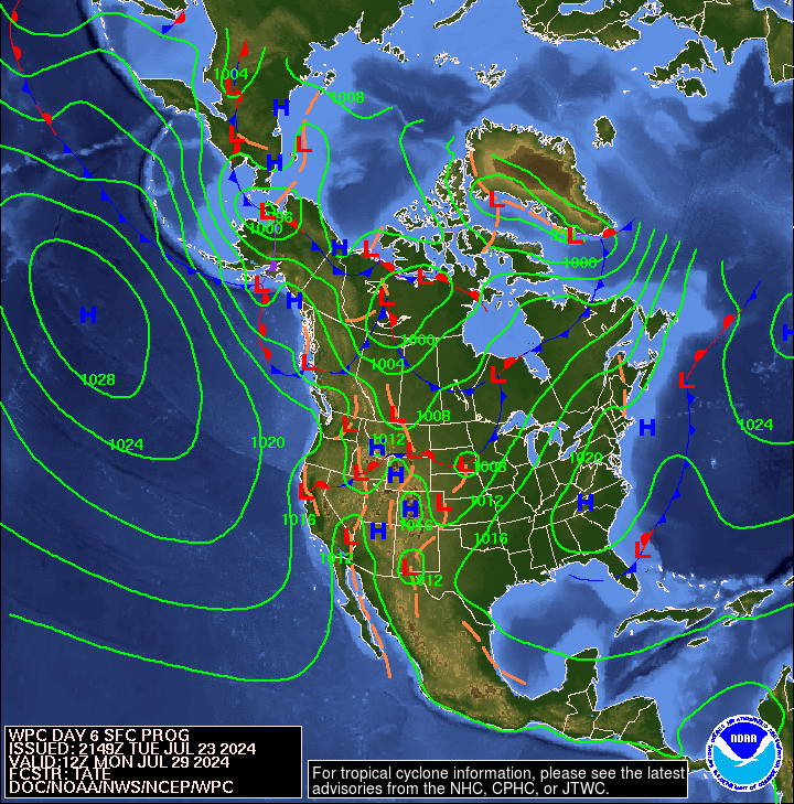
First, here is a national 12 hour to 60 hour forecast of weather fronts shown as an animation. Beyond 60 hours, the maps are available in Part II of the Global Economic Intersection Weather and Climate Report as described above.

The explanation for the coding used in these maps, i.e. the full legend, can be found here.
The map below is the mid-atmosphere 7-Day chart rather than the surface highs and lows and weather features. In some cases it provides a clearer less confusing picture as it shows only the major pressure gradients. You can see the Four Corners High where Utah, Colorado, Arizona, and New Mexico meet. At this time of the year, small changes in the location of that feature make a big difference in the weather of probably about ten or more states. Note the Day 7 location of the Four Corners High was projected to be in Eastern Texas at the time that I wrote this report. It possibly explains the projected western shift in the impacts of the North American Monsoon (which probably is more properly called the Sonoran Monsoon).
It certainly explains the warmer than climatology conditions in Texas. But this High moves around a lot so by the time you view it most likely it will be located somewhere else. But you can always imagine the clockwise circulation and how that might impact the movement of moisture in from the Gulf of Mexico and up from Mexico and in from the Gulf of California. So this graphic can be very very useful. And it auto-updates, I think every six hours.

In the Tropical Weather Outlook graphic below, notice the stream of moisture moving north from Mexico into the Southwest. To some extent this is enhanced by the position of the extreme western edge of the influence of the Bermuda High. It has not been a full-fledged Southwest Monsoon or at least it has not followed the normal development phase for the North American Monsoon (reduction of the Westerlies and steady increase in the Southerlies due to the creation of the Monsoonal Ridge) but it is part of a fairly consistent pattern that is currently making CONUS unusually wet. But it looks like that pattern is about to be interrupted for at least a week and perhaps longer. But notice the new tropical activity off of Central America which has already been named Hurricane Dolores.

Below is another view which highlights the surface highs and the lows re air pressure on Day 6 (Day 3 can be seen in Part II of this Report). The Aleutian Low although it has weakened a bit refuses to take its usual summer vacation and that may be related to the El Nino. The RRR has moved further off shore and the Northwest can now more easily receive warm wet air from the Pacific. You may be able to see an “L” on the map in that area but remember these maps update every six hours.
Outlook Days 6 – 14 (but only showing the 8 – 14 Day Maps)
Here is a graphic of the July Outlook issued June 30, 2015:

And here is the current 8 – 14 Day Temperature Outlook which will auto-update and thus be current when you view it.

It covers the week following the current week. Today’s 6 – 14 Day Outlook is just nine days of the month and the map shown of the 8 to 14 day Outlook only shows seven days. As I view this map on July 13 (it updates each day), other than the Southeast, there is little resemblance to the updated monthly forecast for July issued on June 30, 2015.
And here is the Outlook for July Precipitation issued on June 30, 2015:

Here is the current 8 – 14 Day Precipitation Outlook which will be auto-update daily and thus be current when you view it.

And again remember that this map shows only seven days and the full 6 – 14 Day Outlook only covers nine days. There are 31 days in July.
As I look at this map on July 13 (it updates automatically each day) it looks like things have changed since the Monthly Updated Outlook for July was issued on June 30, 2015.
Here are excerpts from the NOAA discussion released today July 13, 2015.
6-10 DAY OUTLOOK FOR JUL 19 – 23 2015
TODAY’S ENSEMBLE MEAN SOLUTIONS ARE IN FAIRLY GOOD AGREEMENT ON THE 500-HPA MEAN CIRCULATION PATTERN ANTICIPATED OVER MOST OF THE NORTH AMERICA DOMAIN FOR THE 6-10 DAY PERIOD. THE ENSEMBLE MEANS DEPICT AN ANOMALOUS RIDGE OVER MOST OF ALASKA, A TROUGH NEAR THE WEST COAST OF CANADA AND THE CONUS, RIDGING OVER THE CENTRAL U.S., AND A TROUGH OVER THE EASTERN U.S. THE ANOMALOUS RIDGE/TROUGH PATTERN OVER ALASKA AND THE WESTERN CONUS HAS BEEN A PERSISTENT FEATURE IN THE ENSEMBLES FOR THE PAST SEVERAL DAYS, SO CONFIDENCE IN THAT PATTERN IS RELATIVELY HIGH. IN ADDITION TODAY’S SPAGHETTI DIAGRAMS SHOW RELATIVELY SMALL SPREAD WITH THESE TWO FEATURES, WITH NEARLY EVERY ENSEMBLE MEMBER INDICATING ANOMALOUS RIDGING OVER ALASKA, AND ANOMALOUS TROUGHING IN THE WESTERN U.S. THE FORECAST HEIGHT PATTERN IN THE EASTERN U.S. IS MUCH LESS ANOMALOUS, WITH 500-HPA HEIGHT ANOMALIES NEAR ZERO. TODAY’S DETERMINISTIC GFS AND ECMWF MODELS INDICATE HIGHER ANOMALIES, BUT POOR RUN-TO-RUN CONSISTENCY. THEREFORE THEY HAD A RELATIVELY SMALL CONTRIBUTION TO TODAY’S MANUAL 500-HPA BLEND, WHICH FAVORED TODAY’S 0Z ECMWF ENSEMBLE MEAN, DUE TO ITS BETTER CORRELATION WITH RECENT OBSERVATIONS.
ANOMALOUS RIDGING OVER ALASKA FAVORS ABOVE NORMAL TEMPERATURES FOR MUCH THE STATE, EXCEPT OVER INTERIOR ALASKA, CONSISTENT WITH REFORECAST-CALIBRATED TEMPERATURE TOOLS. ANOMALOUS TROUGHING OVER THE WESTERN CONUS INCREASES THE LIKELIHOOD OF BELOW NORMAL TEMPERATURES, EXCEPT ALONG THE WEST COAST WHERE ABOVE NORMAL SEA SURFACE TEMPERATURES ARE EXPECTED TO FAVOR ABOVE NORMAL TEMPERATURES. WEAK POSITIVE 500-HPA HEIGHT ANOMALIES, COMBINED WITH BELOW-MEDIAN PRECIPITATION, ARE EXPECTED TO FAVOR ABOVE NORMAL TEMPERATURES FROM THE CENTRAL PLAINS INTO THE MID-ATLANTIC AND SOUTHEAST.
ANOMALOUS RIDGING FAVORS BELOW MEDIAN PRECIPITATION FOR SOUTHERN ALASKA, WHILE A STORM SYSTEM PREDICTED TO AFFECT ALASKA NEAR THE END OF THE PERIOD FAVORS ABOVE MEDIAN PRECIPITATION OVER NORTHERN ALASKA, WHERE CLIMATOLOGICAL RAINFALL IS RELATIVELY LOW THIS TIME OF THE YEAR. AN ANOMALOUS SHORTWAVE TROUGH ENTERING THE WESTERN CONUS IN THE BEGINNING OF THE PERIOD INCREASES THE LIKELIHOOD FOR ABOVE MEDIAN PRECIPITATION IN THE CENTRAL GREAT BASIN AND SOUTHWEST, AS WELL AS FROM THE PACIFIC NORTHWEST TO THE NORTHERN PLAINS. WITH 500-HPA ANOMALIES SLIGHTLY POSITIVE TO NEAR ZERO OVER THE EASTERN HALF OF THE CONUS, NEAR TO BELOW MEDIAN PRECIPITATION IS FAVORED FOR THE SOUTHERN PLAINS AND THE EASTERN HALF OF THE CONUS.
FORECAST CONFIDENCE FOR THE 6-10 DAY PERIOD: NEAR AVERAGE, 3 OUT OF 5, DUE TO FAIRLY GOOD AGREEMENT AMONG THE MODELS AND TOOLS.
8-14 DAY OUTLOOK FOR JUL 21 – 27 2015
THE WEEK-2 ENSEMBLE MEAN PREDICTIONS OF THE MID-TROPOSPHERIC CIRCULATION PATTERN ACROSS NORTH AMERICA ARE FAIRLY CONSISTENT WITH THE EXPECTED MEAN CIRCULATION PATTERN ANTICIPATED FOR THE 6-10 DAY PERIOD, EXCEPT SLIGHTLY [Editor’s Note: Ever so Slightly] RETROGRADED.
THE FORECAST TEMPERATURE PROBABILITIES IN THE WEEK-2 PERIOD ARE VERY SIMILAR TO THE 6-10 DAY PERIOD, WITH A FEW EXCEPTIONS. NEAR NORMAL TEMPERATURES ARE FAVORED OVER INTERIOR ALASKA, INSTEAD OF ABOVE NORMAL TEMPERATURES, SUPPORTED BY A PREDICTED WARMING TREND IN THE REFORECAST-CALIBRATED GEFS. NEAR NORMAL TEMPERATURES ARE FAVORED OVER THE GREAT LAKES REGION AND THE NORTHEAST, INSTEAD OF ABOVE NORMAL TEMPERATURES, DUE TO A FORECAST DECREASE IN POSITIVE HEIGHT ANOMALIES IN THOSE AREAS.
THE FORECAST PRECIPITATION PROBABILITIES IN THE WEEK-2 PERIOD ARE ALSO VERY SIMILAR TO THE 6-10 DAY PERIOD, EXCEPT THAT NEAR MEDIAN PRECIPITATION IS FAVORED OVER THE CENTRAL GREAT BASIN AND PARTS OF THE SOUTHWEST AS THE UPPER-LEVEL SHORTWAVE PREDICTED IN THE 6-10 DAY PERIOD IS EXPECTED TO EXIT THE REGION BEFORE THE WEEK-2 PERIOD BEGINS.
FORECAST CONFIDENCE FOR THE 8-14 DAY PERIOD IS: BELOW AVERAGE, 2 OUT OF 5, DUE TO POOR RUN-TO-RUN CONSISTENCY OF THE DETERMINISTIC MODELS AND SOME SIGNIFICANT DISAGREEMENT AMONG THE PRECIPITATION TOOLS.
Analogs to Current Conditions
Now let us take a detailed look at the “Analogs” which NOAA provides related to the 5 day period centered on 3 days ago and the 7 day period centered on 4 days ago. “Analog” means that the weather pattern then resembles the recent weather pattern and was used in some way to predict the 6 – 14 day Outlook.
Here are today’s analogs in chronological order although this information is also available with the analog dates listed by the level of correlation. I find the chronological order easier for me to work with. There is a second set of analogs associated with the outlook but I have not been analyzing this second set of information. This first set applies to the 5 and 7 day observed pattern prior to today. The second set which I am not using relates to the forecast outlook 6 – 10 days out to similar patterns that have occurred in the past during the dates covered by the 6 – 10 Day Outlook. That may also be useful information but they put this set of analogs in the discussion with the other set available by a link so I am assuming that this set of analogs is the most meaningful.
Analog Centered Day | ENSO Phase | PDO | AMO | Other Comments |
| 1976 July 8 | Neutral | + | – | Just before an El Nino |
| 1976 July 19 | Neutral | + | – | Just before an El Nino |
| 1982 June 29 | El Nino | Neutral | – | Late but strong |
| 1982 July 4 | El Nino | Neutral | – | Late but strong |
| 1983 July 8 | El Nino | + | – | Tail end of above El Nino |
| 1987 July 4 | El Nino | + | + | Modoki Type I |
| 1991 July 15 | El Nino | Neutral | + | Modoki Type I or II |
It is interesting that for the first time we have all the analogs being El Nino or pre-El Nino in nature. The 1982 El Nino is of most interest in that it was late arriving but very strong and not associated with a climate shift in the Pacific. I have been surprised not to see it on the analog list more often. The ocean phases associated with the analogs this week clearly point towards McCabe Condition A. The seminal work on the impact of the PDO and AMO on U.S. climate can be found here.

You may have to squint but the drought probabilities are shown on the map and also indicated by the color coding with shades of red indicating higher than 25% of the years are drought years (25% or less of average precipitation for that area) and shades of blue indicating less than 25% of the years are drought years. Thus drought is defined as the condition that occurs 25% of the time and this ties in nicely with each of the four pairs of two phases of the AMO and PDO.
Historical Anomaly Analysis
When I see the same dates showing up often I find it interesting to consult this list.
Progress of the Warm Event
Let us start with the SOI.
Below is the Southern Oscillation Index (SOI) reported by Queensland, Australia. The first column is the tentative daily reading, the second is the 30 day moving/running average and the third is the 90 day moving/rolling average.
| Date | Current Reading | 30-Day Average | 90 Day Average |
| 07 July 2015 | +13.4 | -14.82 | -10.27 |
| 08 July 2015 | +3.5 | -15.00 | -10.01 |
| 09 July 2015 | +3.3 | -15.39 | -9.92 |
| 10 July 2015 | -3.0 | -15.75 | -9.97 |
| 11 July 2015 | -0.4 | -15.66 | -10.00 |
| 12 July 2015 | -3.8 | -15.65 | -10.06 |
| 13 July 2015 | -9.6 | -16.33 | -10.23 |
This past week has not been particularly favorable for the development of the current El Nino. The 30-day average, which is the most widely used measure, on July 13 was reported as being -16.33 which is clearly an El Nino reading. The 90-day average also is solidly in El Nino territory at -10.23. So the SOI averages have not changed very much partly because they are a moving/running average i.e. as each new day’s data is added, the data for an earlier day either 30 or 90 days earlier is removed from the calculation. So you really have to take a look at the values for the days removed from the calculation to fully understand how the average is impacted.
Here are the low-level wind anomalies. This graphic is not as compact as the graphic provided by the weekly NOAA ENSO Report (more white space) but this version auto-updates so you will always have the latest version of this Hovmoeller. As you can see, the wind gust of a several weeks ago at 160E is over. 160E is where the prior Kelvin Waves formed and if you look earlier in this Hovmoeller you can see that in Feb, Mar, and May. Will it happen again now? A subsequent but less intense wind gust occurred at 160W to 140W (which was probably along the path of the MJO transit) but it also appears to have just about played out. Is there enough warm water in the Western and Central Pacific to create a substantial Kelvin Wave? I do not think so.

Here is another graphic that is less compact than the prettied up version published by NOAA on Mondays but which has the advantage of auto-updating. You can see how the convection pattern (really cloud tops has in May shifted to the East from a Date Line (180) Modoki pattern to a 170W to 120W Traditional/Canonical El Nino Pattern. The signs of an El Nino are getting quite faint and shifting to the west. The probably impacts on CONUS are thus lessened.

Let us now take a look at the progress of the Kevin wave which is the key to the situation. I like this Hovmoeller a lot and I have now been able to find a version that autoupdates but is not prettied up. I will take the auto-update feature. You can see the Kelvin Wave that got started in February which started this Warm Event. There have been earlier such events that proved to be not very strong. But if you look at the bottom of the Hovmoeller which represents the current situation, you can see that this latest Kelvin Wave is moving to the East fairly rapidly and we will see the impact of that on declining ONI estimates fairly soon. The strongest impact is no longer shown on this graphic as it occurred a week or two ago. The main impact of this Kelvin Wave is already East of 170W the western-most extension of the Nino 3.4 region. In less than two months it has moved to the east 30 degrees of longitude to 150W so I think that within 2.5 months (i.e. Early October 2015), the ONI values will be way under 1.0 and very close to ENSO Neutral.
In their weekly ENSO EVOLUTION REPORT NOAA now highlights an upwelling phase of a Kelvin wave which might signify the end of this El Nino event. Until now there has been no indication of a follow-up Kelvin wave being created but take a look over at 170E to the Date Line. Is this yet another Kelvin Wave? I think it is too soon to tell (latest information is a five day average centered on July 7, 2015 but it may update by the time you read this report) but we should know within a couple of weeks if this will be enough to extend the life of this El Nino Event. If it does not happen, I believe the various computer forecast models will turn out to have been very over-optimistic about the duration of this El Nino. If this is yet another Kelvin Wave, the models will turn out to have been correct. Either way, impacts can linger for a couple of months after a Warm Event no longer registers as an El Nino as weather teleconnections do not travel at the speed of light but more like at the speed of wind.and weather patterns.
You can see below in the graphic which shows temperature along the Equator as a function of depth, both the magnitude of the anomalies and their size. You can now see where 2C (anomaly) water is impacting the area where the ONI is measured i.e. 170W to 120W. The 2C anomaly now extends to about 140W and the blips at the surface visible a few weeks ago further to the west are no longer evident. The subsurface warm water appears to be making its way to the surface to some extent in the Eastern Pacific. In the Central Pacific we now see a relatively small pod of warm water at about 175E where the westerly wind burst occurred and where we see something on another graphic that might be the beginning of one more Kelvin Wave. I believe we are seeing the same thing on all three graphics but different views of it and so far it seems to be fairly minor compared to what has occurred in prior months but that might change. We may get some additional insight when we discuss the TAO/TRITON graphic.
The big issue is where will the +6C and +5C anomaly water go as it reaches the beaches of Ecuador? To the extent it surfaces, it can create convection and impact the Walker Circulation which could then provide positive feedback to this El Nino. But that warm water might tend to go north or south or both. That is part of the phase out process for an El Nino and that is where we are in the life of this El Nino. It is peaking and will soon begin its decline. But it is certainly taking its sweet time probably because of the large amount of the subsurface warm water.

The bottom half of the graphic is not that useful in terms of tracking the progress of this Warm Event as it simply shows the thermocline between warm and cool water which pretty much looks like this as shown here during a Warm Event and you can see that the cooler water is not making it to the surface to the east along the coast of Ecuador. However, one is beginning to see possibly a slight increase in the slope of the thermocline (look at the 25C dividing line for example) and the increase in that slope would be the final change as the El Nino dies. .
In the upper graphic, notice the boundary of the 1.5C plus water temperature anomaly (which is now the 1.0C plus water temperature anomaly) was last week close to 170W and moving towards the East. But it now has moved to the West somewhat. When I put all the information together I still conclude that I believe the ONI will soon peak and begin to decline. The possibility that there could be another Kelvin Wave forming is a piece of information that at this point is difficult to assess. And there is the issue of how the Walker Circulation might extend the life of this Warm Event. The question of the Walker Circulation is not separate from the question of the forming of another Kelvin Wave. Pretty much all of the issues I am discussing are interrelated.
Back to the TAO/TRITON graphic below, notice that the warm sea surface temperature (SST) anomalies which last week had kind of shifted north are now showing a tendency to be shifted south. There had recently been a cyclone near the Equator but in the Southern Hemisphere and that might explain the change in the TAO/TRITON SST Graphic and some other graphics that we have looked at. I am not qualified to tell you how this will impact our current weather but my guess is that it will not have an immediate impact (and is more a result of rather than a cause of current conditions in the Pacific) but we are discussing things that might impact Nov, Dec, and Jan 2016 weather and thus these changes are very relevant. We will observe it together. It clearly impacts the details of the Walker Circulation and the Hadley Circulation also but in ways where I do not have an easy way to access the data. The information may be readily available but I am not familiar with how to access that information and sort it all out. Perhaps it will be discussed in the upcoming Seasonal Outlook Update this coming Thursday July 16, 2015.
For my own amusement, I thought I would recalculate the ONI again as I have been doing recently. To refine my calculation, I have divided the 170W to 120W ONI measuring area into five subregions (that I have designated A through E with a location bar shown under the TAO/TRITON Graphic) and have mentally integrated what I see below and recorded that in the table I have constructed. Then I take the average of the anomalies I estimated for each of the five subregions.

| ————————————————– | Nino 3.4 Measurement Area | —————— | ||||
| Location Bar | ||||||
| A | B | C | D | E | ||
So as of Monday July 13 in the afternoon working from the July 12 TAO/TRITON report, this is what I calculated which is basically the same as my calculation last week although the patterns of the anomalies have been changing around quite a bit but the changes have been cancelling each other out.
| Anomaly Segment | Estimated Anomaly |
| A. 170W to 160W | 1.3 |
| B. 160W to 150W | 1.4 |
| C. 150W to 140W | 1.5 |
| D. 140W to 130W | 1.6 |
| E. 130W to 120W | 1.8 |
| Total | 7.6 |
| Total divided by five subregions i.e. the ONI | (7.6)/5 = 1.52 |
My estimate of the Nino 3.4 ONI is now 1.52. NOAA has today reported the weekly ONI as being 1.5 a slight increase from that which was reported last week. Nino 4.0 is again reported as being 1.1 after having dropped to 1.0 last week. You can already see (in my calculation table) the gradient from West to East that has formed with the higher values in the East and the Western part of the Zone having a smaller anomaly which I believe will soon decline slightly.
Here is another way of looking at it:
.
This Hovmoeller shows a lot of useful information. I could copy it into MSPaint and draw some lines on it but then it would not auto-updates so I do not wish to do that. But take a lot at 140E 160E, 165E, 180 (The International Date Line), 120W and 90W. Remember reading from top to bottom one is reading the earlier times to the more current times. So you can see how this Warm Event started at 140E, has moved to 160E and then to 165E and lately you can see continued movement towards 180, which it has now reached, but very slowly. You can especially see the impact east of 90W where the Kelvin Wave is crashing into Ecuador. Also more warmer water has expanded towards 120 W. The eastern progress of this Kelvin Wave has been slower than I had anticipated but now appears to be speeding up. The formation of the second part of the Kelvin Wave or a second Kelvin Wave if you prefer has extended the time during which the Kelvin Wave has been impacting the Equator. Leaving aside the SOI issue which until the past two weeks was no longer consistent with an El Nino, but has come to life perhaps just temporarily, this is clearly an El Nino type sea-surface temperature (SST) pattern right now. But to me it seems to be a pattern that will play out as it does not appear to be going to be reinforced.
You will not see the ONI decline until the warm water over at 180, The International Date Line, has moved to 170W. Until then, the ONI could easily continue to rise but probably not by very much although some models are predicting it will peak at about 2.0. Once the warm surface water no longer extends west of 170W, the ONI should begin to decline.
Weather Pattern Impacts (very likely related to El Nino)
First the most recent 90 days through July 11, 2015

And the shorter-term view which is certainly more intense and impacts the eastern side of the U.S. not just the western side. It clearly appears to be an El Nino Pattern and fairly strong for this time of the year. You can also see how the temperature and precipitation are related. I believe the direction of causality generally has been that the increase in precipitation has resulted in lower than usual temperatures in certain areas. But not in the West where above the southernmost tier it has simply been extra warm with the warmer than climatology area slowly working its way south. .

The View From Japan
Still waiting for the new report from Japan
Pulling it All Together
We are in El Nino conditions now. It is probably influencing the IOD to tend towards being positive thus providing a double whammy for parts of Asia and Australia. The length and intensity of this El Nino is still not clear mostly in terms of whether or not it will extend into the early part of 2016. All the computer models predict that it will last longer than my mental model suggests to me. The disagreement is in terms of a couple of months but a couple of months makes a difference in terms of agriculture and other economic impacts. We may or may not have a Pacific Climate Shift as the PDO+ may be simply related to the Warm Event (and quite frankly at this point appears to be). But for now we do have PDO+. The AMO being an overturning may be more predictable so the Neutral status moving towards AMO- is probably fairly reliable but not necessarily proceeding in a straight line. So none of this is very difficult to figure out actually if you are looking at say a five-year forecast.The research on Ocean Cycles is fairly conclusive and widely available to those who seek it out. I have provided a lot of information on this in prior weeks and all of that information is preserved in Part II of my report in the Section on Low Frequency Cycles which you can get to below. It includes decade by decade predictions through 2050 which today I have included in this Weekly Weather and Climate Report but that information is available at the indicated link all the time. Predicting a particular year is far harder. But we are beginning to speculate on the winter of 2016/201 which I believe will tend to be ENSO Neutral. One thing is fairly certain for the U.S. it will be less wet and warmer than the winter of 2015/2016 which will be quite wet and cool.
TABLE OF CONTENTS FOR PART II OF THIS REPORT The links below may take you directly to the set of information that you have selected but in some Internet Browsers it may first take you to the top of Page II where there is a TABLE OF CONTENTS and take a few extra seconds to get you to the specific section selected. If you do not feel like waiting, you can click a second time within the TABLE OF CONTENTS to get to the specific part of the webpage that interests you.
A. Worldwide Weather: Current and Three-Month Outlooks: 15 Month Outlooks (Usefully bookmarked as it provides automatically updated current weather conditions and forecasts at all times. It does not replace local forecasts but does provide U.S. national and regional forecasts and, with less detail, international forecasts)
B. Factors Impacting the Outlook
1. Very High Frequency (short-term) Cycles PNA, AO,NAO (but the AO and NAO may also have a low frequency component.)
2. Medium Frequency Cycles such as ENSO and IOD
3. Low Frequency Cycles such as PDO, AMO, IOBD, EATS.
C. Computer Models and Methodologies
D. Reserved for a Future Topic (Possibly Predictable Economic Impacts)
TABLE OF CONTENTS FOR PART III OF THIS REPORT – GLOBAL WARMING WHICH SOME CALL CLIMATE CHANGE. The links below may take you directly to the set of information that you have selected but in some Internet Browsers it may first take you to the top of Page III where there is a TABLE OF CONTENTS and take a few extra seconds to get you to the specific section selected. If you do not feel like waiting, you can click a second time within the TABLE OF CONTENTS to get to the specific part of the webpage that interests you.
D2. Climate Impacts of Global Warming
D3. Economic Impacts of Global Warming
D4. Reports from Around the World on Impacts of Global Warming.


