
Written by Sig Silber
Hurricane Season is here but it is for Pacific Hurricanes. For part of the U.S. it is a roller coaster as the analogs used to make forecasts generally do not reflect the specifics of the movement of these storms which are able to introduce substantial moisture into the forecast. The evolution of the El Nino situation is slow so it is not yet clear how much of an impact it will have this Fall and Winter. It appears to be currently impacting the Southern Hemisphere and has made the Southwest wetter and a larger geographic area cooler than climatology records would suggest, especially the last thirty days.

This is the Regular Edition of my weekly Weather and Climate Update Report. Additional information can be found here on Page II of the Global Economic Intersection Weather and Climate Report.
Current (Now to 5 Days) Weather Situation:
For daily forecasts it is better to consult your local weather service or the weather service where you are traveling as these will be more specific. But I do have daily forecasts on Page II of the Report so you can always look at those as they auto-update. What I present here is information that normally is not made available via local weather forecasts and which can help you understand what some of the major drivers are for the local forecast.
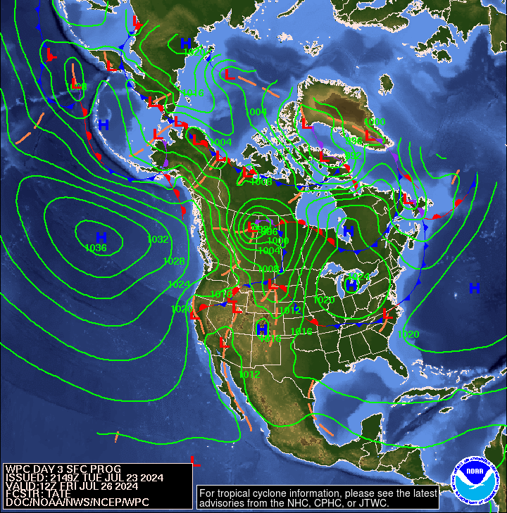
First here is a national 12 hour to 60 hour forecast of weather fronts shown as an animation. Beyond 60 hours, the maps are available in Part II of the Global Economic Intersection Weather and Climate Report.

The explanation for the coding used in these maps i.e. the full legend can be found here.
There has been talk of Pacific Hurricanes and indeed there have recently been two of them but so far they do not appear to have been much of a factor re CONUS. That will change as the most recent storm Blanca is further east and not as susceptible to being blown out to sea by the RRR so it will be impacting our weather very soon (as in TODAY). And there well may be more storms to follow as one can see on this map. The next named storm will be Carlos.

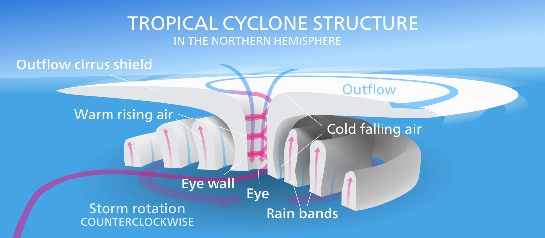
There is always the possibility that the outer circulation can enter the circulation of a High or Low over CONUS and provide moisture to that feature. This is a useful diagram attributable to Kelvinsong.
So we can monitor the below to see if this cyclone is providing water vapor to weather patterns impacting CONUS. So far it has not but you can see at the bottom the circulation of the remnants of Blanca is currently merging with weather patterns over CONUS. More storms are likely to follow. Since these storms are not likely to come onshore north of Mexico as intact cyclones, the wind intensity is less important than the extent and location of the cloud pattern in terms of the impact on CONUS.

You can see that the U.S. is overall pretty well supplied with water vapor right now. That is partially due to the warm water off the West Coast – But the Gulf of Mexico has also been a source of moisture. And the Warm Event along the Equator also enhances the level of atmospheric moisture.
Sometimes it is useful to take a look at the location of the Jet Stream or Jet Streams. This and the following graphic update every six hours. The continuation of the split jet stream may be related to the Warm Event. But I do not see a lot of activity that is very far south.

And sometimes the forecast is revealing. Below is the forecast out five days. The Jet Stream especially the southern branch may be starting to be less intense and you can read the wind speed expressed in knots per hour off of this graphic. One can see how the Jet Stream is tending to keep the Northern Tier of CONUS cool.

To see it in animation, click here.
This longer animation shows how the jet stream is crossing the Pacific. This time of year, it usually is having less of an impact.
And below is another view which highlights the surface highs and the lows re air pressure on Day 3. The Aleutian Low is as I am looking at this graphic is no longer a major factor other than with respect to Siberia. The RRR which normally is not active in an El Nino year but is active in an El Nino Modoki Type II year is still in the picture but further north than recently as the Aleutian Low has moved to the west but the the RRR still has the ability to keep the Northwest toasty warm and dry by blocking storms from the Pacific. Where is Blanca? It is there but now is a wave delineating two different air masses: notice the dashed orange line.
+
And here is Day 6.

Outlook Days 6 – 14 (but only showing the 8 – 14 Day Maps)
Here is a graphic of the monthly Temperature Outlook issued May 31.

And here is the 8 – 14 Day Temperature Outlook issued today June 8, 2015. It covers the week following the coming week.

Today’s Outlook is just nine days of the month and the map of the 8 to 14 day Outlook only shows seven days but it does seem substantially different from the month outlook issued on May 31.
And here is the full month Precipitation Outlook issued May 31, 2015.

Here is the 8 – 14 Day Precipitation Outlook issued today June 8, 2015.

And again remember that this map shows only seven days and the full 6 – 14 Day Outlook only covers nine days. There are 30 days in June. The precipitation outlook is gyrating north to south depending on the passage of the Eastern Pacific Cyclones and the exact location of the Aleutian Low.
Here are excerpts from the NOAA release today June 8, 2015. I have removed more than I usually do because it was more about the process of arriving at the forecast than the forecast.
“PROGNOSTIC DISCUSSION FOR 6 TO 10 AND 15 DAY OUTLOOKS NWS CLIMATE PREDICTION CENTER COLLEGE PARK MD 300 PM EDT MON JUNE 08 2015
6-10 DAY OUTLOOK FOR JUN 14 – 18 2015
THE SURFACE TEMPERATURE OUTLOOK DEPICTS A FORECAST THAT FAVORS GENERALLY ABOVE AVERAGE TEMPERATURES OVER MUCH FOR THE CONUS, EXCEPT FOR THE EASTERN ROCKIES AND GREAT PLAINS. LOW-LEVEL SOUTHERLY FLOW AND RIDGING FAVORS ABOVE NORMAL TEMPERATURES FOR THE EASTERN THIRD OF THE CONUS, WHILE LOW SOIL MOISTURE AND SLIGHT MID-LEVEL RIDGING FAVOR ABOVE NORMAL TEMPERATURES OVER THE SOUTHWEST. BELOW NORMAL TEMPERATURES ARE FAVORED OVER THE HIGH PLAINS REGIONS FROM EASTERN NEW MEXICO TO WESTERN SOUTH DAKOTA DUE TO FORECAST TROUGHING ALOFT. ABOVE NORMAL TEMPERATURES ARE FAVORED OVER MUCH OF ALASKA DUE TO UPPER-LEVEL RIDGING.
ABOVE MEDIAN PRECIPITATION IS FAVORED OVER NORTHERN ALASKA DUE TO LOW-LEVEL SOUTHWESTERLY FLOW, WHILE RIDGING FAVORS BELOW MEDIAN PRECIPITATION FOR SOUTHERN ALASKA. THE BLOCKING PATTERN OVER THE PACIFIC FAVORS BELOW MEDIAN PRECIPITATION FOR THE PACIFIC NORTHWEST. SOME TROUGHING OVER THE FOUR-CORNERS REGION, ALONG WITH SOUTHERLY FLOW IN THE LOW LEVELS, FAVORS ABOVE MEDIAN PRECIPITATION FROM THE FOUR CORNERS TO THE GREAT LAKES TO THE GULF COAST.
FORECAST CONFIDENCE FOR THE 6-10 DAY PERIOD: BELOW AVERAGE, 2 OUT OF 5, DUE A FAIRLY ZONAL LARGE SCALE PATTERN AND SOME DISAGREEMENT BETWEEN STATISTICAL AND DYNAMICAL TEMPERATURE TOOLS.
8-14 DAY OUTLOOK FOR JUN 16 – 22 2015
LOW-LEVEL AND UPPER-LEVEL RIDGING FAVORS ABOVE NORMAL TEMPERATURES OVER SOUTHERN ALASKA, WHILE STRONG WESTERLY FLOW FAVORS BELOW NORMAL TEMPERATURES OVER WESTERN ALASKA. SLIGHTLY ABOVE NORMAL HEIGHTS FAVORS ABOVE NORMAL TEMPERATURES OVER THE GREAT BASIN AND SOUTHWEST, SUPPORTED BY TELECONNECTIONS ON THE LARGE POSITIVE ANOMALY CENTER OVER THE ALEUTIANS. BELOW AVERAGE TEMPERATURES ARE FAVORED OVER THE NORTHERN ROCKIES AND HIGH PLAINS WITH MEAN TROUGHING AT THE SURFACE AND THE POTENTIAL FOR HIGH PRESSURE TO NOSE SOUTHWARD OUT OF CANADA. MEAN SOUTHERLY FLOW FAVORS ABOVE NORMAL TEMPERATURES FROM TEXAS TO THE LOWER GREAT LAKES TO THE SOUTHEAST. THE TEMPERATURE FORECAST OVER THE NORTHWEST AND THE NORTHEAST FROM THE CALIBRATED TEMPERATURE TOOL FROM THE GEFS DIFFERS GREATLY FROM THE SAME TOOL DERIVED FROM THE EUROPEAN ENSEMBLE MEAN, LEADING TO INCREASED UNCERTAINTY THERE.
THE MEAN SOUTHERLY FLOW FAVORS ABOVE MEDIAN PRECIPITATION FROM THE GREAT PLAINS TO THE EAST COAST, WHILE THE BLOCKING PATTERN OVER THE PACIFIC MODIFIES THE STORM TRACK TO FAVOR BELOW MEDIAN PRECIPITATION OVER THE PACIFIC NORTHWEST [Editor’s Note” The dreaded RRR]. BELOW MEDIAN PRECIPITATION IS FAVORED DUE TO THE BLOCKING PATTERN OVER SOUTHERN ALASKA AND THE ALEUTIANS.
FORECAST CONFIDENCE FOR THE 8-14 DAY PERIOD IS: BELOW AVERAGE, 2 OUT OF 5, DUE TO A WEAK ANOMALY PATTERN AND DISAGREEMENT BETWEEN STATISTICAL AND DYNAMICAL TEMPERATURE TOOLS.“
Analogs to Current Conditions
Now let us take a detailed look at the “Analogs” which NOAA provides related to the 5 day period centered on 3 days ago and the 7 day period centered on 4 days ago. “Analog” means that the weather pattern then resembles the recent weather pattern and was used in some way to predict the 6 – 14 day Outlook.
Here are today’s analogs in chronological order although this information is also available with the analog dates listed by the level of correlation. I find the chronological order easier for me to work with. There is a second set of analogs associated with the outlook but I have not been analyzing this second set of information. This first set applies to the 5 and 7 day observed pattern prior to today. The second set which I am not using relates to the forecast outlook 6 – 10 days out to similar patterns that have occurred in the past during the dates covered by the 6 – 10 Day Outlook. That may also be useful information but they put this set of analogs in the discussion with the other set available by a link so I am assuming that this set of analogs is the most meaningful.
Analog Centered Day | ENSO Phase | PDO | AMO | Other Comments |
| 1952 June 5 | Neutral | – | + | |
| 1952 June 6 | Neutral | – | + | |
| 1956 May 29 | La Nina | – | Neutral | Very Long La Nina |
| 1963 June 5 | El Nino | – | Neutral | Modoki Type I |
| 1982 May 23 | El Nino | Neutral | – | Powerful Late Arriving |
| 1982 May 25 | El Nino | Neutral | – | Powerful Late Arriving |
| 1990 June 18 | Neutral | Neutral | – | |
| 1999 May 27 | La Nina | – | + | Strong La Nina |
The most striking aspect of these analogs is the 1982 analog which was a strong late arriving El Nino that some have used as a model to compare the current Warm Event. The tendency for PDO- to show up in the analogs when we have PDO+ is strange. It points to McCabe B and D below which are very different. This is consistent with the fluctuations in the precipitation pattern that we are seeing in the forecasts. The seminal work on the impact of the PDO and AMO on U.S. climate can be found here.

You may have to squint but the drought probabilities are shown on the map and also indicated by the color coding with shades of red indicating higher than 25% of the years are drought years (25% or less of average precipitation for that area) and shades of blue indicating less than 25% of the years are drought years. Thus drought is defined as the condition that occurs 25% of the time and this ties in nicely with each of the four pairs of two phases of the AMO and PDO.
Historical Anomaly Analysis.
When I see the same dates showing up often I find it interesting to consult this list.
Progress of the Warm Event
Here are the low-level wind anomalies

The above graphic It is not as compact as the graphic provided by the weekly NOAA ENSO Report (more white space) but this version auto-updates so you will always have the latest version of this Hovmoeller. As you can see, the wind gust of a few weeks ago is over but a subsequent less intense wind gust at 160W to 140W is still significant but the geographic extent appears to be shrinking. The Eastern and Western Pacific have returned to normal.
Below is the Southern Oscillation Index (SOI) reported by Queensland, Australia. The first column is the tentative daily reading, the second is the 30 day running average and the third is the 90 day average.
2 June 2015 6.4 -13.03 -9.27
3 June 2015 2.8 -12.85 -9.20
4 June 2015 1.1 -12.52 -9.16
5 June 2015 -4.71 -12.45 -9.14
6 June 2015 -2.32 -11.94 -8.92
7 June 2015 3.87 -10.73 -8.63
8 June 2015 8.90 -8.87 -8.34
This past week, for the second week in a row, the SOI has been very negative for the development of or confirmation of the existence of an El Nino. Usually -8 is considered El Nino Conditions. Sometimes -6 is used for local forecasting in Australia. The 30 average, which is the most widely used measure, on June 8 was reported as being -8.87 which is still definitely in El Nino territory but it has dropped dramatically (in terms of being less negative) in the last two weeks. The 90 day average also continues in El Nino territory but at -8.34 it has become less El Nino-ish but being a 90 day average it moves more slowly. This continues to be a very perplexing Warm Event.
Let us now take a look at the progress of the Kevin wave which is the key to the situation. This animation shows the progress of the current Kelvin Wave. Sometimes this animation is a bit cranky so you may need to hit the refresh button on your computer or go here to get a fresh copy.

It is clear that this Kelvin Wave is progressing and will exit stage right fairly soon. But the process has been going more slowly than I had anticipated.
Here is a static version that is easier to read. You can see both the magnitude of the anomalies and their size. The six degree warm anomaly was quite impressive but hardly showing now and compared to the size of the Pacific Ocean it is just a blip. To the fishermen in Peru and Ecuador it is anything but a blip reminding us to keep things in perspective which varies depending on where you are at any given point in time. You can now see where 2C (anomaly) water is impacting the area where the ONI is measured i.e. 170W to120W. This will be apparent when we discuss the TAO/TRITON graphic and my crude estimation of the ONI value that is the situation right now. You can I think see why computer models come to different conclusions on the peak values of the ONI (usually three-month averages are what are used to assess the intensity of a warm or cool event). Some models show predicted monthly values which are very useful but which can be misinterpreted. It takes some time for warm water at the surface to trigger convection and impact the Walker Circulation. This is very important since the reason for monitoring the ENSO Cycle is to gain an understanding of how it might impact weather over land areas. If there is little or no impact over land areas, it is almost as if the ENSO event did not occur. Our tools for predicting impacts lag our tools for measuring certain aspects of the ENSO Cycle.

The bottom half of the graphic is not too useful as it simply shows the thermocline between warm and cool water which pretty much looks like this as shown here except now the cooler water is now making it to the surface to the east along the coast of Equator. That is why this warm event is NO LONGER A PURE MODOKI. To me it looks like the tail-end of a traditional/canonical El Nino. How it will be recorded in history remains to be seen as it is not usual for a Modoki to transform itself into a Canonical El Nino and it is not usual for any of this to occur at this time of the year but is not unprecedented and the 1982 analog is one such event. So this is a very unusual situation.
Here is another animation that covers a larger area but with the same information. Do not be concerned about the gray streaks. The two in the center are on the left Australia and on the right Central America and the the extreme left and right are Africa with 30E splitting Africa. Not sure exactly why they display this the way they do but I assume it is because the wish to focus on the Equatorial Pacific since that is what counts for the ENSO Cycle.
It really shows that when the Kevin wave crashes into Ecuador, the warm water in this case has gone quite deep and if I had a 3D graphic it would show that it heads north also. But you can see the colder water to the west of this Kevin Wave which is what makes me think the computer models are simply WRONG.
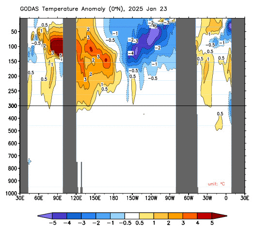
I like this animation a lot. You can see with regards to 170W to 120W where NOAA measures the ONI how first the water near the surface was under 1C in terms of the anomaly. Then you can see water warmer than 1C rising to the surface. You can see the 2C+ zone of subsurface water which if it rises into the Nino 3.4 zone would signify a very powerful El Nino. Does it look like that will happen? Not to me although I could see it in the eastern end of the 170W to 120W measurement zone. On the other hand, it looks like the 0.5C to 1C anomaly will reach 170W at some point which will then be followed by a decline in the measured ONI. It has certainly moved more slowly than I expected. But it has no choice but to move in that direction. So when that happens, the ONI readings will begin to decline.
I simply do not understand the thinking that this El Nino can extend into late 2015 without another Kelvin Wave developing. That of course could happen and NOAA believes it is happening. I am perplexed by the tendency of the computer models to extend this Warm Event. I may well be missing something. We shall see. For those who never get tired of looking at graphics, this is a useful source of information
Here are the surface anomalies. Today I have reversed the order of presentation and I am first showing the Daily Sea Surface Temperature anomalies. The warm areas off the West Coast appear to be somewhat less intense or at least less continuous than as viewed in the seasonal analysis. The situation in the Indian Ocean is clear. It is moving either towards IOD Neutral or IOD Positive which has implications for Australia and most likely is related to our Warm Event. More on that later when I present the View from Australia.
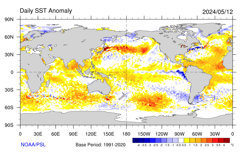
This Seasonal Anomaly graphic autoupdates but I think it does so on a weekly basis or perhaps monthly. You can see the PDO+ Pattern and the El Nino combination of a Modoki Type II and a Canonical/Traditional El Nino and the warm Gulf of Mexico and the Negative IOD in the Indian Ocean. You also see cooler water off of West Africa that suggests a weak Atlantic Hurricane Season.
It may not be enough to just look at these two graphics to draw correct conclusions. As you can see, the situation in the Indian Ocean is changing and that does not show up correctly in the seasonaly anomaly graphic.
Here it is as an animation showing the evolution of the recent sea surface temperature anomalies,
For my own amusement, I thought I would recalculate the ONI again as I have been doing recently. To refine my calculation I have totally changed my approach and rather than having the anomalies be the way I organized the data, I have divided the 170W to 120W ONI measuring area into five subregions and have mentally integrated what I see below and recorded that in the table I have constructed. Then I take the average of the anomalies I estimated for each of the five subregions. So now I am applying more subjectivity but it should produce a better estimate.

So as of Monday June 8 in the afternoon working from the June 7 TAO/TRITON report, this is what I calculated.
| Anomaly Segment | Estimated Anomaly |
| 170W to 160W | 1.4 |
| 160W to 150W | 1.5 |
| 150W to 140W | 1.3 |
| 140W to 130W | 1.1 |
| 130W to 120W | 1.2 |
| Total | 6.5 |
| Total divided by five subregions i.e. the ONI | (6.5)/5 = 1.3 |
My estimate of the Nino 3.4 ONI is now 1.3 which appears to be a precise number but that is misleading since I made a rough estimate of the anomaly in each of the five subregions. But this procedure fits with the NOAA definition of the ONI. So if I had a way to make more accurate estimates, I would arrive at the same number as they do except that I am working with more recent data and computing a daily ONI while they calculate a weekly average ONI which they have just reported as being 1.2 which without considering other factors would if it persisted for three months be considered a moderate El Nino. One week has very little significance but it will be interesting to monitor. The above graphic updates daily so one can basically monitor this on a daily basis. My calculations however do not auto-update. I may decide to add this analysis to Page II of my Report and update mid-week.
Here is another way of looking at it.
This Hovmoeller shows a lot of useful information. I could copy it into MSPaint and draw some lines on it but then it would not autoupdate so I do not wish to do that. But take a lot at 140E 160E, 165E, 175E, 120W and 90W. Remember reading from top to bottom one is reading the earlier times to the more current times. So you can see how this Warm Event started at 140E, has moved to 160E and then to 165E and lately you can see movement towards 175E. You can also see that suddenly the entire Equator is warmer. You can especially see the impact east of 90W where the Kelvin Wave is crashing into Ecuador. The eastern progress has been slower than I had anticipated. Leaving aside the SOI issue, this is clearly an El Nino type pattern right now. But to me it seems to be a pattern that will play out as it does not appear to be going to be reinforced. It may well play out more slowly that I have anticipated. But it is playing out. You will not see the ONI decline until the warm water over at 175E has moved to 170W. Until then, the ONI could easily continue to rise but probably not by very much. Once the warm surface water no longer extends west of 170W the ONI should begin to decline. I hesitate to offer a new estimate of when that will happen as I have not had the time to play those animations enough times to make an estimate. The size of the deep water anomaly may have a bearing on the rate of movement to the east which is slower than what I read in the literature as being more usual. We will watch the progress of this Warm Event together because I have provided the graphics that will allow us to do that.
And here is one more way of looking at the situation. I like this Hovmoeller a lot but I have not been able to find a version that autoupdates. You can see the Kelvin Wave that got started in February which started this Warm Event. There have been earlier such events that proved to be not very strong. On the left you see what might be a reverse process called an upwelling wave of cooler water that NOAA refuses to recognize and so far that cooler water has not progressed very far to the East so perhaps NOAA has been correct not to call it an upwelling wave. NOAA has also “penciled in” a reinforcing follow-up downwelling Kelvin Wave. It is consistent with the data. I am skeptical that this wave will persist as long as the immediately prior wave. Indeed the whole issue is about this. The SOI has at least temporarily ceased to support the development of this El Nino. So the question is does this Warm Event have one more boost to carry it through this coming winter.

Greater than single Northern Hemisphere winter warm events are fairly rare. I looked at the NOAA list of El Ninos declared since 1950 and there are 19 of them and only two lasted through two winters. One started at the time of year that this Warm Event first reached a ONI 0.5 level and one started later in the season. Both were during a period later recognized as PDO+. So I am just wondering if there is a reason to assume that this particular Warm Event has the staying power of the former champions. The PDO is currently positive but not as positive as recently and what has occurred so far re this Modoki Type II in terms of geographical coverage of warmer water has been minimal so the dissipating impacting may have been sufficiently minimal to allow this event to make it through this winter. I will be surprised if that happens but I have been surprised before.
Current El Nino Impact
The only real issue is the duration of this event. Summer El Ninos generally have minimal impact in the Northern Hemisphere. So the duration of this El Nino is very important for Northern Hemisphere impacts. The impacts to the Southern Hemisphere are already happening and will happen. But this Warm Event is having impacts on CONUS.
First the last 90 days which shows moderate impacts and remember a 90 day analysis includes the last 30 days as well as the prior 60 days. So it is difficult to tell if the 90 day analysis is anything different than simply the impact of the most recent 30 days and I think the answer is that it is not as an earlier version of this showed impacts restricted to Mexico.

But the last 30 days have seen significant impacts. I believe that reflect the Fax El Nino (which was a marginal Modoki at best) converting into a true El Nino.

For the Southwest, given that this is normally a dry time, a substantial percentage increase is not a major factor in the overall seasonal impact which is why I say that what happens in the winter is more important…..unless this translates into a powerful Monsoon Season which it might. The temperature departures are clear but with all things weather, it is rarely possible to be 100% sure one is attributing the result to the proper cause. But the result is fairly impressive.
View from Australia
Australia has their own model which updates every two weeks.

Notice the criteria for achieving El Nino or La Nina status are different than that used by most others. And curiously, the view from Australia with respect to the development of an El Nino this year has until now been pretty much more subdued than the view from the U.S. But now they are projecting the Warm Event to extend into next Spring but tapering off.
“Ocean temperatures continue to rise in the tropical Pacific
Issued on 9 June 2015
The 2015 El Niño continues to develop. International climate models surveyed by the Bureau of Meteorology suggest further warming of the tropical Pacific is likely, with sea surface temperatures forecast to remain above El Niño thresholds for the remainder of the year.
Most oceanic and atmospheric indicators are consistent with El Niño. Sea surface temperatures in the tropical Pacific have continued to warm, and trade winds have been consistently weaker than average. However, the Southern Oscillation Index (SOI) is currently rising, with this due to local weather, not climate factors. In the past three months the SOI has averaged −9.7, exceeding El Niño thresholds. Cloudiness near the Date Line has also eased towards more normal levels, but this shift may only be short-lived.
El Niño is often associated with below-average winter and spring rainfall over eastern Australia, and above-average daytime temperatures over the southern half of the country. The strength of El Niño doesn’t directly relate to the strength of its effects on Australia’s climate.
The Indian Ocean Dipole (IOD) is currently neutral. Of the five international models that provide IOD outlooks, two suggest a positive IOD is likely later in 2015, with a third model just shy of thresholds. A positive IOD is typically associated with reduced winter and spring rainfall over parts of southern and central Australia.
Next update expected on 23 June 2015″
Indian Ocean Dipole (IOD)
The Australian Bureau of Meteorology has their own proprietary Model (POAMA) for forecasting the IOD.

We were able to observe this tendency towards a positive IOD in the SST anomaly graphic that I presented earlier. Notice the projection beyond this month is fairly inconclusive.
Japan has not yet updated their web site to reflect their latest model runs.
Pulling it All Together.
We are in El Nino conditions now. The length and intensity of this El Nino is still not clear mostly in terms of whether or not it will extend into the early part of 2016. We may or may not have a Pacific Climate Shift as the PDO+ may be simply related to the Warm Event (and quite frankly at this point appears to be). But for now we do have PDO+. The AMO being an overturning may be more predictable so the Neutral status moving towards AMO- is probably fairly reliable but not necessarily proceeding in a straight line. So none of this is very difficult to figure out actually if you are looking at say a five-year forecast.The research on Ocean Cycles is fairly conclusive and widely available to those who seek it out. I provided a lot of information on this in prior weeks and all of that information is preserved in Part II of my report which you can get to below. It includes decade by decade predictions through 2050. Predicting a particular year is far harder.
Click Here for the Global Economic Intersection Weather and Climate Report. Page II where you will find:
- A more complete set of NOAA and other agency graphics (including international agencies) that auto update. So this includes both short term- and seasonal “updates”. Most of the graphics will ALWAYS be up to date even if my commentary on the graphics is not. I update my commentary when it seems necessary and certainly every Monday, but some of these graphics auto update every six hours.
- Economic and other Impacts of major weather events. Not sure there is any other place to obtain this information consistently other than very specialized subscription services.
- Information on Climate Cycles both those which are fairly short term i.e. less than a decade in duration and multi-decadal cycles.
- Economic and other Impacts of those Climate Cycles which are referred to by the IPCC as Internal Variability as opposed to secular Climate Change which is always in the same direction. Again I am not sure if there is another source for this information where it is pulled together in one place as I have.
My Editor tells me that he will show me how to create a Table of Contents for Part II to make it easier to navigate.
Click Here for Page III which deals with Global Warming.
- Information on Anthropogenic Global Warming science i.e. the secular change in our climate that overlays both short-term weather and historical climate cycles as well as black swan events like volcanic eruptions. I prefer to call this Global Warming as it is the warming that triggers the other changes.
- Economic and other Impacts of Global Warming. The IPCC AR5 WG2 attempts to describe and quantify these and I have some excerpts from their report. Over time I will go beyond their report as it is very deficient.


