Written by Sig Silber
Snowstorms in the Southwest in May are not unheard of but unusual. Does that mean a cool summer? The sardine catch is a bust in Peru. Does that mean an El Nino Winter? The Antarctic ice shelf is not receding, does that mean no Global Warming? Nigerian corn production is increasing, does that mean Global Warming is a great blessing? Those are some of the topics to be addressed in this report as well as the usual review of the 6 – 14 Day U.S. Weather Outlook.

This is the Regular Edition of my weekly Weather and Climate Update Report. Additional information can be found here on Page II of the Global Economic Intersection Weather and Climate Report.
Things have been a little weird lately.
“SAN DIEGO (AP) — A second round of rain from a rare spring storm swept into drought-stricken Southern California on Friday, along with heavy winds and snow in the mountains before heading inland, where other states were also feeling weird late-season weather.”
Read more about it here. What does it mean and does it mean no Summer this year? The short answer is no. This weird weather has two perhaps three more weeks to go before being replaced by more normal late Spring conditions. The probably cause of this situation is the influence of the strong Aleutian Low and RRR (ridiculously resilient ridge) which has earlier sent cold air into Canada to then plague the U.S. Northeast since everything must return to balance. Over time, that pattern has shifted to the west and then further west as the RRR began to fall apart. I believe that process is in its final stages although the Aleutian Low remains unusually strong for this time of year.
El Nino Status

As usual you have to be a bit careful when reading NOAA as they have their own language. But this assessment seems reasonable. We now have El Conditions present for the first time this year (using legitimate criteria). It is May and my calculations show that we will have El Nino conditions for a minimum of two months more likely three. That is pretty much guaranteed. So that takes us into summer. Beyond that it all depends and that will be discussed later in this report. The big question remains: “will this winter be impacted by El Nino?”
I will now shift timeframes dramatically.
Current (Now to 5 Days) Weather Situation:
For daily forecasts it is better to consult your local weather service or the weather service where you are traveling as these will be more specific. But I do have daily forecasts on Page II of the Report so you can always look at those as they auto-update. What I present here is information that normally is not made available via local weather forecasts and which can help you understand what some of the major drivers are for the local forecast.
First here is a national 12 hour to 60 hour forecast of weather fronts shown as an animation. Beyond 60 hours, the maps are available in Part II of the Global Economic Intersection Weather and Climate Report.

The explanation for the coding used in these maps i.e. the full legend can be found here.
Sometimes it is useful to take a look at the location of the Jet Stream or Jet Streams. This and the following graphic update every six hours. The continuation of the split jet stream may be related to the Warm Event.

And sometimes the forecast is revealing. Below is the forecast out five days. The Jet Stream especially the southern branch may be starting to be less intense and you can read the wind speed expressed in knots per hour off of this graphic.

To see it in animation, click here.
This longer animation shows how the jet stream is crossing the Pacific. Up until this week I have been saying that “one can imagine that attempting to forecast this 6 – 14 days out is quite challenging and NOAA is having fits attempting to guess how this will play out over a 14 day period especially for the Southwest“. But last night I viewed the animation and you can see that now the jet stream is really falling apart half-way over the Pacific which is what one would expect this time of year i.e. it is having less of an impact. But the snow in the Southwest this past week, and perhaps today or tonight, is related to the jet stream even though it is less of a factor right now.
And below is another view which highlights the surface highs and the lows re air pressure on Day 3. The Aleutian Low is still active and probably is the most obvious indication of this Warm Event and has kept Alaska warmer and wetter than usual all winter. The RRR which normally is not active in an El Nino year but is active in an El Nino Modoki Type II year is still in the picture a shadow of its former self (i.e. no tightly wound isobars). The Aleutian Low is still strong but you can see where Low Pressure Systems can sometimes work their way now between the RRR and the West Coast as Winter fades because the RRR is now centered further off shore and is becoming less of a factor. .
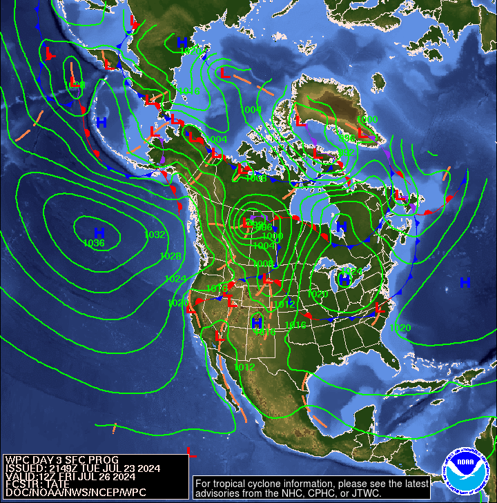
And here is Day 6. We no longer see only “incoming” cold waves another reason to believe our very welcome snow events are likely to cease after today.

Outlook Days 6 – 14 (but only showing the 8 – 14 Day Maps)
Here is the updated Temperature Outlook for May which was issued on April 30.

And here is the April 8 – 14 Day Temperature Outlook issued today May 18, 2015. It covers the week following the coming week.

Remember that the 6 – 14 day outlook only covers 9 days not the full month and the map shown only covers seven days. But other than the Southeast, this Outlook (which applies not to this coming week but the following week) is consistent with the Monthly Outlook for May issued on April 30.
Here is the updated Precipitation probabilities for May issued on April 30, 2015.

Here is the 8 – 14 Day Precipitation Outlook issued today May 18, 2015.
And again remember that this map shows only seven days and the full 6 – 14 Day Outlook only covers nine days. There are 30 days in May. But the week following this coming week (Days 8 -14 of the NOAA Outlook) is projected to be wetter for more of CONUS than the full-month Outlook but drier for parts of Arizona projected to be wetter than Climatology in the Monthly Outlook. But that aspect of the Outlook both by NOAA Central and local forecasters has in recent weeks tended to underestimate the actual Southwest precipitation. Weather is complicated and the situation in the Southwest appears to be extra difficult right now due to uncertainty about the strength and location of the southern branch of the Jet Stream.
Here are excerpts from the very interesting and informative NOAA release today May 18, 2015.
“6-10 DAY OUTLOOK FOR MAY 24 – 28 2015
TODAY’S MODEL SOLUTIONS ARE IN GOOD AGREEMENT ON THE 500-HPA CIRCULATION PATTERN OVER NORTH AMERICA. SPLIT-FLOW IS PREDICTED OVER WESTERN NORTH AMERICA WITH A RIDGE IN THE NORTHERN STREAM OVER WESTERN CANADA AND A TROUGH IN THE SOUTHERN STREAM OVER THE US SOUTHWEST. A TROUGH IS PREDICTED OVER EASTERN CANADA WHILE A RIDGE IS FORECAST OVER THE SOUTHEAST. ENSEMBLE SPREAD IS HIGH OVER THE WEST IN THE GEFS, ECMWF AND CANADIAN MODELS WITH UNCERTAINTY IN THE SPLIT FLOW PATTERN. ENSEMBLE SPREAD IS MUCH LOWER IN PREDICTING THE RIDGE OVER THE EAST.
BELOW NORMAL TEMPERATURES ARE MOST LIKELY FROM THE SOUTHWEST INTO THE CENTRAL PLAINS ASSOCIATED WITH A PREDICTED SOUTHERN STREAM TROUGH AND INCREASED SOIL MOISTURE. THERE ARE ENHANCED PROBABILITIES OF ABOVE NORMAL TEMPERATURES FOR THE EASTERN US CONSISTENT WITH PREDICTED ABOVE NORMAL HEIGHTS. RIDGING OVER WESTERN CANADA LEADS TO INCREASED PROBABILITIES OF ABOVE NORMAL TEMPERATURES FOR THE NORTHWESTERN CONUS AND ALASKA.
THE TROUGH PREDICTED OVER THE SOUTHWEST AND CONVERGENCE TO THE EAST LEADS TO ENHANCED PROBABILITIES OF ABOVE MEDIAN PRECIPITATION FOR MUCH OF THE CONUS, WITH THE GREATEST PROBABILITIES FOR THE CENTRAL ROCKIES AND THE SOUTHERN PLAINS INTO THE LOWER MISSISSIPPI VALLEY. BELOW MEDIAN PRECIPITATION IS MORE LIKELY IN COASTAL REGIONS OF THE PACIFIC NORTHWEST AND ALONG THE US-CANADIAN BORDER FROM THE NORTHERN ROCKIES TO LAKE SUPERIOR, UNDER RIDGING IN THE NORTHERN STREAM.
THE PROBABILITY OF ABOVE MEDIAN PRECIPITATION IS ENHANCED FOR WESTERN AND NORTHERN ALASKA AHEAD OF A TROUGH OVER THE ALEUTIAN ISLANDS, WHILE BELOW MEDIAN PRECIPITATION IS MOST LIKELY FOR SOUTHEAST ALASKA INCLUDING THE PANHANDLE, UNDER A PREDICTED RIDGE.
FORECAST CONFIDENCE FOR THE 6-10 DAY PERIOD: ABOVE AVERAGE, 4 OUT OF 5, DUE TO FAIRLY GOOD AGREEMENT AMONG THE VARIOUS MODELS AND SURFACE TOOLS.
8-14 DAY OUTLOOK FOR MAY 26 – JUN 01, 2015
DURING THE WEEK TWO PERIOD, MODELS SOMEWHAT PERSIST THE CIRCULATION PATTERN OF THE 6-10 DAY PERIOD FORECAST WITH SOME EASTWARD PROGRESSION. MODELS CONTINUE TO PREDICT TROUGHS OVER THE ALEUTIAN ISLANDS, EASTERN CANADA, AND THE US SOUTHWEST, AND RIDGES OVER EASTERN ALASKA, THE PACIFIC NORTHWEST AND THE EASTERN US. ENSEMBLE SPREAD IS HIGH OVER THE WESTERN CONUS WITH INCREASING UNCERTAINTY IN THE SPLIT FLOW PATTERN, WHILE MODEL AGREEMENT IS GOOD FOR THE EASTERN CONUS.
ABOVE NORMAL TEMPERATURES ARE MOST LIKELY FOR THE NORTHWEST, AS WELL AS CALIFORNIA AND NEVADA, AND FOR THE EASTERN CONUS AND GULF COAST STATES. PROBABILITIES OF BELOW NORMAL TEMPERATURES ARE ENHANCED FOR EASTERN AREAS OF THE SOUTHWEST INTO PARTS OF THE SOUTHERN AND CENTRAL PLAINS, ASSOCIATED WITH THE PREDICTED TROUGH. ABOVE NORMAL TEMPERATURES ARE MOST LIKELY FOR ALASKA WITH RIDGING PREDICTED OVER WESTERN NORTH AMERICA.
ABOVE MEDIAN PRECIPITATION IS MOST LIKELY OVER MUCH OF THE CONUS ASSOCIATED WITH THE SOUTHERN STREAM TROUGH AND CONVERGENCE AHEAD OF THE SPLIT STREAM. BELOW MEDIAN PRECIPITATION IS MOST LIKELY FOR SOUTHEASTERN ALASKA, AND COASTAL AREAS OF THE PACIFIC NORTHWEST, AS WELL AS THE NORTHERN PLAINS AND THE WESTERN GREAT LAKES REGION, UNDER AND AHEAD OF THE RIDGE OVER WESTERN NORTH AMERICA.
FORECAST CONFIDENCE FOR THE 8-14 DAY PERIOD IS: ABOVE AVERAGE, 4 OUT OF 5, DUE TO GOOD AGREEMENT AMONG MODELS AND TOOLS.“
[Editor’s Note: Although not mentioned in this discussion, the outlook for the latter part of the period is much less amplified in terms of deviations from climatology than the first part of the period. That is not at all unusual but quite pronounced in the maps issued today and signifies a change in the weather taking place within the 6 – 14 Day Period covered by this Outlook.]
Analogs to Current Conditions
Now let us take a detailed look at the “Analogs” which NOAA provides related to the 5 day period centered on 3 days ago and the 7 day period centered on 4 days ago. “Analog” means that the weather pattern then resembles the recent weather pattern and was used in some way to predict the 6 – 14 day Outlook.
Here are today’s analogs in chronological order although this information is also available with the analog dates listed by the level of correlation. I find the chronological order easier for me to work with. There is a second set of analogs associated with the outlook but I have not been analyzing this second set of information. This first set applies to the 5 and 7 day observed pattern prior to today. The second set which I am not using relates to the forecast outlook 6 – 10 days out to similar patterns that have occurred in the past during the dates covered by the 6 – 10 Day Outlook. That may also be useful information but they put this set of analogs in the discussion with the other set available by a link so I am assuming that this set of analogs is the most meaningful.
Analog Centered Day | ENSO Phase | PDO | AMO | Other Comments |
| 1962 May 17 | Neutral | – | + | |
| 1962 May 19 | Neutral | – | + | |
| 1991 May 2 | El Nino | – | – | Start of El Nino Modoki Type I or II |
| 1991 May 17 | El Nino | – | – | Start of El Nino Modoki Type I or II |
| 1995 May 11 | El Nino | + | + | Tail end of El Nino followed by a La Nina |
| 1998 May 26 | El Nino | + | + | Tail end of El Nino soon followed by a La Nina |
| 2008 May 25 | La Nina | – | + | Tail end |
| 2009 April 28 | Neutral | – | + | Tail end |
This week there are three ENSO Neutral and one La Nina and three El Nino analogs. The 1998 analog is of most interest. The 1997/1998 El Nino is recognized as when the Pacific shifted from PDO+ to PDO- and when the SOI fell to a lower level. That is not to say that this El Nino triggered the change but only that the change occurred right after this El Nino. On the other hand, the 1977 El Nino which has appeared often as an analog and is associated with the prior shift in the PDO from negative to positive has not appeared in the analog list for the last few days. Not sure what this means if anything. NOAA provides me with two groups of five and I discard the duplicates and this week there were three duplicates and one was the significant 1998 analog. The seminal work on the impact of the PDO and AMO on U.S. climate can be found here. The key maps are shown below. Today it is not clear cut but there does seem to be some prevalence of PDO-/AMO+ in the analogs which is associated with McCabe Condition D below. This is a bit surprising as the Outlook is not consistent with McCabe D so I do not know what to make of that.

You may have to squint but the drought probabilities are shown on the map and also indicated by the color coding with shades of red indicating higher than 25% of the years are drought years (25% or less of average precipitation for that area) and shades of blue indicating less than 25% of the years are drought years. Thus drought is defined as the condition that occurs 25% of the time and this ties in nicely with each of the four pairs of two phases of the AMO and PDO.
Progress of the Warm Event
El Niño Looks More Likely for Summer, and with It Drought Relief for West. Here is the full article. But notice the Date of that article: May 9, 2014? We went through the same process last year. And a couple of years ago. That is not to say that we will not have an El Nino this winter. It is simply to say that May is not a really good time to forecast the ENSO situation for the following Winter.
But let us try it anyway.
Sometimes too many graphics can get in the way of understanding and I know I am guilty of doing that…my Editor can tell. So I am trying to be disciplined and not let my love of data (dataphlia) compromise your understanding.
In a way this graphic tells the tale. To preface it there are three levels of data reported by NOAA. There are the actual readings of Sea Surface Temperatures (SST) and to most of us that has no meaning other than for fishing or swimming events. Then there are deviations from normal which to NOAA means the last three full decades of data (1981 – 2010) which they mistakenly call climatology which was a term introduced prior to the knowledge that our climate is substantially determined by 60 year cycles. It is a mistake but it is also a practical approach. The technical term for those deviations are “anomalies” or often “departures” from climatology both of which mean exactly the same thing. And then the really good stuff which is the change in the anomalies or departures. And that is what is shown below. It is actually the same as the change in the actual data readings but you can make it sound more impressive if you label it as they do it. At any rate, it really tells you what is going on.

As you can see, over the last four weeks:
A. It has gotten warmer off the coast of Ecuador and Peru, often called an El Nino.
B. The rest of the Equator in the Pacific has not gotten warmer. Of my gosh: How can you have a Monster El Nino when most of the Pacific Equator has not gotten warmer but in some places colder?
C. The Pacific off the U.S. West Coast has gotten colder which when you look at the full pattern translates into a lessening of the positive magnitude of the PDO index. You have to imagine a big horseshoe shaped area and the blues and the reds correspond to a pattern that is less PDO+. It probably is still PDO+ but less so. I am not good enough to be able to tell from this one graphic but NOAA will tell us on Thursday. BTW that is where the 30 years being too short a time period comes in. You can not identify any of the low-frequency ocean cycles by looking at only three decades of data. That is the problem in the Nigerian Paper I will discuss later.
D. The Gulf of Mexico has cooled. That is very significant and not good for having a wet summer.
E. The Atlantic looks interesting. Maybe in two weeks or so, I might begin to discuss Atlantic hurricanes.
One graphic…much information. I wish I had a one-week version in addition to a four-week graphic and I could have also posted last week’s and if I had the tools, subtracted them to determine the one-week change. But perhaps NOAA is wise to think in terms of a running four-week picture.
For my own amusement, I thought I would recalculate the ONI again as I have been doing recently. The little tick marks on the chart can be used instead of a ruler. When I print out this graphic, one tick is about one centimeter. So you can use a ruler or just estimate the number (including fractions) of tick marks.
But first notice the intense warm anomaly off the coast of Ecuador which is large but is actually slightly weaker than last week. They are definitely concerned about this in Peru as indicated by here and here.
So as of Monday May 18 in the afternoon working from the May 17 TAO/TRITON report, this is what I calculated.
| Anomaly Segment | Midpoint | Length on Equator in number of five degrees of latitude (ticks) | Midpoint X Length (tempxticks) |
| -0.5C to 0C | -0.25 | 0 | 0 |
| 0C to +0.5C | +0.25 | 0 | 0 |
| +0.5C to 1.0C | +0.75 | 0 | 0 |
| 1.0C to 1.5C | +1.25 | 5 | 6.25 |
| 1.5C to 2.0C | +1.75 | 0 | 0 |
| 1.75 | Total | 5 Ticks (or 5 centimeters) | 6.25 |
| Estimated ONI the NINO 3.4 Anomaly | 6.25/5 = 1.25 C |
My estimate of the Nino 3.4 ONI is now 1.25 which is a very respectable value and essentially the same as week. Overall it looks to me like this warm event may be petering out, but more on that later.
Now this week’s weekly SST Departures. I tried something different with less than perfect success from a graphic-arts perspective. I extracted a section from this week’s NOAA graphic of the Nino values and superimposed last week’s values on it. As you can see this Warm Event WEAKENED marginally this past week and probably will continue to do so as the Kelvin Wave moves to the East and plays out.

The key question really is the issue of the inventory of warm water; both the surface and subsurface down to 300 meters. This Faux El Nino this past winter did dissipate heat from the ocean into the atmosphere. Is there enough heat left to sustain this Warm Event? I suspect not but we will see.
All predictions about El Nino for next winter must be tempered by what is called the Spring Prediction Barrier (SPB). Nevertheless, an El Nino this coming winter is a possibility. Greater than single-winter warm events are fairly rare. I looked at the NOAA list of El Ninos declared since 1950 and there are 19 of them and only two lasted through two winters. One started at the time of year that this Warm Event first reached a ONI 0.5 level and one started later in the season. Both were during a period later recognized as PDO+. So I am just wondering if there is a reason to assume that this particular Warm Event has the staying power of the former champions. The PDO is currently positive but not as positive as recently and what has occurred so far re this Modoki Type II in terms of geographical coverage of warmer water has been minimal so the dissipating impacting may have been sufficiently minimal to allow this event to make it through this winter. I will be surprised if that happens but I have been surprised before.
Here is the Southern Oscillation Index (SOI) reported by Queensland. The first column is the tentative daily reading, the second is the 30 day running average and the third is the 90 day average.
12 May 2015 -35.1 -10.11 -6.8
13 May 2015 -31.3 -11.21 -7.01
14 May 2015 -27.7 -12.34 -7.29 –
15 May 2015 -33.1 -13.65 -7.69 –
16 May 2015 -30.3 -14.36 -8.08 –
17 May 2015 -22.7 -14.71 -8.35
18 May 2015 -24.7 -15.34 -8.73
This past week the SOI has really been intense. It started the prior week. Usually -8 is considered El Nino Conditions. Sometimes -6 is used for local forecasting in Australia. The 30 average, which is the most widely used measure, on May 18 was reported as being -15.34 which is an amazingly rapid rise to far exceed -8. Even the 90 day average is now in El Nino territory. The following NOAA graphic now becomes very very important. It is up to date as of only May 15 so it does not reflect the last couple of days but I think it accurately tells the story.

You can clearly see the wind gust at about 160E which is a more precise reflection of the data I presented above. The above data was air pressure differentials but that translates into impact on winds and that impact is shown in the above Hovmoeller diagram. The question now is very simple. Will this wind gust trigger another downwelling Kelvin Wave? If it does, that will extend and possibly strengthen this Warm Event.
So let us take a look. (I feel like I am covering a sporting event here).

We need to examine this graphic very carefully as NOAA will not provide any assistance with this to the extent it contracts their theory. They so far have not recognized a new upwelling phase and perhaps that is the correct call as it may not develop. But if you look at this graphic carefully, you will see that along the bottom of the graphic, which is what counts as being a Hovmoeller the time sequence is from top to bottom and the bottom is the most recent readings, the most extreme anomalies are now impacting the Equator only east of 90W i.e. the Coast of South America. This will impact that area for some time but will not enter into the ONI calculation.
The next level of anomalies has moved to the east and now shows up at 150W. So that is still in the zone 170W to 120W where the NOAA version of El Nino intensity is measured (Asians have a more eastern zone for their measurements..only slightly different). Then there is another lesser level of anomaly that also has moved east slightly.
But then you have something unusual. The next two levels of heat anomaly have expanded to the west. I do not know what that means but I suspect it is the impact of that wind gust and very intense SOI activity. If you look earlier in the time sequence further up in the graphic, you see where that pattern eventually became a subsequent Kelvin Wave. We will see if that happens now which would be very significant.
Let us take a different look and consider the situation from the surface down to 300 meters.

This shows a few things:
A. NOAA was correct not to declare the cooler water in the Western Pacific an upwelling wave as you can see how it has been dissipating.
B. On the other hand, you can clearly see how this Kelvin Wave, like every Kelvin Wave, has been playing out. The Media seems to get overly excited about a Kelvin Wave. They happen. This one was a powerful one but CU (Calendarly Undesirable) for Triggering an El Nino.
C. But this Kelvin Wave is not finished: just playing out. Never heard this term before but if a Kelvin Wave has a tail, this Kelvin Wave has a persistent tail. So we might be having a Luke-Warm Event for a while. That is the Sig Silber ENSO Model. We will see if the high-priced models are more accurate.
My guess is we will know within a few weeks. We need to watch the SOI and the possible formation of a new Kelvin Wave.
Pulling it All Together.
We may or may not have an El Nino this Winter. We may or may not have a Pacific Climate Shift as the PDO+ may be simply related to the Warm Event (and quite frankly at this point appears to be). But for now we do have PDO+. The AMO being an overturning may be more predictable so the Neutral status moving towards AMO- is probably fairly reliable but not necessarily proceeding in a straight line. So none of this is very difficult to figure out actually if you are looking at say a five-year forecast.The research on Ocean Cycles is fairly conclusive and widely available to those who seek it out. I provided a lot of information on this in prior weeks and all of that information is preserved in Part II of my report which you can get to below. It includes decade by decade predictions through 2050. Predicting a particular year is far harder. My Editor tells me that he will show me how to create a Table of Contents for Part II to make it easier to navigate.
New Climate Change Report
Effect of Climate Change on Maize Production in Nigeria. Obasi IO and Uwanekwu GA Department of Agricultural Economics, Michael Okpara University of Agriculture, Umudike, Nigeria.
You can read the full report here.
From the Abstract
The study was conducted in Nigeria. The objective of the study was to examine the effect of climate change on maize. The data for the study was obtained from secondary sources. The result shows that the average rainfall and temperature statistics were 1288.311mm and 31.7173C in Nigeria within the period under study. The average maize output within the period was 4.84mt while hectarage and yield were 3.36mha and 1.44t/ha respectively. The result from the study equally shows that the area cultivated and productivity of maize increased as temperature and rainfall increased. However, there were deceleration of output and area of maize cultivated which may have been induced by the increase in temperature and rainfall over these period. Maize productivity accelerated. The climate change variables show significant effect on maize production with the period under review. Based on findings from the study, it is recommended that since temperature and rainfall are relatively beyond the control of farmers, there should be proper enlightenment of the farmers on the proper climate adaptation practices to employ in order to minimize the adverse effects of climate change on their output.
Quite frankly a 30 year study is not sufficient to show anything relative to Global Warming. 1980 – 2010. It is clear from reading the paper that the authors did not get the result they wanted as both precipitation and output increased. Too bad too sad. I am old school and believe it is best not to state the conclusion you want in the introduction but present it as a question to be answered by the study or experiment. The Climate of Nigeria is controlled mostly by the AMO which was in its positive phase for most of this study period and in general increasing precipitation and temperature increases crop yields. There may well be a point where the temperature goes beyond what C4 plants can tolerate. There is a seasonal aspect to this also. Again 30 years is not a sufficient period of time to observe that. This points out some of the issues with trying to detect the impact of Global Warming. AR5 WG2 failed miserably and the organizers of AR5 WG2 should be embarrassed by their weak effort. Notice the Media have not been reporting on their report very much. Some of the key findings of AR5 WG2 are in Part III of my Weekly Weather and Climate Update so you can find them there. Re Nigeria, one would suspect that population growth might have been a driver of increasing the acreage used for corn production and should have been included in the model. I am not familiar with their situation but usually product prices impact crop mix. The authors did an excellent job of analyzing the data and their paper is well worth reading as I was quite impressed with their approach and it might be useful to others. They did the best they could with the data they had. Their hypothesis may not have been correct. Again it is best in science to look for answers rather than state in the beginning of a study what the answer should be and then try to show that it occurred. There is a place for that approach but it probably was not the proper approach in their situation.
Antarctic Sea Ice
Last week I presented information on where Lower Troposphere (LT) Warming has taken place with the somewhat surprising (not new to me) information that the Arctic has seen a lot more Warming than the Antarctic. Perhaps this article is related to that. In some of these matters, cause and effect are difficult to separate. It does serve to show that Global Warming is not nearly the simple process that is often presented but a far more complex process. The differences between the two hemispheres is fairly substantial. Please do not interpret my reporting on this article as an indication that I do not believe in Anthropogenic Global Warming as I do. I do however believe the climate of Planet Earth is quite complex and there can be many surprises when studying it. As an example, warmer means wetter so you can have more polar ice even as it is getting warmer. The quantity of ice may not be a good surrogate for global temperature.
Click Here for the Econointersect Weather and Climate Page II where you will find:
- A more complete set of NOAA and other agency graphics (including international agencies) that auto update. So this includes both short term- and seasonal “updates”. Most of the graphics will ALWAYS be up to date even if my commentary on the graphics is not. I update my commentary when it seems necessary and certainly every Monday, but some of these graphics auto update every six hours.
- Economic and other Impacts of major weather events. Not sure there is any other place to obtain this information consistently other than very specialized subscription services.
- Information on Climate Cycles both those which are fairly short term i.e. less than a decade in duration and multi-decadal cycles.
- Economic and other Impacts of those Climate Cycles which are referred to by the IPCC as Internal Variability as opposed to secular Climate Change which is always in the same direction. Again I am not sure if there is another source for this information where it is pulled together in one place as I have.
Click Here for Page III which deals with Global Warming.
- Information on Anthropogenic Global Warming science i.e. the secular change in our climate that overlays both short-term weather and historical climate cycles as well as black swan events like volcanic eruptions. I prefer to call this Global Warming as it is the warming that triggers the other changes.
- Economic and other Impacts of Global Warming. The IPCC AR5 WG2 attempts to describe and quantify these and I have some excerpts from their report. Over time I will go beyond their report as it is very deficient.


