Written by Sig Silber
New information on recent Global Warming is available which indicates what areas are warmer or cooler. Warmer is more prevalent but not always where it would be expected. The Warm Event, El Nino if you insist, is heating up but the near-term impacts on U.S. weather other than Alaska appears at this point to be minimal.

This is the Regular Edition of my weekly Weather and Climate Update Report. Additional information can be found here on Page II of the Global Economic Intersection Weather and Climate Report.
Global Warming Update
I was not aware that the University of Alabama at Huntsville, one of three semi-independent parts of the University of Alabama, published temperature analyses but apparently they do and are about to issue a new set that is described as being a Beta Version at this point in time. Dr. Roy Spencer is part of this entity The National Space Science and Technology Center at UAH. You can find Dr. Spencer’s full report here. It is interesting in a number of ways.
From the Abstract:
Version 6 of the UAH MSU/AMSU global satellite temperature dataset is by far the most extensive revision of the procedures and computer code we have ever produced in over 25 years of global temperature monitoring. The two most significant changes from an end-user perspective are (1) a decrease in the global-average lower tropospheric (LT) temperature trend from +0.140 C/decade to +0.114 C/decade (Dec. ’78 through Mar. ’15); and (2) the geographic distribution of the LT trends, including higher spatial resolution. The 0.026 C/decade reduction in the global LT trend is due to lesser sensitivity of the new LT to land surface skin temperature (est. 0.010 C/decade), with the remainder of the reduction (0.016 C/decade) due to the new diurnal drift adjustment, the more robust method of LT calculation, and other changes in processing procedures.
This is a very interesting graphic of temperature anomalies.
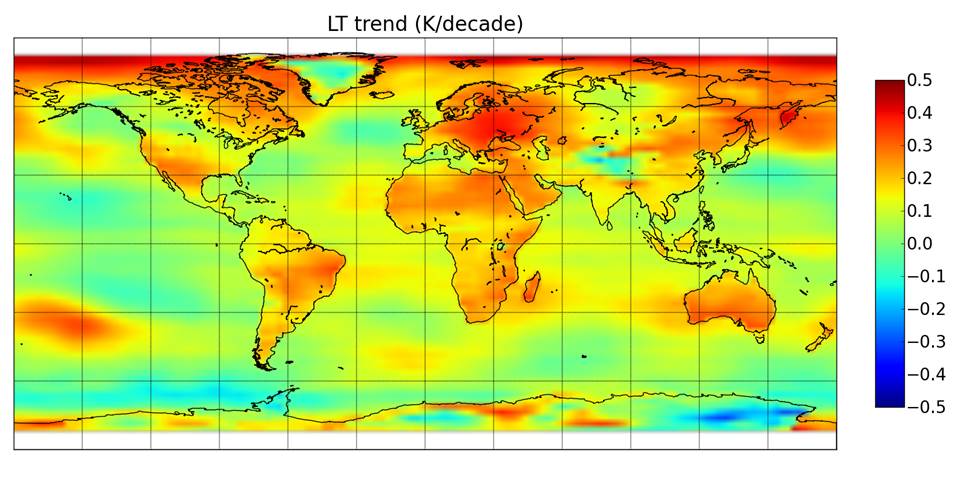
This information is not in any way a challenge to Global Warming. It is simply an improvement in the interpretation of satellite imagery and removing the impact of surface (skin) temperature from the estimate of the temperature of near-surface lower troposphere (LT). The analysis comes with some some interesting commentary.
“The gridpoint trend map above shows how the land areas, in general, have warmed faster than the ocean areas. We obtain land and ocean trends of +0.19 and +0.08 C/decade, respectively. These are weaker than thermometer-based warming trends, e.g. +0.26 for land (from CRUTem4, 1979-2014) and +0.12 C/decade for ocean (from HadSST3, 1979-2014).
A number of things stand out.
- The greater warming of the Arctic Region than Antarctica which is a bit hard to explain but may be related to ocean cycles.
- The greater warming of land areas to ocean which is not a surprise but apparently there is a reinforcing mechanism so that there has been more warming in the Northern Hemisphere than in the Southern Hemisphere.
- This data does not adjust for Ocean Cycles but 1979 – 2015 (I think the 2015 is a typo and should be 2014) represents 36 years so it probably includes parts of different phases of ocean cycles and a further adjustment might move some of the warmer and cooler areas around a bit but will not change the overall conclusion. You can clearly see a PDO- signal in the Pacific which is a bit surprising as more of the period 1979 – 2014 was PDO+. But the number of years in the two phases is not very different. But it is still interesting remembering that this graphic reflects changes from “climatology” and the “climatology” used as the base might be biased to certain phases of the ocean cycles. I probably do not have the time or interest in sorting that out.
It has been getting warmer! The rate may be less than some have previously estimated but it is still getting warmer or at least was getting warmer in the period analyzed. Some of the locations are a bit of a surprise. I expected to see the warming along 30N and 30S and that is not always the case and my guess is that land mass is again the factor. Where there is a lot of land mass above 30N or 30S, it has shifted the warming towards the greater land mass. This might be a factor in the difficulty the IPCC participants have had producing models that work even though it is well known that the ITCZ is impacted by land mass. I may discuss that topic in a future edition of the GEI Weather and Climate Report.
Has this Warming had any geopolitical implications? This from Daniel Pipes suggests it has and you can see the full article here.
“A ranking Iranian political figure, Issa Kalantari, recently warned that past mistakes leave Iran with water supplies so insufficient that up to 70 percent, or 55 million out of 78 million Iranians, would be forced to abandon their native country for parts unknown.
Many facts buttress Kalantari’s apocalyptic prediction: Once lauded in poetry, Lake Urmia, the Middle East’s largest lake, has lost 95 percent of its water since 1996, going from 31 billion cubic meters to 1.5 billion. [Editor’s note: it is a brackish water lake but the inflows are fresh water and possibly are over-utilized]. What the Seine is to Paris, the Zayanderud was to Isfahan – except the latter went bone-dry in 2010. Over two-thirds of Iran’s cities and towns are “on the verge of a water crisis” that could result in drinking water shortages; already, thousands of villages depend on water tankers. Unprecedented dust storms disrupt economic activity and damage health.
Nor are Iranians alone in peril; many others in the arid Middle East may also be forced into unwanted, penurious, desperate exile. With a unique, magnificent exception, much of the Middle East is running out of water due to such maladies as population growth, short-sighted dictators, distorted economic incentives, and infrastructure-destroying warfare. Some specifics:
Egypt: Rising sea levels threaten not only to submerge the country’s coastal cities (including Alexandria, population 4 million) but also to contaminate the Nile Delta aquifer, one of the world’s largest groundwater reservoirs. The Ethiopian government finally woke to the hydraulic potential of the Blue Nile that originates in its country and is building massive dams that may severely reduce the flow of river water reaching Egypt (and Sudan).
Gaza: In what’s called a “hydrological nightmare,” seawater intrusion and the leakage of sewage has made 95 percent of the coastal aquifer unfit for human consumption.
Yemen: Oil remittances permit Yemenis to indulge more heavily than ever before in chewing qat, a leaf whose bushes absorb far more water than the food plants they replaced. Drinking water “is down to less than one quart per person per day” in many mountainous areas, reports water specialist Gerhard Lichtenthaeler. Specialist Ilan Wulfsohn writes that Sana’a “may become the first capital city in the world to run out of water.” [Editor’s Note: For leafy recreational drugs, greenhouses which capture transpiration might reduce water consumption by 95% – Colorado take note.]
Syria: The Syrian government wasted $15 billion on failed irrigation projects in 1988-2000. Between 2002 and 2008, nearly all the 420,000 illegal wells went dry, total water resources dropped by half, as did grain output, causing 250,000 farmers to abandon their land. By 2009, water problems had cost more than 800,000 jobs. By 2010, in the hinterland of Raqqa, now the Islamic State’s capital, the New York Times reports, “Ancient irrigation systems have collapsed, underground water sources have run dry and hundreds of villages have been abandoned as farmlands turn to cracked desert and grazing animals die off.”
Iraq: Experts foresee the Euphrates River’s waters soon halved (refer to Revelations 16:22 for those implications). Already in 2011, the Mosul Dam, Iraq’s largest, shut down entirely due to insufficient flow. Sea water from the Persian Gulf has pushed up the Shatt al-Arab; the resulting briny water has destroyed fisheries, livestock, and crops. In northern Iraq, water shortages have led to the abandonment of villages, some now buried in sand, and a 95 percent decrease in barley and wheat farming. Date palms have diminished from 33 million to 9 million. Saddam Hussein drained the marshes of southern Iraq, at once destroying a wildlife ecology and depriving the Marsh Arabs of their livelihood.
Persian Gulf: Vast desalination efforts, ironically, have increased the salinity level of gulf sea water from 32,000 to 47,000 parts per million, threatening fauna and marine life.
Nearby Pakistan may be “a water-starved country” by 2022.
Israel provides the sole exception to this regional tale of woe. It too, as recently as the 1990s, suffered water shortages; but now, thanks to a combination of conservation, recycling, innovative agricultural techniques, and high-tech desalination, the country is awash in H2O (Israel’s Water Authority: “We have all the water we need”). I find particularly striking that Israel can desalinate about 17 liters of water for one U.S. penny; and that it recycles about five times more water than does second-ranked Spain.

Is this a manifestation of Global Warming? Perhaps. It may also represent population growth, inadequate planning and the results of conflict in the Region. But there does appear to be some correlation with the areas that have experienced the most significant warming so that is why I am presenting Daniel Pipes’ Report.
I will now shift timeframes dramatically. Current (Now to 5 Days) Weather Situation:
For daily forecasts it is better to consult your local weather service or the weather service where you are traveling as these will be more specific. But I do have daily forecasts on Page II of the Report so you can always look at those as they auto-update. What I present here is information that normally is not made available via local weather forecasts and which can help you understand what some of the major drivers are for the local forecast.
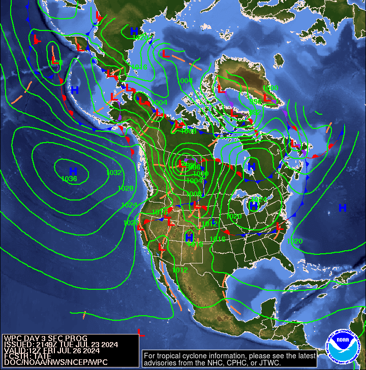
First here is a national 12 hour to 60 hour forecast of weather fronts shown as an animation. Beyond 60 hours, the maps are available in Part II of the Global Economic Intersection Weather and Climate Report.

The explanation for the coding used in these maps i.e. the full legend can be found here.
Sometimes it is useful to take a look at the location of the Jet Stream or Jet Streams. This and the following graphic update every six hours. The continuation of the split jet stream may be related to the Warm Event.

And sometimes the forecast is revealing. Below is the forecast out five days.

To see it in animation, click here.
This longer animation shows how the jet stream is crossing the Pacific and when it reaches the U.S. West Coast is going every which way. One can imagine that attempting to forecast this 6 – 14 days out is quite challenging and NOAA is having fits attempting to guess how this will play out over a 14 day period especially for the Southwest.
And below is another view which highlights the surface highs and the lows re air pressure on Day 3. The Aleutian Low is still active and probably is the most obvious indication of this Warm Event and has kept Alaska warmer and wetter than usual all winter. The RRR which normally is not active in an El Nino year but is active in an El Nino Modoki Type II year is still in the picture, but you can see where Low Pressure Systems can sometimes work their way now between the RRR and the West Coast as Winter fades because the RRR is now centered further off shore.
And here is Day 6. We still see “incoming” cold waves but at this time of year they mostly result in rain not snow.

Outlook Days 6 – 14 (but only showing the 8 – 14 Day Maps)
Here is the updated Temperature Outlook for May which was issued on April 30.

And here is the April 8 – 14 Day Temperature Outlook issued today May 11, 2015. It covers the week following the coming week.

Remember that the 6 – 14 day outlook only covers 9 days not the full month and the map shown only covers seven days. But there is not much resemblance to this Outlook and the Monthly Outlook for May issued on April 30. Last week I commented that it appeared as if the near-term forecasts were rotated perhaps 45 degrees clockwise from the monthly forecast and that still appears to be the case. More on that later in the NOAA discussion.
Here is the updated Precipitation probabilities for May issued on April 30, 2015.

Here is the 8 – 14 Day Precipitation Outlook issued today May 11 2015.
And again remember that this map shows only seven days and the full 6 – 14 Day Outlook only covers nine days. There are 30 days in May. But the week following this coming week (Days 8 -14 of the NOAA Outlook) is projected to be wetter for more of CONUS than the full-month Outlook but drier for parts of the Southwest projected to be wetter than Climatology in the Monthly Outlook. Oops, I misspoke as the prior comment applies to the unsupervised computer outputs issued over the weekend but the human meteorologists appear to have overridden the computers. It is interesting how the wetter areas and the drier areas are drawn and it makes one curious as to how the various factors combine to create such a contorted result. Again that comment applies more to the unsupervised computer maps issued over the weekend. I am not trying just to be funny but to point out that this is a complex pattern and the meteorologists attempt to make sense out of it but it is not a simple thing to do even though they project a high level of confidence in their output.
Here are excerpts from the very interesting and informative NOAA release today May 11, 2015.
“6-10 DAY OUTLOOK FOR MAY 17 – 21 2015
TODAY’S 500-HPA HEIGHT MANUAL BLEND DEPICTS A FAIRLY AMPLIFIED PATTERN OVER THE PACIFIC-NORTH AMERICA REGION. AN ANOMALOUS TROUGH IS FORECAST NEAR THE ALEUTIANS, WHILE A REX BLOCK [Editor’s Note see this description of a Rex Block] DOWNSTREAM IS FORECAST TO DOMINATE THE MID-LEVEL CIRCULATION THROUGH THE PERIOD. IN MANY WAYS THIS PATTERN IS VERY SIMILAR TO THE OBSERVED PATTERN OVER THE PAST WEEK OR SO. THE MEAN CONFLUENCE ZONE IS FORECAST TO RESIDE OVER THE GREAT LAKES AND EASTERN CANADA, SUGGESTING A GENERALLY WARM PATTERN ACROSS MUCH OF THE EASTERN PART OF THE COUNTRY.
THE ANOMALOUS TROUGH FORECAST OVER SOUTHERN CALIFORNIA IS EXPECTED TO COINCIDE WITH BELOW-NORMAL TEMPERATURES CENTERED OVER THE SOUTHWESTERN U.S., EXTENDING NORTHEASTWARD TOWARD THE NORTHERN PLAINS. THIS IS CONSISTENT WITH STRONG CANADIAN HIGH PRESSURE PUSHING SOUTHWARD ALONG THE FRONT RANGE DOWNSTREAM OF STRONG RIDGING FORECAST OVER WESTERN CANADA. IN FACT, TELECONNECTIONS UPON THE FORECAST POSITIVE HEIGHT ANOMALY CENTER OVER NORTHWESTERN CANADA HIGHLIGHT THE TENDENCY TOWARD BELOW-NORMAL TEMPERATURES CENTERED NEAR THE DAKOTAS, AND THE MODEL GUIDANCE IS IN VERY GOOD AGREEMENT ON THIS POINT.
THE PRECIPITATION OUTLOOK REFLECTS MORE UNCERTAINTY, AND THE CALIBRATED DYNAMICAL GUIDANCE FROM THE GEFS AND ECMWF ENSEMBLE WAS WEIGHTED THE MOST, WITH LITTLE CONSIDERATION GIVEN TO THE STATISTICAL TOOLS. ABOVE-MEDIAN PRECIPITATION IS GENERALLY FAVORED FROM THE REGION NEAR THE TROUGH AXIS OVER THE WESTERN CONUS, NORTHEASTWARD INTO THE MEAN CONFLUENCE ZONE NEAR THE GREAT LAKES. SOUTH OF THAT REGION, CONVECTIVE ACTIVITY IN THE WARM SECTOR RELATIVE TO THE MEAN STORM TRACK IS LIKELY TO BE ENHANCED DUE TO THE ANOMALOUS BAROCLINICITY AND ASSOCIATED FRONTAL ZONE. THERE IS ALSO AN ELEVATED RISK OF SEVERE WEATHER DURING THIS PERIOD OVER CLIMATOLOGICALLY FAVORED REGIONS OF THE CENTRAL CONUS.
THERE IS SOME UNCERTAINTY OVER THE NORTHEASTERN U.S., ESPECIALLY WITH RESPECT TO THE PRECIPITATION OUTLOOK. THIS REGION IS FORECAST TO BE NEAR THE MEAN RIDGE AXIS, AND ABOVE-MEDIAN PRECIPITATION IS SLIGHTLY FAVORED TO THE WEST OF THAT AXIS. HOWEVER, THE SENSIBLE WEATHER IS LIKELY TO HINGE ON THE PLACEMENT OF THE CONFLUENCE ZONE, WHICH SEEMS TO BE SOMEWHAT LESS CERTAIN THAN THE PLACEMENT OF THE BLOCKING FEATURE FORECAST OVER WESTERN NORTH AMERICA.
FORECAST CONFIDENCE FOR THE 6-10 DAY PERIOD: ABOVE AVERAGE, 4 OUT OF 5, DUE TO EXCELLENT AGREEMENT AMONG THE VARIOUS TOOLS, OFFSET SLIGHTLY BY A HIGH DEGREE OF UNCERTAINTY IN THE PRECIPITATION OUTLOOK ACROSS THE EASTERN CONUS.
8-14 DAY OUTLOOK FOR MAY 19 – 25 2015
THE OFFICIAL 500-HPA HEIGHT BLEND FOR WEEK-2 SHOWS AN INCREDIBLY SIMILAR ANOMALY PATTERN COMPARED TO THE 6-10 DAY PERIOD, BUT WITH ABOUT HALF THE AMPLITUDE. THIS IS LIKELY DUE TO INCREASED MODEL SPREAD, AS WOULD BE EXPECTED DURING THIS PERIOD; THIS IS CONFIRMED BY INSPECTION OF THE SPAGHETTI CHARTS OF THE VARIOUS GLOBAL ENSEMBLE SYSTEMS.
THERE IS SOME HINT IN THE MANUAL BLEND THAT THE AVERAGE POSITION OF THE 500-HPA CONFLUENCE ZONE OVER EASTERN NORTH AMERICA MAY SHIFT SOUTHWARD [Editor’s Note: this is an example of what I mean by rotation] DURING THIS PERIOD, REDUCING PROBABILITIES OF ABOVE-NORMAL TEMPERATURES ACROSS PARTS OF THE GREAT LAKES, AND INCREASING ODDS OF BELOW-MEDIAN PRECIPITATION OVER PARTS OF THE NORTHERN PLAINS. ELSEWHERE, THE FORECASTS ARE VERY SIMILAR TO THAT FOR THE 6-10 DAY PERIOD, BUT WITH REDUCED PROBABILITIES.
IT IS REASONABLE TO ASK WHETHER SUCH A PATTERN, GIVEN ITS APPARENTLY LOW-FREQUENCY NATURE, MIGHT BE RELATED TO THE ONGOING ENSO STATE IN THE PACIFIC. THIS WARM ENSO EVENT IS AMONG THE STRONGEST FOR THIS TIME OF YEAR, AND SO ANY MIDLATITUDE TELECONNECTIONS WOULD BE EXPECTED TO MANIFEST THEMSELVES DURING SUCH AN EVENT. FOR A BACK OF THE ENVELOPE ATTRIBUTION, WE WILL CONSIDER THE COMPOSITE 500-HPA HEIGHT ANALOG FOR THE PAST WEEK’S OBSERVATIONS AS WELL AS FOR THE WEEK-2 OFFICIAL HEIGHT BLEND. BY LOOKING AT THE SST FOOTPRINTS OF THE TEN-YEAR COMPOSITES FOR EACH MAP, WE SEE THAT THEY ARE QUITE DIFFERENT, WITH THE OBSERVED PERIOD MORE CONSISTENT WITH EL NINO [Editor’s Note: I do not see that in the analogs], BUT THE FORECAST PATTERN STRONGLY TILTED TOWARD LA NINA [Editor’s Note: I do not see this in the forecast maps released today]. THIS IS NOT ENTIRELY SURPRISING CONSIDERING THAT THE EL NINO CIRCULATION FOOTPRINT IS WEAKER DURING BOREAL SUMMER OVER THE PACIFIC-NORTH AMERICA REGION, AND SO VERY LITTLE WEEK-TO-WEEK VARIANCE IS LIKELY ATTRIBUTABLE TO THE ONGOING EVENT.
FORECAST CONFIDENCE FOR THE 8-14 DAY PERIOD IS: ABOUT AVERAGE, 3 OUT OF 5, DUE TO GOOD AGREEMENT AMONG TOOLS, OFFSET BY LARGE ENSEMBLE SPREAD.“
Analogs to Current Conditions
Now let us take a detailed look at the “Analogs” which NOAA provides related to the 5 day period centered on 3 days ago and the 7 day period centered on 4 days ago. “Analog” means that the weather pattern then resembles the recent weather pattern and was used in some way to predict the 6 – 14 day Outlook.
Here are today’s analogs in chronological order although this information is also available with the analog dates listed by the level of correlation. I find the chronological order easier for me to work with. There is a second set of analogs associated with the outlook but I have not been analyzing this second set of information. This first set applies to the 5 and 7 day observed pattern prior to today. The second set which I am not using relates to the forecast outlook 6 – 10 days out to similar patterns that have occurred in the past during the dates covered by the 6 – 10 Day Outlook. That may also be useful information but they put this set of analogs in the discussion with the other set available by a link so I am assuming that this set of analogs is the most meaningful.
Analog Centered Day | ENSO Phase | PDO | AMO | Other Comments |
| 1962 May 18 | Neutral | – | + | |
| 1977 April 21 | Neutral | Neutral | – | In between two El Nino’s |
| 1991 May 18 | El Nino | – | – | Modoki Type I or II |
| 1994 April 27 | Neutral | + | – | Prior to an El Nino |
| 2003 April 21 | Neutral | + | + | Right after an El Nino Modoki Type I |
| 2007 May 24 | Neutral | – | + | Right after an El Nino |
| 2009 April 27 | La Nina | – | Neutral | Followed by an El Nino Modoki Type II |
This week there are five ENSO Neutral and one La Nina and one El Nino analogs. So that contradicts the description of the current situation released by NOAA today. The 1977 analog is of most interest. 1976/1977 is recognized as when the Pacific shifted from PDO- to PDO+ and when the SOI rose to a higher level. So that analog which has shown up before could be very significant or not. NOAA provides me with two groups of five and I discard the duplicates and this week there were three duplicates. The seminal work on the impact of the PDO and AMO on U.S. climate can be found here. The key maps are shown below. Today I do not see a clear pattern of how the analogs correlated with the phase of the ocean cycles that were associated with those analogs. This gives me less faith in the forecast.

You may have to squint but the drought probabilities are shown on the map and also indicated by the color coding with shades of red indicating higher than 25% of the years are drought years (25% or less of average precipitation for that area) and shades of blue indicating less than 25% of the years are drought years. Thus drought is defined as the condition that occurs 25% of the time and this ties in nicely with each of the four pairs of two phases of the AMO and PDO.
Progress of the Warm Event
This shows the state of the Tropical Pacific over the past four weeks as I published it last week.

And here is the updated version

It is difficult to see the change.
But NOAA has a graphic that shows the change over the last four weeks. And this is what I published last week.

At that time I commented that it was extremely interesting as it showed:
- The Warm Event has strengthened somewhat.
- The PDO has become less positive
- The AMO has become more positive
- Look at the increase in SST off of Asia
- Some progress towards the formation of a positive IOD
“2” Contradicts “1” and “3” mediates both “1” and “2”. So this is a confusing situation and confirms in my mind that NOAA has consistently misinterpreted what is going on and this shows why they are having problems.
Here is the newer version

And even though it is diluted in that you add one week and remove the fourth oldest week you can see the dramatic change especial off the coast of South America near the Equator.
For my own amusement, I thought I would recalculate the ONI again as I have been doing recently. The little tick marks on the chart can be used instead of a ruler. When I print out this graphic one tick is about one centimeter. So you can use a ruler or just estimate the number (including fractions) of tick marks.
But first notice the small but intense warm anomaly off the coast of Ecuador. 
So as of Monday May 11 in the afternoon working from the May 10 TAO/TRITON report, this is what I calculated.
| Anomaly Segment | Midpoint | Length on Equator in number of five degrees of latitude (ticks) | Midpoint X Length (tempxticks) |
| -0.5C to 0C | -0.25 | 0 | 0 |
| 0C to +0.5C | +0.25 | 0 | 0 |
| +0.5C to 1.0C | +0.75 | 1 | 0.75 |
| 1.0C to 1.5C | +1.25 | 4 | 5 |
| 1.5C to 2.0C | +1.75 | 0 | 0 |
| 1.75 | Total | 5 Ticks (or 5 centimeters) | 5.75 |
| Estimated ONI the NINO 3.4 Anomaly | 5.75/5 = 1.15 C |
My estimate of the Nino 3.4 ONI is now 1.15 which is a very respectable value and essentially the same as week. Overall it looks to me like this warm event may be petering out. The asymmetry around the Equator has increased a bit. I think the NOAA reading is a bit too low.
Now this week’s weekly SST Departures and the trend graphs on the right.

These are all fairly high values especially the Nino 1+2 estimate of 2.3C which is even higher than last week and actually quite high. On the other hand the Nino 4 value is slightly lower due to the eastward movement of the current Kelvin Wave. The view of El Nino as a 2014/2015 event has morphed into a view that it is a 2015/2016 event.
But all predictions about El Nino for next winter must be tempered by what is called the Spring Prediction Barrier (SPB). Nevertheless, an El Nino this coming winter is a possibility. It is due and many factors are in place that suggest it will happen. But it needs another Kelvin Wave to make it happen. At this point I am leaning towards thinking it is not going to happen. The reason I am less positive than most computer models is that both warm and cold ENSO events are processes that have negative feedback loops i.e. they tend not to reinforce themselves but dissipate. Greater than single-winter warm events are fairly rare. I am looking at the NOAA list of El Ninos declared since 1950 and there are 19 of them and one lasted through two winters years starting when this warm event first reached a ONI 0.5 level and one lasted two winters but started later in the season. Both were during a period later recognized as PDO+. So I am just wondering if there is a reason to assume that this particular Warm Event has the staying power of the former champions. The PDO is currently positive but not as positive as recently and what has occurred so far re this Modoki Type II in terms of geographical coverage of warmer water has been minimal so the dissipating impacting may have been sufficiently minimal to allow this event to make it through this winter. I will be surprised if that happens but I have been surprised before.
Here is the Southern Oscillation Index (SOI) reported by Queensland. The first column is the tentative daily reading, the second is the 30 day running average and the third is the 90 day average.
5 May 2015 – 8.20 -4.23 -4.71
6 May 2015 -6.60 -4.72 -4.77
7 May 2015 -17.8 -5.22 -4.90
8 May 2015 -32.3 -5.26 -5.18
9 May 2015 -46.9 -6.16 -5.66
10 May 2015 -44.1 -7.47 -6.13
11 May 2015 -40.4 -8.87 -6.55
This past week the SOI started off being neutral for the development of an El Nino and then became very very favorable with a value one day of -46.9 which I have never seen before. Usually -8 is considered El Nino Conditions. Sometimes -6 is used for local forecasting in Australia. The 30 average, which is the most widely used measure, on May 11 was reported as being -8.87 which was a very rapid rise to exceed -8. The following NOAA graphic would be helpful but it is up to date as of only May 8 so it does not reflect the last couple of days.

It is totally different from last week but you can see last week by just looking up slightly as this is a Hovmoeller diagram and the data is shown from the most recent along the bottom to less recent as you look up. So you can see the change in one diagram and I do not need to post last week’s graphic.
Now we see a strengthening of the Easterlies in the Eastern Pacific and actual Westerlies in the Western Equatorial Pacific. We may be seeing the beginning of the wind gust that is necessary to keep this Warm Event going. We should know within a week or two.
The Kelvin Wave graphic to me is the key to the situation at this point. It is really the Upper Ocean Heat Anomaly.

We need to examine this graphic very carefully as NOAA will not provide any assistance with this to the extent it contracts their theory. They so far have not recognized a new upwelling phase and perhaps that is the correct call as it may not develop. But if you look a this graphic carefully you will see that along the bottom of the graphic, which is what counts as being a Hovmoeller the time sequence is from top to bottom and the bottom is the most recent readings, the most extreme anomalies are now impacting the Equator east of 130 W and thus will soon exit the area where the ONI is measured. But there are still significant anomalies from 150W east and even over to 170W. So this Kelvin Wave is playing out but will take a couple of months to exit where the ONI is measured and another couple of months to fully dissipate re impacting the coast of South America along the Equator. The TAO/TRITON data is showing surface anomalies further west but this is showing upper level anomalies which is the surface down probably down to 300 meters (but I am not positive about that). So it is a bit confusing to be sure but there is another graphic that helps to resolve the confusion but it is showing very little change from last week. .

I hate presenting so many graphics as it is a lot for a reader to process but when your Government Agency is not fully explaining the situation, sometimes it becomes necessary to present more of the data they are working from so that informed readers can draw their own conclusions. I think it is pretty obvious looking at the snapshots on the right and the most recent (hardly current) snapshot on the left, that this Kelvin wave which was quite powerful is playing out and will do so within three to four months. So far there is no sign of a follow-up wave which is why the concept of a Spring Prediction Barrier re ENSO events has developed based on the experience of those who attempt to predict Fall and Winter conditions in the Spring and Summer. It just is not a highly reliable approach.
View from Australia
Australia has their own model which updates every two weeks.

Here is the commentary that goes with the model runs.
“El Niño in the tropical Pacific
Issued on 12 May 2015
The tropical Pacific is in the early stages of El Niño. Based upon model outlooks and current observations, the Bureau’s ENSO Tracker has been raised to El Niño status.
El Niño–Southern Oscillation (ENSO) indicators have shown a steady trend towards El Niño levels since the start of the year. Sea surface temperatures in the tropical Pacific Ocean have exceeded El Niño thresholds for the past month, supported by warmer-than-average waters below the surface. Trade winds have remained consistently weaker than average since the start of the year, cloudiness at the Date Line has increased and the Southern Oscillation Index (SOI) has remained negative for several months. These indicators suggest the tropical Pacific Ocean and atmosphere have started to couple and reinforce each other, indicating El Niño is likely to persist in the coming months.
International climate models surveyed by the Bureau indicate that tropical Pacific Ocean temperatures are likely to remain above El Niño thresholds through the coming southern winter and at least into spring.
El Niño is often associated with below-average winter and spring rainfall over eastern Australia, and above-average daytime temperatures over the southern half of the country. However, the current May to July outlook suggests much of Australia is likely to be wetter than average. This is because a warmer-than-average Indian Ocean is dominating this outlook. El Niño is expected to become the dominant influence on Australian climate during the second half of the year.”
Pulling it All Together.
We may or may not have an El Nino this Winter. We may or may not have a Pacific Climate Shift as the PDO+ may be simply related to the Warm Event. But for now we do have PDO+. The AMO being an overturning may be more predictable so the Neutral status moving towards AMO- is probably fairly reliable but not necessarily proceeding in a straight line. So none of this is very difficult to figure out actually if you are looking at say a five-year forecast.
Warm Event Impacts
When you look at the last 30 days one sees some signs of this Warm Event impacting CONUS. It has impacted Alaska all winter. I say Warm Event because for the most part it has appeared to be an El Nino Modoki Type II which has different impacts than a traditional El Nino. Right now it is not clear as it does not fit well with any defined pattern especially in terms of Northern Hemisphere (Boreal) Spring.

But when you look back 90 days, not so much in the way of impacts that would normally be associated with an El Nino but the wetter Mexico is quite interesting.

My conclusion is that we are in a period of time when making predictions is difficult and my major criticism of NOAA is simply their failure to acknowledge this.
The research on Ocean Cycles is fairly conclusive and widely available to those who seek it out. I provided a lot of information on this in prior weeks and all of that is preserved in Part II of my report which you can get to below. Predicting a particular year is far harder. My Editor tells me that he will show me how to create a Table of Contents for Part II to make it easier to navigate.
Click Here for the Econointersect Weather and Climate Page II where you will find:
- A more complete set of NOAA and other agency graphics (including international agencies) that auto update. So this includes both short term- and seasonal “updates”. Most of the graphics will ALWAYS be up to date even if my commentary on the graphics is not. I update my commentary when it seems necessary and certainly every Monday, but some of these graphics auto update every six hours.
- Economic and other Impacts of major weather events. Not sure there is any other place to obtain this information consistently other than very specialized subscription services.
- Information on Climate Cycles both those which are fairly short term i.e. less than a decade in duration and multi-decadal cycles.
- Economic and other Impacts of those Climate Cycles which are referred to by the IPCC as Internal Variability as opposed to secular Climate Change which is always in the same direction. Again I am not sure if there is another source for this information where it is pulled together in one place as I have.
Click Here for Page III which deals with Global Warming.
- Information on Anthropogenic Global Warming science i.e. the secular change in our climate that overlays both short-term weather and historical climate cycles as well as black swan events like volcanic eruptions. I prefer to call this Global Warming as it is the warming that triggers the other changes.
- Economic and other Impacts of Global Warming. The IPCC AR5 WG2 attempts to describe and quantify these and I have some excerpts from their report. Over time I will go beyond their report as it is very deficient.


