Written by Steven Hansen
As stated yesterday, the U.S. continues to host over one-third of global new and total coronavirus cases and deaths. Although the curves have flattened, they continue to remain elevated (and actually worsened today) resisting a decline. Following is a set of interactive graphs and tables for the world and individual states – as well as today’s headlines on coronavirus which include topics on “COVID Toe” and the 1976 failed response to the swine flu.

There are great interactive charts in this post that readers can modify to expand their understanding of this pandemic. I continue to talk about the U.S. not bending the curve anymore – and I draw your attention to the first graphic [i have inserted the following static graph with the U.S. highlighted for your information]. We have flattened the curve, but it is staying elevated even though most of the U.S. has “sheltered-in-place” for the past month. Logic tells you that something is wrong in the way the U.S. is responding to this pandemic.

One point is that the above graph does not adjust to the populations of each country. The U.S. is far from the worst performance in terms of cases per 1,000 population – but is the worst in its ability to bend the curve and have a noticeable reduction in the number of new cases. Also, note that South America is seriously being affected – and the curves are still skyrocketing.
This pandemic is far from over, and I am concerned that this pandemic will surge again globally. Stay Safe.
Several selections today in the coronavirus news have been contributed by Roger Erickson, GEI author and Biology Entrepreneur.
Coronavirus News You May Have Missed
I Have Seen the Future—And It’s Not the Life We Knew – The Atlantic
One of the strangest things about this pandemic is that while it’s afflicting the entire world, it’s doing so asynchronously, transforming countries into cautionary tales and object lessons, ghosts of outbreaks past, present, and yet to come.
As the United States engages in its own agonizing debate about how far to go in easing lockdown measures, I’ve spoken with people in China, South Korea, Austria, and Denmark to get a sense of what they’re witnessing as their countries’ respective coronavirus curves flatten, their social-distancing restrictions abate, and they venture out into life again. And although that life doesn’t look like the present nightmare those still locked in coronavirus limbo are experiencing, it doesn’t look like the pre-COVID-19 past either.
… “In the very beginning of the lockdown you start thinking, Oh, this is just a quick thing; it’s just like a hurricane; it’ll be done in a couple of days,” Suzanne continued. “And then a couple of weeks into it, you start reading into conspiracy theories and rabbit holes, and then you get past that point, and you’re talking with your group-chat buddies and they’re sharing their cooking videos, and how they’re using beer and ketchup to cook food, just to make jokes. And then it gets to this point like, okay, this is getting old … when is it going to go back” to normal?
The last time the government sought a ‘warp speed’ vaccine, it was a fiasco – The Washington Post
Gerald Ford was president. It was 1976. Early that year, a mysterious new strain of swine flu turned up at Fort Dix in New Jersey. One Army private died. Many others became severely ill. The nation’s top infectious disease doctors were shaken.
… Ford raced to come up with a response, consulting with Jonas Salk and Albert Sabin, the scientists behind the polio vaccine, and in late March he announced an audacious plan for the federal government to produce the vaccine and organize its distribution.
… One manufacturer produced 2 million doses with the wrong strain. As tests progressed, more scientific problems emerged — even as there were few, if any, signs that a pandemic was materializing. In June, tests showed the vaccine was not effective in children, prompting a public squabble between Salk and Sabin over who should be vaccinated.
… And then more problems emerged. There were reports of sporadic deaths possibly connected to the vaccine. Cases of Guillain-Barre syndrome also emerged, and are still cited today by the anti-vaccine movement. Panic emerged, with dozens of states pausing vaccinations.
The Small Business Loan Racket – Counterpunch
A scandal blew up over the small business loan fund recently. The first, $350 billion Paycheck Protection Program (PPP) was created to help small businesses – walloped by Covid-19 lockdowns – keep paying employees. But the banks were in charge of disbursing these loans. And it turned out these banks doled out $365 million in forgivable loans to big, publicly-traded chains like Potbelly Sandwich Shop, Shake Shack, and Quantum Corp. Amid the outcry, Shake Shack returned its $10 million loan. Potbelly and Sweetgreen said they would do so too. As of April 27, 13 big corporations promised to return the money they had illegitimately received, with reportedly $2 billion returned to or declined from the program. But the banks were exposed as having aided 94 or more publicly-traded companies in snatching government handouts from mom and pop businesses. Many of those 94 plus firms, including cruise ships, have evinced little shame. They do not intend to return their loans. They helped empty the fund. Not a good look. They should be compelled to return the money.
Lower-income zipcodes report the highest COVID-19 cases & severe illnesses – untapped New York
Ben Wellington, Visiting Assistant Professor in the City and Regional Planning program at the Pratt Institute, a quantitative analyst, and the founder of the website I Quant NY, goes deeper using regression analysis of the data on April 2nd. He writes, “positive testing rates, given the disparities in testing, is likely not a good proxy for the rate of infection when comparing across income lines.”
… To look deeper at the possible correlation with income, Wellington looked at data from symptom surveillance data also from NYC Department of Health that shows symptom counts from emergency room visits. He writes, “A quick analysis seems to confirm that there is a relationship between median income in a Zip Code and the ER visit rate for respiratory symptoms…And here is the striking thing – it turns out there is no mathematical correlation between hospitalization rates and positive test rates, adding the evidence that positive test rates is not a great proxy for understanding the spread.”
Covid Cases by Zip Code, Normalized by Population:
What Is ‘Covid Toe’? Maybe a Strange Sign of Coronavirus Infection – New York Times
Before the coronavirus outbreak, Dr. Lindy Fox, a dermatologist in San Francisco, used to see four or five patients a year with chilblains — painful red or purple lesions that typically emerge on fingers or toes in the winter.
Over the past few weeks, she has seen dozens.
… The lesions are emerging as yet another telltale symptom of infection with the new coronavirus. The most prominent signs are a dry cough and shortness of breath, but the virus has been linked to a string of unusual and diverse effects, like mental confusion and a diminished sense of smell.
Federal health officials do not include toe lesions in the list of coronavirus symptoms, but some dermatologists are pushing for a change, saying so-called Covid toe should be sufficient grounds for testing. (Covid-19 is the name of the illness caused by the coronavirus.)

Coronavirus India highlights: COVID-19 cases in India rise to 37,776, death toll at 1,223 – Business Today
After issuing new guidelines regarding lockdown 3.0 on Friday, the Union Home Ministry sources clarified on Saturday that e-commerce services will be allowed only for essentials in the red zones. The sources also said that the liquor shops will be allowed to open orange and green zones, while the ones in the red zones will only be permitted to open if they are standalone or neighbourhood shops.
As many as 790 fresh coronavirus cases reported in Maharashtra on Saturday, taking tally to 12,296. Death toll touched 521 with 36 patients succumbing today, as per the statement issued by the state health department. Meanwhile, 121 coronavirus patients discharged after recovery today, taking number of recovered persons to 2,000, added health department.
| U.S. Only | Global | U.S Percentage of Total | ||||
| Today | Cumulative | Today | Cumulative | Today | Cumulative | |
| New Cases | 33,955 | 1,100,000 | 93,350 | 3,310,000 | 36.4% | 33.2% |
| Deaths | 2,062 | 65,068 | 5,861 | 238,431 | 35.2% | 27.3% |
| Mortality Rate | 6.1% | 5.9% | 6.3% | 7.2% | ||
| total COVID-19 Tests per 1,000 people | 0.92 | 19.79 | ||||
Today’s Posts On Econintersect Showing Impact Of The Pandemic With Hyperlinks
A ‘New Deal’ for Informal Workers in Asia
COVID-19, School Closings And Labor Market Impacts
COVID-19 Caused 3 New Hires For Every 10 Layoffs
Current Unemployment Is Worse Than The Great Depression
Microsoft Teams Sees Jump In Usage As Remote Work Surges
The Coming Battle For The COVID-19 Narrative
Coronavirus INTERACTIVE Charts
include($_SERVER[‘DOCUMENT_ROOT’].’/pages/coronavirus.htm’); ?>
Analyst Opinion of Coronavirus Data
There are several takeaways that need to be understood when viewing coronavirus statistical data:
- The global counts are suspect for a variety of reasons including political. Even the U.S. count has issues as it is possible that as much as half the population has had coronavirus and was asymptomatic. It would be a far better metric using a random sampling of the population weekly. In short, we do not understand the size of the error in the tracking numbers.
- Just because some of the methodology used in aggregating the data in the U.S. is flawed – as long as the flaw is uniformly applied – you establish a baseline. This is why it is dangerous to compare two countries as they likely use different methodologies to determine who has (and who died) from coronavirus.
- COVID-19 and the flu are different but can have similar symptoms. For sure, COVID-19 so far is much more deadly than the flu. [click here to compare symptoms]
- From an industrial engineering point of view, one can argue that it is best to flatten the curve only to the point that the health care system is barely able to cope. This solution only works if-and-only-if one can catch this coronavirus once and develops immunity. In the case of COVID-19, herd immunity may need to be in the 80% to 85% range. WHO warns that few have developed antibodies to COVID-19. At this point, herd immunity does not look like an option.
- Older population countries will have a higher death rate.
- There are at least 8 strains of the coronavirus. New York may have a deadlier strain imported from Europe, compared to less deadly viruses elsewhere in the United States.
- Each publication uses different cutoff times for its coronavirus statistics. Our data uses 11:00 am London time. Also, there is an unexplained variation in the total numbers both globally and in the U.S.
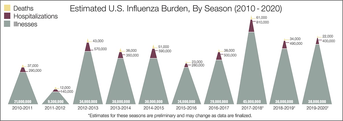
- The real question remains if the U.S. is over-reacting to this virus. The following graphic from the CDC puts the annual flu burden in perspective [click on image to enlarge].
What we do not know about the coronavirus [actually there is little scientifically proven information]. Most of our knowledge is anecdotal, from studies with limited subjects, or from studies without peer review.
- Is social distancing at 6 feet correct? Some are saying 4 meters (13 feet). And what is the correct social distance if one rides a bike?
- Will warm weather and higher humidity slow the coronavirus spread? Will September see another spike in cases? Next Winter may see more cases than seen previously.
- Should we decontaminate products (such as food) that are brought into the house?
- Does one develop immunity after recovering from coronavirus?
- Is COVID-19 mutating? How will this impact the ability to create immunization or even immunity?
- Are ventilators damaging patients – should oxygen be used instead?
- The U.S. outsourced bat virus research to Wuhan after the U.S. shut down its testing due to containment issues.
The bottom line is that COVID-19 so far has been shown to be much more deadly than the data on the flu. Using CDC data, the flu has a mortality rate between 0.06 % and 0.11 % Vs. the coronavirus which to date has a mortality rate of over 5 % – which makes it between 45 and 80 times more deadly. The reason for ranges:
Because influenza surveillance does not capture all cases of flu that occur in the U.S., CDC provides these estimated ranges to better reflect the larger burden of influenza.
There will be a commission set up after this pandemic ends to find fault [it is easy to find fault when a once-in-a-lifetime event occurs] and to produce recommendations for the next time a pandemic happens. Those that hate President Trump will conclude the virus is his fault. The most important issue will be an analysis of whether the federal government took a strong enough lead in dealing with the pandemic.
include(“/home/aleta/public_html/files/ad_openx.htm”); ?>


