 Written by Steven Hansen
The BLS job situation headlines bad. Jobs growth decelerated this month – and the previous month’s data was downwardly revised. The Verizon stike did not help but most the internals were weak. Economic intuitive sectors were mixed.
- The effect of the Verizon strike was a reduction of 34,000 jobs as shown on the graph below.

- The rate of growth for employment decelerated this month (red line on graph below).
Unadjusted Non-Farm Private Employment – Year-over-Year Change (blue bars – left axis) and Year-over-Year Growth Acceleration / Deceleration From Previous Month (red line – right axis)

z bls2.png
- The unadjusted jobs increase month-over-month was well below average for times of economic expansion.
- Economic intuitive sectors of employment were mixed.
- This month’s report internals (comparing household to establishment data sets) was consistent with the household survey showing seasonally adjusted employment improving 26,000 vs the headline establishment number of growing 38,000. The point here is that part of the headlines are from the household survey (such as the unemployment rate) and part is from the establishment survey (job growth). From a survey control point of view – the common element is jobs growth – and if they do not match, your confidence in either survey is diminished. [note that the household survey includes ALL jobs growth, not just non-farm).
- The household survey removed 458,000 people from the workforce.
A summary of the employment situation:
- BLS reported: 38K (non-farm) and 25K (non-farm private). Unemployment rate significantly declined to 4.7% from 5.0%.
- ADP reported: 173 K (non-farm private)
- In Econintersect‘s May 2016 economic forecast released in late April, we estimated non-farm private payroll growth at 120,000 (based on economic potential) and 240,000 (fudged based on current overrun of economic potential);
- NFIB comments on this Jobs Report is towards the end of this post.
- The market expected (from Bloomberg):
| Seasonally Adjusted Data | Consensus Range | Consensus | Actual | |
| Nonfarm Payrolls – M/M change | 110,000 to 219,000 | 158,000 | 38,000 | |
| Unemployment Rate – Level | 4.9 % to 5.0 % | 4.9 % | 4.7 % | |
| Private Payrolls – M/M change | 105,000 to 211,000 | 150,000 | 25,000 | |
| Average Hourly Earnings – M/M change | 0.2 % to 0.3 % | 0.2 % | +0.2 % | |
| Av Workweek – All Employees |
| 34.5 hrs | 34.4 hrs |
The BLS reports seasonally adjusted data – manipulated with multiple seasonal adjustment factors, and Econintersect believes the unadjusted data gives a clearer picture of the jobs situation.
Non-seasonally adjusted non-farm payrolls improved 697,000 – worse than last year and well below average for May’s in times of economic expansion.
Historical Unadjusted Private Non-Farm Jobs Growth Between Aprils and Mays (Table B-1, data in thousands) – unadjusted (blue line) vs seasonally adjusted (red line)

bls non-adjusted change.PNG
Last month’s employment gains were revised downward.
Change in Seasonally Adjusted Non-Farm Payrolls Between Originally Reported (blue bars) and Current Estimates (red bars)

z bls1.png
Most of the analysis below uses unadjusted data, and presents an alternative view to the headline data.
Unemployment
The BLS reported U-3 (headline) unemployment was 4.7 % with the U-6 “all in” unemployment rate (including those working part time who want a full time job) was unchanged at 9.7 %. These numbers are volatile as they are created from the household survey.
BLS U-3 Headline Unemployment (red line, left axis), U-6 All In Unemployment (blue line, left axis), and Median Duration of Unemployment (green line, right axis)

Econintersect has an interpretation of employment supply slack using the BLS employment-population ratio, demonstrated by the graph below. The employment-population ratio was unchanged at 59.7.
Employment-Population Ratio
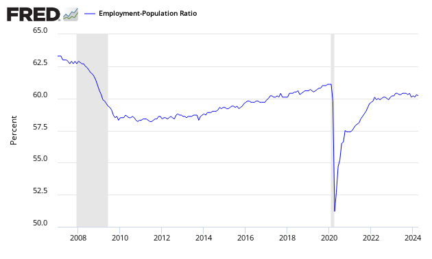
The jobs picture – when the employment / population as a whole – has been on an uptrend since mid-2011 – even with the significant decline this month. This ratio is determined by household survey.
- Econintersect uses employment-populations ratios to monitor the jobless situation. The headline unemployment number requires the BLS to guess at the size of the workforce, then guess again who is employed or not employed. In employment – population ratios, the population is a given and the guess is who is employed.
- This ratio has been in a general uptrend since the beginning of 2014. The employment-population ratio tells you the percent of the population with a job. Each 0.1% increment represents approximately 300,000 jobs. [Note: these are seasonally adjusted numbers – and we are relying on the BLS to get this seasonal adjustment factor correct]. An unchanged ratio would be telling you that jobs growth was around 150,000 – as this is approximately the new entries to the labor market caused by population growth.
Employment Metrics
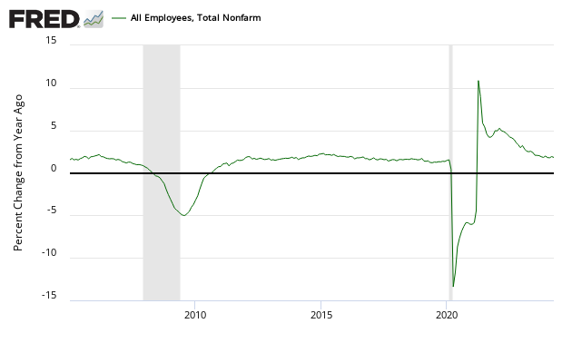
The growth trend in the establishment survey’s non-farm payroll was trending up beginning of 2014 but has been trending down beginning in 2015. This month there was a decline.
Unadjusted Non-Farm Payrolls Year-over-Year Growth
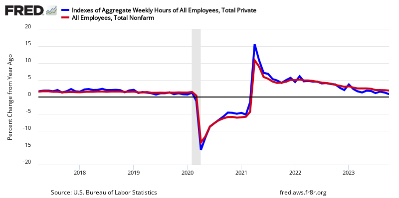
Another way to view employment is to watch the total hours worked.
Percent Change Year-over-Year Non-Farm Private Weekly Hours Worked
The bullets below use seasonally adjusted data from the establishment survey except where indicated:
- Average hours worked (table B-2) was unchanged at 34.5. A rising number normally indicates an expanding economy .
- Government employment grew 13,000 (13K) with the Federal Government up 12K, state governments down 7K and local governments up 8K.
- The big contributor to employment growth this month was health care and social assistance (55.4K).
- Manufacturing was was down 10K, and construction was down 15K.
- The unemployment rate (from household survey) for people between 20 and 24 (Table A-10) improved from 8.8% to 8.3%. This number is produced by survey and is very volatile.
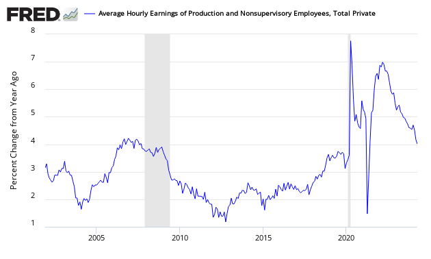
- Average hourly earnings (Table B-3) was was up $0.05 to $25.59.
Private Employment: Average Hourly Earnings
Economic Metrics
Economic markers used to benchmark economic growth (all from the establishment survey).
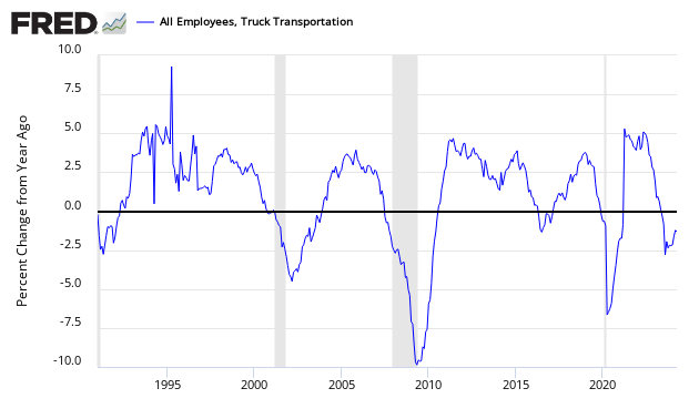
The truck employment was up 0.3K.
Truck Transport Employment – Year-over-Year Change
Temporary help fell 21K.
Temporary Help Employment – Year-over-Year Change
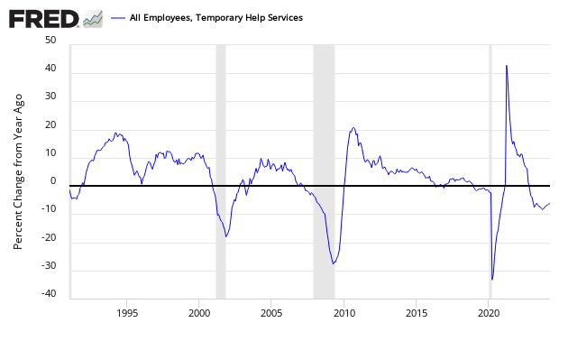
Econintersect believes the transport sector is a forward indicator. Others look at temporary help as a forward indicator.
Food for Thought
Who are the victims in this mediocre employment situation. It is not people over 55.
Index of Employment Levels – 55 and up (blue line), 45 to 54 (red line), 35 to 44 (green line), 25 to 34 (purple line), 20 to 24 (light blue line), and 16 to 19 (orange line)

Women are doing better than men.
Index of Employment Levels – Men (blue line) vs Women (red line)

Mom and Pop employment remains below recessionary levels.

The less education one has, the less chance of finding a job.
Index of Employment Levels – University graduate (blue line), Some college or AA degree (orange line), high school graduates (green line), and high school dropouts (red line)

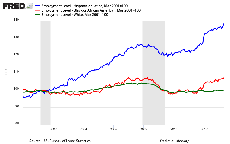
Here is an indexed view of employment levels.
Index of Employment Levels (from the BLS Establishment Survey) – Hispanic (blue line), African American (red line), and White (green line)
However, keep in mind that population growth is different for each group. Here is a look at employment to population ratios which clearly shows NO group has recovered from the Great Recession:
Employment / Population Ratios (from the BLS Household Survey) – Hispanic (blue line), African American (red line), and White (green line)

NFIB comment on this Month’s BLS Job Situation
NFIB’s chief economist William C. Dunkelberg, issued the following statement on employment this month:
The small business employment outlook was positive in May with job creation, job openings, hiring plans, and compensation increasing.
Overall the report improved only modestly, but there are some reasons for longer-term optimism. This month’s report was a ray of sunshine in an otherwise dreary economic recovery.
Reported job creation during the month of May crept up to 0.03 workers per firm. That’s an improvement over the April report, which was negative. More small business owners also reported that they are raising compensation, including higher pay and more benefits. In fact, the NFIB survey shows that compensation reports are at the highest level since 2007.
Hiring activity among small business owners increased and more owners said that they plan to create new jobs. However, among those trying to fill a position, a large percentage, 48 percent, reported difficulty finding qualified applicants. Thirteen percent of owners listed “finding qualified workers” as their Single Most Important Business Problem. Interestingly, temporary employment also continued to rise.
NFIB President and CEO Juanita Duggan said that the proliferation of labor-related rules at the federal and state levels, like minimum wage and paid leave mandates, is a high concern for small business owners. That, she said, could be why more owners are bringing on temporary workers instead of permanent employees.
“What we hear very often from our members is that government mandates make it harder to bring on permanent workers and that could be what we’re seeing here,” Duggan said. “Small businesses will continue to look for ways to be more efficient in order to pay for these bad economic policies.”
Based on the NFIB Jobs Report data for May, Dunkelberg predicted that the May federal jobs number will show a better performance, coming in above 200,000 with the unemployment rate likely unchanged.
NFIB’s May Jobs Report is based on the NFIB monthly Small Business Economic Trends survey. The survey was conducted in May and reflects the response of 700 small businesses. The full Small Business Economic Trends report will be released on Tuesday, June 14th.
Results of the full survey will be released on Tuesday, June 7th.


Caveat on the use of BLS Jobs Data
The monthly headline data ends up being significantly revised for months after the initial release – and is subject also to annual revisions. The question remains how seriously can you take the data when first released.
The above graphic (updated through October 2011) is the month-over-month change in employment based on the original headline non-farm employment level and the current stated employment levels at month end. You will note some pretty drastic backward revision for a major economic release the market reacts to in real time.
Econintersect Contributor Jeff Miller has the following description of BLS methodology:
- An initial report of a survey of establishments. Even if the survey sample was perfect (and we all know that it is not) and the response rate was 100% (which it is not) the sampling error alone for a 90% confidence interval is +/- 100K jobs.
- The report is revised to reflect additional responses over the next two months.
- There is an adjustment to account for job creation — much maligned and misunderstood by nearly everyone.
- The final data are benchmarked against the state employment data every year. This usually shows that the overall process was very good, but it led to major downward adjustments at the time of the recession. More recently, the BLS estimates have been too low.
Econintersect has repeatedly pointed out questions about how the seasonal adjustment algorithms and data gathering methodology used by the BLS introduce uncertainty into interpretation of month to month changes in employment.
Econintersect believes the simplistic sampling extrapolation technique of ADP yields a far better picture of the employment situation than the complicated, convoluted Bureau of Labor Statistics (BLS) methodology. However, ADP is using a new methodology beginning with the October 2012 data – and only time will tell if their new approach was as good as their old one.
ADP (blue line) versus BLS (red line) – Monthly Jobs Growth Comparison

Because of the differences in methodology, many pundits ignore the ADP numbers – while waiting for the BLS numbers. Although there can be a low correlation in a particular month, the different methodologies tend to balance out, and the correlations are excellent outside of the data turning points. We are now 16 months past the post recession turning point in employment.
However, there is some discussion that neither the ADP nor BLS numbers are correct – as both are derived by a sampling methodology. The answer could be that there is no correct answer in real time – and that it is best to look at the trends. As has been noted, all eventually end up correlating.
The BLS uses seasonal adjusted data for its headline numbers. The seasonally adjusted employment data is produced by an algorithm. The following graph which shows unadjusted job growth – seasonal adjustments spread employment growth over the entire year. Employment does not really grow in the second half of the year and always falls significantly in January.
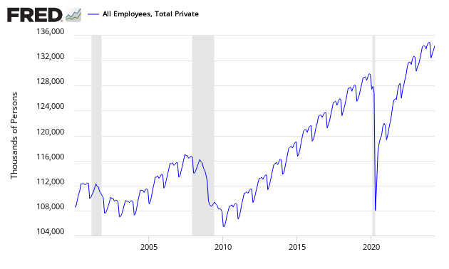
Non-Seasonally Adjusted Employment – Private Sector
There is the proverbial question on what is minimal jobs growth each month required to allow for new entrants to the market. Depending on mindset, this answer varies. According to Investopdia, the number is between 100,000 and 150,000. The Wall Street Journal is citing 125K. Mark Zandi said 150K. Econintersect is going with Mark Zandi’s number:
- In Econintersect‘s June 2014 economic forecast released in late May, we estimated non-farm payroll growth at 160,000 (unadjusted based on economic potential) and 229,000 (fudged based on current overrun of economic potential).
- If Econintersect uses employment – population ratios, the correct number would be the number where this ratio improved. Using the graph below, the ratio began to improve starting a little after mid-year. This corresponds to the period where the 12 month rolling average of job gains hit 150,000.
Employment to Population Ratio
Note: The ratio could be fine tuned by adjusting to the ratio of employment to working age population rather than the total population. However, this would not change the big picture that an increase of somewhere around 150,000 (+/-) is needed for the growing population numbers. We have estimated 140k – 160k. The number might possibly be within the range 125k – 175k. Econintersect cannot find reason to support the estimates below 125k.
The question of how changing demographics impact the employment numbers is at the margins of analysis. Econintersect will publish more on this fine tuning going forward, both in-house research and the work of others.
include(“/home/aleta/public_html/files/ad_openx.htm”); ?>


