by Callum Thomas, Topdown Charts
The Chart Storm is a weekly selection of 10 charts which I hand pick from around the web (plus some of my own charts), and then post on Twitter.
The charts focus on the S&P500 (US equities); and the various forces and factors that influence the outlook – with the aim of bringing insight and perspective.
Please share this article – Go to very top of page, right hand side, for social media buttons.
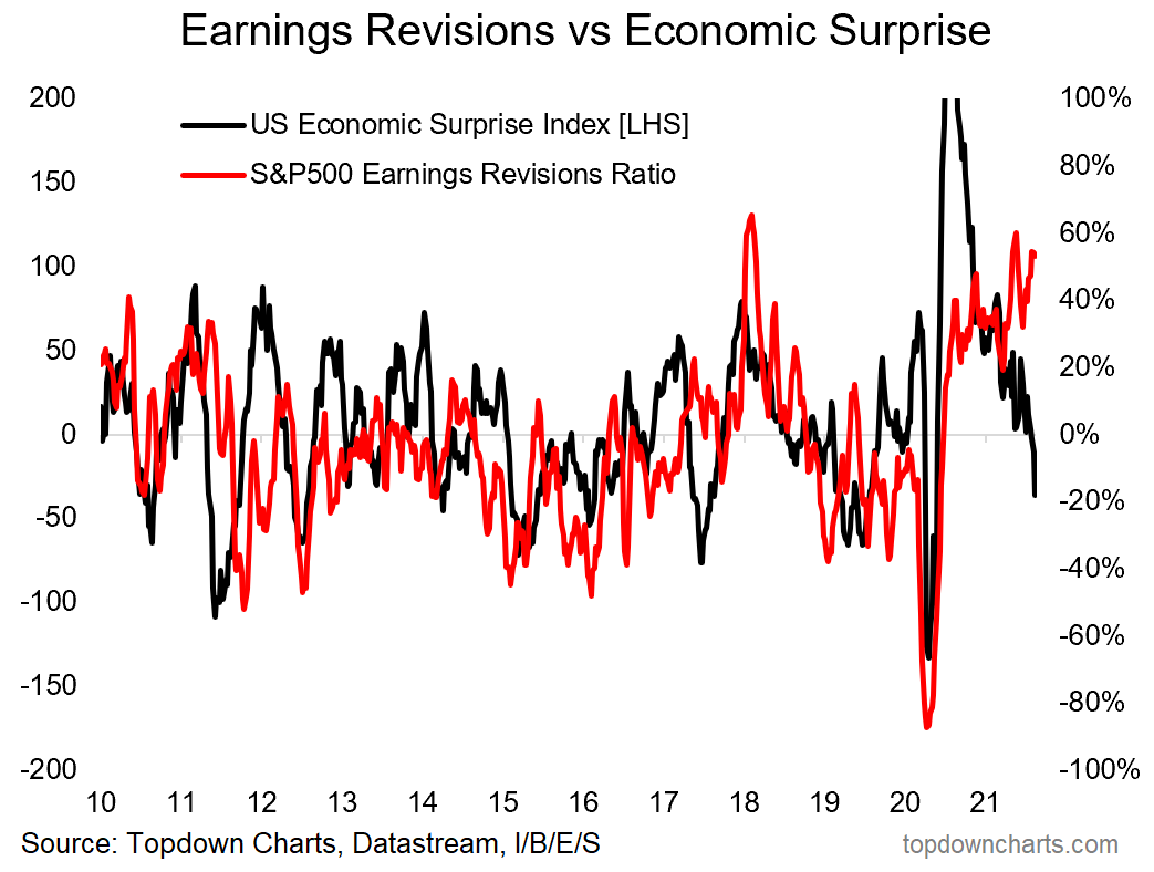
1. Earnings Revisions vs Economic Surprises: Wall Street analysts continue to revise earnings upwards, meanwhile the economic data continues to disappoint vs economist expectations …it begs the question: if economists are apparently too optimistic, are stock analysts also too optimistic?
 |
Source: @topdowncharts
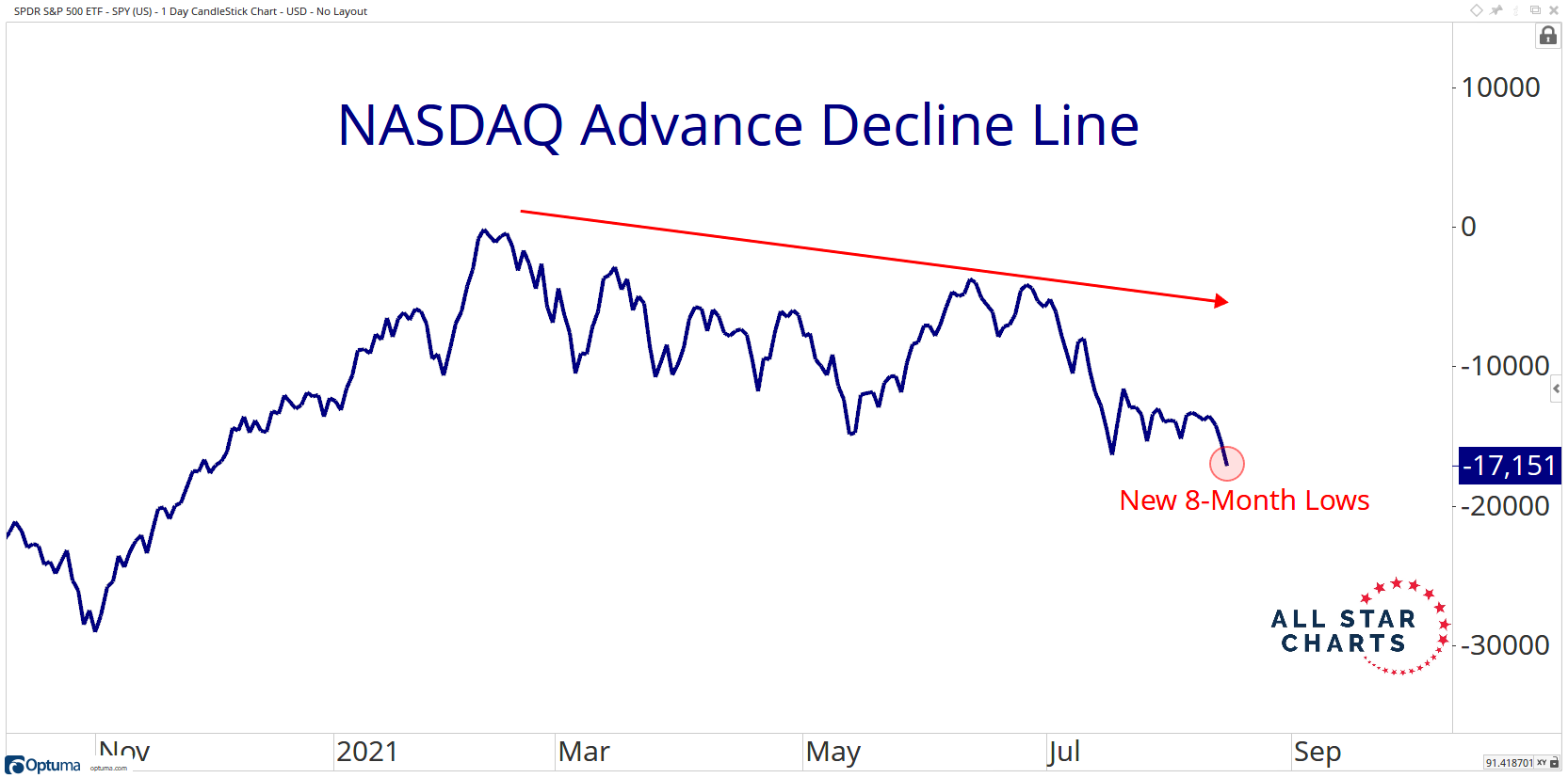
2. NASDAQ Advance Decline Line: I’ve previously highlight various breadth metrics which show basically a picture of weakness under the surface – and here’s another interesting piece of evidence. The bearish take is that this portends a correction, while the optimistic take is that it represents a sort of stealth correction – a gentle reset and pressure release valve. Either way, it is a clear sign of underlying weakness.
 |
Source: @allstarcharts
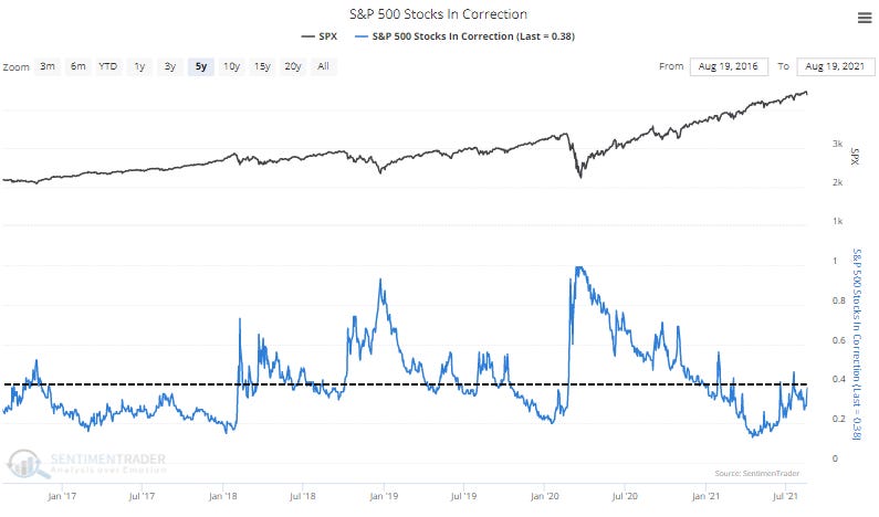
3. Proportion of Stocks in a Correction: As SentimenTrader notes: “nearly 40% of S&P 500 stocks are more than 10% below their peaks. Healthy markets typically see this figure hold consistently below 40%; when above, it signals dangerous internal conditions in the index“ …basically add this one to the bearish pile – also gels with the previous chart.
 |
Source: @sentimentrader
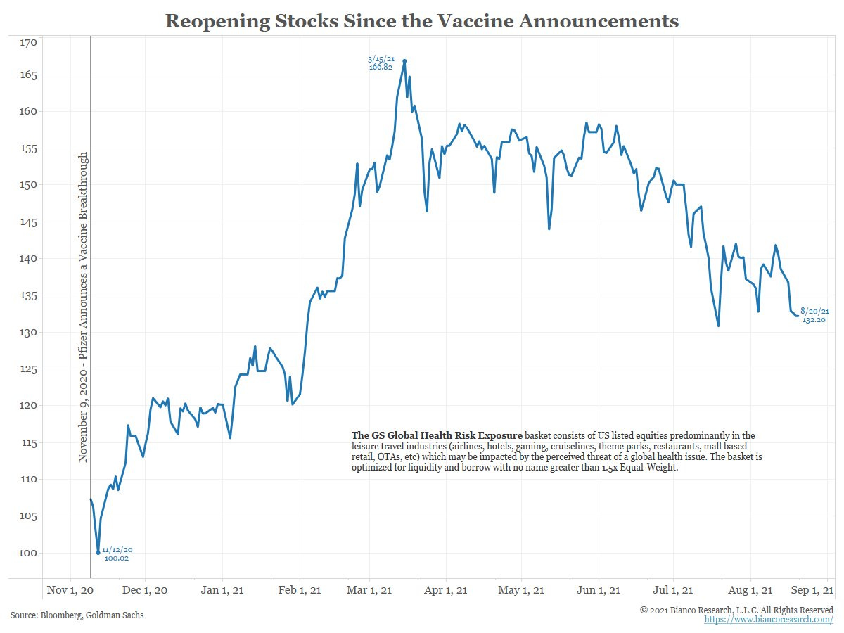
4. Reopening Stocks: On the macro/market weakness theme of the past few charts, this one helps lay out a big part of the market concerns – post-vaccine announcement there was a sort of reopening euphoria, but this has since given way to a delta-dysphoria. Consensus seems to be moving to the idea that the way out of this is becoming less obvious, and “normal” a thing of the past.
 |
Source: @biancoresearch
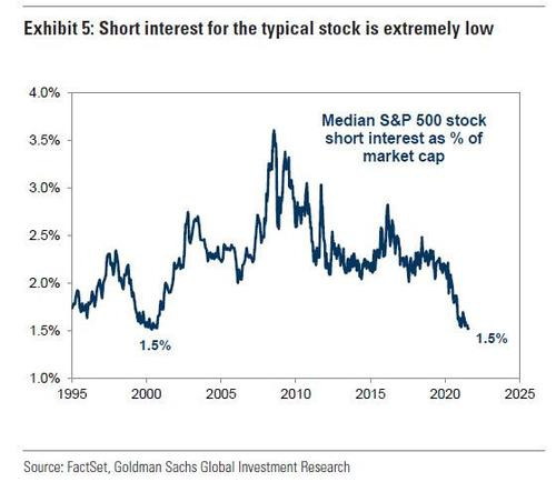
5. Median Short Interest: File this in the “things that remind us of the dot com bubble“ folder. Short selling has been a difficult game with the market as a whole surging off the March lows thanks to historic stimulus… not to mention some of those headline grabbing short-squeeze blow-ups. I guess we could say something like ‘short selling is dead, long live short selling‘!
 |
Source: @zerohedge
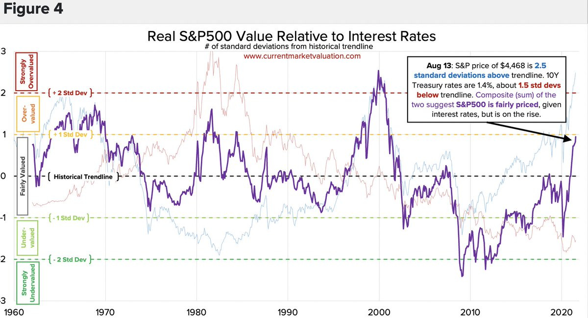
6. Alternative Valuation Metric: Must admit this is a new one to me, it shows the detrended S&P500 vs detrended bond yields… with the takeaway being that the valuation on this metric is currently in the fair value zone (albeit it is steadily pushing closer to the mildly overvalued zone). Interesting approach, but basically the conclusion is ‘good news: the market is only mildly expensive‘.
 |
Source: @TheMarketDog
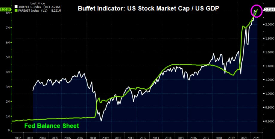
7. Buffett Indicator vs Fed Balance Sheet: It’s no secret that we’ve seen a truly historic stimulus effort in response to the pandemic (and by the way, not just in the US, but globally, and not just monetary but fiscal etc etc also). So, could we (like the previous chart) actually then conclude that the “Buffett Indicator“ is actually fair value at these levels?
 |
Source: @MaverickBogdan
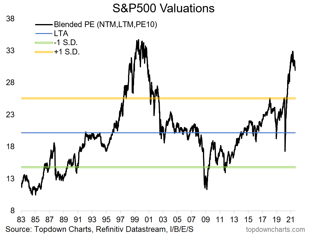
8. Blended PE Ratio: This absolute valuations metric is an equal weight of the PE10 (price vs trailing 10 year average earnings), NTM PE (price vs consensus next 12-months earnings), and LTM PE (price vs trailing 12-months earnings). As you can see, it is still very much at extreme expensive levels, but interestingly the indicator has begun to come down slightly as earnings recover – and begin the process of attempting to catch up with price…
 |
Source: @topdowncharts
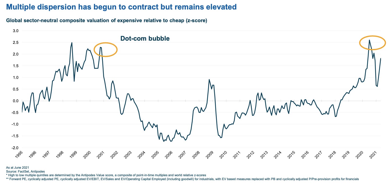
9. Valuation Multiple Dispersion: This interesting chart shows a composite view of where expensive stocks are trading relative to the cheaper stocks. As you can see, the more expensive stocks are looking more expensive than usual vs the cheaper stocks. If you want a quick “so-what?“ – simply look at the last time it was at these levels.
 |
Source: @AntipodesInvest
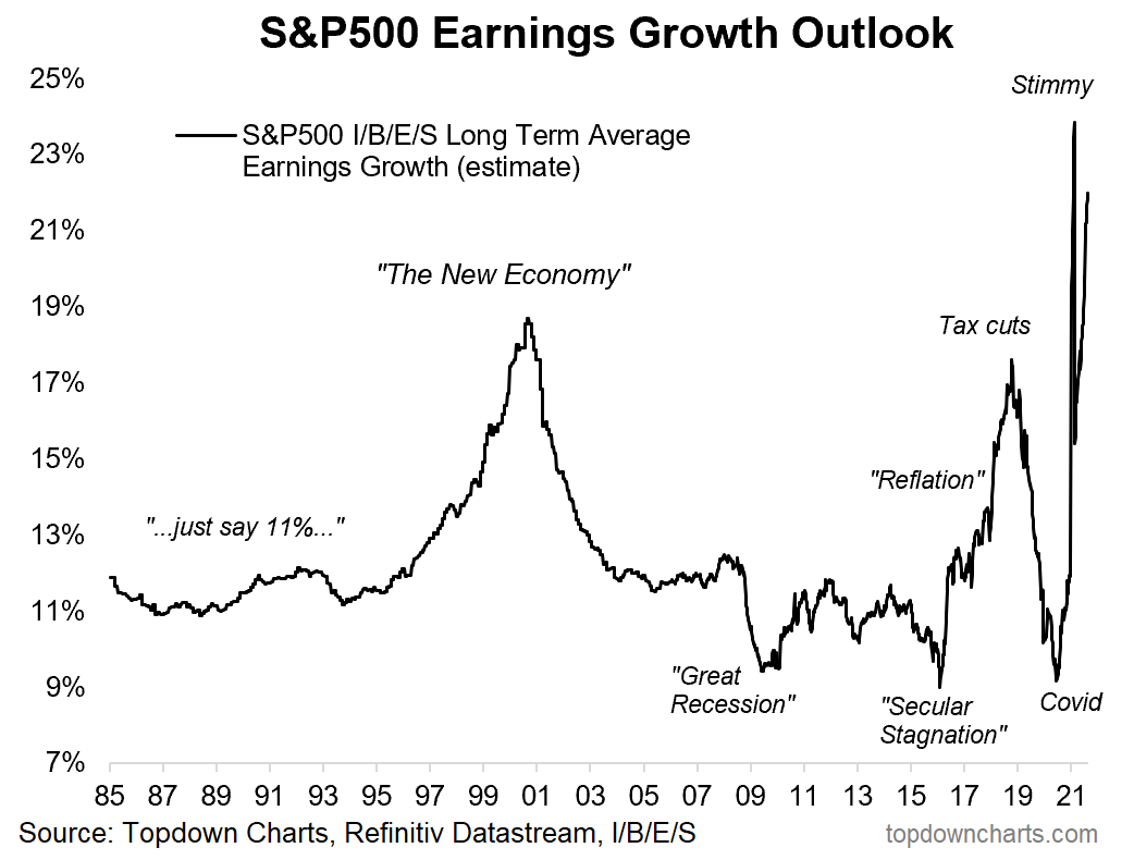
10. Long-Term Earnings Growth Outlook: Last but not least, a look at the exponential rise of earnings expectations …”exponential age”?
 |
Source: Long-Term Earnings Growth Outlook
Thanks for following, I appreciate your interest!
oh… that’s right, almost forgot!
BONUS CHART
S&P500 Priced in Bitcoin: this chart shows the relative performance of the S&P 500 vs Bitcoin (or basically “S&P500 priced in Bitcoin“.
From the perspective of “Bitcoin Maximalists“, the S&P500 is now basically in bear market mode, having fallen almost -40% since July [when priced in Bitcoin]. Talk about stealth corrections… that’s more like a stealth market crash!
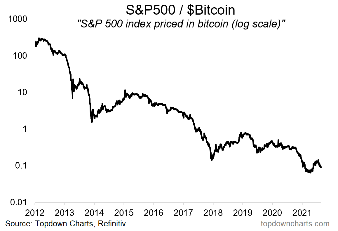 |
Goes to highlight the old saying that if you’re not long, you’re short. On that note, there does seem to be a fairly clear trend here, and an interesting tendency that once it rolls over like it just has, that it seems to keep going.
Indeed, with Bitcoin up 65% off the lows, begs the question if a second wave of speculation is setting up. Rather than dwell on the merits or otherwise of crypto, I think at the minimum this is an interesting continuation of the procession of bubbles we’ve seen since March 2020.
Stimulus has awoken the spirit of speculation, and as history shows, when this spirit awakens, there’s no telling how far things can go.
.


