by Callum Thomas, Topdown Charts
The Chart Storm is a weekly selection of 10 charts which I hand pick from around the web (+some of my own charts), and then post on Twitter.
The charts focus on the S&P500 (US equities); and the various forces and factors that influence the outlook – with the aim of bringing insight and perspective.
Please share this article – Go to very top of page, right hand side, for social media buttons.
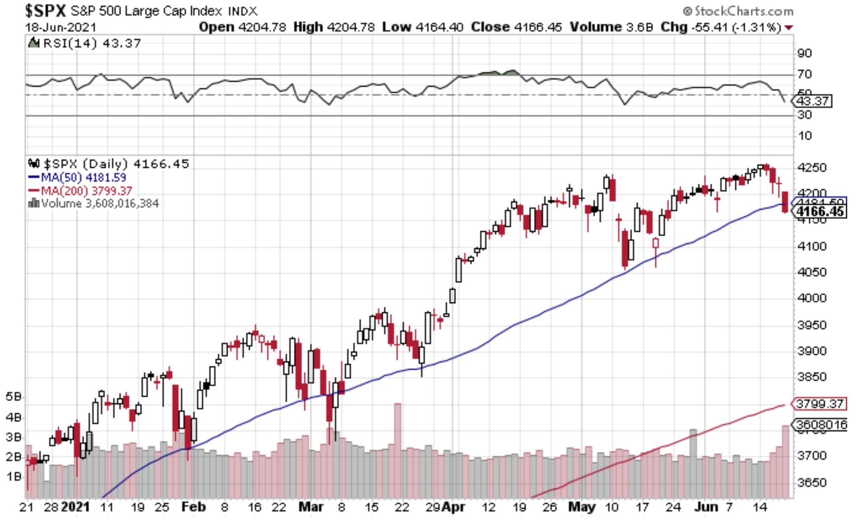
1. Selloff Starts: Following the Fed, markets have experienced a bit of heartburn while digesting the slight shift in tone. It’s probably fair to say that while the shift in Fed policy (bringing prospective interest rate hikes forward to 2023 from 2024), it’s more of a wake up call to the fact that all this easing will eventually come to an end.
 |
Source: @Callum_Thomas
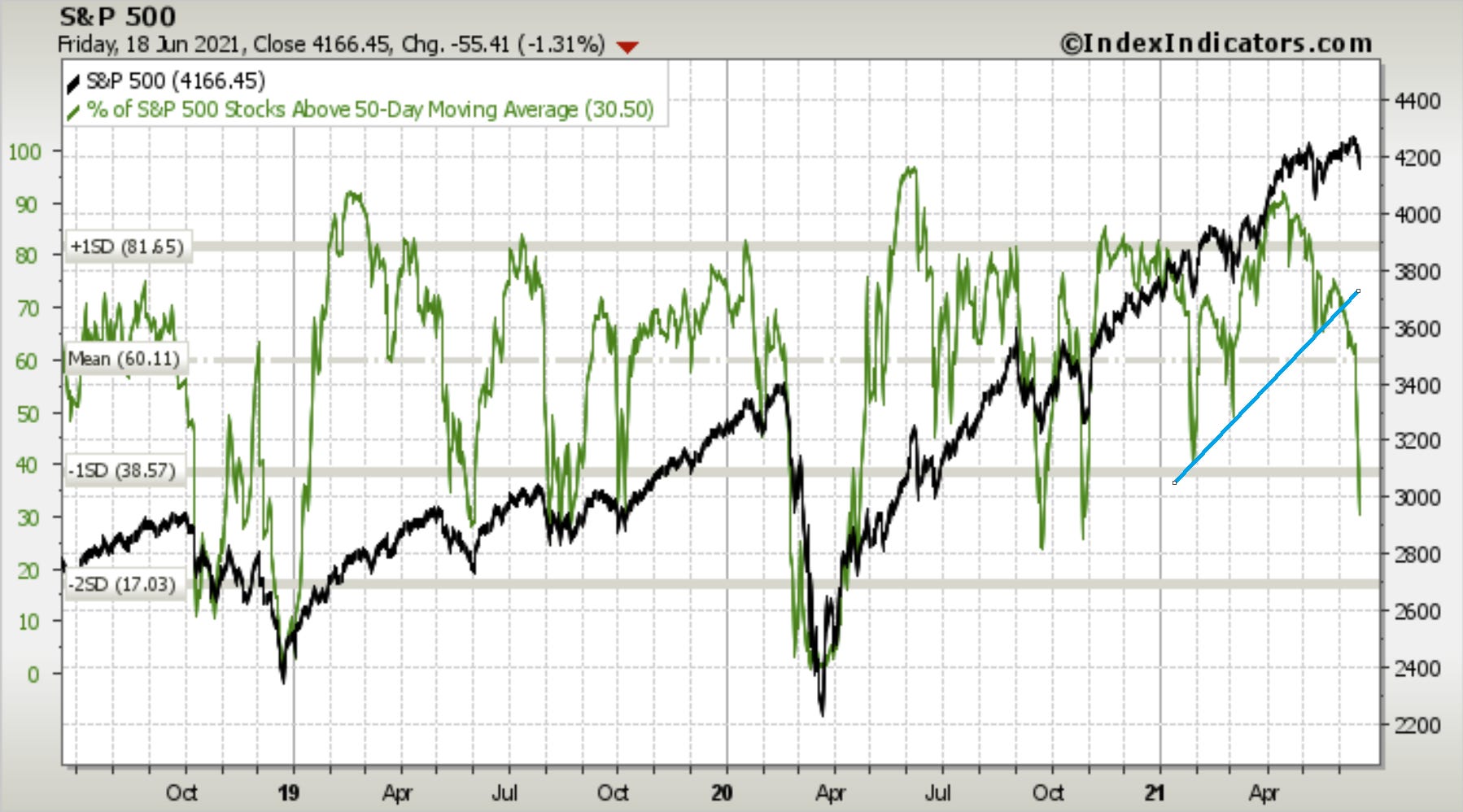
2. Market Breadth: One last time for that running feature – that trendline on the 50-day moving average breadth indicator has well and truly been broken. Now it’s more of an issue of asking whether or not it’s oversold. Strictly speaking for an indicator like this to give an oversold signal it needs to fall sharply and substantially (yes) and then turn up (not yet). So I’d say risk of further short-term downside is still on the table.
 |
Source: @Callum_Thomas
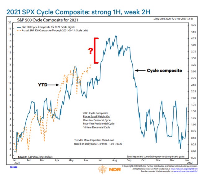
3. Composite Seasonality Signal: This interesting schematic shows the cycle composite pattern across 3 different cycles (annual, presidential, decennial). It looks like there might be a little bit of short-term upside left, but probably the more pressing aspect of the chart is how seasonal tailwinds turn to headwinds in the coming months.
 |
Source: @MacroCharts & @lena_popina
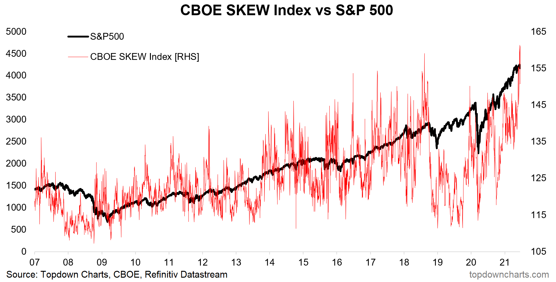
4. Something a SKEW: The CBOE SKEW index slipped slightly on Friday after chalking up a couple of new all-time-highs last week. It’s been explained as a measure of tail risk hedging demand, and it’s probably understandable why there might be greater demand for hedging given lofty valuations on the one hand and FOMO on the other hand. Not terribly useful as a market timing signal, but interesting nonetheless.
 |
Source: @topdowncharts
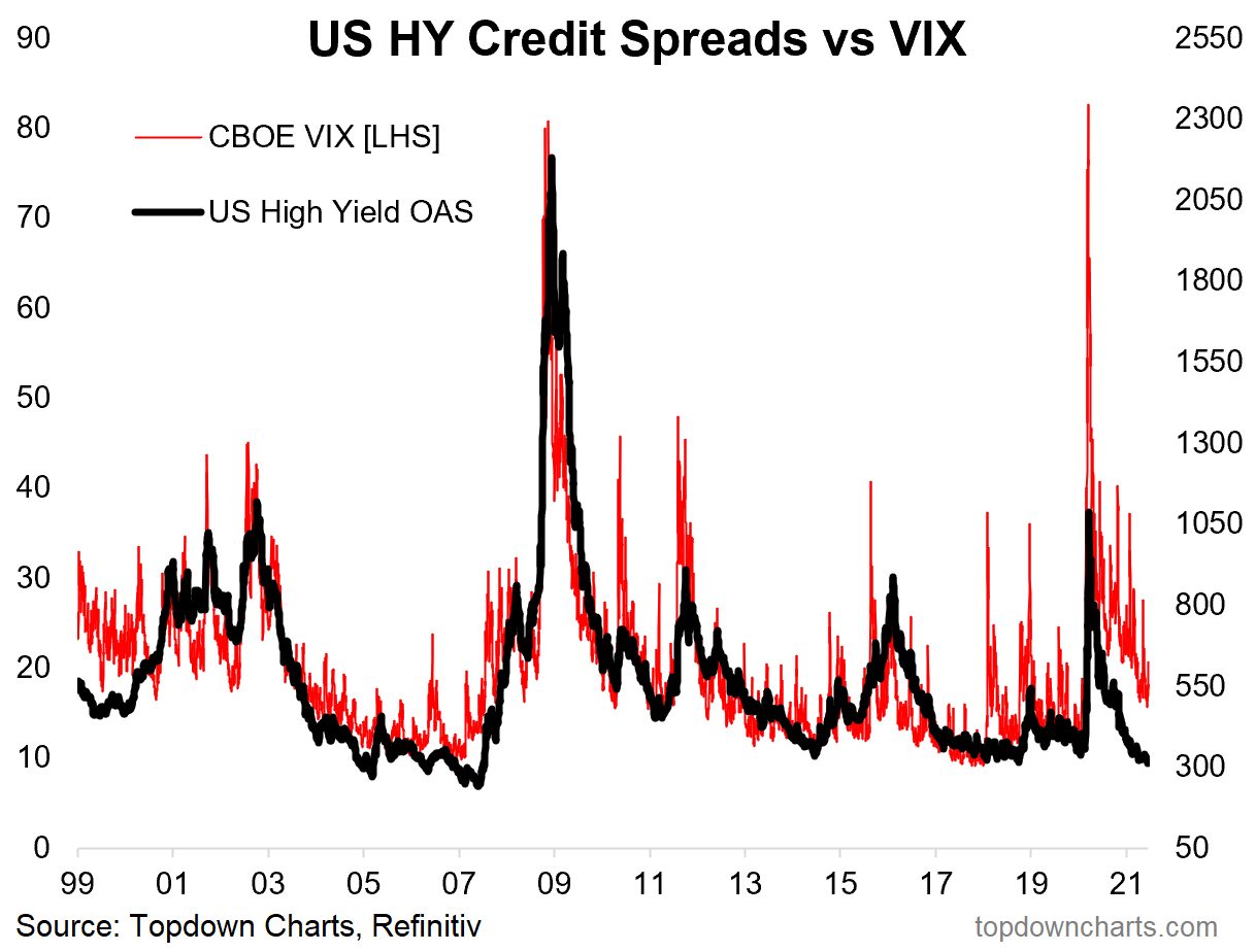
5. Credit Spreads vs The VIX: The VIX closed back above 20 on Friday. But zoom out a bit and notice this interesting gap… Are credit spreads too tight? (…or is the VIX too high?)
 |
Source: @topdowncharts
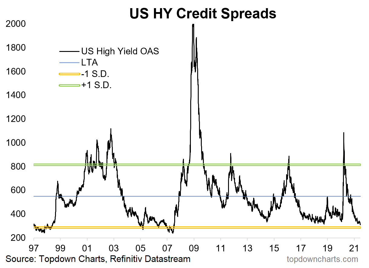
6. Credit Spreads Lowest Since 2007: Credit spreads have made their merry way back down to levels last seen in 2007. Of course another way to say it is that credit spreads have tightened the same way they did into 2005 – and then stayed low for a few years. Thing to remember is that credit spreads usually only go this low if the macro backdrop is actually good.
 |
Source: US Junk Bonds – Not So High Yield
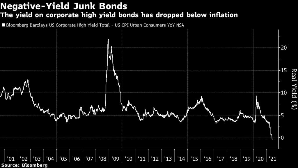
7. Junk Bond Real Yields: Another junk bond chart – “real yield” (running yield minus CPI YoY*) at the lowest level on record…. Albeit I would point out the CPI YoY (year on year) aspect is very much overstated by base effects. Still certainly a stark statistic.
 |
Source: @ecommerceshares
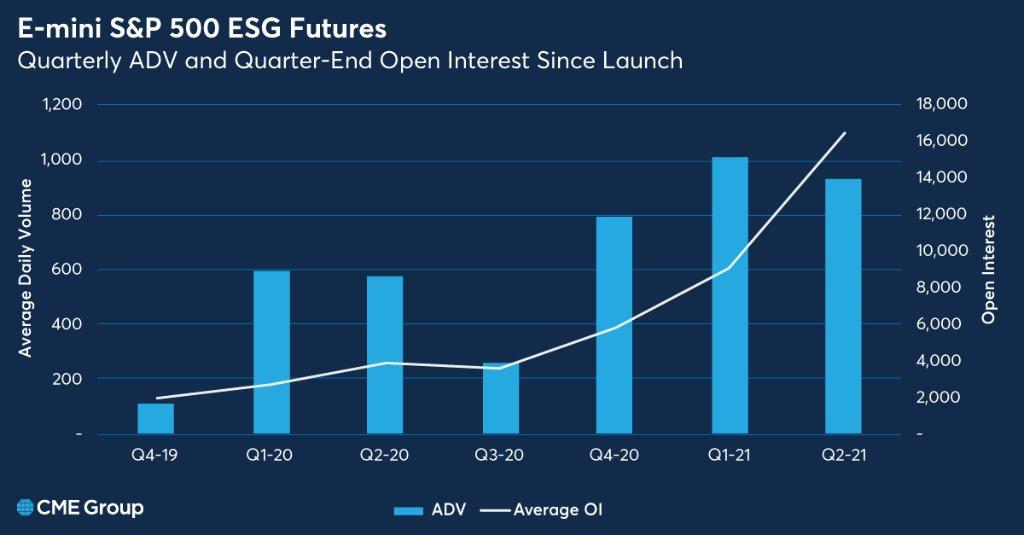
8. ESG Futures: ESG is all about making investing work for the future, but in this case we are looking at making futures work for ESG investing. CME shows open interest is steadily rising as ESG investing gains more and more traction.
 |
Source: @CMEGroup
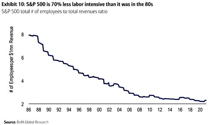
9. S&P500 Labor Intensity: Intriguing – “In 1986, it took 8 employees to generate US$1 million in revenue. Today, the S&P 500 is 70% less labor intensive than it was in the 80s”. It’s probably no surprise given the dominance of the tech sector, but certainly a very big shift.
 |
Source: @ISABELNET_SA
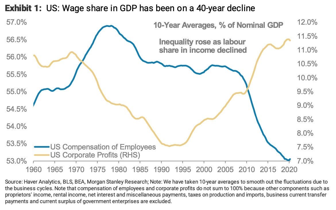
10. Labor vs Corporate share of Profits: Following on from the previous chart, notice what happened in this chart: corporate vs labor distribution of profits. Of course DO note the different scales and also the relatively small moves across the scales. Even saying that, there has been a clear shift, and the full societal impacts are likely yet to be fully realized.
 |
Source: @MichaelaArouet & @SamRo
Thanks for following, I appreciate your interest!
oh… that’s right, almost forgot!
BONUS CHART
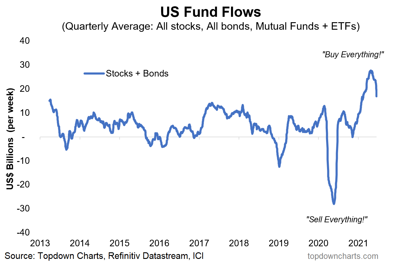
US Fund Flows: This chart shows the rolling quarterly average net-fund flows across equities + bonds and ETFs + mutual funds. The interesting point is how after reaching an all time high it’s starting to roll over.
What’s also interesting is how it went from a state of “sell everything“ during the peak of the pandemic panic to “buy everything“ during the peak of the liquidity and panic-buying frenzy – where a rising liquidity tide floated many boats.
 |
As hinted at in the first chart in this week’s session: the subtle movement in Fed policy echoes a wider shift in global monetary policy. Charts like this will be among the first places where changes in investor moods will be reflected. The shift could happen slowly at first and then all of a sudden.
It’s inevitable that as the global economy reopens and recovers and inflation expectations move higher that central banks the world over will pull back from extraordinary stimulus.
I don’t think it’s time to move structurally defensive – after all we’re still just talking about talking about removing stimulus, let alone moving into full blown tightening.
But things are definitely changing…
.


