Written by Lance Roberts, Clarity Financial
Review and Update
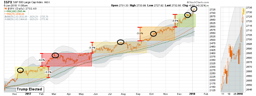
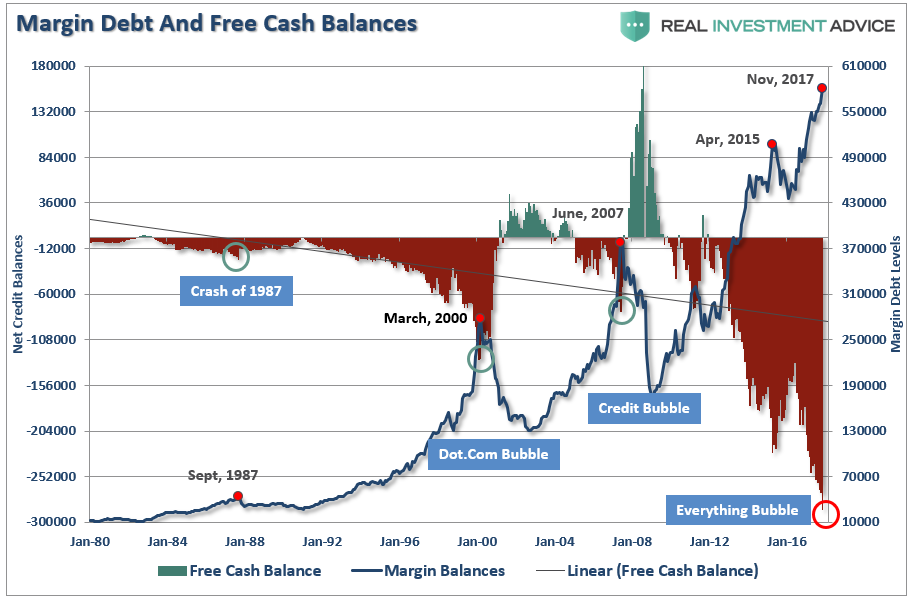
Last week, we discussed the record-setting year of the market. Not only did the markets tie the most number of up years for any bull market in history, it also hit records for the longest streak without a 3% correction, lowest volatility, record margin debt and more.

The exuberance that surrounded the markets going into the end of the year, as fund managers ramped up allocations for end of the year reporting, spilled over into the start of 2018 with the S&P hitting new record highs.
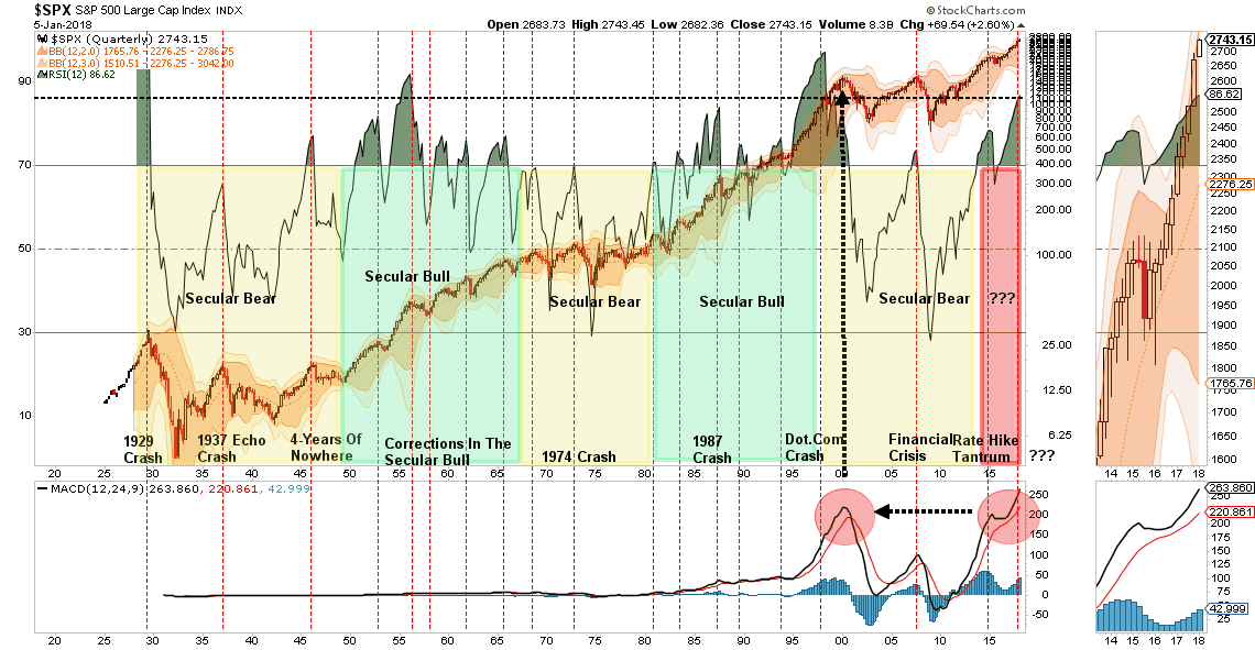
Of course, this is just a continuation of the “stair-step” advance that has been ongoing since the Trump election. The difference this time is the extreme push into 3-standard deviation territory above the 50-dma that is concerning.
But it isn’t just the 3-standard deviation above the 50-dma that is concerning, but rather the 3-standard deviation extension above the 50-MONTH moving average as shown below.
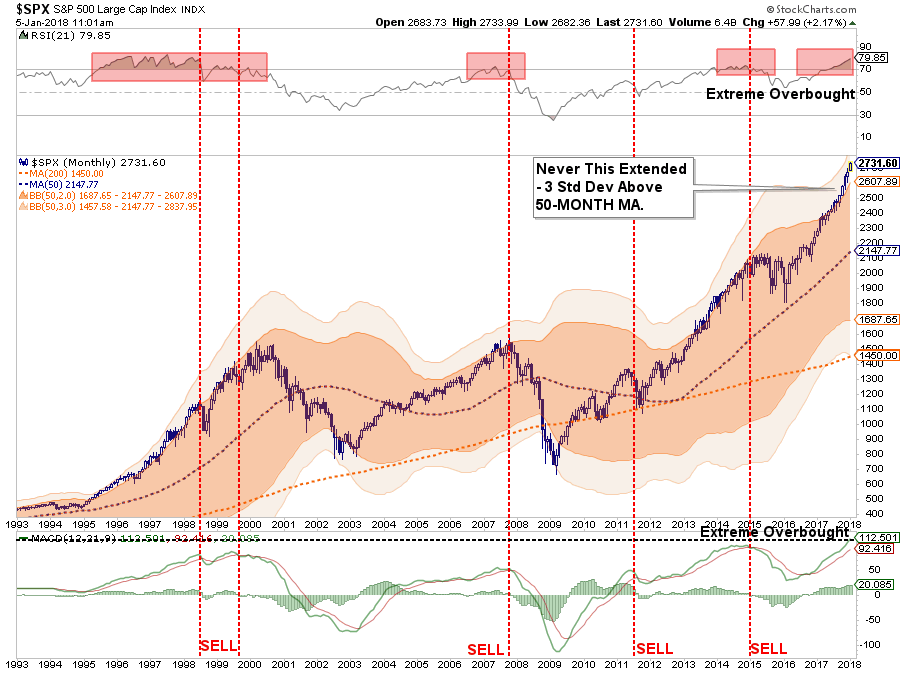
That extension, combined with extreme overbought conditions multiple levels, has historically not been met with the most optimistic of outcomes.
Importantly, such extensions have NEVER been resolved by a market that moved sideways. But, as I will discuss next, “exuberance” of this type is not uncommon during a market “melt-up” phase.
As I noted last week, we did add some defensive positions to our portfolio allocations while we still retain a fully allocated long-position as well. These defensive “shock absorbers” are simply in place to reduce a volatility shock when, not if, one occurs.
Exuberance Everywhere
As prices rise, investors become more exuberant.
The longer prices rise, without a correction, the more exuberant and confident investors become.
The longer prices rise, without a correction and with very low price volatility, the more exuberant, confident and complacent investors become.
The problem is that when investors are overly confident, exuberant and complacent, they unwittingly take on excessive amounts of investment risk without realizing the inherent danger. In other words, “investing mistakes” are covered up by steadily rising prices, but will be immediately exposed when prices reverse.
Currently, with markets ratcheting up to new milestone marks on a continually faster pace, it is not surprising that as we turn the page into a New Year, investor sentiment has blown out to the upside.
Individual bullishness, as measured by AAII, is now at the highest levels on record with a massive surge over the last two weeks.

Professional investors, as measured by INVI, is also at a record.
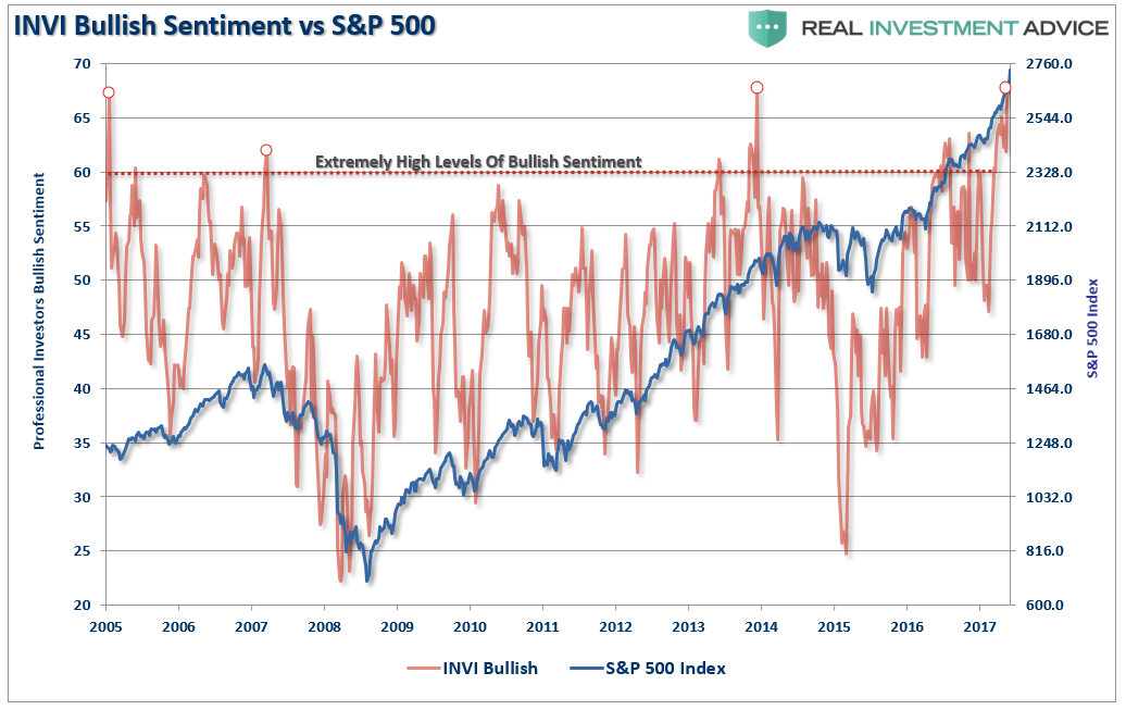
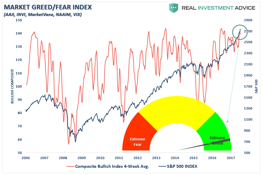
Even our composite fear/greed index which is a combination of AAII, INVI, MarketVane and the VIX is now also registering extreme greed on a rolling 4-week basis.
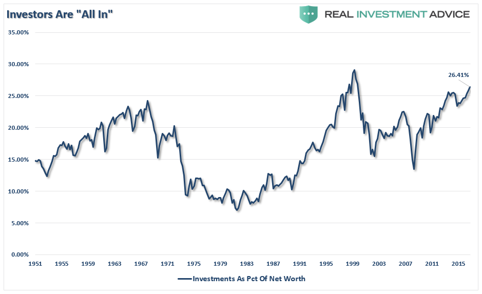
And, as I showed last week, not only is everyone now “all in,” they are doing so with record leverage.
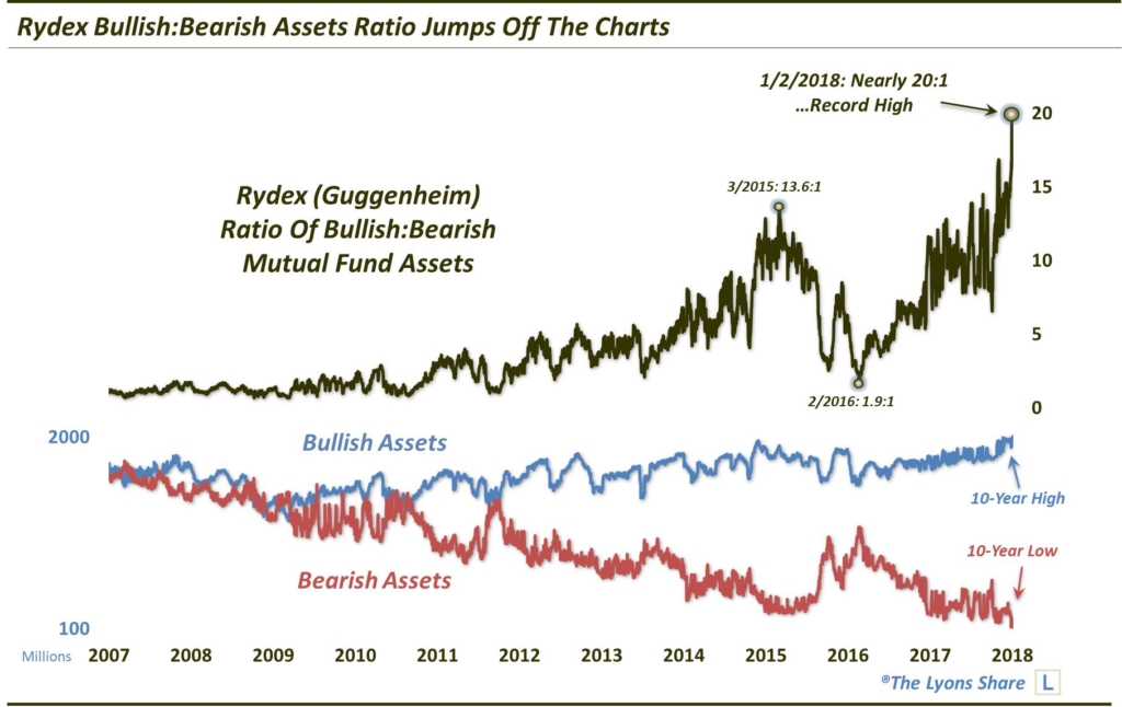
And, as Dana Lyons noted last week:
“It should be no surprise that this Rydex Bull:Bear asset ratio has risen to an extreme. However, the level to which it has risen in recent days is truly off the charts when compared with historical readings.
As the following chart shows, up until 2014, the ratio generally ranged from about 1:1 to 5:1. In other words, when bullish assets hit 5 times the level of bearish assets, it could reasonably be considered an extreme. Near the market top in 2015, the ratio rose to a then-record (for the period shown, at least) 13.6:1. In the ensuing correction, the ratio dropped back under 2:1 briefly near the market lows in February 2016. Since then, the ratio has steadily climbed back up, reaching close to those 2015 highs on several occasions last year. So, one could certainly have argued that sentiment was back to bullish extremes on those occasions.
However, readings in recent days should leave no doubt that short-term sentiment has gotten a bit frothy. That’s because the ratio has jumped to previously uncharted levels near 20:1.”
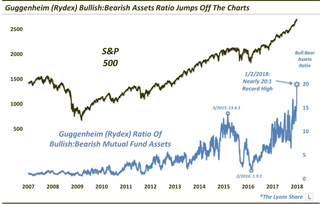
“Here is the ratio versus the S&P 500.”
While the levels of exuberance are quite astonishing, it certainly isn’t surprising. This is what has been witnessed during previous market “melt-ups” throughout history.
Jeremy Grantham of GMO recently wrote an excellent piece on market “melt-ups” and potential outcomes. To wit:
“As a historian of the great equity bubbles, I also recognize that we are currently showing signs of entering the blow-off or melt-up phase of this very long bull market.
When most have talking heads yammering about Amazon, Tencent and bitcoin and not Patriot replays – just as late 1999 featured the latest in Pets.com – we are probably down to the last few months. Good luck. We’ll all need some.
The classic examples are not just characterized by higher-than-average prices. Price alone seems to me now to be by no means a sufficient sign of an impending bubble break. Among other factors, indicators of extremes of euphoria seem much more important than price.
Let’s look at what is missing in the way of psychological and technical signs of a late-stage bubble and what is beginning to fall into place. On the topic of classic bubbles, I have long shown Exhibits 1 and 2. They recognize the importance of a true psychological event of momentum increasing to a frenzy. That is to say, acceleration of price. The average time of the final bubble phase of the great equity bubbles shown in Exhibit 1 is just under 3.5 years, with the average upcycle of real acceleration just 21 months. And the two smaller equity bubbles had gains of 65% and 58%.”
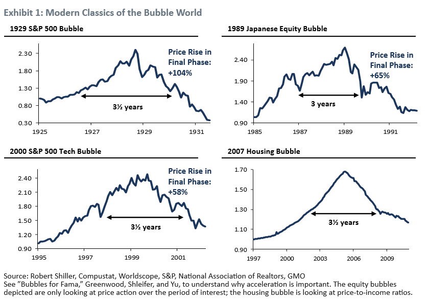
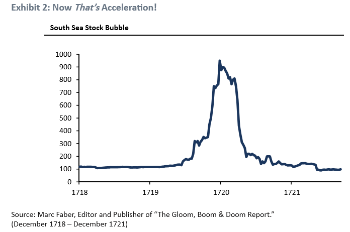
“They also show an interesting symmetry, don’t you think? Rising and falling at about the same rate, as did the real McCoy – the South Sea Bubble shown in Exhibit 2 – before them.”
“Yes, there is a real danger of being late. And in general, average market declines are considerably faster than average advances. But historically, when dealing with real bubbles, being late has not been materially different in time and pain than being too early, as you can see. Value managers are historically painfully too early over and over again, as I know better than most.
Recently an academic paper titled “Bubbles for Fama” concluded that in the US and almost all global markets, the strongest indicator – stronger than pure pricing or value – was indeed price acceleration. (This is perhaps the third time I have agreed with mainstream economists in the last 50 years. I have a firm principle of generously quoting them when they agree with me.)”
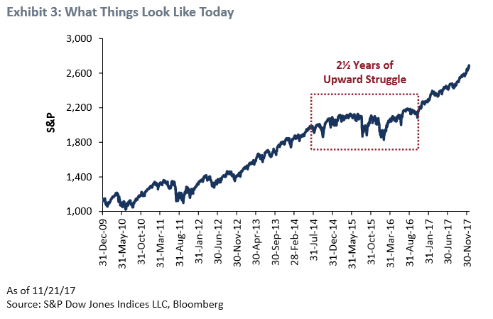
“Exhibit 3 shows what the market looks like today. Until very recently it could justifiably be described as clawing its way steadily higher. But just recently, say the last six months, we have been showing a modest acceleration, the base camp, perhaps, for a final possible assault on the peak.”

“Exhibit 4 represents our quick effort at showing what level of acceleration it might take to make 2018 (and possibly 2019) look like a classic bubble. A range of 9 to 18 months from today and a price rise to around 3,400 to 3,700 on the S&P 500 would show the same 60% gain over 21 months as the least of the other classic bubble events.”
* * *
Grantham is certainly very correct in his analysis.
However, as an investor, I certainly WOULD NOT complacently accept the notion that a rise to 3400-3700 is set in stone. Nor would I be overly confident this bull market has another 18-24 months in it.
It could. But these are “possibilities” not “probabilities.”
There are many factors from economic, monetary, geopolitical, and financial which have ignited each bubble, and bust, period throughout history. However, each bubble had in common the same extreme levels of confidence, exuberance, valuation and price extension that we see today. And they all ended the same, as well.
Again, our portfolios remain on the long-side for now. However, as I will discuss in following articles this week, we are also starting to add hedges and looking for additional opportunities to de-risk portfolios as prices continue their exuberant press higher.


