Written by Lance Roberts, Clarity Financial
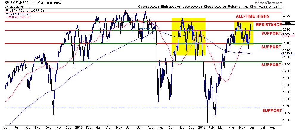
Despite the litany of longer-term fundamental and economic issues that stalk the markets, the short term technical dynamics for traders still remain with bullish bias. As shown in the chart below, the markets defended important support at 2040 last week and rallied back to recent highs.

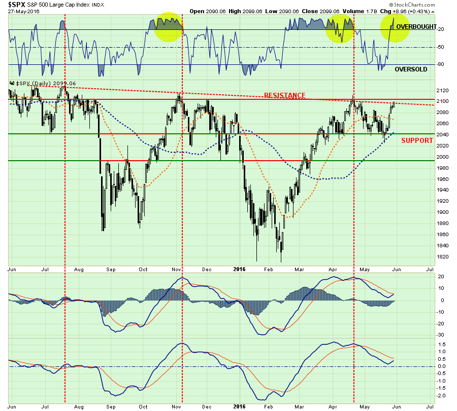
However, this rather “spiky” move in the market last week, as shown above, has become quite commonplace since the beginning of last year. Such spikes in activity have been more opportunistic for “sellers” rather than “buyers.”
Furthermore, as I have been detailing over the last couple of weeks, the current price action remains very similar to that seen last November. While I am not “certain” the outcome will be the same, given that we are moving into a more “seasonally weak” period of the year, a potential Fed rate hike like last December, and a political election cycle; there are certainly enough things to worry about.
With the market back to overbought conditions and pushing on important resistance at 2100, it will be critical for the markets to advance next week above 2100. A failure to do so will likely lead to a retest of the 2040 level, a break of which, would signal a deeper decline in progress.
Stops & Hedges
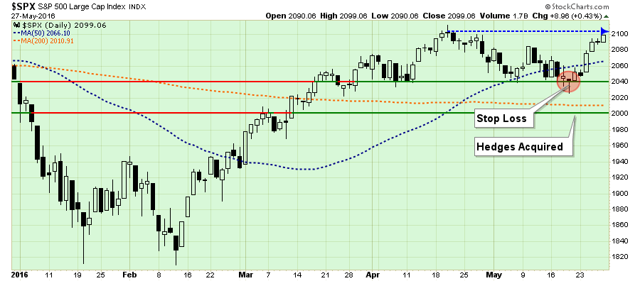
I am leaving my stops in place this week at the current support level at 2040 as shown above.
Furthermore, as stated previously, I have also positioned a short-market hedge in portfolios to reduce to overall allocation to market neutral in the event the market breaks 2000. I am leaving that trigger level in place this week as a breach of such level would be a violation of both the 200-dma (currently at 2010) and the psychological support levels of 2000.
While there are many reasons to move the hedging level higher this week, given the price volatility over the last several months keeping the current level should reduce the potential for a “whipsaw” to occur.
Watching The Yield Curve
“There has never been a recession without the yield-curve having been inverted first.”
Well, that is not exactly true.
The point is that nothing in the financial markets is “ALWAYS” the case. This is particularly the issue when the yield curve is being artificially manipulated through direct Central Bank interventions.
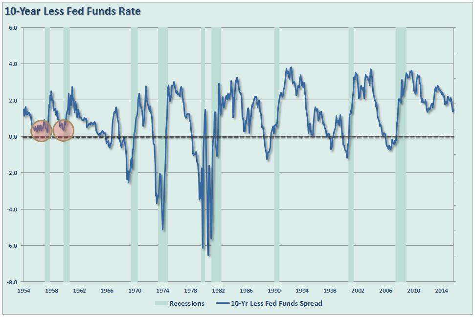
However, as is always the case, it is the trend of the data that is far more important to investors as a leading indication of potential outcomes. As shown above, the current trend of the yield spread between the 10-year and the Fed Funds rate is not a positive one.
Since the Fed Funds rate is not a “traded” rate, we can see the same development in the spread between the 10-year and 2-year rates as shown below.
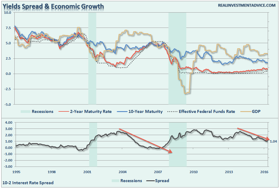
At just 1.04% there is not a lot of “wiggle room” for maintaining a positive spread. Importantly, the trend has become clearly negative as was the case prior to the last recessionary onset.
The DIFFERENCE between today and “pre-financial crisis” is that economic growth was running at nearly 5% previously versus roughly half that rate currently. This gives the Federal Reserve very little room to raise interest rates, which slows economic growth, before the onset of a recession.
Furthermore, with economic growth projections crashing, the potential for a “policy error” has risen markedly in recent months. (Chart courtesy of ZeroHedge)
Jeffrey Snider from Alhambra Partners also made an interesting point using a 5-10yr yield spread. To wit:
“In past cycles an inverted curve has appeared months before the onset of recession, so the fact that there is still positive spread in the calendar maturities is being taken as if credit is suggesting still some hope for avoiding it… The incidence of the steeper yield curve is itself a reflection of monetary degradation.
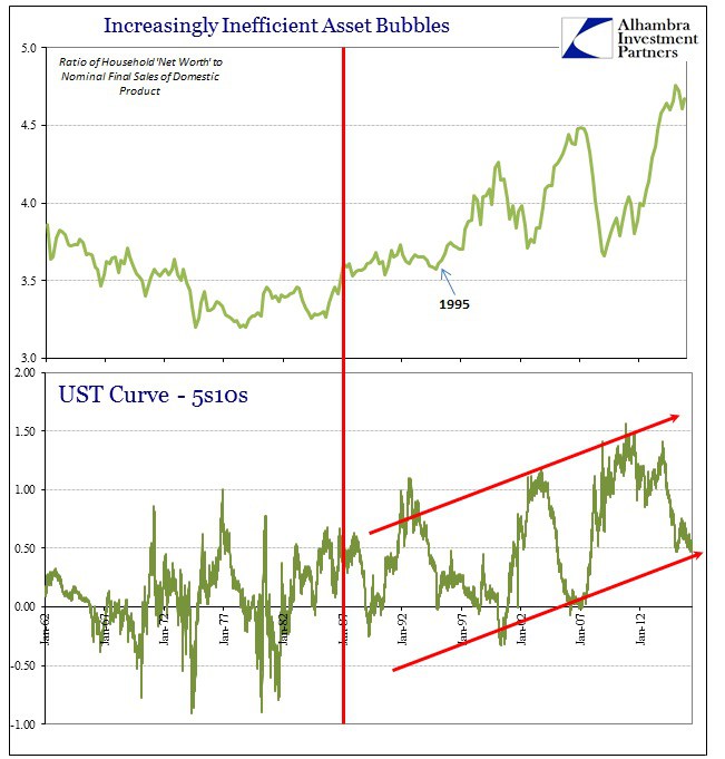
The FOMC targeted lower and lower rates for the front end which UST bill rates “obliged.” The back end of the curve was relatively apathetic, which had the effect of steepening the curve far beyond the historical range. While a steeper curve is supposed to reflect better long-run economic prospects, that was never the case.
Instead, that numerically sharper curve only suggested the increasing inefficiency of monetary policy… So the narrow focus on the +95 bps spread remaining in the 2s10s part of the curve misses the economic slowing and drastic risks that the prior 150 bps of already completed flattening has been proved right about. It is not the absolute level of the curve that has been useful in determining the slowdown condition (or the appearance of slowdown itself) but rather the relative changes and flattening all throughout this “cycle.”
The last sentence is exactly correct. As I stated above, it is the TREND of the data that is far more important than the level itself.
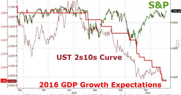
One other important point about the potential of a Fed rate hike is that higher rates will also lead to a stronger US Dollar. As I stated last week:
“Well, with the revelation of the recent FOMC minutes the worries about a June rate hike, as suspected, have indeed surfaced sending the US dollar spiking above resistance.”

“If the Fed hikes rates in June, as is currently expected, higher rates will attract foreign money into US Treasuries in search of a higher yield. The dollar will subsequently strengthen further impacting commodity and oil prices, as well as increase the drag on companies with international exposure.
Exports, which make up more than 40% of corporate profits, are sharply impacting results in more than just ‘energy-related’ areas. This is not just a ‘profits recession,’ it is a ‘revenue recession’ which are two different things.”
Short-term portfolio management instructions currently remain:
Tighten up stop-loss levels to current support levels for each position.
Hedge portfolios against major market declines.
Take profits in positions that have been big winners
Sell laggards and losers
Raise cash and rebalance portfolios to target weightings.
S.A.R.M. Model Allocation
The Sector Allocation Rotation Model (SARM) is an example of a basic well-diversified portfolio. The purpose of the model is to look “under the hood” of a portfolio to see what parts of the engine are driving returns versus detracting from it. From this analysis, we can then determine where to overweight sectors which are leading performance, reduce in areas lagging, and eliminate those areas that are dragging.
Over the last several weeks, RISK based sectors outpaced performance relative to SAFETY. However, starting last week and continuing this week, that level of outperformance has begun to fade rather significantly.
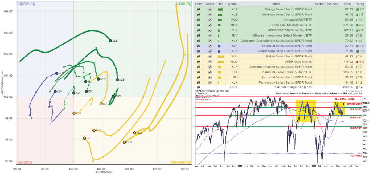
HealthCare moved up from lagging to improving last week. While the primary leaders of Energy, Basic Materials, Industrials, Mid-Cap, Small-Cap and International have weakened sharply. Such action suggests the recently rally last week may well be close to its conclusion.
LEADING: Energy, Materials, Mid-cap, Small-cap, International and Discretionary. (REIT’s are leading as investors chase risk and yield. Financials are rapidly improving playing catch-up)
IMPROVING: Financials, HealthCare
LAGGING: Utilities, Gold, Bonds, Staples, Technology, Industrials
The sector comparison chart below shows the 9-major sectors of the S&P 500.
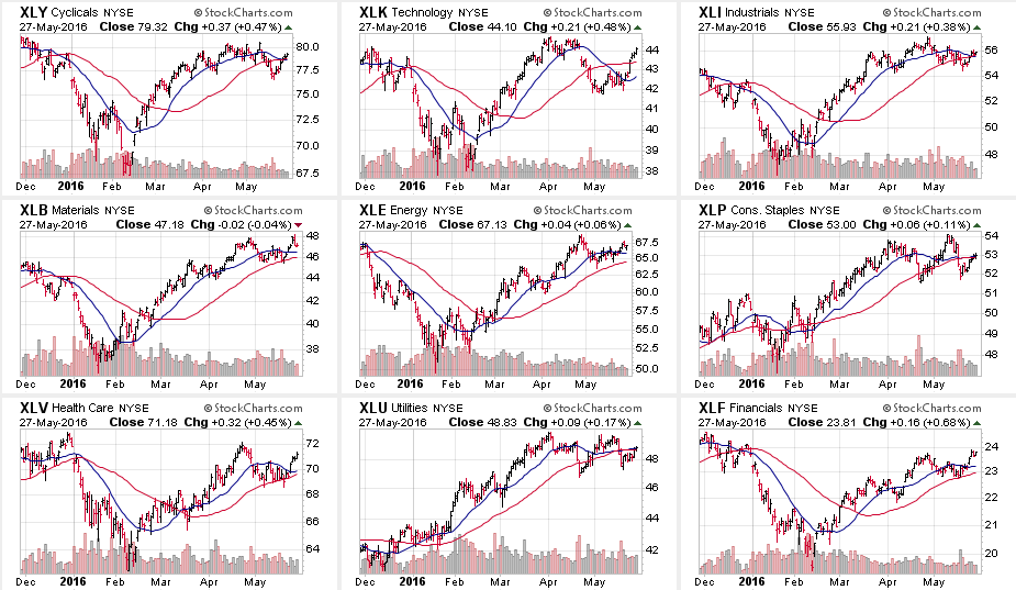
Last week’s “beta driven” rally was enough to reverse many of the warnings discussed last week by pushing many of the sectors back above their broken short-term moving averages for the S&P 500 Index.
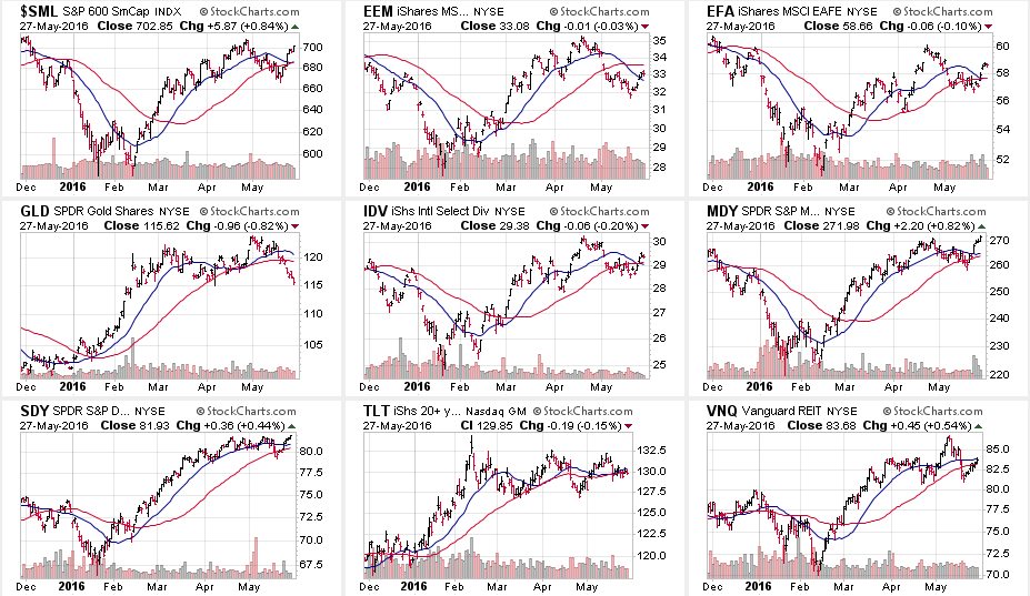
The same can be seen in Small-Cap International, Mid-Cap and Dividend Yielding Stocks. The chase for “beta” was clearly apparent as we headed into the end of the month.
This is interesting given the “smack-down” beta stocks received the last time the Fed hiked rates.
So, either the markets are betting the Fed will “punt” on hiking rates in June, or they are hoping that “this time will be different.” The problem is that tighter monetary policy is not good for stocks, particularly high-beta stocks, ever.
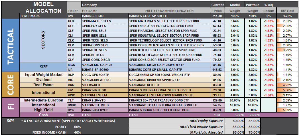
S.A.R.M. Sector Analysis & Weighting
As stated above, the SARM Model is an “equally weighted model” adjusted for risk. The current risk weighting remains at 50% this week. It will require a move to new all-time highs in order to safely increase model allocations further at this juncture.
Relative performance of each sector of the model as compared to the S&P 500 is shown below. The table compares each position in the model relative to the benchmark over a 1, 4, 12, 24 and 52-week basis.
Historically speaking, sectors that are leading the markets higher continue to do so in the short-term and vice-versa. The relative improvement or weakness of each sector relative to index over time can show where money is flowing into and out of. Normally, these performance changes signal a change that last several weeks.
Last week’s market action was a direct reflection of the Fed’s FOMC minutes. Financial stocks picked up in performance while Staples, REIT’s and Utilities continued to struggle. The movement in the interest rate sensitive sectors of the market was not unexpected as interest rates ticked up in anticipation of a June rate hike.
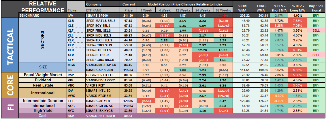
The last column is a sector specific “buy/sell” signal which is simply when the short-term weekly moving average has crossed above or below the long-term weekly average. The number of sectors on “buy signals” has improved from just two a few weeks ago to 17 this past week. Sectors that are on buy signals tend to outperform in the near term.
The risk-adjusted equally weighted model remains from last week. No changes this week.

The portfolio model remains at 35% Cash, 35% Bonds, and 30% in Equities.
As always, this is just a guide, not a recommendation. It is completely OKAY if your current allocation to cash is different based on your personal risk tolerance, time frames, and goals.
For longer-term investors, we need to see an improvement in the fundamental and economic backdrop to support a resumption of the bullish trend. Currently, there is no evidence of that occurring.


