by Pebblewriter, Pebblewriter.com
As we discussed yesterday, it’s do or die time for the equities markets.
Click on any graphic for larger image.
Keep an eye on the small rising wedge today. A break down below 1560 is important to the bears’ case — while the bulls obviously have their sights set on the all-time high of 1576.
As always, watch for a backtest after the wedge is broken. Any such bounce should fail by 1562.80 or so.
The US dollar reached our Mar 4 target [see: After the Funding’s Gone] and reversed sharply. Note this was the confluence at the completion of a Crab Pattern (in purple below), a Bat Pattern (red) and two channel midlines.
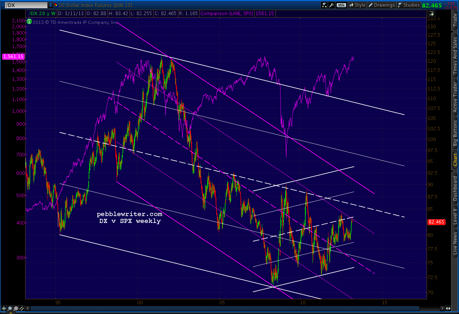
The channels can be better seen on a longer term chart.
DX and SPX have become mildly positively correlated of late with the 25-day moving average at 0.59. This is a huge shift from the high negative correlation we had all become used to: as the dollar as a safe haven during equity market sell-offs:
This chart from Deutsche Bank showing the 1-year rolling correlation has been widely circulated. It’s a week old, but shows that despite some huge swings over the past few years, correlation continues to become more and more negative.
The last little blip up in the dark blue line represents a relative decrease in negative correlation, but it appears to have formed a channel since 2009. In the absence of a breakout, one would expect the trend to continue…
From a technical standpoint, whether the trend continues or not — and, where the dollar goes from here — couldn’t possibly be more important.
The ebbs and flows of the relationship can best be seen in a long-term comparison. Here, we can see long periods such as 1995-2000 when they moved in lock step. Notably, when stocks faltered in Aug 2000, the dollar vacillated for a while before finally joining in in Jan 2002.
But, when stocks finally bottomed in 2003, the dollar continued to sell off. It got a big bounce in Dec 04 (the previous low) but didn’t bottom out until Apr 08 as SPX was about to fall off a cliff.
When stocks bottomed in Mar 2009, the dollar peaked. The next time the dollar bottomed was in May 2011, as the 2011 correction got underway. It rallied again with the equity sell-offs in Apr 2012 and Sep 2012, but has so far failed to break the high established in July 2012.
Why should equity investors care so much about the recent shift in the relationship between these two? When we chart DX, we can see that equities often moved dramatically at fairly predictable key turning points.
The most prominent chart pattern for DX is the falling channel shown above. When DX dropped through the midline in 2003, it marked a bottom for equities. They rallied strongly until the dollar finally approached the channel bottom and, as mentioned above, fell sharply after it bottomed.
As DX raced up toward its midline, stocks plunged toward their 2009 low. The dollar’s peak and stocks’ trough were almost simultaneous. As DX fell away from the midline, stocks took off — not pausing again until DX’s next run at the midline in Apr 2010. As soon as DX tagged the midline, stocks were off to the races again.
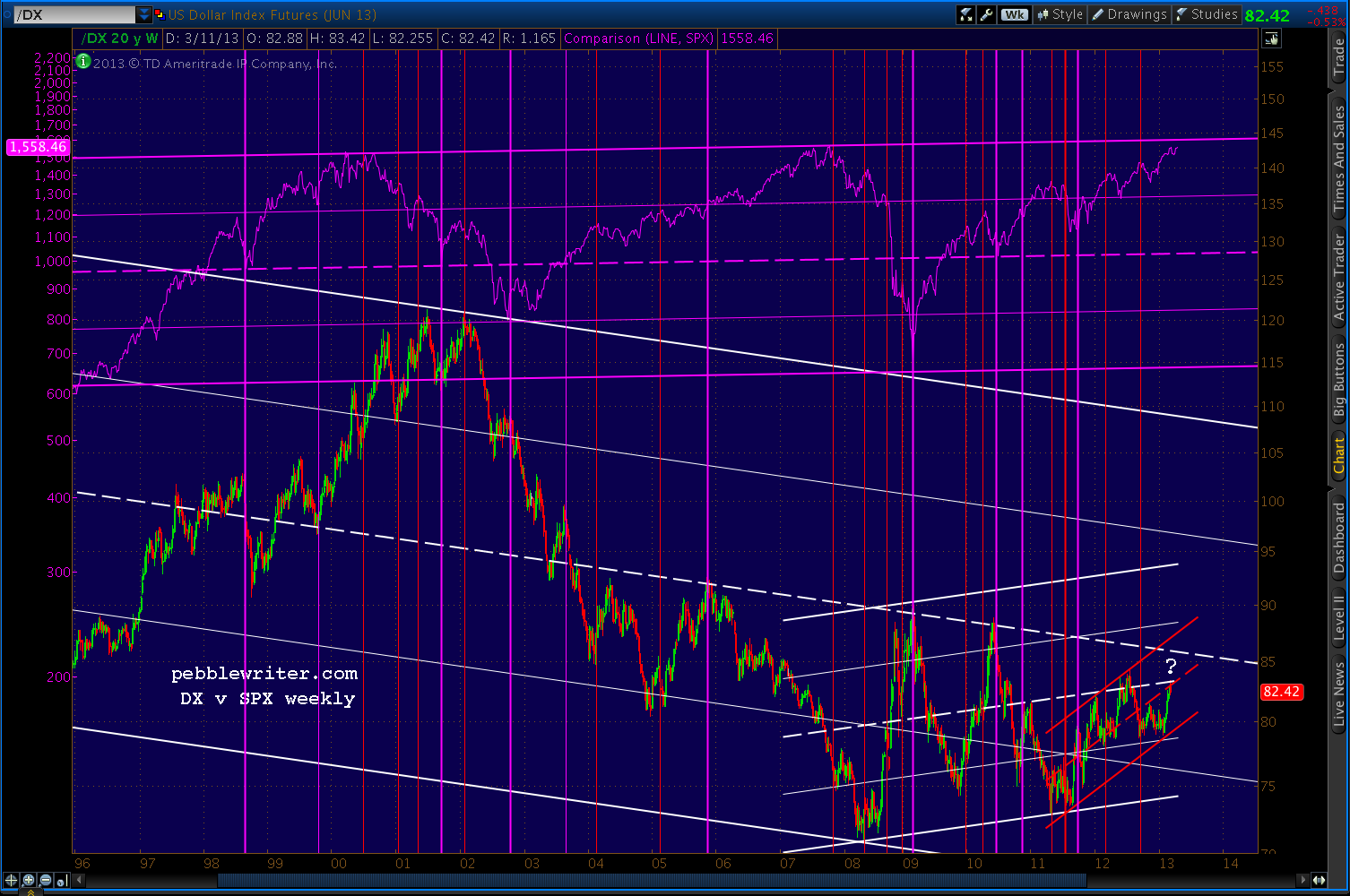
In May 2011, the dollar bottomed again, enabling us to draw a little rising channel reflecting the strengthening trend since.
Like its big brother, this smaller channel has proven pretty successful at indicating potential turning points — a breakout or breakdown — at its midline. In general, each downturn from the midline meant the accompanying equity rally was nearing at end.
Stocks didn’t actually reverse until DX bottomed at either the channel bottom or the .25 line as occurred with the May 2011, Apr 2012 and Sep 2012 corrections.
Significantly, this last bounce off the .25 line in late January resulted in stocks going up. The SPX has rallied 160 points or so, leaving us to wonder whether DX will head back down — which has always produced equity rallies — or break above the channel midline.
The past several instances have produced large declines of 630 points (May 2008), 200 points (Apr 2010) and 160 points (Apr 2012.)
In other words, a sudden strong rally in DX is highly likely to accompany a sudden and significant decline in stocks. And, as we’ve seen in the past, prices that approach a midline are, by definition, poised to break out or break down.
So, which will it be here for the dollar: a break out or a reversal? Let’s set aside SPX’s recently completed bearish chart patterns for the moment, and focus on DX.
Based on the larger of the white channels, we would have to conclude DX has much more upside. Its midline is up around 86-87, which would clearly take DX beyond the smaller channel midline — tagged yesterday at 83.42.
In addition to the small white midline, however, DX will need to break above the .75 line on another falling channel (purple below) in order to reach the larger midline.
But, it might not be all that difficult. DX recently broke back above a trend line drawn from the Jan 2002 and Jun 2010 highs. This TL looks fairly decent as a channel (yellow below), and reflects another breakout such as the one which occurred in Apr 2012.
That DX channel breakout, of course, accompanied the SPX slide from 1422 to 1266. It backtested nicely, then suddenly failed when the Fed announced QE3. Prices fell back into the channel until the latest breakout in February.
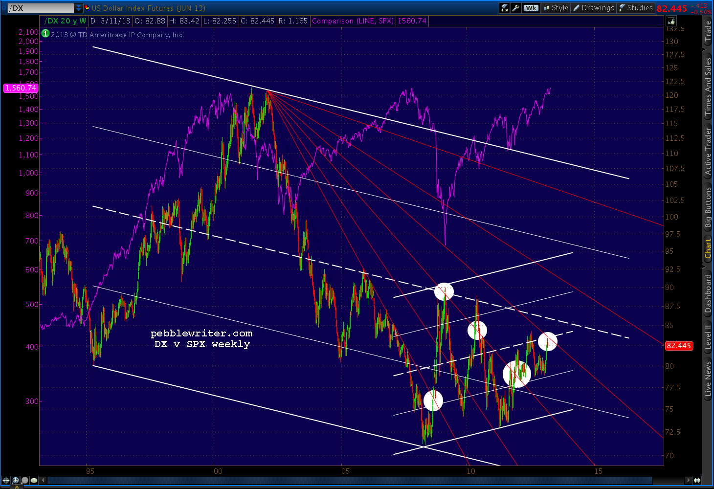
In keeping with the theme of sudden strong DX rallies being unhealthy for stocks, take a look at the Fibonacci Fan chart below.
Each time DX crossed one of those lines — even by just a little — SPX reacted. DX has reached the latest line — the .707 — and is thus signalling either an equity breakout or breakdown depending on which way it goes.
Weekly RSI mirrors the rising channel DX has been in since October 2007. DX RSI recently broke out of the latest falling red channel and through the white channel midline. After reacting against the purple .75 line, RSI is backtesting the white channel midline.
If it’s more than a back test and RSI breaks back below the midline, this would confirm DX’s price reversal. If, on the other hand, DX RSI survives the midline, it’s not hard to imagine a rally to the top of the purple channel or even the white channel .75.
The daily RSI chart shows a similar situation. RSI is finding support on the small white midline, the large white midline, and backtest of the red channel it just broke out of.
A reversal here and a strong rally qualify would qualify as one of those sudden turns that isn’t terribly healthy for equities.
I know, I know. With eleventy zillion dollars being pumped into the markets every hour by Bernanke and friends, how in the Wide World of Sports could the dollar suddenly soar and the stock market flop? The answer to that, of course, requires one more chart.
I’ve marked some of the more obvious “sudden, strong rallies” in DX which, as discussed above, frequently coincide with sudden, strong declines in stocks.
But, note how many of them occur as SPX is nearing one of its own channel lines drawn off the 2000 and 2007 tops.
We’ll get into that and other channels in the forecast coming up next. But, it’s fascinating that SPX is only a few points from a channel top dating back 13 years just as DX has arrived at the confluence of such important support and resistance lines. For both, it truly is do or die time.


