by Albertarocks
 We’ve all heard the cliché about Dr. Copper. It’s so cliché by now that I’d be embarrassed to even repeat it. But that cute saying has more to do with the fact that the price of copper is a relatively good gauge indicating the health of the economy, than offering a true reflection of the health of the equities markets. After all, the action in the stock markets has become so disconnected from the real economy (in essence, from ‘reality’) that I sometimes wonder whether the stock markets are even going to be in existence a decade from now. Nonetheless, what I’d like to demonstrate here is that copper, as a truly good representative of industrial materials (commodities), also relates to the stock markets in such a way that it can provide us with very sound signals about the future direction for equities. At this time, it appears to be issuing a very stern warning, a warning that in the past has been very accurate and dependable… to get the hell out of equities.
In the past, we have seen charts showing the S&P 500 when it is priced in terms of various other vehicles… gold for example. Those studies are very interesting and offer ‘some’ guidance about whether or not investors are really getting ahead after inflation is taken into account. The unfortunate problem with that particular gold analysis is that the price of gold had for years been clandestinely, and later proven to be, manipulated. Clearly, it still is. Gold had been held down by those who wish to hide the fact that the only real money “is” gold, and that the illusion of a soaring stock market is just that… an illusion based on ever increasing liquidity that continuously and severely destroys the value of fiat dollars. No folks, when the equities markets are soaring, you are not getting your money’s worth. But the global banking oligarchy doesn’t want you to know that. So the sad truth is that any analysis that uses gold as one of the component comparators is flawed, thanks to the likes of JPM.
In an effort to provide a better, and far more accurate, picture of the real effects of inflation, I presented a study back in April of 2011 which showed the S&P 500 as priced in oil. Needless to say it offered a much clearer picture of the real value of the S&P and was indeed very revealing. Disgustingly so, because that study exposed the fact that while equities had indeed risen in nominal terms since 1999, the price of oil had actually increased at 870% the pace. For anyone who might be interested in reviewing that particular analysis, it can be found by clicking here. But before you do that, I beg your kind understanding that this article was written at the beginning go my little foray into the world of publishing articles (at the behest of several of my friends at Seeking Alpha). I was a neophyte. I hadn’t yet thought of better ways to display charts so that they weren’t quite so ‘busy’. I didn’t consider myself to be an particularly good writer back then and as far as I’m concerned I still isn’t.
So far, we have discussed two different comparative studies: a) the S&P as priced in real (but grossly manipulated) money, namely gold…. and b) the S&P as priced in ‘fuel’ that a healthy economy requires… oil. There was a third, one which I address in the footnote and which is relating the S&P to the $CRX. But what we’re going to investigate here is a 4th way of pricing the S&P 500… as priced in one of the most commonly used ‘materials’ consumed in a healthy and growing ‘industrial’ economy… and of course we’re talking about copper.
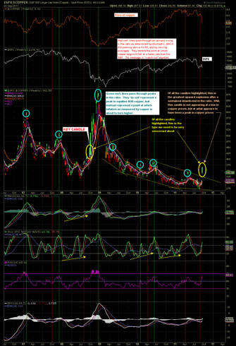
The chart below is a weekly scale that looks at the S&P 500 as priced in copper, going back to mid 2006:

Click here for a live and updated chart
In general, when the candles on the ratio are falling, the S&P 500 is underperforming copper. Or more importantly, when the candles are falling, copper is rising relative to equities. At times when copper is in high demand (when the candles on this chart are falling) we can be pretty certain that two phenomena are in vogue… a) the global economy is strong enough to be creating demand for copper and therefore driving its price up faster than the gains in a raging equities bull market, and b) commodities prices in general are rising right along with copper. They always do. It shows that inflation in ‘real goods’ is indeed occurring at a faster rate than in what otherwise appears to be a soaring equities market. And of course, the inverse is true: when the candles on the ratio are rising, the S&P 500 is outperforming copper. Or, from the opposite and far more ominous perspective, when the candles are rising copper is falling relative to equities. There is pretty much only one reason for copper prices to suddenly reverse and start falling at a faster rate than equities are. And as has occurred so regularly in the past… this recent reversal in that trend was indeed “sudden”.
As can be seen on the chart, peaks in this ratio very often take the form of ‘island tops’. Of critical importance is to recognize whether these island tops occur after a sustained uptrend in the ratio, or after a sustained downtrend. In other words, is it an exhaustion gap? Or does it represent a breakaway gap? Please take note of the candle on the chart denoted by “KEY CANDLE”. Let there be no misunderstanding here… the moving averages on this chart are indicating that this ratio is going to rise further. The odds that the latest candle on the chart is an island reversal are very slim. Having said that, the dark lords are very powerful and have a habit of making many types of analyses (and analysts) look rather foolish. Still, I’ll take my chances here. The shape of the overall pattern since the beginning of 2009 suggests we may be on the verge of a very sharp movement out of what appears to be a sustained and impressive ending diagonal. Does that aspect of this chart look familiar? It should… it is perfectly logical that this chart appears to be resolving in a pattern very similar to that of the US dollar. Folks, inflation does not appear to be in the cards at this time. Instead, despite my distain for the FED and everything it stands for, when Mr. Bernanke speaks of not seeing deflation as being a big problem, what he really means is that he’s doing all he can to keep that deflation genie tightly corked up in that bottle. He’s speaking the truth. And he’s losing the battle.
 What we’re seeing is a rather alarming indication that copper has most likely entered a phase of diminishing demand, a trend which is not likely to reverse to upward any time soon. That my friends is a huge ship on the global economic ocean… it takes a sea-change to reverse its course. No matter how we slice it, the phenomenon of copper suddenly underperforming equities is not only a sure sign of an economy that is not firing on all cylinders, it is also a signal that deflation in real goods (materials) is beginning to take hold… and as has been the case in the past, it’s happening ‘suddenly’. Considering the level from which we are starting this journey, there is every potential for the coming deflation to be so mind bogglingly crushing in percentage terms, that most of us can’t even envision it. Yes, at some point we will see the phase of enormous inflation that everyone is expecting… but that era is just going to have to wait its turn.
My conclusion based on this chart and my interpretation of its signals will no doubt be criticized by a few. So be it… there is ample evidence elsewhere that strongly support the conclusions. In fact, I think maybe it’s time to rename the US dollar. I think I’ll call it Bruce… as in Bruce Almighty. From this point, I defer to the annotations on the chart since this really is a case where a picture is worth thousand words. Eeeewww… that was so cliché.
Related Articles
Investing articles by Albertarocks:
About the Author
 Albertarocks is the pseudonym for a talented chart analyst whose work has been published at several web sites and now appears at Albertarocks’ TA Discussions. Global Economic Intersection is fortunate that Albertarocks posts some of his very unique analysis here.


