econintersect.com
  • 토토사이트
    • 카지노사이트
    • 도박사이트
    • 룰렛 사이트
    • 라이브카지노
    • 바카라사이트
    • 안전카지노
  • 경제
  • 파이낸스
  • 정치
  • 투자
No Result
View All Result
  • 토토사이트
    • 카지노사이트
    • 도박사이트
    • 룰렛 사이트
    • 라이브카지노
    • 바카라사이트
    • 안전카지노
  • 경제
  • 파이낸스
  • 정치
  • 투자
No Result
View All Result
econintersect.com
No Result
View All Result

Updating America’s Scariest Chart

admin by admin
9월 21, 2015
in 미분류
0
0
SHARES
0
VIEWS

by Constantin Gurdgiev, TrueEconomics.Blogspot.in

As you know I rarely post on the U.S. economy. But recently I was updating a presentation involving the state of financial flows for retail investors and savers around the world and had to check up on my old chart that I labeled America’s Scariest Chart Redux (see previous update here).

Keep in mind the dominant media meme: the U.S. economy has been growing at a robust rate and the Great Recession has been officially over now for 74 months.

So where does the current unemployment duration (in terms of average duration in weeks) stand?

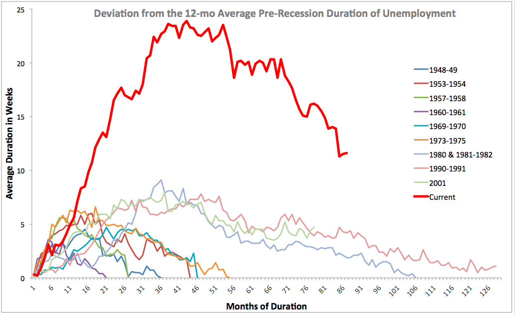
Err… average duration of unemployment in the U.S. is currently at 28.4 weeks. Over 12 months period before the onset of the Great Recession, duration averaged 16.8 weeks. Which means that even today, a full 87 months after the start of the Great Recession, average duration of unemployment is 11.6 weeks longer than it was before the crisis. Current deviation from pre-crisis levels in average duration of unemployment is consistent with this measure of labour markets performance in months 17-18 of the crisis.

Worse, we are now (still) in a situation where people on unemployment benefits are staying in unemployment longer, on average, than in any other recession on record.

Now, let’s revisit the ‘official’ former Scariest Chart – the index of employment also plotted by each recessionary period. This chart used to be published regularly, but since end of March 2014, U.S. employment index has finally reached pre-crisis levels of employment and everyone forgot the said chart. Too bad. Here it is, updated to the latest data:

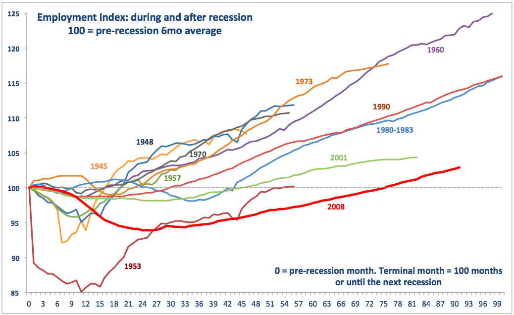
And guess what? The chart above clearly shows that the current period of ‘recovery’ is still the worst in terms of employment performance than any previous recovery on record.

Just thought you would like an update…


Previous Post

Why are We Blaming ‘Culture’ for Social and Economic Problems?

Next Post

Most Read Articles Last Week (Ending 19 September)

Related Posts

Bitcoin Is Finally Trading Perfectly Like 'Digital Gold'
Economics

Bitcoin Is Finally Trading Perfectly Like ‘Digital Gold’

by admin
Namibia Will Regulate And Not Ban Crypto With New Law
Finance

Namibia Will Regulate And Not Ban Crypto With New Law

by admin
6,746 ETH Valued At $12M Was Just Burned
Economics

6,746 ETH Valued At $12M Was Just Burned

by admin
Bitcoin Is Steady Above $29,000 Awaiting US NFP Figures
Economics

Bitcoin: What Next After Consolidation Ends?

by admin
US Government Offloads Another 8,200 Bitcoin – On-chain Data
Economics

US Government Offloads Another 8,200 Bitcoin – On-chain Data

by admin
Next Post

Most Read Articles Last Week (Ending 19 September)

답글 남기기 응답 취소

이메일 주소는 공개되지 않습니다. 필수 필드는 *로 표시됩니다

Browse by Category

  • Business
  • Econ Intersect News
  • Economics
  • Finance
  • Politics
  • Uncategorized

Browse by Tags

adoption altcoins bank banking banks Binance Bitcoin Bitcoin market blockchain BTC BTC price business China crypto crypto adoption cryptocurrency crypto exchange crypto market crypto regulation decentralized finance DeFi Elon Musk ETH Ethereum Europe Federal Reserve finance FTX inflation investment market analysis Metaverse NFT nonfungible tokens oil market price analysis recession regulation Russia stock market technology Tesla the UK the US Twitter

Categories

  • Business
  • Econ Intersect News
  • Economics
  • Finance
  • Politics
  • Uncategorized

© Copyright 2024 EconIntersect

No Result
View All Result
  • 토토사이트
    • 카지노사이트
    • 도박사이트
    • 룰렛 사이트
    • 라이브카지노
    • 바카라사이트
    • 안전카지노
  • 경제
  • 파이낸스
  • 정치
  • 투자

© Copyright 2024 EconIntersect