
Econintersect: Let it not be said we have not been covering the LIBOR fraud as this is the tenth post. We believe in a graphical approach to understanding, and this newly produced infographic does a good job of framing and timelining the LIBOR fraud – as well as showing how Barclays manipulated LIBOR.

The rest of the infographic follows after the “Read More”
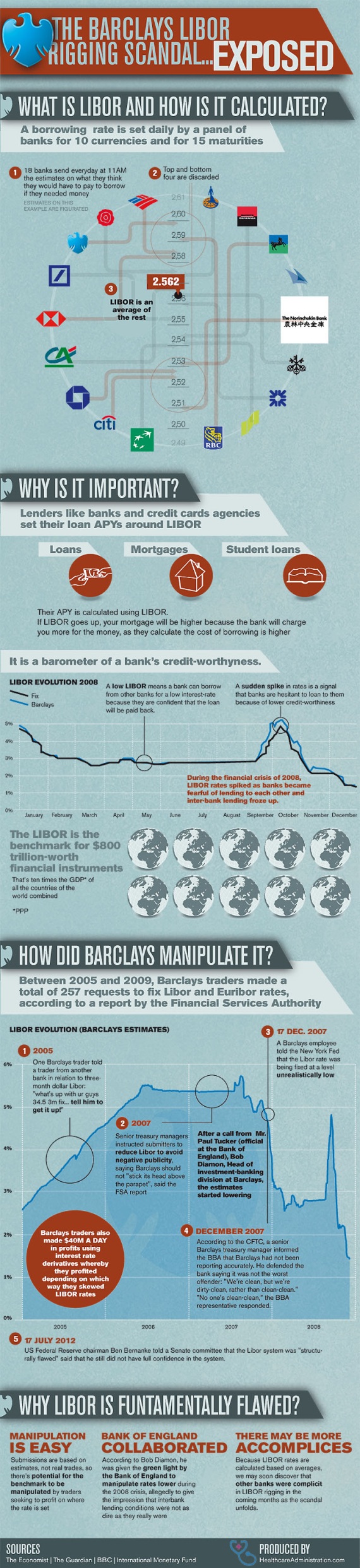
Via: HealthcareAdministration.com
More reading and understanding:
- Beyond Animal Spirits
- Why Aren’t LIBOR Manipulating Banksters in Prison?,
- Barclays Bank: CTFC Complaint Details,
- Bill Black: LIBOR Fraud 101,
- Info Graphic: LIBOR Scandal Explained,
- Barclays LIBOR Scandal: The Fed Knew WHEN? ,
- Diamond: I Am a Victim,
- Financial Fraudster Hall of Fame,
- Did Bank of England Have a Hand in Libor Fixing?


